HbD News: Finnish Olympic Jerseys Announced
The day after the Nike made a more positive splash in the Olympic jersey design with the anthem-laden Slovakian jerseys, they’re right back to making to cheap-looking tripe with Finland’s jerseys.
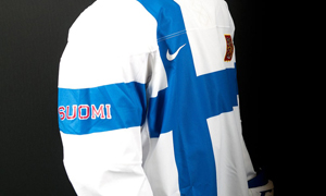
 The problem with these jerseys, and more specifically the white jersey, is the same problem with the Canadian jerseys. It looks cheap, like it was bought at a dollar store in the days before Itsenäisyyspäivä, Finland’s Independence Day. The design process for the white Finnish jersey seems exactly the same as the Czech Republic’s flag jersey: a flag draped over the shoulders of a hockey player with a national crest on it.
The problem is not so much that any decent sewer with nothing more than a Finnish flag could make this jersey in about an hour (because good design doesn’t have to be complex), but it’s that there appears to be so little thought or passion put into the design. Like the Czech’s, here’s a flag, slap it on the jersey and let’s be done with it. At least with the Czech Republic, they showed some thought and turned the flag sideways, which actually might have looked more interesting with the Finnish jerseys as well.
Nike is certainly pushing the boundaries for jersey design (and certainly for patriotism apparently), but with the leaps they’re taking, they shouldn’t be surprised that they’re going to get crucified. But then they’re embarrassing the players who have to wear these jerseys in the end. Remember what the Kings made Gretzky – the greatest player to play the game – wear? It’s actually pretty shameful.
It’s also convenient how prominently the design features the Nike logo on the white jerseys, which is looking more and more like advertising to me with each jersey that gets announced.
The only nice touch on these white jerseys is the Finnish national crest over the heart of the player, which oddly featured a human/lion hybrid stabbing himself in the head and not liking it one bit. I don’t blame him. If I had one arm that was a lion’s arm and it kept scratching at me uncontrollably, I wouldn’t like that either. But, for the jersey, it’s about the only thing I like about it. Yes, the jersey is minimalist for sure, which is something regular readers know is something that I like, but minimalism is like the man on wire, a tight line to walk and any mistake pushes you over.
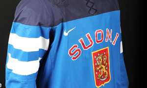
 And while the white jerseys are minimalist, the blue jerseys feel clunky and way too busy. First, I’ve never too sure about the shape and size of the shoulder yokes at the top of all the jerseys. This is the first jersey to come out that really makes me not like them. The two tones of blue, with the darker one on top, makes the shoulder yokes look overly big and awkwardly sized, like Bret from Flight of the Conchords and his oversized wet suit. Plus, they couldn’t stop themselves from putting the glossy lion-man from the coat of arms on the shoulders, which is already prominently shown on the main crest of the jersey, so it becomes repetitive and superfluous. Oh, and those damn fake laces.
The crest itself, with Suomi (the Finnish work for Finland, if you didn’t already know) curved over it, is classic Finnish jersey design and, as such, don’t have much of a problem with it. Is the Suomi necessary? I don’t really think so, but it doesn’t bother me enough to recommend taking it off.
Other than that, there’s not much else to talk abou…OH MY GOD GUYS, WE FORGOT ABOUT THE FLAGS! THIS JERSEY ISN’T PATRIOTIC ENOUGH! QUICK, SLAP THEM ON THE SLEEVES! Phew, that was close.
That seems about all the thought process that went into these jersey designs.
Agree? Disagree? Let me know below.


Leave a Reply