
The Best Winter Classic Jerseys (2014)
 I wrote a similar post last year on the day of the Winter Classic to commemorate the best hockey game – aesthetically speaking – during the regular season regardless of whose playing. With the addition of a Maple Leafs jersey and another Red Wings jersey, here’s an updated countdown of the best Winter Classic jerseys. As January 1, 2014 marks the 6th Winter Classic game, here they are, from #12 to #1.
12. 2011 Washington Capitals
 Originally in the previous post, I had these second-t0-last, but I realize now that was a mistake. These jerseys don’t have the retro-chic feel that these jerseys usually go for, instead looking gaudy and dated. To be fair, I’ve never been crazy about this original logo in the first place (as the ranking of their modified, updated version in the BTLNHL Countdown will attest to), with a strange, modified Helvetica-esque font. The jerseys weren’t that much better, and it’s apparent when they brought them back for last year’s Classic. But, the Capitals also don’t have much heritage to draw from, and better these jerseys than bringing back these ones. Still, it’s the worst we’ve seen at the Winter Classic.
11. 2012 Philadelphia Flyers
 Switching places with the Capitals, these jerseys jump from last to second last. I stand by what I said about the jerseys in an earlier post, particularly about how little the Flyers’ look has actually changed over their existence, and since they’ve already been to the Winter Classic dance (in 2010 against the Bruins) they had limited options to work with. But, what they essentially did was create a jersey extremely similar to what they already wear, with some slight changes to the piping in a not-so-great way. It’s money in the bank for them, with fans most likely clamouring to buy them up, but it feels like a disingenuous cash grab. A better option? Maybe a play on the old Philadelphia Quakers from the ’30s. But with one of the best logos in the league, and owners of the orange, it’s still a more striking jersey than Washington’s. And bonus points for the keystone-shaped captaincy markings.
10. 2010 Boston Bruins
 It’s not a bad jersey, but it’s a curious choice to use a logo that was only in existence for only one of the Bruins’ 90 seasons (1948-49), using a more fluid and bulbous B rather than the strong and aggressive one they’ve been wearing from years. It’s a bad departure from the Bruins’ otherwise well-crafted brand from the last decade. Also, the piping along the shoulder is awkward and doesn’t work that well. And there were a few other vintage options available to them, even possibly the other jersey they wore during that same 1948-49 season.
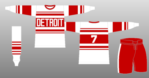
9. 2009 Detroit Red Wings
 Again, like the Bruins, not a bad jersey considering how little their jersey has changed over the years, but it’s a bit bland and doesn’t fully take advantage of the retro look they could have gone for with the opportunity of participating in the Classic. Sure, it’s still an exact replica of their 1926-27 Detroit Cougars jersey, but there’s still room for play here, like designing a better gothic-styled D, and there’s still some other possibilities from their history they could have gone for. I would have loved to have seen a Red Winged variation of this 1928 classic, also when they were the Cougars. They do get extra points for the striped socks though. That’s pretty awesome.
8. 2011 Pittsburgh Penguins
 The cummerbund jersey! Of the two Penguins jerseys in the Winter Classics, this one is definitely the weaker cousin. That waist piping is crazy large and while it certainly has a retro thing going for it, it’s a bit much. It could have been a reduced to maybe three baby blue stripes, allowing the logo to get a little bit larger and not compete as much with the cummerbund. On the positive, the Penguins designed something they’ve never actually worn before while still pulling from their original 1967-68 jerseys and logo, both of which only lasted that one season. And the stylized numbers (matching those original jerseys) are great and also represent the very first time an NHL team didn’t wear the standard font of blocked-off corners on a jersey. Too bad it only lasted a season and no team tried anything else until the ’90s. But yeah, just a bit much on the stripes. And regular readers know I’m not a huge fan of the dark navy blue on jerseys: too dark to really read as blue and looks more like black.
7. 2009 Chicago Blackhawks
 It’s hard to improve on the Blackhawks jerseys in general, and these are certainly great looking vintage jerseys, replicating the team’s 1935-37 jerseys. But I’m also a fan of updating vintage looks to fix design issues that don’t make much sense. In this case, there’s no reason why the logo needs to be that small. It would have been a better jersey if the logo had overlapped the wide white band, and gone into the black. Speaking of which, the black doesn’t bother me as much here as there’s lots of colour to break it up. These jerseys are definitely still vintage-looking and fitting for the game and venue, but could’ve used some slight changes.
6. 2008 Buffalo Sabres
 This is very close to the jersey they currently wear, but don’t forget when this game happened. This is the game that reminded people how nice of a jersey it was, especially when compared to their recent redesigns, including the buffalo zombie and the golden slug, which is what their actual jersey was at this time. It may not be considered classic or vintage now, but it certainly was in 2008. Any time a one-off jersey can influence a change of their current logo/jersey, you know you have a pretty good thing happening. And just when Sabres’ fans thought bad design was a thing of their team’s past, this came along. But that’s a whole other discussion.
5. 2014 Detroit Red Wings
 The Red Wings’ second entry into the Winter Classic jersey archive is miles ahead of their first one, and there’s a lot to love about this jersey, which I discussed in detail here. It’s a mixture of their 1927-28 and 1928-29 Detroit Cougars jerseys, with a stylized version of the ’30s-era Red Wing logo brought in. It looks vintage, with some contemporary elements brought in and relatively consistent striping. A solid Winter Classic entry. My main gripe is the “Detroit” and numbers font. It looks like a contemporary font trying to be vintage. Also, more space between “Detroit” and the logo please. Of note, it looks like the captaincy marking has been moved to a diamond shape on the left sleeve, which is a very non-traditional move. It’s also against league rules, so I imagine the league gave them special permission, as they did for the Sabres. I like it better on the sleeve than on the shoulders, as the Sabres did, and it works for a one-off jersey. A regular jersey, I’m not so sure.
4. 2012 New York Rangers
 The Rangers’ jerseys (which I also talked about in a previous post) are a great look for a team that also hasn’t changed their look much over their existence. The piping is great, the off-white base is perfect, and while it certainly draws from their current jersey and look, it’s enough of a variation to give it a vintage look. Stripes on the shoulder yokes seems to be an emerging theme for vintage-based jerseys. A single stripe, as is the case here, works. But please don’t let it go too far. Essentially, the jersey isn’t an exact replica of any of their past jerseys, but it looks like it could be. The logo itself is an updated replica of their original logo from the ’20s and ’30s.
3. 2009 Philadelphia Flyers
 Another jersey that spawned a redesign of the permanent jersey design for the Flyers. Like the Sabres’ Winter Classic jersey, it doesn’t look classic now, but it was a bold choice in 2009, simplifying the overall design and piping of the jersey and letting the loud orange colour do its job of demanding attention, replicating their original 1967 jerseys. The box surrounding the nameplate on the back of the jerseys works really well when the jersey is simplified in this way. In short, it worked so well and was liked so much, it became their new permanent look. When you have such a stable visual brand as the Flyers have had since their inception back in 1967, this is definitely a good thing.
2. 2014 Toronto Maple Leafs
 If there’s one team that’s had an incredibly consistent jersey design, it’s the Leafs, which is remarkable since the franchise been in existence for almost 100 years now. Since 1927, they’ve worn either white with a blue logo and stripes or blue with a white logo and stripes. So, how do you make a jersey that you’ve always worn look vintage? You replicate your (almost) original 1927 Maple Leaf jersey, wonky logo and all. It fits the brand, it looks vintage and, because of the simplicity of the blue/white, the crazy striping is necessary to bring out that vintage feel. I would never want this as a permanent jersey, but as a one-off game like the Winter Classic, it’s perfect for the Leafs. You can read more analysis about it here.
1. 2008 Pittsburgh Penguins
 When these jerseys first stepped onto to the ice in Buffalo in 2008, they looked damn good. They were a complete departure from anything the Penguins had word in the previous 25 years, but were almost a complete replica from their 1970-71 jersey. The baby blue was a bold and daring colour choice, and pretty much unused in the the NHL since the Penguins themselves abandoned it in the late ’70s. The piping, simple and strong. Outside, against the white sheet of ice and the dark blue sky, they looked great and, even after six instalments, still set the bar for Winter Classic jerseys. This jersey almost single-handedly introduce a new wave of retro jersey and logo designs that persist to this day. An instant classic.
Think I’m nuts? Put them in your own order in the comments below.


[…] to take away from the brand overall, and their jersey for the 2012 Winter Classic more than compensates. Although the Rangers haven’t enjoyed the legacy and history of on-ice success that most of […]
[…] to take away from the brand overall, and their jersey for the 2012 Winter Classic more than compensates, as well as having a relatively solid Stadium Series jersey. Although the Rangers haven’t […]
[…] and oddly shaped alternative logo of today, and the “meh”-inducing logo for their Winter Classic jerseys, they’ve kind of stunk up the joint. And the alternative jersey with Smokey on it? […]
[…] Related Reading: The Best Winter Classic Jerseys (2014) […]