
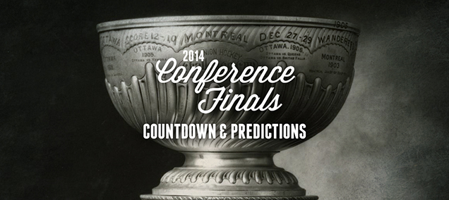
NHL Playoffs 2014 (Round 3) Countdown and Predictions
 We went a perfect 4-for-4 in the second round, including calling 2 exactly right (Hawks in 6 and Habs in 7). Together with the first round, that brings it to 9-for-12. Not too shabby, but how will things go in the Conference Finals?
For those just joining, we’re making predictions for all the playoff rounds based on the branding of that team. We’ll compare the overall branding of each series and see how they match-up. This includes the logos, alternate logos, jerseys, historical logos and jerseys, and everything else that builds a team’s brand. Short but sweet, live a certain strawberry cake. But on top of that, the match-ups are going to be ranked according to which will be the best to watch from an aesthetic standpoint. Some jerseys work better together than others, and you’ll see why.
You can see the Round 2 predictions/countdown here and Round 1 predictions/countdown here. But now, Round 3…
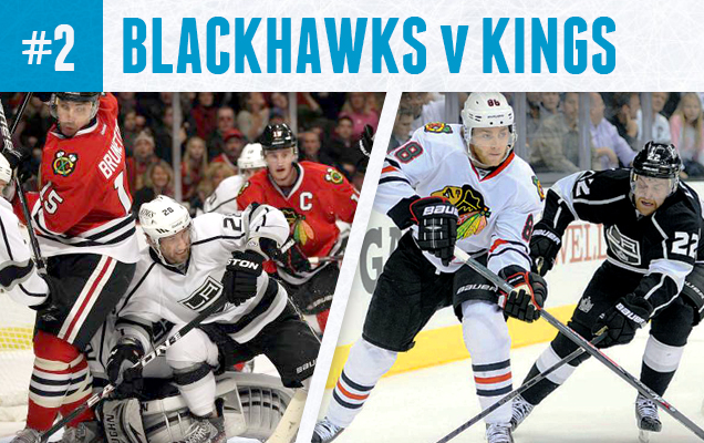
The rematch of last year’s Western Conference Final features the monochromatic Kings jerseys, which bring this whole series down. As we know, the ‘Hawks have some of the best jerseys in hockey – both home and away. But with the Kings adding no colour into the mix, they’re not holding up their end of the aesthetic match-up. But watching the ‘Hawks jerseys play is almost always a pleasure, so it’s not all bad. And I have to admit, the Kings jerseys are growing on me. At least the whites look sharp and the games in Chicago will be better to watch than the ones in LA. Or maybe they could wear their Stadium Series jerseys? Actually, scratch that. They’re pretty hideous.
Prediction
Meanwhile, the Blackhawks’ logo ranks at #7 in the league, which is very decent, but they also have one of the absolute best jerseys in the league, both home and away. They have history (as the logo hasn’t changed at all since 1964, and the same concept since their inception in 1926), the Madhouse on Madison, a passionate fanbase, overall high-quality design, and a good Winter Classic jersey addition. They had a tough go of it through the ’90s and early ’00s, with bad ownership and lack of a on-ice quality product, but overall, from a branding perspective, they’re a beast.
The Kings, meanwhile, have been retooling their logo for years. In 14 years, they’ve had 4 distinctly different logos, and each of the previous three are better than their current one, with a crown too small to make out and letters that look awful on a home plate shape. And they forced the greatest player to play the game to wear one of the worst jerseys ever created in the NHL. But, they’ve kept to their black and white motif (with flashes of a regal purple thrown in now and again, which also makes a connection to their original colours) for over 24 years, a scheme that no one else in the league has toyed with, so it’s all their own. That’s a great bonus for establishing an identity, but overall, it’s has been maddeningly inconsistent. This contest isn’t really that close.
Blackhawks in 5.
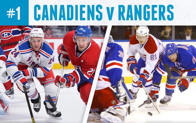 Was there any doubt this would be the better aesthetic match-up? Yet another Original Six match-up in the East, and the second in a row for the Habs. And we’ve got a classic red-vs-blue match-up between Montreal’s iconic reds and the Blueshirts of New York. Even the white road jerseys of both these teams are some of the best in the league, with a nice amount of colour of the shoulder yokes and stripings. It actually might get a bit confusing as the two teams have almost identical jerseys in many ways, but just with the blues and reds swapping places. Regardless, it’s another excellent series that will be an absolute pleasure to watch more matter what team you’re cheering for or what the score is.
Prediction
Another Original Six match-up for the Canadiens, so it’s not a cake walk at all for the might Habs by any stretch, brand-wise. They do have the best logo for a Canadian team in the NHL (and 5th overall). They have the most iconic hockey sweater in existence and it’s endured for almost 100 years now. The “bleu, blanc et rouge” is on par with the Yankee pinstripes and has been celebrated in book and film. It is the one jersey/logo/brand that will never change because of how iconic it has become, and the team plays in the birthplace of hockey. Oh, and there’s 24 banners hanging in the rafters in Montreal that attest to a small amount of success as well.
Meanwhile, the Rangers were ranked as having the 12th best logo in the league. The Rangers have a history of a solid logo concept since the 1920s and nobody in the league save the Canadiens can match the uniqueness and iconic nature of the Rangers’ home jerseys that have stood the test of time. Often imitated, never duplicated. Their alternate logo is just okay, but not enough to take away from the brand overall, and their jersey for the 2012 Winter Classic more than compensates. Although the Rangers haven’t enjoyed the legacy and history of on-ice success that Montreal has had, the Blueshirts are not a brand to be messed with. In the end though, it’s hard to topple what could be the most powerful, timeless, passionate and consistent visual brand in hockey.
Montreal in 6.
Check back for the Stanley Cup Finals in a couple weeks!


[…] but sweet, live a certain strawberry cake. You can catch-up by reading Round 1, Round 2 and the Conference Finals. But first, the Stanley Cup […]