
Top 5: “Manliest” Hockey Logos
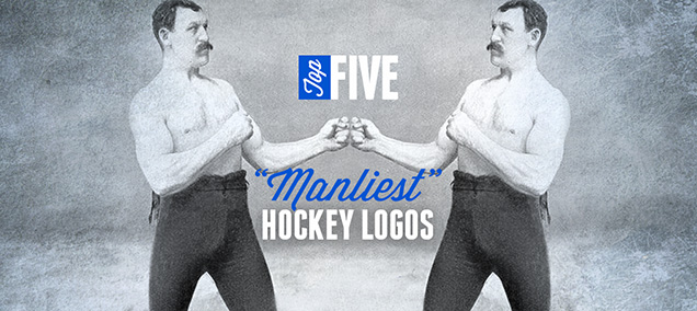
So, it would have been pretty cool to release this article closer to Father’s Day this year, but of course I was far too busy doing manly activities such as BBQ’ing, Jeep driving, and strutting around the neighborhood with my ferocious pug dog to get it done in time…my apologies hockey design fans. In this edition of Top 5, we rank the “manliest” logos amongst both major and minor league hockey teams. But what does that mean? What exactly makes a logo “manly”? In a late honour to Father’s Day, please continue reading for manly enlightenment…
 The AHL’s Portland Pirates logo is manly for a variety of reasons. Let’s start with the obvious: The Beard. There is wisdom and respect imbedded in this pirate’s whiskers, traits every man needs. I mean, can you really take a pirate seriously without a beard anyway? Furthermore, the scowl and defensive stick-holding position of this Pirate have me convinced that he should be taken seriously, especially combined with a striking red and black color scheme. This logo may have been ranked higher if it weren’t for the inclusion of ‘Portland’ arching over the top left side, in what seems like an after-thought by the designer, this salty swashbuckler could easily stand on his own without it.
 If Bruce Springsteen wrote a song about a logo, it would be this one. The hard-working, blue-collar aesthetic of the ECHL’s Tulsa Oilers is represented well with this abstracted oil worker logo. Here’s a quick design lesson, jagged edges create a sense of danger, and danger is definitely manly. Also, this guy looks like he has Elvis Presley sideburns, so he gets double the manly points on this one. I don’t mind the hockey puck ‘O’ but the rest of the ‘Oilers’ type isn’t ‘oily’ enough, and it could be integrated better with the rest of the logo, but maybe I’m just biased towards Edmonton’s version?
 Formerly the ECHL’s Stockton Thunder of California, this re-located version debuting 2015-16 season, has a noticeable difference to the logo: a switch from a blonde to red-beard on their Norse god mascot. Perhaps they are summoning the spirit of the manly (and fiery tempered) Viking explorer Erik the Red, or perhaps even someone a little more family friendly. Whichever it is, this sleeve-less winged-hat wearing brute continues to be a badass. I also enjoy that the lightning bolt has moved to the ‘T’ in ‘Thunder’ and there is no longer a bolt in the letter ‘N’ which, let’s be honest, did not look great in the first place.
 This “Original Six” NHL team has kept their classic logo relatively unchanged since their founding in 1926. Don’t be fooled by the colorfully painted, smirking face and feather accessories, this logo is 100% manliness. Quick history: The club was named after the founder’s World War I infantry unit in which he was a commander (which was inspired by Chief Black Hawk of the Sauk Nation). No city or team name is needed to compliment this logo, it strikes fear into the hearts of its opponents, all on it’s own.
 He’s sort of like Captain America…except it’s Canada, and hockey is involved. The NHL’s Vancouver Canucks adopted a version of ‘Johnny Canuck’ as an alternate logo during the 2007/08 season. The character itself has a much longer history, dating back to 1896 as a political cartoon and later revived as a World War II superhero who almost single-handedly won the war against Hitler! It’s debatable whether modern Johnny is more lumberjack or hipster…but he still has a ton of manly to go around. Let me point out, he is ice-skating in overalls and a pom-pom beanie and still manages to look as tough as nails. You have my respect Johnny Canuck, and have earned the top spot on this edition of Top 5, and hopefully more spotlight time on future Canucks jerseys.
Agree? Disagree? What’s the “manliest” hockey logo you’ve ever seen? Let us know in the comments below.


[…] • More: Top 5: “Manliest” Hockey Logos […]