
HbD Masks: 7 Most Iconic NHL Masks
 With 30 teams in the NHL, each with at least two goaltenders on their roster and some wearing multiple masks in one season, the league has seen thousands upon thousands of masks throughout its long history. Ok, so goalies didn’t actually wear masks until the late 50’s when Jacques Plante became the first NHL netminder to wear one after being struck in the face with a puck and later returning to the game in the mask he had previously only worn for practice. Regardless, the number of unique mask designs that have graced NHL rinks is too high to count.
 Photo: Montreal Canadiens
Even the goaltenders who then adopted the new form of protective gear didn’t think much about the appearance of them until the 1970’s when Gerry Cheevers began putting markings on his mask every time he was hit in the face, either with a puck or a skater’s stick. That all changed in 1974 when art student and former goalie Greg Harrison crafted a light blue mask for Penguins goalie Jim Rutherford, commonly viewed as the first instance of personal art on a mask and thus spawning a new artform. Harrison would go on to make masks for more than eighty percent of the league’s goaltenders in the 70’s, including the famed masks of Gilles Gratton, Brian Hayward and Wayne Stephenson, just to name a few.
40-odd years later, goalie mask design has reached a new level of artistry and personal expression for netminders. Among the thousands of masks to hit the NHL ice over the past few decades, there are a handful whose design and innovation make them stand out as pioneers and icons of one of the most unique forms of artistry in sports.
Honorable Mention: Jonas Hiller, 2013
 Photo: rantsports.com
While Jonas Hiller’s black and gold Ducks mask hasn’t exactly hit icon status in the 2 years since its debut, the design is worth mentioning for its innovative and contemporary style. I wrote about this mask last summer, as it’s one of my favorites in the modern era of mask design, opting for a more design-y (for lack of a better term) aesthetic, rather than the busier, airbrushed style (or the “drug-induced, side-of-the-van paint job” look, as Harrison so eloquently called it) of his colleagues.
More Reading: HbD Masks #3: Jonas Hiller
The gold foil complementing the matte black paint and gold cage is something we don’t see very often (although Lundqvist is seemingly a fan of the glitter foil himself) and the lightweight sans-serif font across the top of the mask is especially unique. To quote Buzzfeed (file that under things I thought I’d never write), “this is the best of the bunch in the ‘stylized team logos’ category, but it looks like a grad student in a graphic design class made it.” As someone who has a degree in graphic design, I’ll assume that was meant as a compliment.
7. Curtis Joseph, 1996
 Photo: Edmonton Oilers
We don’t often mention the 90’s in matters of good or influential design, particularly when it comes to sports (*shudder*) but CuJo’s oil sploosh mask is still relevant almost two decades later. Jaroslav Halak commissioned an almost-replica of Joseph’s mask last season in Long Island with some tweaks made to update the design for the new millennium, and Ilya Bryzgalov used a similar orange splash design in his 2013-14 Oilers mask as well.
The clean lines and relevant imagery on this mask still bring the same immediate recognition to the Oilers franchise as they did during Joseph’s time with the team.
6. Ben Bishop, 2015
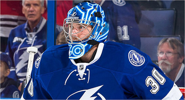 Photo: NHL.com
It’s always a bit of a stretch to call something “iconic” when it’s only been around for less than a year, but Ben Bishop’s glowing Tron mask is one of the most innovative and eye catching masks in recent time and will probably be much higher up one of these lists 10 or 20 years from now. The winner of our 2015 Bucket Bracket Showdown, Bishop’s mask is special for a number of reasons. From the finals matchup:
Famed Swedish artist Dave Gunnarsson took a much more graphic, yet incredibly dynamic approach to designing Bishop’s TRON Legacy mask. Using his new G.L.O.W. Tech FX paint effect, Gunnarsson encapsulated Bishop’s mask with a glowing, energy-filled lightning pattern on a Tampa Bay-blue backdrop.
More Reading: The Bucket Bracket Showdown (The Finals)
More Reading: HbD Interviews: Dave Gunnarsson
For the complete analysis of this mask, you can read the full article of the Bucket Bracket Showdown finals (link above), but what really makes this a standout is the use of a new medium in a sensible way. It’s a well-known principle among designers that content and subject matter should always precede design, and Bishop’s artist, Dave Gunnarsson, has used his G.L.O.W. Tech FX paint here in a way that makes sense – to depict lightning. Gunnarsson has been a pioneer in, perhaps still the only artist, using glow in the dark paint on goalie masks, and for that, this mask is a trailblazer for masks of the future.
5. Gilles Gratton, 1976
 Photo: boards.sportslogos.net
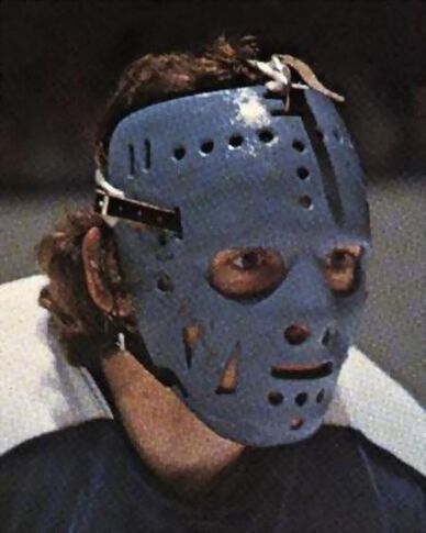
Despite the slightly terrifying Jason Voorhees associations, the popular face plate-style masks of the 70’s helped opened a new door when it came to mask design. While most goalies were at the time just beginning to explore the idea of decorating their masks, Gratton had perhaps one of the most elaborate designs of the era.
Passionate about astrology, it seemed fitting that Gratton would channel his zodiac sign – the Leo – by wearing a mask that all but transformed him into a lion. It’s been said that Gratton hoped the mask would scare or distract opponents, but his numbers with the Rangers suggest that maybe his plan wasn’t the most effective…
Many goaltenders in today’s day and age have used intimidating animal motifs on their buckets, including Tuukka Rask and Ryan Miller carrying on Gratton’s legacy of ferocious designs. His one season in New York may not have been the most notable from a goaltending standpoint, but his lion mask has since gone down in history.
4. Brian Hayward, 1991
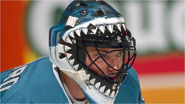 Photo: boards.sportslogos.net
In the Sharks’ inaugural season, Hayward’s mask stole the stage for its bold and in-your-face paint job. Following in the footsteps of Gratton’s mask with a serious intimidation factor, the blood-dripping teeth surrounding the face opening of Hayward’s bucket created the illusion of a shark swallowing the goaltender inside the mask.
Like Gratton’s, Hayward’s Jaws-inspired design sparked a new take on the animal theme, as he was one of the first to use the mask’s face opening as the mouth of said animal. More recently, we’ve seen goalies including Al Montoya and Justin Peters use the same concept on their masks.
With the Sharks now celebrating their 25th anniversary, Hayward’s mask will forever be an icon for the franchise and all animal masks of the future.
3. Ken Dryden, 1976
 Photo: Sports Illustrated Kids
Another from the 1976 season, Ken Dryden’s face mask is perhaps one of the most recognizable in Canadiens history. Still in the early days of mask design, Dryden breaks the top three for being one of the earliest to incorporate team branding into his mask design.
In the modern era of mask art, we see goalies like Ben Scrivens and Michael Hutchinson sporting minimalist designs that are entirely focused around their team’s visual identity, but Dryden’s red and navy stripes pioneered this way of thinking about mask design. The stripes on his mask closely mimic those on the iconic Montreal jerseys, tying what was, at the time, an odd and new piece of protective equipment to the team’s uniform and visual identity.
Former Hab Alex Auld even paid tribute to Dryden’s iconic look with a split 50/50 design, incorporating elements from the franchise’s storied history.
2. Wayne Stephenson, 1976
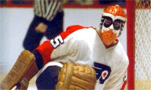 Photo: thevintagemask.com
Well, 1976 sure was a good year for progressive mask design, eh? Another goaltender who used his team branding in an innovative way was Wayne Stephenson in Philadelphia. Having served as a backup to Bernie Parent, Stephenson’s mask didn’t get the same level of recognition as that of Ken Dryden, but the creative use of the Flyers’ logo is certainly worth noting.
Rather than keeping the white base of the mask as many goaltenders did in the 70’s, Stephenson’s mask went all orange, turning the Flyers’ logos into a superhero-like eye mask. While most masks in the modern era incorporate the team’s logo somehow in the design, the placement and transformation of the logos on Stephenson’s mask was ground-breakingly creative for the time period.
Well-known mask artists like Steve Nash of EyeCandyAir are still inspired by Harrison’s clean and minimalist style. “I loved everything Harrison did,” Nash said in an interview with NHL.com. “When I watched guys wearing his masks, they had this aura about them. It captivated me.”
1. Gerry Cheevers, 1970
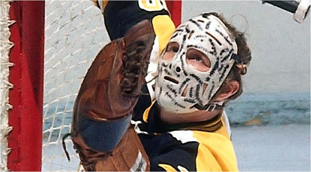 Photo: 989 The Drive
When it comes to iconic masks, it’s hard to think of anyone to fill the top spot but Gerry Cheevers. Widely credited with sparking the beginning of mask design with only a permanent marker, Cheevers’ black markings worked both as decoration and for intimidation.
Having inspired a tribute mask from former Bruin Steve Shields, Cheevers’ legacy, not only for his play but for his mask, is held in high regard across the league. “When he started putting the stitches on, people took note,” said former goaltender-turned-GM, Ron Hextall. “It wasn’t just to protect your face, it was a piece of art.”
Agree? Disagree? What iconic mask is your favorite? Tell us in the comments or on Twitter!


Jerry Cheever’s Hannibal Lecter mask, hands down. Firstest, Baddest, Bestest. And look at the catching glove the size of my old first baseman’s mitt…
[…] • Applauding goaltender creativity over the years with the ‘Top 7 Most Iconic NHL Masks.’ [Hockey by Design] […]
Ernie Higgins from Norwood Ma. made masks back in the day for many NHL,college and HS goalers! I believe he made Cheevers mask!
Cool, thanks for sharing! That was one piece of info we were looking for.
Ron Tugnutt was actually the first person to do the splash mask. At the time the Canadians played at the Molson Center and he wanted a design that looked like an exploding beer barrel. He kept the same design with Ottawa, Pittsburgh, Dallas and Columbus.
Good catch. It seems he wore it with the Habs first, but then stopped wearing it for a couple seasons, at which point Cujo started wearing it, and then Tugnutt brought it back.
Thanks, I always thought the beer idea was really cleaver. Btw, great site!
Thanks, much appreciated!
Bishop and Hiller you got to be kidding me…so boring!
Where is the Richter Statue of Liberty mask; Gary Bromley double Canucks logo mask…the modern ones suck; they look like someone owning a 70s van would have on the side paneling.
I’d take the Mike Liut all white suction cone mask over these new modern pieces of crap…even the Hasek helmet cage is better than these modern designs.
Keith
[…] a foreword by mask art pioneer Gerry Cheevers, (that guy holding the top spot on our iconic mask ranking) this book is a must-have for any goalie or mask art appreciator. Pick one up on Amazon for a […]
[…] tribute to legendary Canadiens goaltenders Ken Dryden and Jacques Plante (who coincidently had a sweet mask of his own) and the team’s history with vintage logos stamped throughout in a light gray. The Winter Classic […]
Completely disagree with you on Hiller and Bishop. Nothing special at all in my opinion.
Missing:
Belfour – Any Team
Roy – Habs
Richter – Lady Liberty
Vanbiesbrouck – Panthers
I have been reading several articles about goalie masks and only one credits Clint Benedict with being the first NHL goalie to wear a mask; all the others say that Jacques Plante was first. Benedict was first, but Plante was the first to wear one on a regular basis. This bugs me as much as people who think the H on the Montreal logo stands for Habs, it actually stands for Hockey as the Canadiens were once known as Le Club de Hockey de Montreal.
[…] More: 7 Most Iconic NHL Masks • More: 2015 Bucket Bracket Showdown (The […]
[…] • More: HbD Masks: 7 Most Iconic NHL Masks […]
To be honest, few modern masks impress me, let alone scare me. Most attempts are just gory/gross. Of the modern mask style, I suppose the Brian Hayward San Jose Shark mask in the 90’s was the best example of both impressive & scary.
The single biggest problem with modern masks is that they don’t actually mask much. Most close-up shots show as much face as face-mask. The reason masks are scary is because they both protect & hide the wearer during the evil they’re about to commit(ie goal thefts) and because you can’t read their facial expressions. The 70’s style of mask covered everything. Even eyes were hard to spot. Full face-masks just carry with them a base-level of fear much higher than the modern mask. Even a plain, 70’s-style mask is scarier than most painted modern ones. (See: the above “Jason” mask.) Another example, Rogie Vachon’s “smiley face” mask is smiling, but it’s still creepy, especially when he played for the Red Wings.
The second problem also stems from from the see-through cage. (Now that I think of it, a dark-tinted plastic cover would make them more intimidating.) It creates a giant whole in the centre of the canvas. Unless you take the Brian Hayward Shark mask route of building one piece around the gap, you wind up with small, scattered, designs that are hard to make out, especially from Row 197. It’s a lot like all these Millennials and their 257 tattoos that just get lost in their own noise. I know it’s heretical in this age of excess; but less is more.
Another problem is that I’ve noticed most modern masks have the manufacturer’s logo on them. While rampant consumerism is very scary in itself, a visible company logo on a mask really kills whatever scary mood the mask design had going for it.
As for comments on the list and other scary-mask-list suggestions (in no order):
1)Gilles Gratton (aka Grattoony the Loonie) was outright nuts, even by GOALIE standards. Back in the WHA, he was Shirley MacLaine before Shirley MacLaine. Gratton thought he’d been reincarnated dozens of times. After stopping a hard shot in the torso, he’d often collapse in a heap and suffer a “past life regression” to trauma suffered during the Spanish Inquisition. While a Toronto Toro, he went AWOL during the infamous $5,000-A-Goal-Shootout where he was scheduled to “duel with Evel Knievel”. And in a classic 70’s move, Gratton once “streaked” a few laps around the Gardens during a team practice wearing nothing but skates, goalie pads and his Toros mask. Now THAT’s scary! After his time with the Rangers, Gratton retired early to a hippie ashram in India.
2) The Cheevers classic goes without saying and reminds everyone how incredibly tough those Original 6 goalies had to be…which leads me to…
3) Lorne “Gump” Worsley’s and Andy “Fearless” Brown’s “invisible masks”. (Honourable mention to Joe Daley’s “part-time” mask.) They played in the curved stick, slapshot, era that generated harder, more unpredictable, shots. Extra bravery points for all three.
4) The Bones Bromley mask is pretty scary. He also had a good mask with the Calgary Cowboys of the WHA. It wasn’t meant to be scary. The team’s colour was red and so was his mask. From a certain angle, it looked like his face was covered in blood.
5) Toronto Toro’s/Birmingham Bulls teammates John Garrett & Wayne Wood had bull-themed masks. Garrett’s was built as if he was a Minotaur. Horns were painted on his head and smoke snorted out of the nostril holes. Wood’s mask had the face of a bull painted on it. Both masks’ eye-holes corresponded with the bull’s eyes. If they incorporated more red than blue, they would have been even better.
6)Dave Dryden’s Chicago Cougar mask. I’ve heard it described as “one part rabid animal, one part Juggalo.” Way scarier than anything his brother Ken wore.
7)Anything Billy Smith or Ron Hextall wore. Not because the masks were scary, but because of the stick-wielding maniacs inside them.
@Sedate Me. I’m late to this show but you’re comments are on point. The iconic goalie mask was extra iconic and never more scary than when the faceplate was the thing. I find lately that goalie mask art just isn’t cutting it.
I see the author has floor knowledge it the subject as well as some practical expertise.
This kind of info is more precious than copypasted blog posts
ideas.
Grew up in Boston at that time period! Gerry Cheevers was Bad Ass his iconic mask set the tone for how bad ass
The game of hockey was & how Tough not only his era was but but those before him. Loved the game & played myself
Thought the Bruins were the best. Don’t F___k with Boston. All sports not a better town on earth to grow up in.