
Top 5: Best Designs of 2015
 It’s that time of the year, where everyone and their top-5-favourite-dogs-of-the-year are counting down the best and worst lists for 2015. We here at Hockey By Design are not immune to such things. In fact, we do it on a semi-regular basis. Why? Because they’re addictive. And because you seem to like them.
So today, we’re moving to the Top 5 Best Designs of 2015 in the NHL. Yesterday, we did the Top 5 Worst Designs of 2015, and you can read that here. Why worst first? Because you always pick the bad news before the good news when given the option. Always. Remember, these are the Top 5 Worst Designs that were announced in 2015. Not all of them have necessarily been used in a game yet.
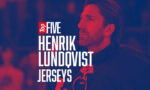
 A special Honourable Mention goes to the San Jose Sharks for bringing back their original logo and jersey for select games during the 2015-16 season to celebrate their 25th anniversary. It’s not a ‘new’ NHL jersey, so it can’t make the Top 5, but it’s classic, it’s awesome, and it was the first jersey to introduce teal into the hockey design vernacular. If not for the NBA’s Charlotte Hornets, it was the first in all of professional sports North America. And they were uber-successful, as they should be. Check out our interview with the logo/jersey designer to get the back story on how it was created.
More: HbD Interviews: Terry Smith (San Jose Sharks)
More: Worst to First Jerseys: San Jose Sharks
 It’s difficult to design an orange jersey properly (see: Anaheim), but for teams that do it well (see: Philadelphia) it’s an impactful and visual punch in the face that can look really fantastic on the ice. The Oilers here haven’t pulled it off to perfection (still a bit too busy), but it’s a really great and unexpected attempt, basing the design closely on their old WHA jerseys, complete with numbers on the shoulders. It fits solidly within their jersey set and established classic branding. For a team that hasn’t done great with alternative jerseys and/or branding changes, it’s nice to see them celebrate their classic look.
 I’ll let Ally Koss, our resident goalie mask expert, take this one:
In a rare aberration from Rinne’s long string of monster masks, this season Dave Gunnarsson helped the Preds goaltender create a tribute mask for his cousins. “On the side you will find paintings of Pekka[‘s] cousins and his sister as kids,” Gunnarsson explains on Instagram. “On the other side, paintings of Pekka and his cousins playing pond hockey as kids, and also a painting of Pekka playing as a pro.” The interpretation of Nashville’s alternative logo is fantastic, as the guitar pick shape fits perfectly on the top of the mask. As Gunnarsson described, it showcases in the Predators brand in an explicit way while still honoring Rinne’s family as he wanted. The composition is a bit stagnant, being so symmetrical and having most of the artistry hidden in such fine, subtle details, but this mask really is a beautiful tribute to Rinne’s family, which makes it an automatic success.
More: HbD Interviews: Dave Gunnarsson
More: HbD Masks Series
 The Stadium Series uniforms so far haven’t really been examples of great hockey uniforms design, appearing more often than not on the Worst of the Year list than the Best. So, it’s really nice to see one finally achieve something that really works and fits the general look the league goes for: large simplicity. And it helps that the league, for the first time, isn’t mandating a specific jersey template for all the Stadium Series teams to use. Minnesota put this creative freedom to good use: strong simple stripes on the sleeves and socks, impactful white shoulder yokes, the Wild-styled “M” on the pants. It all creates an incredibly classic and (at the same time) forward-thinking uniform. Nice patches too. And it even doesn’t make the large numbers look incredibly stupid.
 This thing is a perfect example of how you do event logos. It’s got very strong connections to its location, with very well-executed Nashville-esque (read: country music-esque) typography. It’s got very strong connections to the hosting team, with the Predators’ colours, their three-starred alternative logo being used (which fits nicely with the All-Star Game). The league logo is placed smartly: clearly visible but not interfering with the design. The additional elements and flourishes (including subtly placed hockey sticks and a puck) are all well done. And it’s all tied together within the guitar pick, again drawing from both Nashville’s musical legacy and the Predators’ alternative logo. It’s just extremely well-executed all around.
 It’s the first new Habs jersey concept since 1944, and it was worth the wait. These things are just fantastic. Old without looking dated. New while still looking vintage. It strikes an almost perfect balance between jersey design innovation and paying homage to the Habs’ storied past. And the inclusion of the globe on the sleeves – drawing from their 1924-25 jerseys – is a unique addition that delves into their history. When Bruins fans are even admitting they’re nice jerseys, you know you’ve got something good. Still nobody seems able to do jerseys quite like the Canadiens do.
Full Analysis: HbD Breakdown: Canadiens’ Winter Classic Jerseys
Agree? Disagree? What was your favourite design of 2015? Let us know in the comments below, or join the conversation on Twitter and Facebook.
Don’t forget, we counted down the worst designs of 2015 yesterday.


[…] Top 5: Best Designs of 2015 More: Top 5 All-Star Jerseys: Best | […]
[…] Related: Top 5: Best Designs of 2015 […]