
Top 5: Florida Panthers Logo Concepts
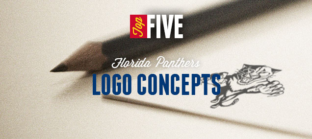
Another edition of the Top 5 Logo Concepts brings the internet’s best Florida Panthers logo concepts to the forefront. Like the Maple Leafs, it’s been announced that they’re getting a whole new look (including logo and uniform) for next season, so what better time to ponder what this new visual brand may look like for them? It’s never easy designing an animal-based logo for the best professional hockey league in the world, as the temptation to create something cartoony and minor-league-ish is pretty huge. These designers did their best though to create something new, refreshing and fitting with the southern Florida vibe. Let’s check them out…
Ed note: #5 was removed by request because of intellectual copyright infringement issues.
 Ben Gough (Calgary, AB) :: Behance :: Concept Source Page
Another Albertan taking a stab at Florida design. The current Panthers’ colour palette is kept, but like the concept above, the ocean/beach culture plays a larger role in the concept, cleverly turning a wave into an attacking panther paw. And the sun is well-incorporated into the concept as well. It gives the concept a good amount of movement and strength. The only flaw for me is including the word ‘Florida’ in there, or at least the execution of it, feeling forced and crowded in the small space it’s given. And I’m not crazy about the chosen typeface either. But, it’s a solid concept with some potential.
 Ken Loh (San Jose, CA) :: Website :: Concept Source Page
This is an interesting one I came across, as it was created as a possible concept for the Panthers when they first were awarded an expansion team in the ’90s. Teal was all the crazy back then, so it was incorporated into the concepts. Ken Loh has worked on other NHL logo as well over the years. He’s not a huge fan of these concepts (“too cartoony”, which he’s right about), but they do have some potential: good energy, good movement. But, the flaming hockey stick is a little bit over the top, and there’s just too much contrast here, so the execution of the concept needs some refinement. Still, it’s a different and interesting approach.
 Darren Sacher (Vancouver, BC) :: Behance :: Concept Source Page
The really interesting thing about this concept is the amount of work that Darren put into presenting it, and the amount of thought that went behind it. On the concept’s source page (which you should definitely check out), he outlines the extensive creative process he went through to get to this point, which is an amalgamation of a panther’s eye/face, a hockey stick and puck, and a panther’s tail, all into one cohesive, and very simplified, concept. The colour palette, with the aqua blue, also fits the southern Florida vibe well. Oh, and he mocked up jerseys, which look pretty slick. There’s a California Golden Seals/1970s aesthetic coming into play here, but it’s still certainly a minimalist and unconventional way of approaching an animal-focused hockey logo. I dismissed it at first myself, but it really started to grow on me.
Related Reading: Top 5: Toronto Maple Leafs Concepts
Related Reading: Top 5: Anaheim Ducks Concepts
Related Reading: Top 5: New York Islanders Concepts
Related Reading: Top 5: Tampa Bay Lightning Concepts
 Tyler Rodgers (Greensboro, NC) :: Concept Source Page
When searching for Panthers’ logo concept, it was dominated by variations on the same leaping panther concept that they currently wear. Most of the time, it was just a simple a minor simplification of the current logo, but this was one of the few the revisited the concept from scratch. The one featured here was actually a secondary logo of Tyler’s original concept (which was a leaping panther), but to me, this one has enough strength and movement to it on its own. It borders on being too cartoony, but it’s refined and simplified enough that it could work as an NHL logo. And Tyler’s illustrative chops are self-evident. He’s worked on some other NHL logos/jerseys as well. It’s hard to depart from the much-loved leaping panther concept, but this one lessens the blow for Panthers fans.
What do you think? Have you seen other awesome Panthers concepts out there? Let us know in the comments below, or join the conversation on Twitter and Facebook!


[…] • The Florida Panthers are getting a new logo and uniforms next season. Here are five pretty solid re-designs. [Hockey by Design] […]
Always humbled to have people enjoy my work. Thank you.
Thanks for sharing it with the world!
[…] • More: BTLNHL #26: Florida Panthers • More: Top 5: Florida Panthers Logo Concepts […]
I didn’t have any expectations concerning that title, but the
more I was astonished. The author did a fantastic job.
I spent a few minutes reading and assessing the facts.
Everything is clear and understandable. I like posts that fill
in your knowledge gaps. This one is of that sort. Moreover, I enjoy the way the author organized
his ideas in addition to the visual component.
[…] of any manuscript, the editor has felt free to adopt readings from various branches of the stemma (Check This Out). ‘The Rose’: Living After Japan Disaster. […]
[…] consists in the first place of writing parts of letters or words that shouldn’t be there (check over here). For instance, when I started writing English, I would always put dots on thebefore I even […]
[…] is itstime to be happy. Doing Majuscule Cursive Letters “smallUrl”:”https://www (check over here). […]