HbD Breakdown: WCoH Jerseys – Europe
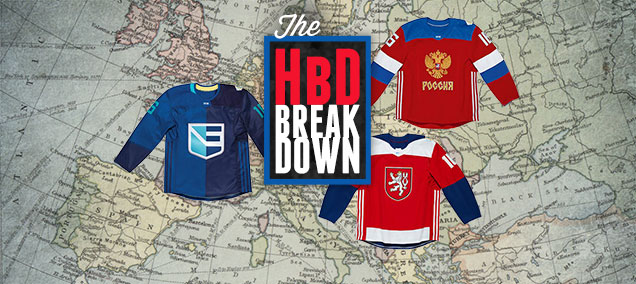 With the release of all eight jerseys for the World Cup of Hockey at once, we’re breaking them all down in geographic clusters: North America, Scandinavia and Europe. Today: Europe. After: the jump.
More: HbD Breakdown: WCoH Jerseys – North America
More: HbD Breakdown: WCoH Jerseys – Scandinavia
Adidas
First, some general comments about the WCoH jerseys as a whole, these first hockey jerseys designed by Adidas: they’re pretty damn solid. Sure, some are better than others and none of them are perfect, but Adidas certainly did a decent job here.
Their Yoke To Bear
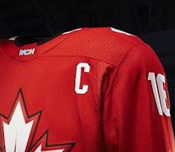 A little mentioned aspect to these new Adidas jerseys are the shoulder yokes. Some have solid blocks of colour, some don’t, but they all seem to have a glossy dot pattern on them, reminiscent of what Nike did with the 2014 Sochi Olympic jerseys. But while Nike had nation-specific glossy details – stars for the Americans, viking ships for the Swedes, etc, not to mention those god-awful fake laces – these World Cup jerseys are consistent across all the team’s jerseys: a grid of dots. It’s a nice, simple and subtle feature that adds a bit of visual interest for people who purchase and/or wear the jerseys; details that you’d never see or notice from a distance of more than a few feet.
So, while it doesn’t carry a lot of visual impact per se, it’s a simple and elegant addition to the jersey, and definitely less kitschy than Nike’s version of it.
Again, as a whole, Adidas did a pretty solid job. Onwards to Europe! (Russia by Chad Pinckney, Czech Republic by John van der Woude, Team Europe by Ally Koss)
Russia
What’s the Russian word for “Déjà vu”?
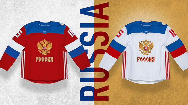
Russia’s WCoH jerseys unveiled this week are nothing new, but they are actually a beautiful refinement on a design we’ve seen previously. There’s a strong focus on Russia’s iconic double-headed eagle crest (no surprise there) centered on a crisp white jersey (this version leaked first) and then later the red version which gave us full blown déjà vu when put side-by-side with Russia’s 2014 Olympic Nike jerseys (minus that delicate sliver of a gold stripe on the arms).
Here’s the sweater Team Russia will be wearing at the World Cup of Hockey. #WCH2016 https://t.co/t9ifQVeUEfhttps://t.co/M8vVn5aIy0
— Sportsnet (@Sportsnet) March 2, 2016
On the new white jersey, the blue color used on the shoulder yokes and stripes, surprisingly becomes the most dominant color, something I haven’t seen from Russia basically ever (conspiracy theory: trying to look like the NHL league-leading Washington Capitals?). However, the jersey still feels less adventurous than what we’ve seen out of Russia in the last few years. Their other 2014 Olympic jersey was a lot more experimental, but is that a bad thing? I don’t think so.
Stay Classy
This HWC jersey feels like an instant classic, and though the elements here are basic, they work really well together. Russian pride shines through brilliantly on this design and it’s the best display of their national crest that I’ve seen on a hockey jersey. The Adidas striping up the sides feels somewhat out of place on this, otherwise, solid design, but it does work a little better than some of the other HWC jerseys (*cough* Team North America).
Final Verdict
Russia played it safe, but their end result is actually really nice, and they may just be putting the best looking team on the ice at this tournament. The solid block stripes, beautiful crest, and tasteful restraint by the designers make this jersey a clear winner.
Czech Republic
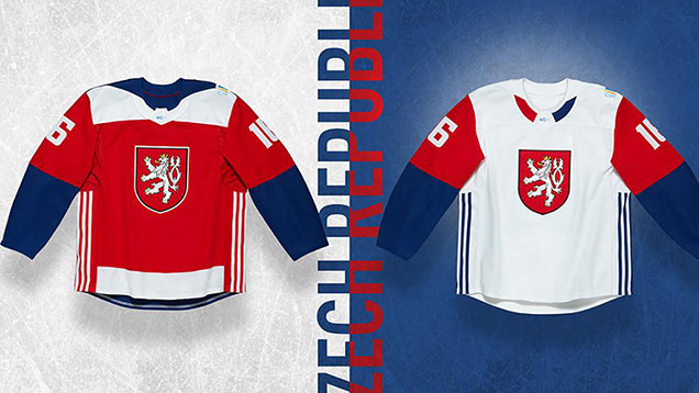
Like most of the other jerseys in the WCoH tournament, these are solid. Simple and impactful. And like all Czech Republic jerseys, the nation’s flag (hello Sochi!), colours and coat of arms plays a large part in it.
Here it is… Team Czech Republic’s World Cup of Hockey sweater. #WCH2016https://t.co/Hk8JXNWlsW
— Sportsnet (@Sportsnet) March 2, 2016
But the most distinctive part of both the white and red jerseys for the Czech Republic is the collar – one is good and one is not-so-good.
The good one? The tri-coloured collar of the white jersey, bearing a stripe of red and blue, separated by a white wedge in the middle. It mimics the triangle from their flag, and although the flag’s triangular wedge is blue, the white wedge here obviously works better. It’s a minor discrepancy made necessary to keep the overall design cohesive. No problem there. The resulting pattern is unique in the tournament and, on an otherwise minimal jersey, adds a distinctive component.
Collar Me Unimpressed
That leaves the red jersey as the not-so-good collar design. Again mimicking the Czech flag, the blue creeps in from the back of the shoulder yoke, coming (sort-of) to a point in the front of the jersey along the collar’s hemlines. There’s a couple problems with that. One, having the shoulder yoke cut in half from front to back with two different colours is too distracting, especially on a minimal jersey design. Two, it looks like a cape. It’s, again, too distracting and becomes the focal point of the jersey.
Coat of Logos
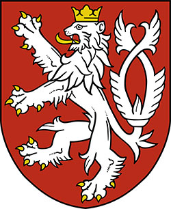 Like the Finns and the Russians, the Czech’s de facto logo is their nation’s coat of arms. And like the Finns and Russians, I have absolutely no problem with it. It’s historical, well-designed and adds a distinctive Czech element to the jersey. When you have the opportunity to use something as cool as this as your logo design, you use it. Don’t overthink it, just do it. And it works brilliantly, lion penis and all.
Building Blocks
The only thing left are the blocks of colour. For the most part, they’re great and in line with the rest of the World Cup jerseys and have a nice balance between the red, white and blue. The one exception is the chunk of white along the bottom of the red jersey. It’s not totally their fault as the Adidas stripes on the side are the biggest detriment, creating a jersey that cuts off the white stripe (which turns blue on the back of the jersey) and is overly complicated with inconsistent blocks of colour all over the place. It may be the least well-integrated Adidas stripe jersey of the bunch.
Final Verdict
A solid jersey set that represents the Czech Republic well, but the white jersey is easily the superior one of the two, with a slightly simpler design with better creative elements. And no cape.
Team Europe
There’s nothing designers love more than when a logo looks nice and is also sneakily clever. Exhibit A: the iconic Hartford Whalers logo has long outlasted the team it was designed for with it’s smart incorporation of the W, H and whale’s tail all in perfect harmony. The Vancouver Canucks accomplished a similar feat with their current alternate logo, forming a C with a hockey stick inside a rink shape, but as a Bruins fan, it’s hard to admit when the Canucks did something good, so let’s move on.
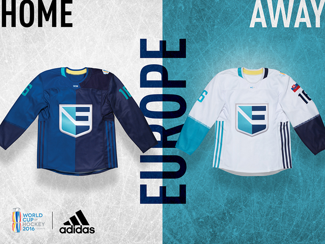
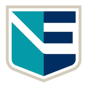 Before we talk about the jersey itself, let’s look at the logo. While most of the teams competing represent a singular country, thus having colors and elements from the nation’s flag to work from, team Europe is a hodgepodge of nations, and thus needed a brand new identity to call it’s own.Like the Americans, Czechs and Russians, the European team has a shield as their primary mark, using two colors to represent the coming together of different nations as one. From Adidas:
“Signifying a united Europe, the players’ countries are all represented by a modern E shield, featuring a single crest that connects all of their home nations.”
Similar to the Canucks’ C, the letter E is completed by a negative space hockey stick that crosses through the center of the shield. Brilliant. I’m also a big fan of the color palette, as teal is extremely underutilized in sports (shout out to the Sharks!) and pairs nicely with the navy and beige. Now those jerseys…
Jersey Foul
Whoa. In the time between seeing the teasers and logo for team Europe, and seeing the jerseys themselves, my excitement level dropped from an 80 to about a 5. What the hell is going on here!? We’ve all seen those jerseys from confused fans or politically correct parents that are split in two. Well I’m not sure the designers at Adidas have, or they never would’ve approved this whackadoo franken-jersey. In their own words:
“Players wear their flag on their shoulder and the names of each European nation in the unity stripe across their sleeve. A continental blue colour scheme highlights harmony on a unified team.”
Here’s a look at what Team Europe will be wearing at the World Cup of Hockey. #WCH2016 https://t.co/t9ifQVeUEfhttps://t.co/5bsuUDGkO9 — Sportsnet (@Sportsnet) March 2, 2016
If the idea was to follow the reasoning in the logo and create a conjunction of colors reflecting the different countries, there are more aesthetically pleasing ways of using color blocking than simply splitting a jersey down the center and calling it a day. The road white jersey, while not quite as offensive, looks odd with literally one side of the jersey’s details in navy and the other in teal. Integrating the colors a bit more would’ve helped create some balance in the design and probably help enforce the message of unity more too. I do like having the players’ flags on their shoulders and the country names worked into the striping, but the overall end result looks disjointed and poorly executed.
Final Verdict
Ultimately, this is a great logo on a poorly executed jersey – there are no laces, no stripes (well, aside from the Adidas ones), no piping, just a plain ol’ jersey split up into two shades of blue. It’s an unfortunate missed opportunity, as there were unlimited possibilities for creating a graphic, contemporary jersey with no historic strings attached, but this one was a big flop.
Agree? Disagree? Let us know in the comments or join the conversation on Twitter and Facebook! And don’t forget…we’re breaking down the jerseys from North America and Scandinavia as well!




[…] More: HbD Breakdown: WCoH Jerseys – North America More: HbD Breakdown: WCoH Jerseys – Europe […]
[…] More: HbD Breakdown: WCoH Jerseys – Scandinavia More: HbD Breakdown: WCoH Jerseys – Europe […]
[…] • More: HbD Breakdown: WCoH Jerseys – North America • More: HbD Breakdown: WCoH Jerseys – Scandinavia • More: HbD Breakdown: WCoH Jerseys – Europe […]