
Top 5: Best Designs of 2016
 It’s that time of the year, where everyone and their top-5-favourite-dogs-of-the-year are counting down the best and worst lists for 2016. We here at Hockey By Design are not immune to such things. In fact, we do it on a semi-regular basis. Why? Because they’re addictive. And because you seem to like them.
So today, we’re moving to the Top 5 Best Designs of 2016 in the NHL. Yesterday, we did the Top 5 Worst Designs of 2016, and you can read that here. Why worst first? Because you always pick the bad news before the good news when given the option. Always. Remember, these are the Top 5 Worst Designs that were announced in 2016. Not all of them have necessarily been used in a game yet.
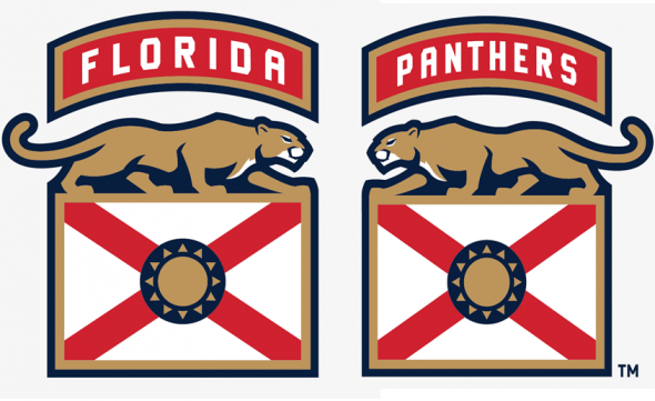
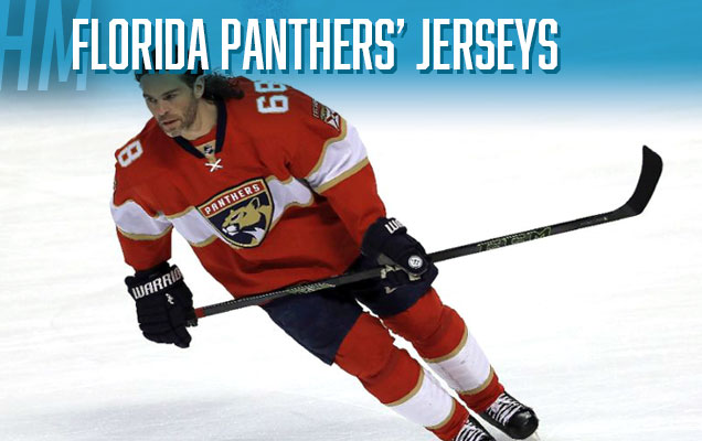 Florida takes an Honourable Mention in the Best of 2016 list mostly because of what is probably the most-improved jersey in recent history. Gone is the overly complex jerseys in favour of something more minimalist, more mature. The logo is a huge improvement as well, but the jerseys, for me, are more interesting, with unique military-referencing patches, modern striping, and a colour palette that’s less circus-act and more like a professional hockey team. Are they the best jerseys in the league? No, not at all. But for a team searching for a new identity, they now have a solid foundation for building one.
• More: Hbd Breakdown: Florida Panthers Logo and Jersey
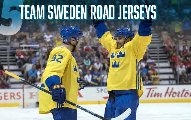 When you’ve got something that’s a classic and is continuously one of the best international jerseys to have ever existed, why mess with it? So while it may be difficult to consider this a “new” design for 2016, as it’s more of an iconic classic, they made additions that made these jerseys stand out above the rest. The inclusion of very subtle Scandinavian-esque patterns within the Tre Kronor logo is what really does it for me: refined, simple, and unexpected. And they were smart enough to leave the rest of the jersey alone, letting the mandated Adidas tri-stripe to do the heavy lifting for the rest of the jersey. Nobody does iconic and elegant quite like the Swedes, and it was the best jersey to hit the ice in September’s World Cup of Hockey.
• More: The World Cup of Hockey Jersey Countdown (Part 2)
• More: HbD Breakdown: WCoH Jerseys – Scandinavia
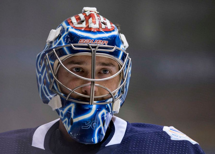
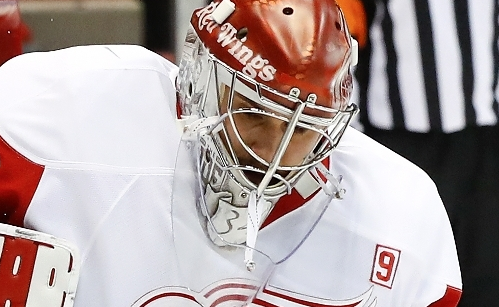
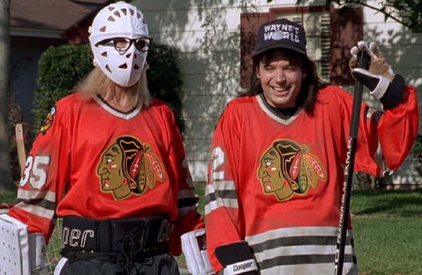
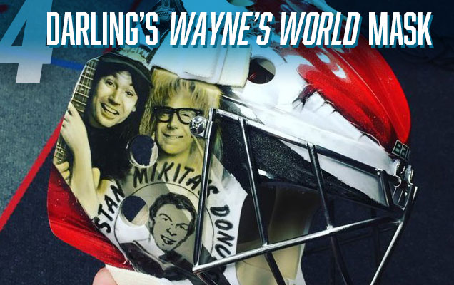 A lot of great masks made their way onto the ice this year, including Ben Bishop’s glowing World Cup bucket and Mrazek’s Joe Louis tribute, but none were more “excellent“ than Scott Darling’s Wayne’s World mask. From our Western Conference mask preview:
The Mike Myers cult favorite has been associated with the Blackhawks since the skit’s debut due to the characters’ suburban Illinois hometown and the Chicago jerseys frequently sported by Wayne and Garth. The duo’s “Game On!” saying even became the official slogan of the NHL back in the 90’s. Blackhawks-Wayne’s World plays have popped up quite frequently in the form of jerseys and t-shirts, but this is the first time (at least in recent memory) that we’ve seen it on a goalie mask. This season marks the 25th anniversary of the film adaptation, so it’s only fitting that Darling would pay tribute now.
Of all the great masks 2016 brought us, Darling definitely takes home the fan favorite with this one, and Dave Gunnarsson knocked it out of the park on the execution.
• More: HbD Interviews: Dave Gunnarsson
• More: HbD Masks Series
• More: HbD Masks: 2016-17 Western Conference Preview

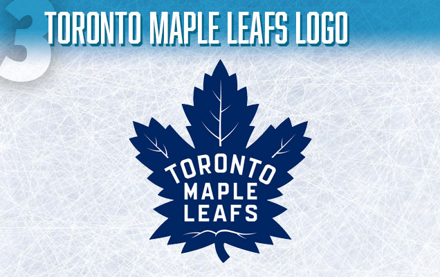 I’ll be the first to admit that I was skeptical about this logo when I first saw it: a little bit too complex, a little too forced, a little too slapped with symbolism. But the more I see it on jerseys, in gameplay, on hats, and everywhere else, I’m loving it more and more. While the historical aesthetic in undeniable (essentially, it’s a re-modeling of their 1938–63 logo), the modern refinements they made – like actually having the text centred in the leaf, better typography, and a better-shaped leaf – help bridge the gap between paying homage to the huge amount of history the Leafs have and the direction they’re heading for the future. As a basis for an entire visual brand, it’s encapsulates everything the Leafs need it to.
• More: HbD Breakdown: Toronto Maple Leafs Logo
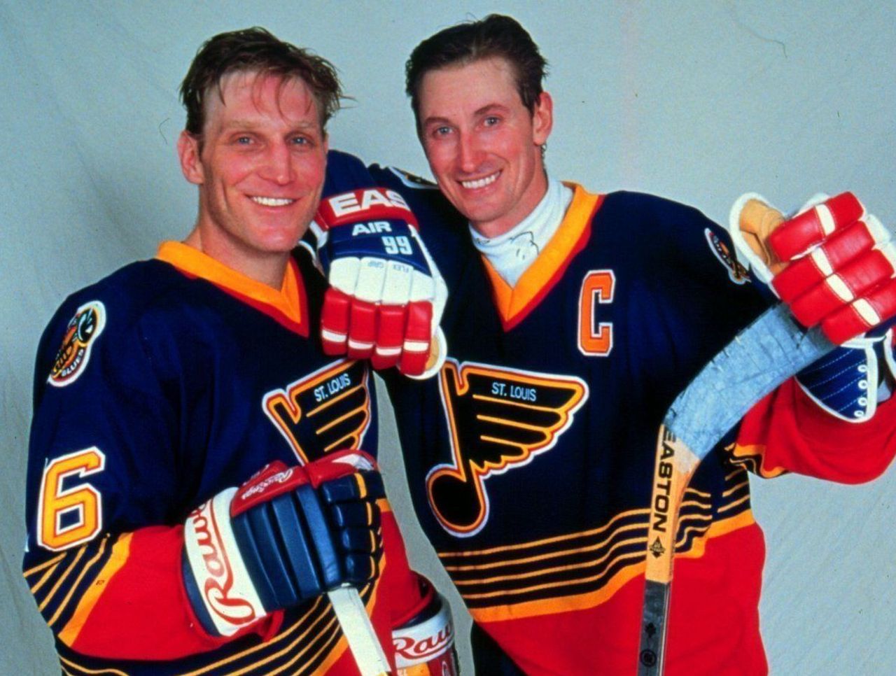
 The Blues enter the Winter Classic jersey library with an instant classic. Everything about it is old-school, but in a surprisingly refreshing way, with a sky blue jersey we haven’t seen since the days of the Nordiques, along with a fantastic classic logo that just never gets old (well, depending on what you add to it). The ribbed sweater collar is great, as is the the classic striping. Basically, for a first attempt at a jersey that celebrates the franchise’s, league’s and hockey’s history, St Louis couldn’t have done much better. For a team that wandered in jersey design Siberia for many years, they’re doing fantastic work recently.
• More: HbD Breakdown: Blackhawks and Blues 2017 Winter Classic Jerseys
• More: Worst to First Jerseys: St Louis Blues
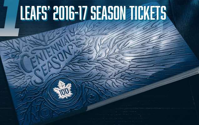 These are, simply, the best designed season tickets I’ve ever seen. We never covered these on the site here, and there’s way too many examples of beautiful design on each ticket to cover in a single paragraph, so I highly recommend you check out the vast collection of photos of the tickets by visiting designer Conrad Garner’s Behance project page. The details are impressive, the illustrations are wonderful, the typography is outstanding, and the whole concept beautifully captures the history of the Leafs while also capturing design aesthetics of today. Every page in the book of tickets is a piece of artwork unto its own, and there’s nothing else that comes close this year to deserving the top spot on this list.
Agree? Disagree? Let us know in the comments or join the conversation Twitter, Facebook and Instagram! And if you’re interested, we’re now on Pinterest too.
Don’t forget, we counted down the worst designs of 2016 yesterday.


[…] • More: Top 5 Best Designs of 2016 […]
[…] pretty much identical to their 2017 Winter Classic Jerseys (which we already featured on the Best of 2016 post), but credit St Louis with recognizing excellence and giving it life again, but I really love it. […]