
HbD Masks: 2017-18 Eastern Conference Preview

With the new season less than two months away and a number of goaltenders on the move to different teams, masks for the 2017-18 season are starting to be unveiled.
• More: HbD Masks: 2016-17 Eastern Conference Preview
We’ll be rounding up the newest NHL buckets and breaking down their designs, so keep checking back as new masks roll out before opening night.
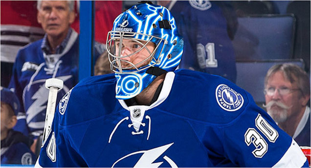
Andrei Vasilevskiy • Tampa Bay Lightning
Sylvie Marsolais, Sylabrush
 Once again finding ways to stay cool in the south Florida heat, Sylabrush‘s Sylvie Marsolais crafted another color changing mask for Tampa netminder, Andrei Vasilevskiy.
• More: HbD Interviews: Sylvie Marsolais
“This season we did a matte and glossy finish on his mask,” Sylvie described. The mixed medium design combines a matte background with chrome silver and blue accents like the number on the chin and lightning bolts on each side. The negative space around the bolts and palm trees is filled in with blue and white Russian imagery, adding another level of dimension to the composition.
Finished off with Vasy’s signature lion on the top, the wow factor comes when the mask changes from white to blue, revealing the club’s 25th anniversary logo and other details, when exposed to cold temperatures. “This special SubZero paint will darken at cold temperature,” the artist shared on Instagram, “so when Vasy will hit the ice the logos will appear!”
Grade: B
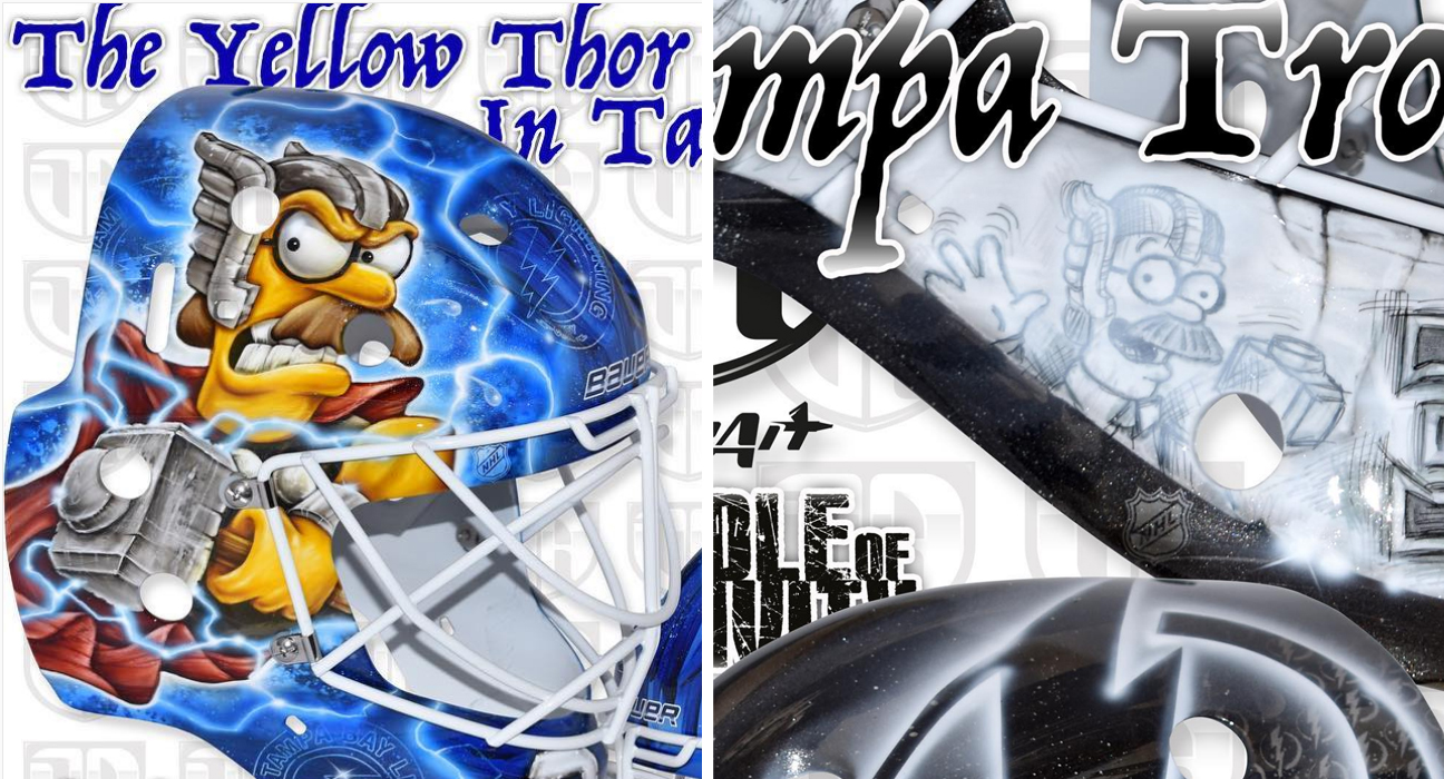
Peter Budaj • Tampa Bay Lightning
Dave Gunnarsson, Daveart
 Continuing with his string of Simpsons-themed masks, Peter Budaj and artist Dave Gunnarsson put together a sharp and somewhat understated (well, by Gunnarsson’s standards) design for the new season.
• More: HbD Interviews: Dave Gunnarsson
Showcasing the team’s 25th anniversary mark, Gunnarsson framed the logo with large silver lightning bolts on each side, creating a barrier between the rich cobalt blue underneath. The Bolts’ primary logo sits on the side with glowing lightning rods (a little Ben Bishop-esque, eh?) all around.
Hidden amidst the glowing line work is a small drawing of Ned Flanders who we’ve seen pop up on Budaj’s masks time and time again. This look is much simpler than we’re used to seeing from this duo, but the paired down composition really works and allows Gunnarsson’s artistry to shine.
Grade: B
Roberto Luongo • Florida Panthers
Stephane Bergeron, Griffe Originale
 Following in the footsteps of one of the most polarizing masks of last season, Luongo took a stark and minimalist approach to his bucket for the new season. Unveiled on Thursday via a photo shoot with CCM Goalie, the artist is assumed to be Lu’s regular painter, Stephane Bergeron, who also often works with Corey Crawford and Marc-Andre Fleury, the other two netminders to reveal their new masks through CCM last week.
Some more! Here’s @strombone1‘s new mask! pic.twitter.com/9Dku7vDbn0
— CCM Goalie (@CCMGoalie) August 3, 2017
The crisp white bucket, like Jake Allen’s Blues mask from 2017, features subtle renderings of the Panthers’ logos on each side, set off by a sh!t ton of gold foil throughout the design. The team’s primary logo is the showcase piece on the top of the mask, paired down into a single color variation and highlighted in a blue border. The blue lacquer cage and blue border on Bobby’s #1 on the chin tie the whole design together in a really cool and well-balanced way. What could have gotten gaudy real fast was kept tasteful and clean, so bravo on a successful and standout design.
Grade: A+
Frederik Andersen • Toronto Maple Leafs
Dave Gunnarsson, Daveart
 The next bucket for Freddie Andersen’s Toronto chapter is very much in line with his 2016-17 Leafs mask. Aptly titled “TML Old School, Volume 2,” the mask centers around the Leafs’ brand with fabric tears creating the silhouette of the logo on each side.
“A clean cut vintage styled mask created in hockey textiles,” Gunnarsson explained, “the textiles creates the design with the leafs on the sides.” Small holographic leaves fill in the blue fields around the mask with torn fabric creating Freddie’s number 31 on the chin. Tampa Bay Lightning bolts run throughout the design, injecting some energy into an otherwise simple composition.
As with Budaj’s mask, it’s refreshing to see Gunnarsson take a more simplistic route when it comes to composition, which really allows the detail and artistry in his work to shine. Despite this feeling a tad like a Tampa Bay mask, it’s a sharp design that’ll look great on the ice.
Grade: A-
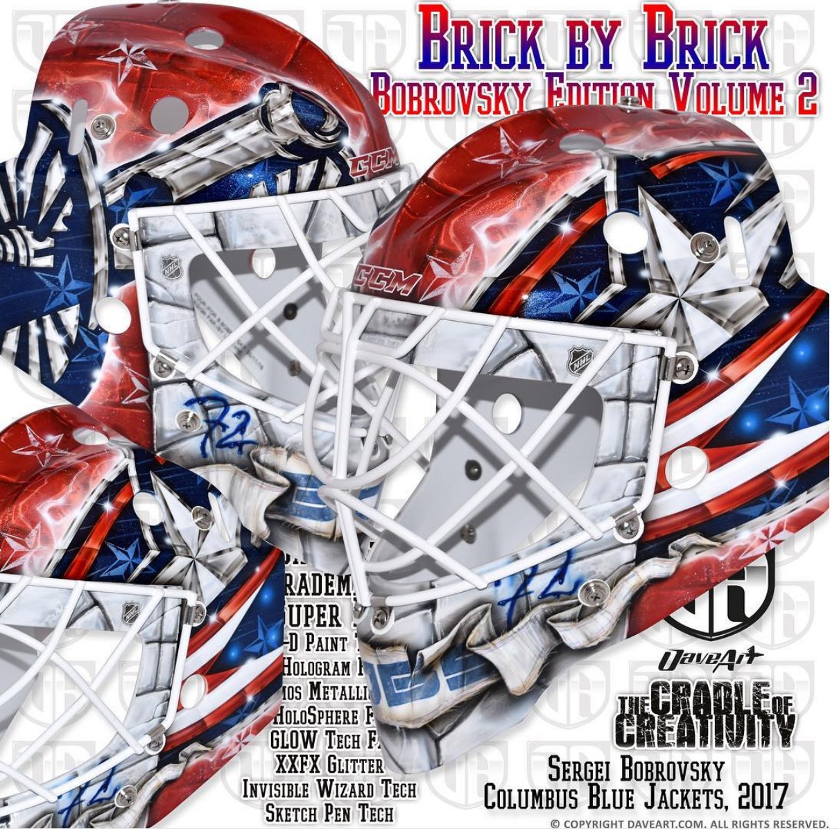
Sergei Bobrovsky • Columbus Blue Jackets
Dave Gunnarsson, Daveart
 Once again titling his mask “Brick by Brick,” Bob and Dave Gunnarsson continue to tap into the common theme of stone walls or bricks on a mask. “It is a direct continuation based on his previous mask creations,” Gunnarsson explained, “a true Bobrovsky mask with the brick wall in focus mixed with the awesome CBJ logos.”
The design has Bobrovsky’s nickname scrolled across the banner on the chin over a light gray brick wall surrounding the cage. The bricks continue more subtly in red through the top of the mask with the two large Blue Jackets logos on each side. Holographic stars and light flares are mixed in throughout the design to add that extra Daveart pizazz.
This mask isn’t anything super new or innovative based on what we’ve seen from Gunnarsson and Bobrovsky before, but it is a solid design that works for the Vezina winner, so if it ain’t broke…
Grade: B
Henrik Lundqvist • New York Rangers
Dave Gunnarsson, Daveart
 With almost two decades of making masks together, you might think Dave Gunnarsson would be short on ideas for Hank’s new buckets by now (spoiler alert: not the case). “This new mask is a direct continuation based on Henrik’s latest masks,” said Gunnarsson. “It is also connected closely to his new pads,” and for those who may have missed it, he’s referencing Lundqvist’s new setups that all but set the internet on fire.
Which of Lundqvist’s sets of @BauerHockey 2S Pro pads do you like better: Left or Right? pic.twitter.com/4cIjZwYyJH
— Goalie Gear Nerd (@GoalieGearNerd) August 28, 2017
Hank’s buckets always carry a theme of the Swedish Tre Kronor, also referencing Lady Liberty’s crown. The “razor” motif is a bit more subtle than in past seasons, shown more loosely in the shape of the lightning bolts over the top of the mask. Like in past seasons, Lady Liberty is depicted on each side with a stone texture and small holographic Rangers logos throughout.
This concept isn’t super dynamic or fresh, but it does align with Hank’s signature style, so we’ll give it a decent grade.
Grade: B
Scott Darling • Carolina Hurricanes
Dave Gunnarsson, Daveart
 Scott Darling’s new bucket for his first season in Carolina uses what Dave Gunnarsson calls “The DaveArt 4-D Experience” that allows you to “physically feel the story.” The design includes a number of Canes-centric elements, including the hurricane flag pattern in the stripes, the Stormy the pig mascot on each side and the large Hurricanes logos underneath.
In addition to the crosshatched technique used to illustrate this mask, the logos appear to have an etched texture to them, adding the new dimension to Daveart’s signature “storyteller” style.
Darling’s had some great masks throughout his years in Chicago including the Wayne’s World tribute and Cubs-themed Winter Classic bucket, so unfortunately this design falls short of expectations. The 4-D element is certainly a cool feature, but it doesn’t contribute much to the success of the composition overall.
Grade: B+
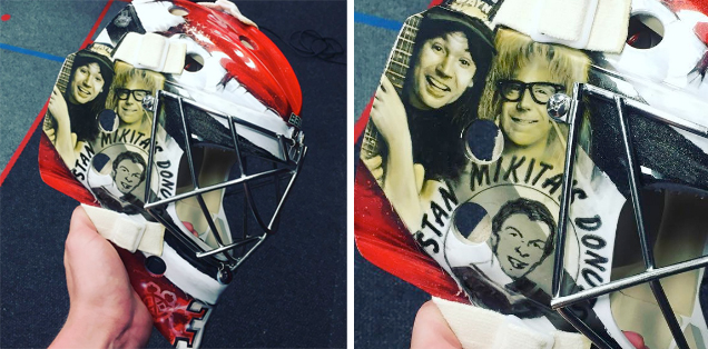
Cory Schneider • New Jersey Devils
Dave Gunnarsson, Daveart
 The king of special effects took a more traditional approach to Cory Schneider’s new mask. “We traveled back in time to create the design, just like the first days of mask paint back in the 70s, so no airbrush, no FX,” Dave Gunnarsson described of the process. “It is painted so rough, so you can clearly see the brush strokes.”
The traditional red, white and black design uses mirror images of the Devil horns and tail on each side in a matte, painterly style with visible brush strokes. The outlines are deliberately sketchy, creating a hand-drawn effect throughout.
Based on what we typically see from Gunnarsson, this mask is a refreshing departure. The bold, simple composition and old school techniques really make this design stand apart, so hopefully we’ll see more work like this from Daveart in the future.
Grade: A-
Brian Elliott • Philadelphia Flyers
Franny Drummond, Paintzoo
 Artist Franny Drummond of Paintzoo has a long history of creating phenomenal Flyers masks, including Steve Mason’s zombie and Stadium Series masks. For Brian Elliott’s first season in Philadelphia, he added to the list with a crisp, graphic design for the Flyers’ new netminder.
• More: HbD Masks: 2017 Stadium Series Masks
A nod to Ron Hextall’s iconic mask, Ells’ new orange bucket uses an interpretation of the Flyers logo as the primary design elements on each side. His initials “BE” are stenciled on the chin with full Flyers logos in the black stripes above.
Known for always incorporating his nickname “Moose” into his masks, the backplate features a cartoon moose in a Casey Jones mask with a more detailed rendering of Jones above it.
The crispness of this design works great with the Flyers sweaters and will be perfectly legible on the ice. Check the box for Drummond––another Philly mask well done.
Grade: A
Carey Price • Montreal Canadiens
Dave Gunnarsson, Daveart
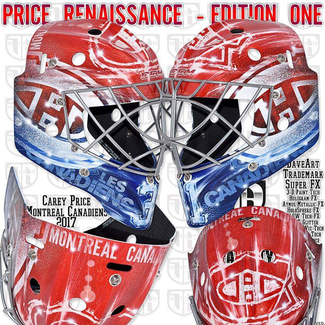 The next goaltender up with one of Daveart’s new 4-D masks is Carey Price, going in a slightly different direction this season with his bucket design. Price is known for more traditional team-centric looks, but this one goes a little nuts with the bells and whistles. Let’s break it down.
Gunnarsson describes this mask as a “direct continuation based on Carey’s previous masks” with “a vintage and gritty style,” but I’m going to have to disagree. While the color palette and logo placement may be classic Canadiens, there’s nothing vintage about the amount of gradients, glitter, texture and holograms on this mask.
The inclusion of “Edition 1” in the title suggests that this may be the first in a series of a new look for Price, but if I’m being honest here, I’d say go back.
Grade: C
Curtis McElhinney • Toronto Maple Leafs
David Leroux, Diel Airbrush
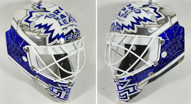 Getting yet another slick mask from David Leroux of Diel Airbrush is Toronto netminder, Curtis McElhinney. The colorblocked design makes use of the Leafs’ blue plus liquid silver chrome to pull together a really sharp and polished design.
The blue panels on each side showcase line drawings of the Leafs’ logo, while the full logo sits highlighted in silver and blue on top of the mask. A nice addition to this design is the “TML” monogram on the chin, a space where most goaltenders opt to put their number or a nickname.
A real shining (pun intended) moment in this mask though is the backplate––it’s super slick, and the simplicity really allows us to appreciate the beauty of the chrome (for full effect, check out Leroux’s Instagram). Overall, the mask is cohesive, balanced and really well executed. Beautiful work all around.
Grade: A
Michal Neuvirth • Philadelphia Flyers
Dave Gunnarsson, Daveart
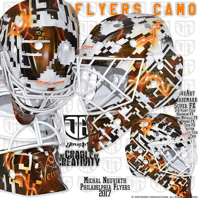 Following in the 8-bit footsteps of John Gibson, Michal Neuvirth will be sporting a pixelated camouflage bucket this season. Like with all Daveart masks, the design has layers upon layers of design elements, starting with the Flyers’ logo and wordmark, portrayed in a subtle, pixelated style. Underneath are additional details like holographic Flyers logos and small illustrations of the castle from Neuvirth’s hometown in the Czech Republic.
Most of Gunnarsson’s work this season seems to include the electric current, which fits with some masks better than others, but here it’s not too much of a distraction––more just a linear piece that draws your eye throughout the mask. The concept is unique and it’s well executed, so overall, this mask gets high marks.
Grade: B+
Jaroslav Halak • New York Islanders
Dave Gunnarsson, Daveart
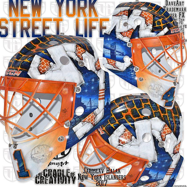 Titled “New York Street Life,” Jaro Halak’s new bucket showcases the best of his two home cities. As a nod to his native Slovakia, the left side of the mask shows a landscape of the Bratislava Castle under a starry night sky opposite the Brooklyn Bridge on the right side of the mask, a tribute to the Isles’ new home in the borough.
Like with many of Jaro’s past masks, the top is covered in a brick wall pattern behind the Isles’ NY logo made from a combination of concrete and bricks. These parts of the mask are great, but Gunnarsson starts to lose me with the abrupt transition from blue to the orange gradient along the side. Had this mask had a full blue background, the imagery in the foreground would really stand out, but unfortunately, the brightness of the orange and white detract from the rest of the design and knock this bucket down a few points.
Grade: B+
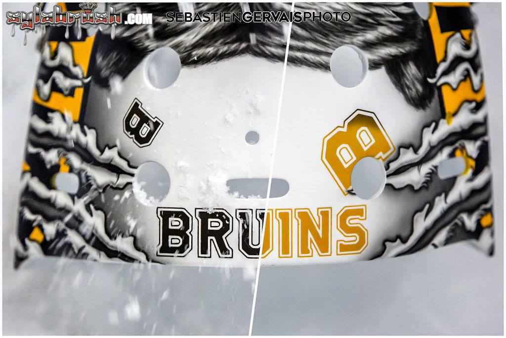
Anton Khudobin • Boston Bruins
Sylvie Marsolais, Sylabrush
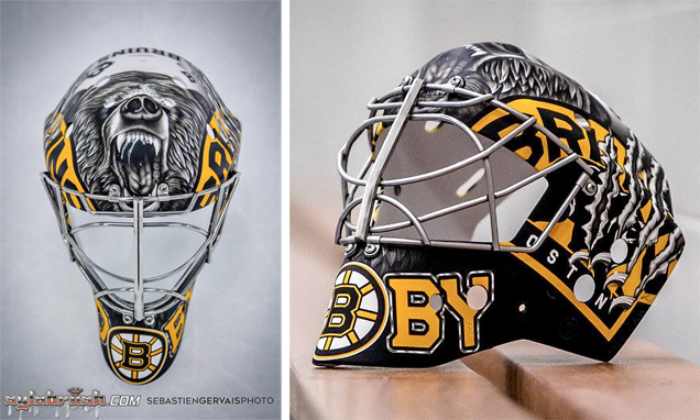 Sporting another color-changing mask by Sylvie Marsolais is Anton Khudobin. What would be a totally badass design on its own gets extra brownie points by changing from light to dark when Dobby takes the ice.
Like in past seasons, Anton’s mask is entirely centered around the Bruins brand, even using the spoked B logo to center his nickname, “Dobby,” around the chin. A super grizzly bear takes center stage on the top of the bucket with the Bruins’ secondary logos covered by claw tears on each side. The SubZero paint used by Marsolais allows this mask to transform when exposed to the cold, a really cool feature for a sport played on ice.
Marsolais did a really great job of taking the color change into consideration when designing this mask, and the end result truly shows.
Grade: A+
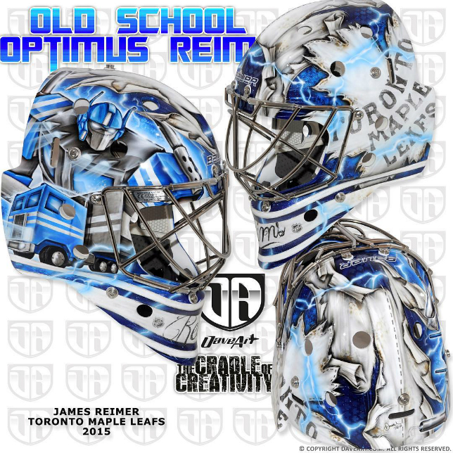
James Reimer • Florida Panthers
Dave Gunnarsson, Daveart
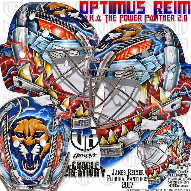 Following in his string of Transformers-themed buckets, James Reimer has another “Optimus Reim” mask for the new season, this time in Panther form. Like with most Daveart masks, the detail in this design is a bit overwhelming, so let’s break it down one piece at a time.
“The mask transforms from a panther into a goalie robot in front of our eyes,” Gunnarsson explained. The panther teeth wrap around the underside of the cage with some kind of cannon or smoke stack on either side. Layered metal and screws frame the Panthers logo on top, all surrounded by electric currents in the Panthers’ blue and red.
The artistry in this mask is really impressive, as clearly a ton of thought and detail went into the design and execution, but the amount of detail is so overwhelming that we’re distracted by the mask as a whole and can’t really appreciate any one piece of the workmanship. Because of the issues with the overall composition and clarity, this mask unfortunately falls short in the grade book.
Grade: C
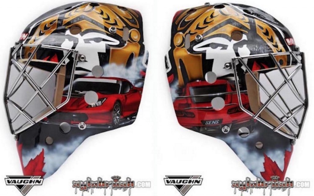
Craig Anderson • Ottawa Senators
Sylvie Marsolais, Sylabrush
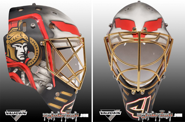 Back with another Corvette-themed bucket, Sylvie Marsolais took a matte approach to Andy’s mask for this season. Featuring a simplified version of the Corvette logo across the top in Senators red, the design is a bit less car-centric than last season’s, showing subtle glimpses of the mechanics on each side behind the Sens’ logo.
The shining point for this mask is the contrast between the matte paint job and the gold chrome cage that really sets off the design. The mask’s composition isn’t the most exciting or dynamic, but it’s clean, crisp and finished off meticulously.
Grade: B+


[…] […]
[…] • More: HbD Masks: 2017–18 Eastern Conference Preview […]
[…] More: HbD Masks: 2017-18 Eastern Conference Preview • More: HbD Masks: 2016-17 Eastern Conference […]
[…] More: HbD Masks: 2018-19 Eastern Conference Preview• More: HbD Masks: 2017-18 Eastern Conference Preview• More: HbD Masks: 2016-17 Eastern Conference […]