Worst to First Jerseys: The Winnipeg Jets
As we go through the 2019-20 season, we’ll be updating all of the Worst to First Jersey posts every Monday, as almost all the teams in the league have unveiled new jerseys since their original posts. We’ll start with the ones most needing updating and work our way through the league. Today, it’s time for the Winnipeg Jets to get updated.
Also, a huge thanks to SportsLogos.net and NHLUniforms.com for most of the jersey images and references.
The big question for the Jets is which jerseys should be included? Do I ignore the jerseys of the Jets incarnation that moved to Phoenix to become the Coyotes? Or, do I include the jerseys of the Atlanta Thrashers, the same organization that now resides in Winnipeg? The original post had the Thrashers in there, but now that the current Jets have been around for a few seasons and have amassed enough jerseys to earn their own non-Thrasher rankings. But, we’ll still throw in the original Jets jerseys.
Here’s how this works: I’ll count down, from worst to first, all the jerseys the Jets have ever worn. Homes and aways will be lumped into the same category (so, more of a jersey “era”) and I won’t worry about small changes (like slightly changed positions of piping for example). Third jerseys will stand on their own. And I’m focusing on the jerseys only, not the entire uniform. The jersey images are compliments of the fine people over at nhluniforms.com. For the Jets (new and old), there’s 6 different jerseys/eras. And we’ll start with the worst one:
6. 1979-90 Home and Away Jerseys
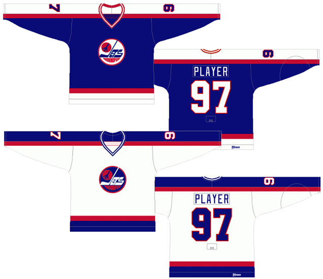
We’ll start with the original (NHL-version) Jets jerseys. Like the majority of hockey jerseys (especially at the time these were worn), they’re either blue or red. The lines are simple and bold. The logo is prominently displayed and, because of the simplicity of the jersey, is the obvious focal-point of the jersey. And it’s the worst jersey a team named the Winnipeg Jets has ever worn.
That’s a harsh statement, but consider it more a positive indication of the approach that the Jets have taken to jersey design throughout their existence than calling-out one specific jersey. But, what makes this jersey drop to the bottom is the dated piping/striping on the jersey.
The straight solid band of striping, from cuff to cuff and over the shoulders, is the most obvious culprit. Some teams still use this element (Colorado, Philadelphia and, well, the Jets), but in all those cases, it’s not a solid line. There’s curves and/or bands to break up the monotony of it. Another example of this look is the Maple Leafs from 1970 to 1992, and the NHL itself, in various All-Star jerseys.
The simple, straight red and blue (or red and white on the blue jerseys) bands along the bottom of the jerseys are also an aesthetic born from the late ’70s and ’80s, and don’t help alleviate its dated look.
But otherwise, there’s little to complain about, as the jerseys are solid and simple (too simple?). The blue is a perfect shade of blue (not too dark to almost be considered black, which I’ll talk more about later). The red works as an accent and the font/type are your basic hockey standards. Like the Jets at that time, it was nothing flashy but it got the job done.
Jersey Recommendation: #10 Hawerchuk. Was there any doubt? The undisputed leader of the Jets during this time. Get it in the home whites, a classic symbol of the playoff whiteouts in Winnipeg.

5. 2018–present Third Jerseys
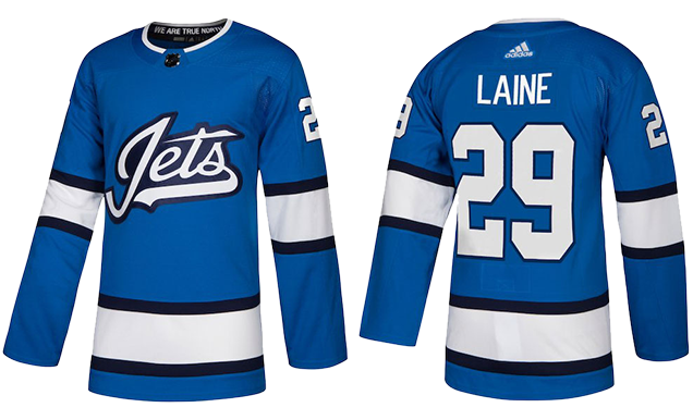
My problem with these jerseys mainly rests on the assumption that they’re a completely stolen design. There’s just too many similarities between this jersey and the EAHL’s Johnstown Jets jerseys from the 1950s to be coincidental, especially since this jersey is so far outside of anything the Winnipeg Jets have ever had in either of their iterations.
And I’m totally fine with using the past as inspiration, as long as it’s stated as much. But there’s nothing ever mentioned by the Jets, Adidas, or the NHL regarding the extreme similarities of the Jets jerseys of the EAHL. The whole situation stinks of something rotten.
With that out the way, I love the sky blue base of these jerseys. It’s rich, relatively unique within the league, plays with the Jets’ visual brand, and looks great on the ice. The navy/black and white stripes are classic and slightly evoke the Jets’ ’90s jerseys.
The wordmark crest is really nicely executed too, subtly integrating a jet illustration into the wordmark, which is definitely a nice touch. It’s also very unique for the Jets brand to use something like this on their jerseys. The closest they’ve ever come is their original 1972-73 jerseys. The original 1972–74 logo comes a little bit closer.
But, I just can’t shake the feeling that there’s something missing. It’s just too minimalist…oh yeah, and completely stolen.
• More: HbD Breakdown: Jets and Sharks Third Jerseys
Jersey Recommendation: #81 Connor. Kyle Connor’s probably the newest star on the Jets, and putting him on one of the newest jerseys makes sense. Plus, he was a steal at #17 in the 2015 draft, so put him on the stolen sweater.
4. 2011-present Home & Away Jerseys
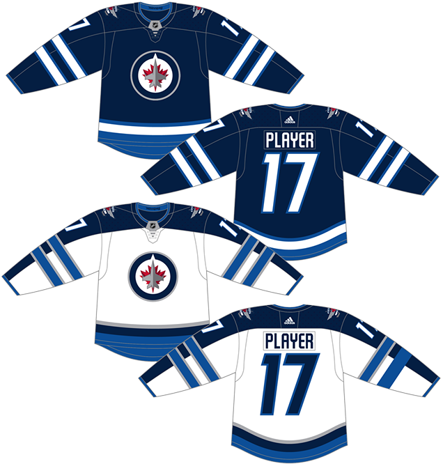
This is not a bad jersey by any means, but it’s not without its issues. One of the biggest for me is the use of “midnight blue” on the home jerseys, a blue so dark that it comes across as black whenever you see it. Especially when the Jets hit it perfectly with such a rich blue (dark, but not too dark) in their first iteration of existence.
So, what’s the problem? Hockey is a sport that’s played on a blank canvas – a clean sheet of white ice – and putting splashes of colour onto that canvas makes for a more interesting and absorbing game to watch. A road white jersey versus a home black jersey is just not taking advantage of one of the opportunities that playing the sport of hockey gives you. Take notes Los Angeles.
Aside from that, these are some solid looking jerseys. It’s a well-executed traditional hockey jersey aesthetic, but with some interesting contemporary elements to it. The piping along the bottom of the jersey follows the contour of the jersey line rather than just being a straight line. The two sets of striping on the sleeves too is a slightly departure from standard hockey design aesthetics, but it works well in this case. I’m not convinced it works as well on the road white, since it’s crossing over the dark blue band on the sleeves, but that’s a small complaint.
Using two tones of blue as the dominant colour scheme and leaving the logo (and alternative logo shoulder patches) as the only red on the jersey is great as well. It keeps the logo as having the most visual draw to the entire jersey, as it should be.
Oh, and a unique font has been used, which I’m almost always a fan of and it works well in this instance. It’s, overall, a solid jersey.
• More: BTLNHL #15: Winnipeg Jets
Jersey Recommendation: #26 Wheeler. The current captain has been with the Jets since their first season (including a half-season in Atlanta), emerging as one of the most gifted playmakers on a team full of them. Get it in the white-out-esque whites.

3. 1990-96 Home and Away Jerseys
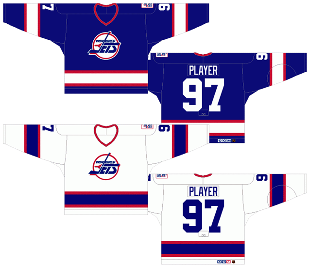
If anyone with no previous hockey knowledge were to ask me what a typically standard hockey jersey looks like, I would probably pull up this jersey. It’s just so incredibly solid and again, nothing flashy and gets the job done. It is the quintessential hockey jersey.
That’s not to say it’s the best hockey jersey ever. Those are the jerseys that push the envelope successfully, or have some amount of flash, or uniqueness, or element that’s specific to the team wearing it. And these Jets jerseys don’t really have anything like that.
Another way of saying it is that there’s absolutely nothing to complain about with these jerseys, but there’s nothing really to get incredibly excited about, which sounds like a back-handed compliment, but it’s not intended that way. It’s a solid jersey that should be worn with pride.
The blue is, again, a perfect shade of blue and would never be confused with black. The piping on both the sleeves and the bottom of the jersey is consistent and solid, something that’s more timeless. The fonts and type are given the standard hockey treatment. The amount of red compliments the amount of blue, working perfectly as an accent colour. The logo is allowed the room to breathe and be the most prominent element on the jersey. It’s just a solid jersey.
Jersey Recommendation: #13 Selanne. No question, the best player to ever wear this specific jersey. 76 goals in his rookie season. Unbelievable. Get it in the blues.
2. 2016 Heritage Classic Jersey
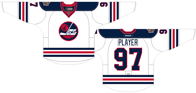
First off, there’s the classic logo. It has a certain timeless quality to it, with some truly unique character to it – not so far off from the Oilers logo that they’ll be facing in the Heritage Classic. Quirky, charismatic, simple, well-constructed. You can’t look at these jerseys and not admire the logo.
But the whole jersey is also a look of classic elegance, and part of that is the bold, colour-alternating three stripes. It’s the simplest way to ensure that you’re going to have a classy, classic and well-balanced jersey design without breaking a sweat. Just ask Chicago or Boston. The alternating red and blue on Winnipeg’s jersey uses classic hockey colours on a pristine white background to full effect.
Of course, it’s a borrowed look from the WHA’s Winnipeg Jets jerseys, which carried the same design for their entire 1972–79 WHA existence.
Otherwise, the shoulder yokes are Simple, minimal and classic blue, which compliments the overall jersey design without distracting from it. The numbers and nameplates use your traditional sports jersey typeface.
The collar is the only mis-step. The original jerseys had a simple red collar. The new Heritage Classic jerseys feature a blue stripe added in the middle of a red collar. It’s extremely minor, but somewhere, a designer decided to add that in, and it’s unnecessary.
Jersey Recommendation: #55 Scheifele. Winnipeg lost the Heritage Classic game 3–0, so there’s no easy pick there. But, Scheifele was the model for the jersey’s unveiling, so sure, let’s go with that.
1. 2019 Heritage Classic Jersey
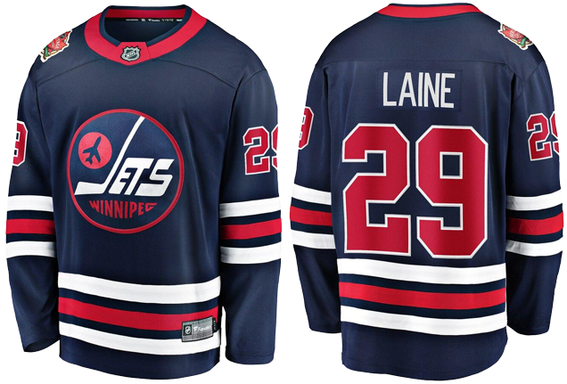
All the positives that was said about the 2016 Heritage Classic jerseys can be reiterated here, the spiritual partner for this jersey, also based on their original days in the WHA. It’s a classic, timeless, elegant jersey design. The lack of shoulder yokes works on a blue jersey (which is a bit too dark, but I digress), and the full red collar more than makes up for it.
• More: HbD Breakdown: Winnipeg Jets Heritage Classic Jerseys
And we just broke them down recently, so we’ll borrow from that post here:
Maybe this Jets look was pretty standard…average even…during its original playing days. The traditional color palette, basic stripe patterns and vintage logo all create a classic look that was the norm back then.
Fast forward a few decades, get a little more distance in the rear view mirror, and these become something more. They call back to an era of gritty, hard-nosed hockey. Times were simpler back then and memories are often looked upon much more fondly.
All of these reasons are why teams and the fans that support them crave retro-era jerseys. History unites fanbases and it’s that feeling of unity that creates bonds over generations of hockey fans. Can a simple retro jersey do all of that? The NHL is counting on it.
And these are just great jerseys. We even think it’s the best the Jets have ever worn.
Jersey Recommendation: #29 Laine. We don’t know yet who will play the hero (or villain) at the 2019 Heritage Classic, but Laine’s as safe a bet as any.
Agree? Disagree? Let us know in the comments below or join the conversation on Twitter, Facebook, or Instagram!


[…] • More: BTLNHL #15: Winnipeg Jets• More: HbD Breakdown: Jets and Sharks Third Jerseys• More: Worst to First Jerseys: Winnipeg Jets […]
Go back to original W.H.A. Logo,was the best!