
Top 5: Worst Designs of 2019

Christmas is almost here. 2020 is right around the corner, so it’s that time of the year where everyone and their top-5-favourite-dogs-of-the-year are counting down the best and worst lists for 2018. We’re not immune to such things. In fact, we do it on a semi-regular basis.
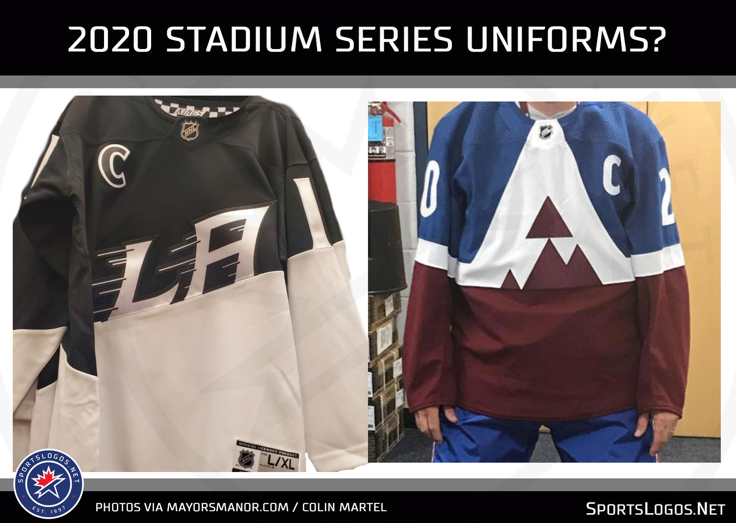
So today, we’re got the Top 5 Worst Designs of 2018 in the hockey world. We’ll tackle the Best Designs as well, but Worst is first because you always pick the bad news before the good news when given the option. Always. Remember, these are the Top 5 Worst Designs that were announced in 2019 (like the leaked 2020 Stadium Series jerseys, which have not officially been unveiled yet). Not all of them have necessarily been used in a game yet, or some were excluded from this list because they were announced in 2018.
• More: Top 5: Worst Designs of 2018
• More: Top 5: Best Designs of 2018
Let’s get started, shall we?

Stay with me here. I’m definitely not saying that any of plethora of heritage jerseys that have been unveiled (from the Flames, to the Canucks, to the Coyotes, to the Jets, etc) are bad per se…except that Blues one, it’s truly awful. This is more about the trend of just resurrecting an old jersey and calling it a day.
• More: HbD Breakdown: Winnipeg Jets Heritage Classic Jerseys
• More: HbD Breakdown: Vancouver Canucks 2019 Jerseys
The cynic in me believes it’s just an easy way to make a cash grab for the teams. The idealist in me believes it’s a way to bring back classic jersey designs for a new younger audience and relive the glory days a little bit. The pragmatist in me knows it’s probably somewhere in-between.
But which so many teams participating in this trend, it’s starting to impede the natural progression of hockey jersey design. We’re looking backwards instead of looking forwards.
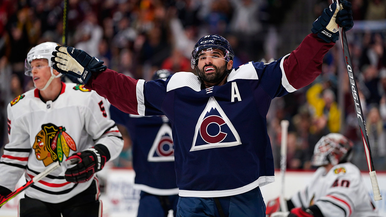
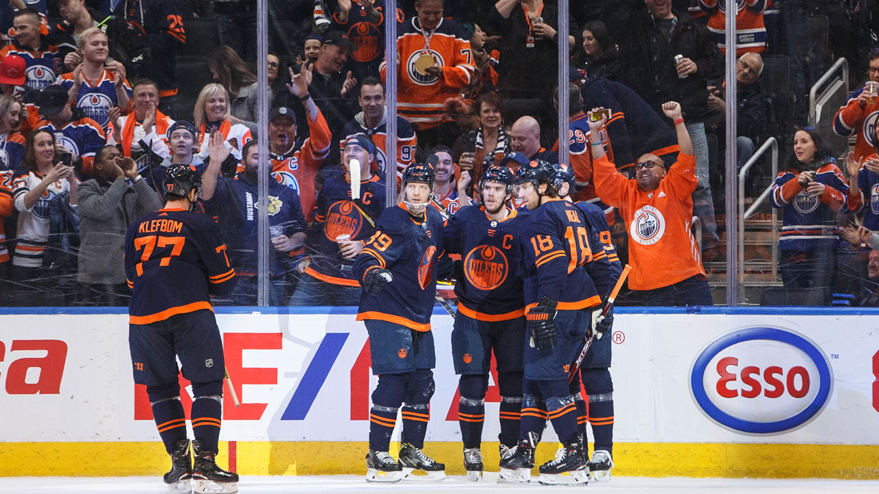
You may not like what the Hurricanes, Avalanche, and Oilers (for example) are doing, but at least they’re doing something different and innovative.

Speaking of the Oilers…these are not terrible jerseys, as there’s some interesting approaches and elements to them, especially from the perspective of a branding exercise for the modern-day Oilers.
But the lack of meaningful elements on the jerseys, as well as the lack of white anywhere on a jersey that’s got a navy blue (almost black) base creates a lack of contrast that makes the jersey lack any sort of visual depth to it. And the extreme minimalist approach doesn’t help that either.
• More: HbD Breakdown: Edmonton Oilers Third Jerseys


First of all, the Parley involvement/production of using the jerseys to raise awareness of the health of the oceans is something I’m completely, 100% on-board with. That aspect of the jerseys are really great.
But using almost completely monochromatic jerseys for a festivity like the All Star Game (which, let’s face it, is geared towards kids and corporate interests more than anything) makes for a boring viewing experience. And it sucks out all the charisma and unique character of hockey jerseys.
• More: HbD Breakdown: 2019 All Star Game Jerseys
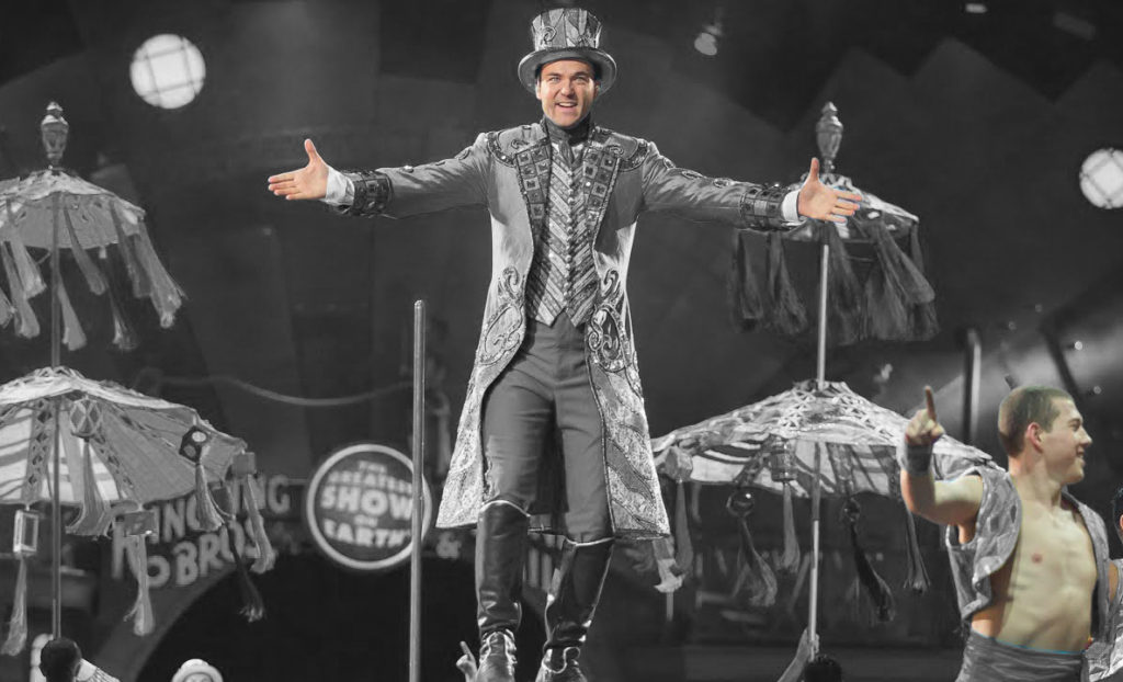
Would you go to a monochromatic circus show? Or what about a white and grey fireworks show? Yeah, didn’t think so. So why would they make the hockey equivalent of a sideshow this way?
And what’s worse, the host team probably had the worst monochromatic version of their logo, with their teal-splotch on the top of the shark’s head turning white and becoming the main focal point of the whole jersey. Bleah.

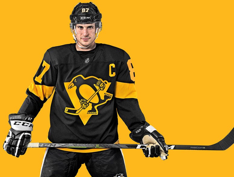
The extreme minimalism inherit to Stadium Series jerseys reached new heights with this year’s entries. The Penguins jerseys were basically a pre-cursor to the Oilers’ new third jerseys, albeit better in some ways (yellow more vibrant than orange) and worse in others (less striping and black instead of blue).
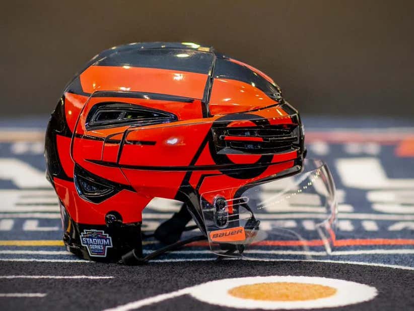
The Flyers jersey at least had some prominent use of colour, but the black on orange look was lacking any contrast, making the jerseys appear dirty and flat, almost like prison garb more than anything fit for a hockey club. They did try a unique helmet design, but that just looked ridiculous on the ice as well.
• More: Stadium Series Jersey Countdown (2019)
Mix those two jerseys together, and you’ve just got a visual mess of black with a little bit of colour that doesn’t comes across as flat and lacking any depth. Yuck.

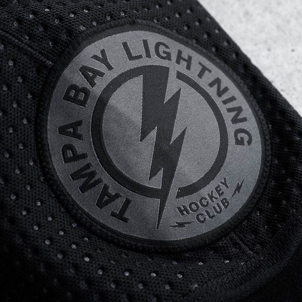
The Tampa Bay Lightning take top spot this year, with another tragic inclusion to their sordid history of third jerseys. Whereas previous versions were too busy, these swung the pendulum so far in the opposite direction, it broke off the clock and people are still searching the swamps of Florida for it.
The only meaningful design element on these practice jerseys is the light grey pixelated gradient on the sleeves, which is so subtle that it’s basically invisible during game play. Otherwise, it’s black. Just black. No stripes, no collar, no nothing. And that’s not just the jersey…that’s for the entire uniform.
Oh, aside from a greyed-out shoulder patch. Yippee.
• More: HbD Breakdown: Tampa Bay Lightning Third Jerseys
Any element of personality or character were stripped out of these jerseys in what seems like an exercise in, what? Seeing what people will blindly spend their money on buying?
Agree? Disagree? Did we forgot your favourite pop culture reference? Let us know what you think in the comments or join the conversation on Twitter and Facebook! And don’t forget, we’re on Instagram too.


/https://www.thestar.com/content/dam/thestar/sports/hockey/2018/10/18/johnny-gaudreau-scores-100th-goal-as-flames-topple-bruins/jmc124506693.jpg)
Leave a Reply