
HbyD Breakdown: Dallas Stars Third Jersey
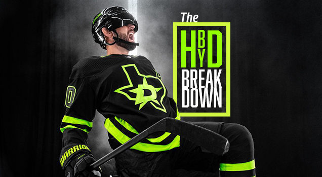
Today we’re breaking down another third jersey that recently made its debut on the ice…and this one was definitely hard to miss. Get out your shades for these Dallas Stars jerseys that’ll be worn for 10 games throughout this season. Are we feeling the neon vibes, or nah? Find out after the jump…
Do You Even Rock Neon, Bro?
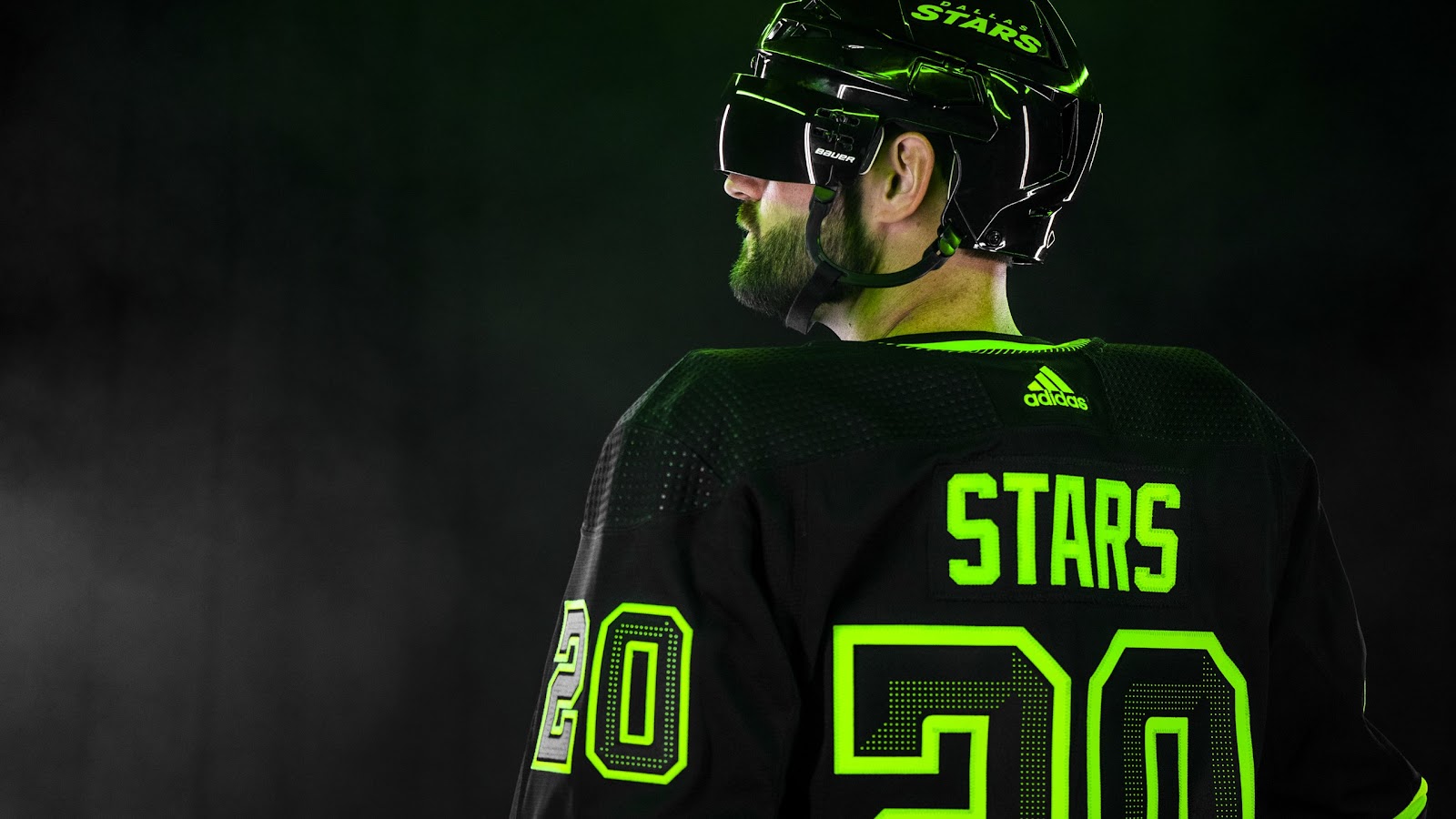
They say everything is bigger in Texas, but I think they meant to say everything is brighter in Texas. The Stars return to black, but this time it’s paired only with bright – and I mean bright – neon green. Obviously, the neon green is the primary feature of this “blackout” jersey that was developed to represent all things Dallas, Texas. From the official press release:
“The jersey design committee was tasked with finding a way to incorporate the heart of the city of Dallas and the spirit of Texas into a uniform,” Stars president and CEO Brad Alberts said. “Today is an exciting day as we have worked hard over the last two years at creating a third jersey that will make our fan base proud, and with the help of adidas Hockey, we feel like the Blackout third jersey will do just that. The Dallas skyline is iconic and introducing Skyline Green into our uniforms is a vibrant reminder of our great city.”
When the initial promo photos were released, it’s fair to say that this particular critiquer did not have a favorable first impression. The styling of the photoshoot really magnified the neon aspect, so much so that it essentially overshadowed any and all other elements of the jersey.
The black background and the strobe lights, it was (purposefully) over the top…and we can’t ignore that blacked out helmet visor! I mean, bro, let’s snipe some top corns and celly all night, amiright?!
With all of that, there was something coming to mind…
Something Looks Familiar
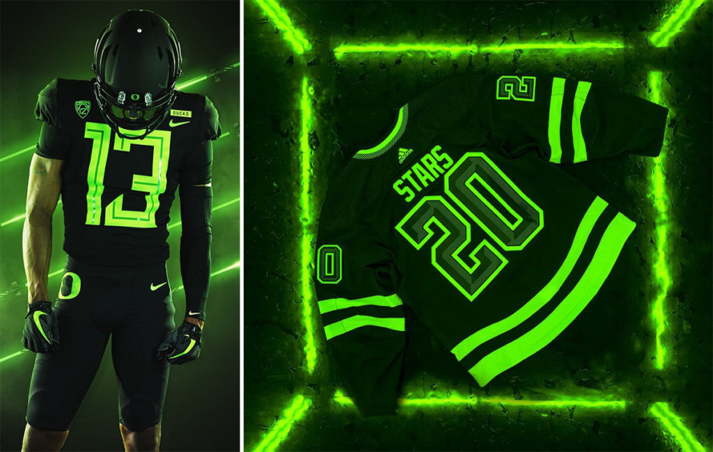
Oregon Ducks football, but make it Dallas Stars hockey. In what has to be a Nike vs. adidas coincidence, there are so many parallels between these Ducks unis from a couple of years ago and this new Stars set.
Both are blacked out from head-to-toe and both feature the accent pop of neon green…which looks to be nearly identical in their respective “neon-ness.” Even the promotional photoshoot looks like it could have occurred on the same day, in the same studio.
Neon, neon, neon aside…let’s look at some other features…

Lone Star Details

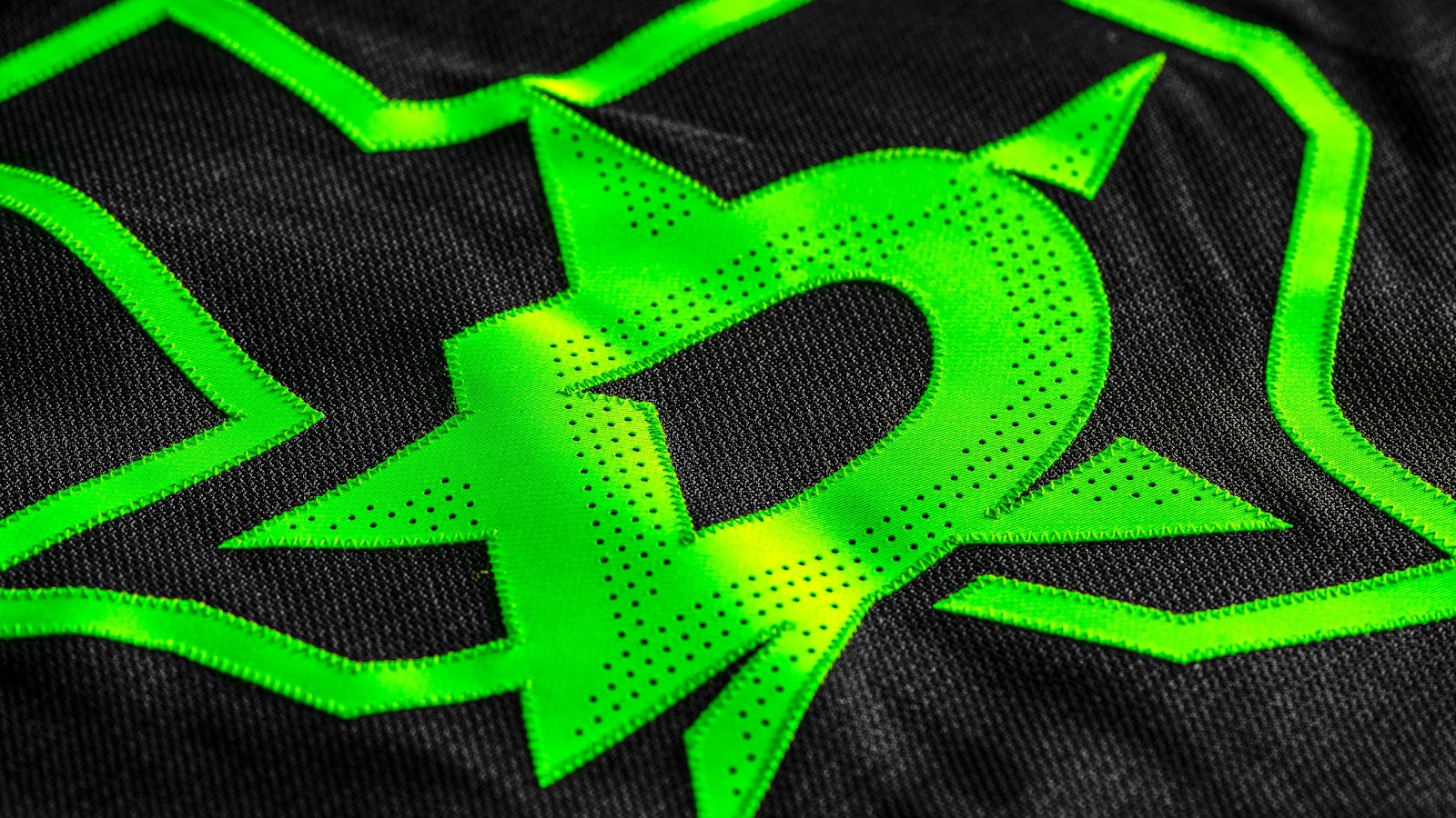
Shielding our eyes from the neon for a moment, there are some other unique details of the jersey that actually work really well. First off, the State of Texas logo version, which has only ever been utilized on the Stars pants to this point, looks great as a primary chest logo. The monochromatic execution of the D interlocking with the state outline looks sharp, resulting in a clean, bold chest crest. Plus, as an added bonus, getting the state outline that large and in-charge will always please a Texan.
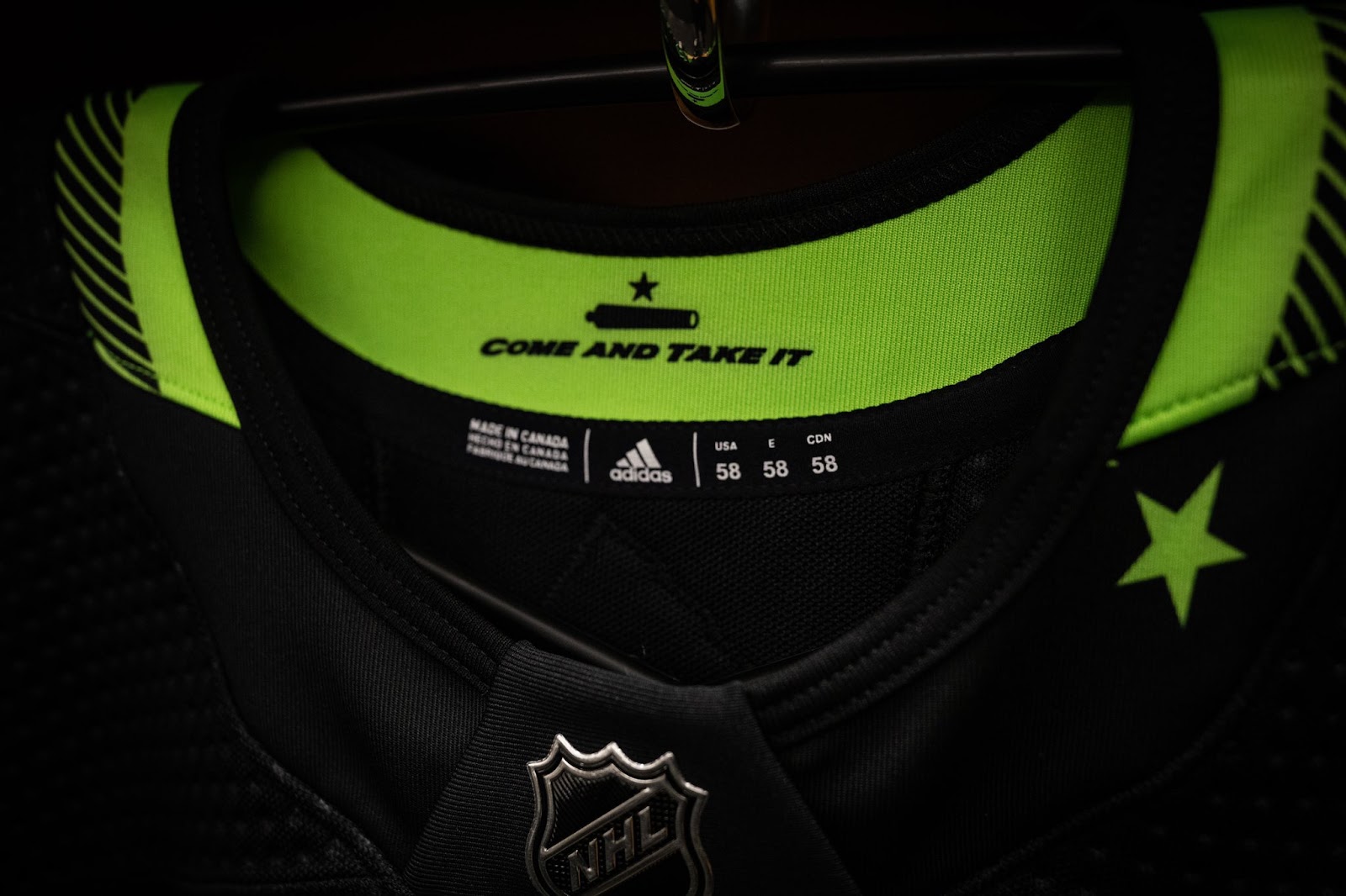
Moving on to a smaller detail: Asymmetry done right is typically hard to pull off on jersey/uniform designs, but the Stars nail it with the single small star on the collar, a clever nod to the Lone Star state, as well as representing the Cup championship in their history.
So, how do all of these elements actually look when they hit the ice…?
Better on Ice

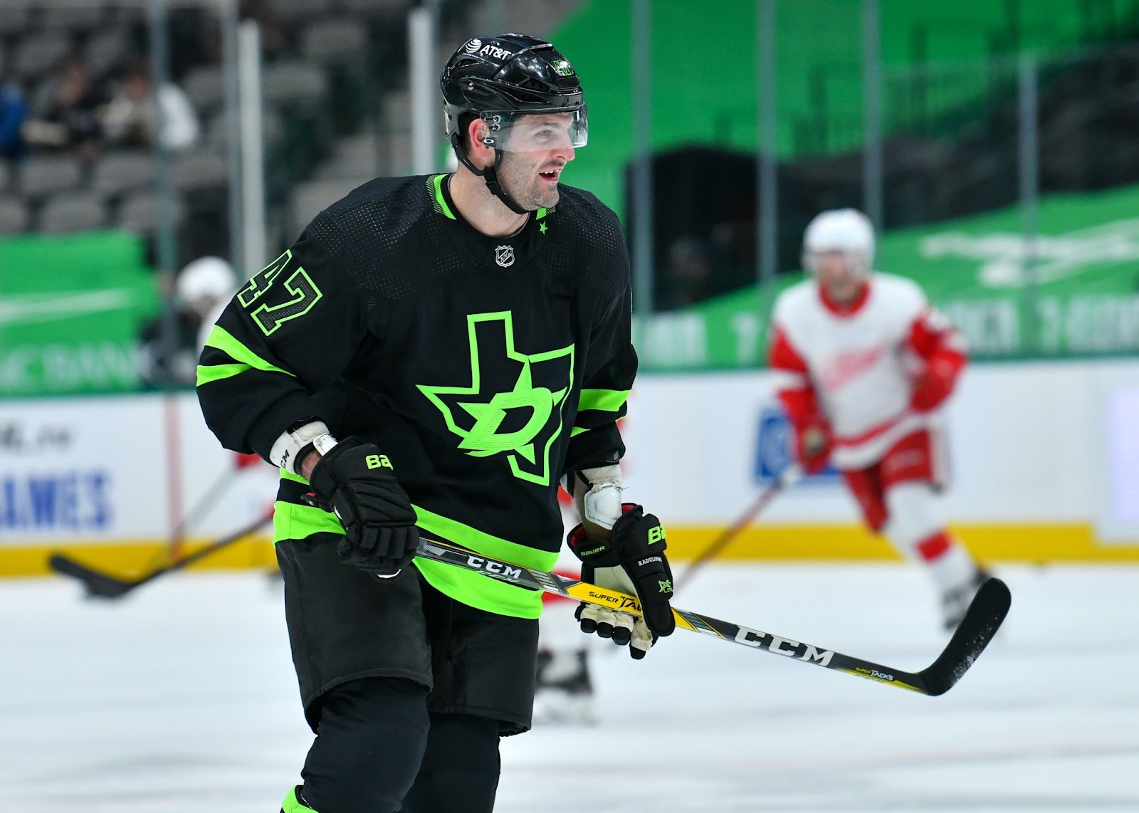
As mentioned, the promo photos really hyped up the neon…and I guess rightfully so as it’s basically the gimmick of this particular 3rd jersey. However, what started as an immediate aversion to the entire uniform set, turned into merely a mild acceptance when they actually made their way onto the ice.
The primary reason for this: the neon loses it’s punch a little bit under arena lights vs. studio/strobe lights and the result is more subdued and balanced, which helps the overall look. This lets other elements of the jersey work, like the traditional sleeve and tail striping and the subtle dot pattern on the numbers and chest logo.
So, back to the very first question at hand…are we feeling these neon vibes, or nah?

Final Verdict
One could argue that a good 3rd jersey is polarizing. If that’s the case, these are successful. Some people will love ‘em and some people will hate ‘em…but that’s kinda the point. Third jerseys are meant to be a break from the norm, meant to push the envelope and ultimately meant to increase jersey sales. Now, if the Stars had announced this jersey as their new primary look, we’d be having an entirely different conversation.
So, with that said, oddly enough I find myself with an opinion stuck in the middle on these. They serve the purpose of a 3rd jersey that’ll only be worn for a handful of games, so in that regard they work. Plus, some of the finer details of the jersey are executed quite well.
On the flip side however, the neon green is just so overpowering that it diminishes everything else and kind of radiates a 90’s minor league vibe. Call it a toss up, and perhaps my own opinions are polarizing.
Agree, disagree? Go grab a Monster energy drink and let us know in the comments below or join the conversation on Twitter, Facebook, or Instagram!


In comparison to other black and/or monochrome jerseys, such as the Black Ice set (egads!), or most of the LA Kings wardrobe (zzz), these are a triumph. The lack of a secondary color certainly doesn’t come off as boring, the striping is well-balanced, the chest logo is great, and the subtle details like the dot-shading are pretty classy. As a single-color uniform, I don’t know how Dallas could have pulled it off any better than this.
Nice analysis, I was unimpressed at first too, but I see your points on some of the smaller details that help salvage this from being a complete disaster of a third jersey. But that Texas state logo just doesn’t do it for me. It seems like two separate elements forced together instead of one cohesive design. I think they should turn the lights out on that one.