
Uncategorized
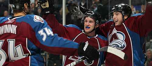
BTLNHL #29: Colorado Avalanche
Oct
Welcome to Yetiville. The 29th best place in the NHL to be.
From the expansion/relocation era of the 1990s and 2000s, there were a rash of teams coming into the league, as well as established teams that redesigned their brands. And there is a definite design aesthetic that emerged from that era, and almost all of the time, it wasn’t pretty. Generally, it was characterized by being overdone, overblown, over-designed and stripped of all sorts of cleanliness and simplicity. The Avalanche logo is a product of this era.
To me, there needs to be a difference in the brand between the junior- and minor-league teams, both in design and branding, and the pros. Why? Because it’s the best hockey in the world, and everything, from the skill level to the management to the branding, should be reflected as such. This is why you get teams in the minors with logos like this. And this. And this. You will should never see anything like this in the NHL. When you’re playing in the best league in the world, you should have the most refined and well-thought designs in the world.
But, back specifically to the Avalanche. I get it, I do. It’s a mountain that’s also an “A” for “avalanche”. And there’s an actual avalanche happening. Oh, and there’s a puck there just so everyone knows it’s about hockey. Gotcha. But since when did logos have to be so incredibly literal? It feels like they’re trying way too hard to be smart and clever while including as many different elements into the design as possible.
There’s a saying I like to use called “death by committee”, where any design project is turned mediocre by having too many people all wanting equal input into the process. A group of vultures is also called a committee. I don’t think that’s a coincidence. But it feels like that’s what happened with the Avalanche logo…
Harry: “Yeah Mr Designer, that’s great, but there’s nothing that says hockey on there.”
Mr Designer: “Does it need to? There’s lots of great logos in the NHL that don’t have any sort of hockey reference…”
Dale: “Oh, but we’ll definitely need it here. This isn’t Canada. People won’t know what it is.”
Laura: “Yes Dale, of course we should. Mr Designer, could you make it more ‘avalanche-y’ too?
Audrey: “Wouldn’t it be cool to have the avalanche swoosh around the mountain?”
Mr Designer: “But avalanches don’t encircle mountains…”
Bobby: “Oooo…encircling. I like that word! Let’s do it!”
Donna: “Can we put lots of detail in the snow. Swooshes everywhere!”
Mr Designer: “Um…I don’t think…”
Benjamin: “Yeah, lots of detail. We don’t want the snow to just be white. And let’s put a circle behind it. You know, to keep it together.”
Bob: “Circles! I love circles!”
Mr Designer: “oh boy…”
There’s too much of everything happening in this logo. And it’s way too literal. The most distinctive logos always have a hint of the abstract and a simplification to it. For one, it will create a more timeless logo and last a lot longer that way.
So, #29 is the Colorado Avalanche.
The BTLNTL Countdown Posts
BTLNHL Finals: Boston Bruins v Detroit Red Wings
BTLNHL #3: Philadelphia Flyers
BTLNHL #4: St. Louis Blues
BTLNHL #5: Montreal Canadiens
BTLNHL #6: Pittsburgh Penguins
BTLNHL #7: Chicago Blackhawks
BTLNHL #8: Toronto Maple Leafs
BTLNHL #9: Phoenix Coyotes
BTLNHL #10: Vancouver Canucks
BTLNHL #11: Edmonton Oilers
BTLNHL #12: New York Rangers
BTLNHL #13: Calgary Flames
BTLNHL #14: Buffalo Sabres
BTLNHL #15: Winnipeg Jets
BTLNHL #16: Minnesota Wild
BTLNHL #17: New Jersey Devils
BTLNHL #18: Nashville Predators
BTLNHL #19: Carolina Hurricanes
BTLNHL #20: New York Islanders
BTLNHL #21: Ottawa Senators
BTLNHL #22: Tampa Bay Lightning
BTLNHL #23: Columbus Blue Jackets
BTLNHL #24: Washington Capitals
BTLNHL #25: San Jose Sharks
BTLNHL #26: Florida Panthers
BTLNHL #27: Dallas Stars
BTLNHL #28: Los Angeles Kings
BTLNHL #29: Colorado Avalanche
BTLNHL #30: Anaheim Ducks