
Uncategorized
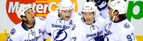
BTLNHL #22: Tampa Bay Lightning
Nov
Okay, so a design team walks into a meeting with a corporate client. They were hired to work on their logo and after a few months of sketches, consultations, failed concepts, back-and-forth deliberations with the client, they walked into the meeting charged, confident and armed with what they knew was a great logo that served all the client’s needs.
They walked into the meeting, presented their logo, talked about the logo’s great concept at each stage of its progression and sold the hell out of it to the corporate suits that were sitting wide-eyed and open-mouthed in glee. They were super impressed.
“Wow,” said the corporate manager, “for an initial design briefing and concept brainstorming, you guys sure hit it out of the park. We’re sold!”
“What do you mean by ‘initial briefing’? We’ve been working on this for months!” retorted the designer.
“Months? What are you talking about? We just contacted you guys for a logo redesign last week. But this is just great! We’ll be ready to use this for next season, maybe even this season!”
Now the design team was really confused. “Um…what do you mean by ‘season’?”
“Well, in October, when the hockey season starts again. These will look great on our jerseys!”
“Hockey?? Wait a minute, this isn’t the Florida Power Company?”
“No, that’s a couple floors down. We’re the Tampa Bay Lightning.”
So that was a bit of long-winded (but hopefully more enjoyable?) way of getting a point across. Some may be surprised that the Lightning rank this low considering how much I’ve preached simplicity so far, and to be honest, I waffled a bit about their placement. But, for me it comes down to one simple thing. The logo missed the mark. It’s not a hockey logo, it’s a corporate logo and would work beautifully for a lot of different organizations but it doesn’t work in sports.
This logo is pretty new, being oddly launched, kind-of, mid-season last year. They played a few games over the rest of the season with the new jerseys, but with the intention of using it full-time in the current season. It’s kind of like a soft launch, but I’ve never seen that before in hockey, or in other sports. The off-season is usually when teams make any significant changes to their logo/jersey. Anyway, that’s besides the point.
Note: Simon (commenter below) provided a link that discusses a bit about how the new logo came out. You can read it here.
There are only two other teams in the NHL that have a brand (logos, jerseys) with only one solid colour, Detroit (red) and Toronto (blue). Without taking away too much from their eventual inclusion in the BTLNHL discussion, their logos have a strength and solidity to it. The solidness of the logo is indicative of the type of sport that hockey is: intense, physical, fast and strong.
Detroit’s logo is mainly red. Toronto’s is almost all blue. Tampa Bay’s has more negative space than positive (i.e. – it’s more white than blue). It’s lighter, it’s less dense and doesn’t carry a strong physical impact. It’s the opposite of hockey.
Here’s a list of things that Lightning’s logo looks like:
An electric company. And another. And another. Most generic corporate logos. Flash Gordon.
All this being said, I definitely admire the direction and the risk they took. Going with one solid colour as your brand, something only two Original Six teams have gotten away with, takes guts. And I like the simplicity and styling of this logo. The differing width of the circle gives it a contemporary feel and it’s iconic enough to stand the test of time.
And throughout their history, the Lightning have improved their logo from this monstrosity (seriously, that type is something awful), to this (which still has strange and badly-kerned type on it) to their current logo, and none of those steps have been huge redesigns or departures from the original logo that might alienate their fans, which is more of a danger in a place like Tampa Bay.
A year ago, they would not be this high on the list. It’s a step in the right direction. But it’s definitely not a hockey logo.
So, Tampa Bay comes in with the 22nd Best Team Logo in the NHL.
The BTLNTL Countdown Posts
BTLNHL Finals: Boston Bruins v Detroit Red Wings
BTLNHL #3: Philadelphia Flyers
BTLNHL #4: St. Louis Blues
BTLNHL #5: Montreal Canadiens
BTLNHL #6: Pittsburgh Penguins
BTLNHL #7: Chicago Blackhawks
BTLNHL #8: Toronto Maple Leafs
BTLNHL #9: Phoenix Coyotes
BTLNHL #10: Vancouver Canucks
BTLNHL #11: Edmonton Oilers
BTLNHL #12: New York Rangers
BTLNHL #13: Calgary Flames
BTLNHL #14: Buffalo Sabres
BTLNHL #15: Winnipeg Jets
BTLNHL #16: Minnesota Wild
BTLNHL #17: New Jersey Devils
BTLNHL #18: Nashville Predators
BTLNHL #19: Carolina Hurricanes
BTLNHL #20: New York Islanders
BTLNHL #21: Ottawa Senators
BTLNHL #22: Tampa Bay Lightning
BTLNHL #23: Columbus Blue Jackets
BTLNHL #24: Washington Capitals
BTLNHL #25: San Jose Sharks
BTLNHL #26: Florida Panthers
BTLNHL #27: Dallas Stars
BTLNHL #28: Los Angeles Kings
BTLNHL #29: Colorado Avalanche
BTLNHL #30: Anaheim Ducks