
Uncategorized
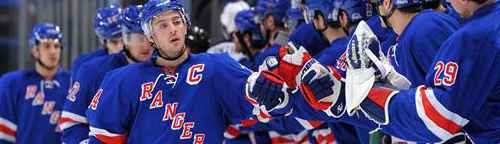
BTLNHL #12: New York Rangers
Jan
First of all, I apologize for the gap between this post and the last one. But I hope that, like Heinz ketchup, the anticipation is worth it.
The Original Six. The holy grouping of hockey. After the Brooklyn Americans folded in 1942, there would be only the same 6 teams in the entire NHL for the next 25 years, until 1967 when the league doubled in size to include teams in Los Angeles, Minnesota, Oakland, Philadelphia, Pittsburgh and St. Louis. In the 95 seasons since the Stanley Cup Finals were first introduced in 1915, Original Six teams have won them 62 times, or over 65% of the time. Even if you take out those 25 years where there were only those 6 to choose from, it’s 37 Cup victories in 70 seasons, still over 50%. In short, this group is drenched in iconic stature and whether you like it or not, it’s hard to separate that sort of historical success and dominance from something like a logo.
A logo is always part of something bigger called a brand. A brand, despite what some corporations may think, is not controlled by the marketing department or the design team. The brand is nothing more than the public’s perception of the organization, influenced by every interaction between the public and the organization. Some of that is marketing, some of it is completely intangible. For example, since 1941, the Colorado Avalanche have won more Stanley Cups than the New York Rangers, but will never get the same reverence that the Rangers get. That’s a brand that can only be built with history. And the brand affects the perception of the logo.
For example, I can’t eat a Christmas dinner without having some marshmallow salad. I know it’s bad for me, it looks really gross, is more dessert than salad and most people snub their noses at it, but I had it every year growing up as a kid, and Christmas dinner just isn’t the same without that marshmallowy goodness. The perception is greater than the actual product.
The Rangers are the first Original Six team to come up in the BTLNHL countdown, and rightly or wrongly, these teams take up 6 of the top 12 spots. The history and dominance of these teams is always difficult to separate strictly from the design, because when you look at the logo, it oozes a certain aura that can’t be touched. Like Slimer.
But, it’s also that my much-ballyhoed aspect of simplicity was a necessity because of design and manufacturing limitations of the time. Having a gradient with bevels, shadows and multiple-outlined font was not a possibility (and thank goodness), but the limitations forced the creation of some excellent designs because if forced the designer to focus more on shape and style, rather than bells and whistles. I’m not saying all the logos from that time were great, but the ones that are still around on the Original Six teams have stood the test of time.
But okay, now out of the Original Six teams, the Rangers come in the lowest, at 12th. This is a logo that has retained the same concept since its inception in 1926. It’s gone through a few different refinements to its current look, but essentially, it has always been a crest with New York on top, Rangers diagonally across the crest, with red above and white below. It’s simple, and the more squared version of today has implied strength to it that earlier versions didn’t have.
The shape of the crest, along with it’s angled notches at the top and point at the bottom is distinctive on its own, giving the shape itself a very recognizable outline. The colours are spot on with the red, white and blue playing well with the idea of Rangers and, of course, aligning itself with a patriotic brand in a city that also had teams named the Americans and the Yankees. Also, the thin blue outline is perfect and necessary, as it loses its weight and just looks naked without it. But, it’s the rest of the logo that drags it down the rankings.
The rest of the logo is basically the font and text treatment. I don’t mind the “Rangers” being on an angle as it gives it a more authentic and historical look to it, but the font itself is odd. It’s seems to be a modified Univers Condensed of some sort, but there’s some weird things going on. The “K” just looks wrong, with one leg a whole lot longer than the arm. It’s like seeing Zdeno Chara‘s legs on Martin St. Louis’ torso. Bizarre.
Other issues with the text: the “E” is too narrow when compared to the rest of the letters. The “G” looks thicker than the rest of the font. The curves of the “S” are inconsistent with the curves of the “O”, “G” and “R”. Yes, I’m a typography snob.
But, the big problem is the inconsistent kerning. The trick to successful kerning it to just take 3 letters at a time and make sure there’s the same visual spacing between them. For example, take a look at just the “YOR” in York from the logo. Visually, the Y is farther away from the O than the O is from the R. The whole logo is filled with kerning issues (like the “RS” in Rangers compared to the rest of the word), so here’s a version of the logo with the kerning corrected a bit.
Or even better yet, get a whole new font in there altogether, one that keeps the font in the same style as the original, but without the wackiness. Like this.
The only thing left to pick on is the white lines in the logo. Could a workable logo be created without these lines? Sure, definitely. Is it better (keep in mind I had to use a more compact font to fill the space)? Not really. It gives a more historical look, but it feels like there’s still something missing. Whether that’s because I’m used to seeing the lines in there or not, I’m not sure. Or you could connect those lines to eliminate that weird gap between them. But, this is a problem too as it causes the eye to get stuck in that empty area to the left of the R. Maybe not. Sometimes design isn’t very scientific.
In the end, the historical significance and distinctiveness outweighs the typographical problems, so the first Original Six team, coming in at #12, is the New York Rangers.
The BTLNTL Countdown Posts
BTLNHL Finals: Boston Bruins v Detroit Red Wings
BTLNHL #3: Philadelphia Flyers
BTLNHL #4: St. Louis Blues
BTLNHL #5: Montreal Canadiens
BTLNHL #6: Pittsburgh Penguins
BTLNHL #7: Chicago Blackhawks
BTLNHL #8: Toronto Maple Leafs
BTLNHL #9: Phoenix Coyotes
BTLNHL #10: Vancouver Canucks
BTLNHL #11: Edmonton Oilers
BTLNHL #12: New York Rangers
BTLNHL #13: Calgary Flames
BTLNHL #14: Buffalo Sabres
BTLNHL #15: Winnipeg Jets
BTLNHL #16: Minnesota Wild
BTLNHL #17: New Jersey Devils
BTLNHL #18: Nashville Predators
BTLNHL #19: Carolina Hurricanes
BTLNHL #20: New York Islanders
BTLNHL #21: Ottawa Senators
BTLNHL #22: Tampa Bay Lightning
BTLNHL #23: Columbus Blue Jackets
BTLNHL #24: Washington Capitals
BTLNHL #25: San Jose Sharks
BTLNHL #26: Florida Panthers
BTLNHL #27: Dallas Stars
BTLNHL #28: Los Angeles Kings
BTLNHL #29: Colorado Avalanche
BTLNHL #30: Anaheim Ducks