Uncategorized
The Best Winter Classic Jerseys
As a special post to commemorate the best hockey game, aesthetically speaking, during the regular season, regardless of whose playing, here’s a post counting down the best Winter Classic jerseys. As Jan 2012 marks the 5th anniversary of the Classic, here they are, from #10 to #1.
10. 2012 Philadelphia Flyers

I commented on these jerseys in an earlier post, particularly about how little the Flyers’ look has actually changed over their existence, and since they’ve already been to the Winter Classic dance (in 2010 against the Bruins) they had limited options to work with. But, what they essentially did was create a jersey extremely similar to what they already wear, with some slight changes to the piping in a not-so-great way. It’s money in the bank for them, with fans most likely clamouring to buy them up, but it feels like a disingenuous cash grab. A better option? Maybe a play on the old Philadelphia Quakers from the ’30s.
9. 2011 Washington Capitals

To be fair, I’ve never been crazy about this original logo in the first place, with a strange, modified Helvetica-esque font. The jerseys weren’t that much better, and it’s apparent when they brought them back for last year’s Classic. They’re not the retro-chic that these jerseys usually go for, instead looking gaudy and dated.
8. 2010 Boston Bruins

It’s not a bad jersey, but it’s a curious choice to use a logo that was only in existence for only one of the 80+ seasons (1948-49), and the piping along the shoulder is awkward and doesn’t work that well. And there were a few other vintage options available to them, even possibly the other jersey they wore during that same 1948-49 season.
7. 2009 Detroit Red Wings

Again, like the Bruins, not a bad jersey considering how little their jersey has changed over the years, but it’s a bit bland and doesn’t fully take advantage of the retro-chic they could have gone for with the opportunity of participating in the Classic. There’s some other possibilities they could have gone for. I would have loved to have seen a Red Winged variation of this 1928 classic, when they were the Cougars.
6. 2011 Pittsburgh Penguins

The cummerbund jersey! Of the two Penguins jerseys in the Winter Classics, this one is definitely the weaker cousin. That waist piping is crazy large and while it has a certain retro thing going for it, it’s a bit bunch. It could have been a reduced to maybe three baby blue stripes, allowing the logo to get a little bit larger and not compete as much with the cummerbund.
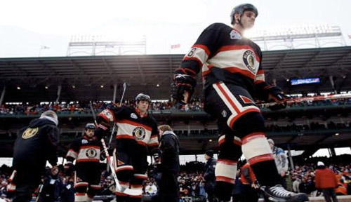
5. 2009 Chicago Blackhawks

It’s hard to improve on the Blackhawks jerseys in general, and these are certainly great looking vintage jerseys. But I’m also a fan of updating vintage looks to fix design issues that don’t make much sense. In this case, there’s no reason why the logo needs to be that small. It would have been a better jersey if the logo had overlapped the wide white band, and gone into the black. Still vintage-looking, but makes a bit more sense.
4. 2008 Buffalo Sabres

This is very close to the jersey they currently wear, but this is the game that reminded people how nice of a jersey it was, especially when compared to their recent redesigns, including the buffalo zombie and the golden slug. It may not be considered classic now, but it certainly was in 2008. Any time a one-off jersey can influence a change of their current logo/jersey, you know you have a pretty good thing happening.
3. 2012 New York Rangers

The upcoming Rangers’ jerseys (which I also talked about in a previous post) is a great look for a team that also hasn’t changed their look much over their existence. The piping is great, the off-white base is perfect, and while it certainly draws from their current jersey and look, it’s enough of a variation to give it a vintage look. Essentially, it’s not an exact replica of any of their past jerseys, but it looks like it could be.
2. 2009 Philadelphia Flyers

Another jersey that spawned a redesign of the permanent jersey design for the Flyers. Like the Sabres, it doesn’t look classic now, but it was a bold choice in 2009, simplifying the overall design and piping of the jersey and letting the loud orange colour do its job of demanding attention. The box surrounding the nameplate on the back of the jerseys works really well when the jersey is simplified in this way. In short, it worked so well, it became their new permanent look.
1. 2008 Pittsburgh Penguins

When these jerseys first stepped onto to the ice in Buffalo in 2008, they looked damn good. They were a complete departure from anything the Penguins had word in the previous 25 years, but were almost a complete replica from their 1970-71 jersey. The baby blue was a bold and daring colour choice, and pretty much unused in the the NHL since the Penguins themselves abandoned it in the late ’70s. The piping, simple and strong. Outside, against the white sheet of ice and the dark blue sky, they looked great and still set the bar for Winter Classic jerseys.


