Uncategorized
BTLNHL #8: Toronto Maple Leafs

Toronto. Winner of 13 Stanley Cups. One of the two most-storied franchises in the NHL. One of the Original Six teams. The ‘Centre of the Hockey Universe’. The most valuable franchise in the league. Arguably hockey’s most rabid fan base with the most scrutinizing media.
I mentioned during the Rangers’ post that separating history and legacy from a logo design is pretty impossible, and this is one of the greatest teams in the NHL. So, I focused on them not getting even in the vicinity of the Stanley Cup since 1967, starting seeing a little clearer, and ranked them here at #8.
And….I think I just lost all of my Toronto readers. Sorry Leafs fans, I’ll shut up and stick to design now.
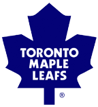
As history goes, the Leafs (shouldn’t it technically be ‘Leaves‘) have had almost every sort of stylized maple leaf that you can: a very goofy non-realistic leaf in the ’20s and ’30s (seriously, have you ever seen a maple leaf shaped like that?); a more symmetrical and more realistic looking leaf, but with painfully off-centred text, from the ’30s to the ’60s (with two outlines added for good measure in the ’60s); a more simplified and iconic leaf in the late-’60s that look extremely similar to the leaf on the Canadian flag; and a more stylized-version of the iconic leaf, and the straightening of the “Toronto” text, which is the logo used today. Each step of the way, it got simpler and more refined. And thankfully, the text is as centred as a chakra.
So, in terms of the leaf, there’s not much to complain about. It’s stylized and iconic. It’s got strength and character to it. It’s simple, but the angles give it just a bit of movement and dynamism. It’s the Hugh Jackman of NHL logos. Too charming not to like. I mean, the guy even makes a point of hanging out with ex-cons!
This is the last logo in the countdown to use fonts as a major design feature (the Bruins’ B and the Canadiens C and H are less a font than an actual design element). The font being used is called ITC Kabel Ultra. Again, a nice font. Simple, but stylized, with dynamism and movement. Strength and character. Distinct but not flashy. It’s the Sandra Bullock of NHL typefaces. Too charming not to like. I mean, she doesn’t just take care of shady characters, she marries them!
As the type goes, there’s nothing to complain about. Every letter is spaced-out nicely. Unlike Rasputin, it’s well-executed.
The blue colour is, at first, an odd choice considering maple leafs are generally green, red, or some shade of orange. However, the Toronto professional hockey team, before being the Maple Leafs, were known (creatively) as the Torontos, or (somewhat slightly more creatively) the Blue Shirts. They then became the Arenas in 1917, when the NHL was formed, then the St Pats in 1919, and then finally the Maple Leafs in 1927. In their first year, they did actually use a green maple leaf as their logo, but in 1928 switched back to blue. According to sources (read: Wikipedia), the switch to the blue was to follow the tradition of blue being Toronto’s principle sports colour, with the Argonauts and Varsity Blues already playing in their respective sports. MLB’s Blue Jays later followed suit.
Then the blue has historical and local significance. Although a blue maple leaf doesn’t necessarily makes sense, these are good reasons to throw logic to the wind.
So, here’s the rub. And again, we’re heading very much into intangibles here since we’re talking about the best logos in the league. And I also feel very strange saying this considering the team that we’re talking about.
Is it really a “hockey” logo?
Well, of course it’s a hockey logo. They’re the second oldest team in the league and about to celebrate their 100th anniversary in a few years. The Maple Leafs are to hockey what the Yankees and Red Sox are to baseball. The Globetrotters to basketball. Murray Hewitt to New Zealand. You see the logo and you think hockey.
But looking at the rest of the logos remaining in the countdown, why are all these ones ahead of the Leafs? They all have something more. This logo doesn’t have the same movement, the same intensity and the same aggressiveness that some of the other ones do, and these are all descriptions of the sport of hockey itself.
Don’t get me wrong, the Leafs logo is a great logo and definitely in the league’s elite, but on this list, it comes in at #8.
The BTLNTL Countdown Posts
BTLNHL Finals: Boston Bruins v Detroit Red Wings
BTLNHL #3: Philadelphia Flyers
BTLNHL #4: St. Louis Blues
BTLNHL #5: Montreal Canadiens
BTLNHL #6: Pittsburgh Penguins
BTLNHL #7: Chicago Blackhawks
BTLNHL #8: Toronto Maple Leafs
BTLNHL #9: Phoenix Coyotes
BTLNHL #10: Vancouver Canucks
BTLNHL #11: Edmonton Oilers
BTLNHL #12: New York Rangers
BTLNHL #13: Calgary Flames
BTLNHL #14: Buffalo Sabres
BTLNHL #15: Winnipeg Jets
BTLNHL #16: Minnesota Wild
BTLNHL #17: New Jersey Devils
BTLNHL #18: Nashville Predators
BTLNHL #19: Carolina Hurricanes
BTLNHL #20: New York Islanders
BTLNHL #21: Ottawa Senators
BTLNHL #22: Tampa Bay Lightning
BTLNHL #23: Columbus Blue Jackets
BTLNHL #24: Washington Capitals
BTLNHL #25: San Jose Sharks
BTLNHL #26: Florida Panthers
BTLNHL #27: Dallas Stars
BTLNHL #28: Los Angeles Kings
BTLNHL #29: Colorado Avalanche
BTLNHL #30: Anaheim Ducks


