
Uncategorized
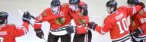
BTLNHL #7: Chicago Blackhawks
Mar
Another Original Six team comes in at #7. The Blackhawks’ logo rivals that of Toronto’s logo in being truly iconic to hockey, existing in some form or another since 1927. It’s been revised four times in its existence. It went from this is 1927, to this in 1935, to this in 1937, to this in 1955, to this in 1964 when it looks like they finally hired a professional designer to create the iconic head, and it has remained untouched since then.
Like an old decrepit heritage apartment (according to its advertisement), it’s got a ton of character. It’s a logo that a fan base can get behind because it’s unique, historical, distinctive and well-executed. Huzzah!
So why is it lower than the remaining teams? Well, if you haven’t read any of the other posts, I have a love affair with simplicity. This logo does have an element of simplicity to it as the actual elements are quite flat. The hair is just black, without a shimmer or highlight in it (à la Veronica Lodge, or Reggie Mantle for that matter) and the face isn’t a complex combination of shadows and highlights (à la the Panthers, or the ECHL’s Trenton Titans). But, there’s sure a huge amount of other design elements thrown in throughout the logo.
So, I had a go of trying to simplify the logo and create something that was very much in the same style as the current logo, but trimmed down and simplified a bit. More tweaking than redesigning the concept. The result? Here it is. What do I think of it? It’s okay, but it’s hard to judge accurately when you have a renowned historical logo to constantly compare it against. I know people will get mad at me for even touching this sacred hockey crest, but regardless, it was a great exercise because it helped me realize why this logo works despite its incredible amount of elements.
Like a Sunday morning newspaper puzzle, most of the changes between the current logo and the simplified version are subtle. The feathers have their extra outline removed (and the colours changed a bit). The line running through the hair is darkened and made a touch thinner, so it’s more subtle. The upper face-paint design is slightly smaller and rotated a bit. The forehead lines are removed. The half-moon shape on the face is adjusted slightly. The nose spiral is removed/changed. All pretty subtle.
Perhaps the biggest change is the emotion of the face. The eyebrow is turned a bit to give the logo a more stern look and the smile is changed to more of a frown. It makes the face look more stern and determined. I’m not against happy logos, but when was the last time you saw someone smiling and giggling in a hockey game (Canucks’ coach Alain Vigneault notwithstanding)? Most of the time, people look more like this. Or this. Even the fans get angry.
Okay, that’s a weak argument. And I know that the smiling face helps make the Blackhawks logo unique, but I just wanted to see if it could work.
Back to what I learned about this logo by playing around with it. The additional elements is what makes it work and gives it balance. If you remove all the face-paint and facial elements, the feathers dominate too much. If you remove the line in the hair, you’re left with a big visual void in the middle of the logo. Minimize the feathers and it’s unbalanced towards the face. Remove all the elements and it loses all the character that makes it great. So, the logo is all about balance in design, and the perfect example of the idea that less is not always more. ‘Just enough’ is more.
It’s hard to argue with how much character and style the logo has. Aside from attempting a major redesign of the concept (other than just tweaking as I did above), I’m not sure simplifying it necessarily improves it. And unless Chicago feels like it wants to be razed to the ground again (this time by angry fans, rather than a cow), a major redesign is almost never going to happen.
Now, about the concept in general. I might be accused of being an over-sensitive and politically-correct-to-a-fault hippie, but I’ve never been a fan of using Native images and/or names for a sports team. The Canucks and Coyotes use Native design aesthetics, but they never represent an actual Native person. To be fair, the Blackhawks are indirectly named after an actual Native figure named Black Hawk who is a prominent figure in Illinois history. But I really wonder how many ‘Hawks fans realize this? As I’m not a fan myself, and have never been to Illinois, I have no idea how prominent a figure Black Hawk is in Chicago. As an impromptu poll…Blackhawks fans, if you’re out there, do you know who Black Hawk is?
Considering they’re named after an actual prominent Illinois historical figure, I have less of a problem with the Blackhawks than other sports teams, like the Atlanta Braves and their awful ‘Tomahawk Chop‘ or the Washington Redskins, since there’s really no historical justification for the Native representation in their logo/name other than, well, profiling. Worst of all are the Cleveland Indians. Seriously, this used to be their logo. Sorry Cleveland fans, but…wow. You might think I’m making something out of nothing, but when you play with elements of race, it’s a dangerous game.
All politics aside, we’re heading into the elite logos now, and the Blackhawks certainly have one. It’s well-balanced and it’s a simple shape loaded with extra features loads it with style and character. And it’s deserving of being the 7th Best Team Logo in the NHL.
The BTLNTL Countdown Posts
BTLNHL Finals: Boston Bruins v Detroit Red Wings
BTLNHL #3: Philadelphia Flyers
BTLNHL #4: St. Louis Blues
BTLNHL #5: Montreal Canadiens
BTLNHL #6: Pittsburgh Penguins
BTLNHL #7: Chicago Blackhawks
BTLNHL #8: Toronto Maple Leafs
BTLNHL #9: Phoenix Coyotes
BTLNHL #10: Vancouver Canucks
BTLNHL #11: Edmonton Oilers
BTLNHL #12: New York Rangers
BTLNHL #13: Calgary Flames
BTLNHL #14: Buffalo Sabres
BTLNHL #15: Winnipeg Jets
BTLNHL #16: Minnesota Wild
BTLNHL #17: New Jersey Devils
BTLNHL #18: Nashville Predators
BTLNHL #19: Carolina Hurricanes
BTLNHL #20: New York Islanders
BTLNHL #21: Ottawa Senators
BTLNHL #22: Tampa Bay Lightning
BTLNHL #23: Columbus Blue Jackets
BTLNHL #24: Washington Capitals
BTLNHL #25: San Jose Sharks
BTLNHL #26: Florida Panthers
BTLNHL #27: Dallas Stars
BTLNHL #28: Los Angeles Kings
BTLNHL #29: Colorado Avalanche
BTLNHL #30: Anaheim Ducks