
Uncategorized
BTLNHL #9: Phoenix Coyotes

Feb
That’s Raffi Torres in the image above, yelling at his teammates, “What the bloody blazes are we doing this high in the BTLNHL countdown?!” Because “bloody blazes” seems like something Raffi Torres would say. Well Raffi, it’s because that’s a pretty nice design you’re wearing, and I’m not talking about your tattoos.
Like the Canucks in the last post, this logo also features an animal prominently, and again, it’s executed extremely well. The features are toned-down and stylized, the colours are unique and work when creating a logo for a city placed in a desert, and it’s about a 10,000% improvement over the previous monstrosity that they claimed was a credible logo. How much is 10,000% percent? It’s more than the 110% often required from players to win a hockey game. So, yeah, it’s a lot better.
But that’s not saying that because their new logo is a vast improvement over their previous joke of a logo allows them to jump up spots (seriously, it would’ve have easily been in 30th place had I worked on this list ten years ago, worse than even the old Mighty Ducks logo). There’s a lot of things to like about this logo and personally, I like the fact that a logo of such quality is coming from a place where you wouldn’t expect it, from the completely non-traditional hockey market. It’s like realizing Desmond is your favourite Lost character. He wasn’t even on the original plane! Gah!
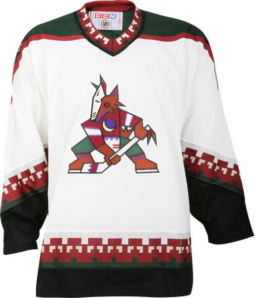
Like their previous logo, their current logo draws on native Navajo design aesthetics. But where their previous logo (and horrendous jerseys) took that aesthetic very literally and to its natural extreme, their current logo uses it extremely subtly and with great restraint. If you look at a selection of traditional Navajo artwork, their aesthetic relies on sharp angles and, specifically, triangles. And on the Coyote’s logo, they have a triangle pattern 5 times: on the fur around the coyote’s neck, on the ear, on the squinting pattern around the eye, the teeth and finally, on top of the snout. There’s also single triangle shapes added everywhere: at the bottom of the ear, around the edge of the mouth, inside the mouth, the squinting eye, on the chin, on the black line in the middle of the logo and, of course, the ear itself. It happens too much to be coincidence. There’s more triangles than that really hard level in Angry Birds. It’s a subtle way to pay homage to the artwork native to the Phoenix area. It’s much less obvious than in the Canucks logo, but I’d put down good money that it was intentional.
It’s also this consistent motif that makes it such a strong logo. As I’ve said repeatedly in previous posts, designing an animal into a logo for a professional league is no easy task because it’s so easy to let the design get out of hand and too cartoonish. But the consistent triangle motif is a great way to hold everything together, to give the animal some character but it’s subtle enough to not make it over-the-top.
The colours, as mentioned earlier, are unique in the NHL landscape as well. Only the Avalanche use something even close to resembling the same maroon colour, but they pair it with blue. The Coyotes keep the desert theme going, matching it with the beige, giving a strong desert-like motif.
I know I keep bringing up the Canucks logo in this post, but it’s because they are fundamentally similar logos. And in the Canucks post, I mentioned that Canucks are easily in the top 3 is connecting the logo with the city. Phoenix would be another one in the top 3, and again, that scores major points. For a non-traditional hockey market like Phoenix, that’s important. With their first logo, they tried way too hard. I mean, come on, did you see those hideous third jerseys they rolled out? Come on! It feels like with this one, they got it right.
And for a sports logo, it shows amazing restraint in terms of outlines. Most of the logos in the league have one, two or sometimes three outlines around their logo. Phoenix has one, and like the rest of the logo, it’s subtle. It’s strong where it needs to be and refined where it needs to be. Strong but refined, just like David Brent. At least in his own mind anyway.
So what’s wrong with the logo? Well, we’re heading into the realm of logos where there’s not necessarily anything specifically wrong, but it’s all about the intangibles. Does the logo give the feeling of strength? Yeah, I think so, but I also think there’s generally a mixed reaction. To me, it’s a coyote, so it’s pretty obvious that it’s howling. But it could also looks like it just stubbed its toe (and it’s not Superman). Or in the process of sneezing. Or should be included in a famous painting.
Is it a strong hockey logo? Meh. Hockey logos don’t necessarily need to have anything hockey-related on them, but this logo seems designed to be more geared to connect to a generally uninterested market, so it’s understandable why they went that direction.
But overall, it’s a well-refined, strong and well-executed logo that speaks to the area it represents, and worthy of being one of the top 10 logos in the league. Enjoy this logo (the best in the Pacific Division, by far) while you can, because within months, it could be gone and replaced as the Quebec Nordiques or the Seattle Totems.
The BTLNTL Countdown Posts
BTLNHL Finals: Boston Bruins v Detroit Red Wings
BTLNHL #3: Philadelphia Flyers
BTLNHL #4: St. Louis Blues
BTLNHL #5: Montreal Canadiens
BTLNHL #6: Pittsburgh Penguins
BTLNHL #7: Chicago Blackhawks
BTLNHL #8: Toronto Maple Leafs
BTLNHL #9: Phoenix Coyotes
BTLNHL #10: Vancouver Canucks
BTLNHL #11: Edmonton Oilers
BTLNHL #12: New York Rangers
BTLNHL #13: Calgary Flames
BTLNHL #14: Buffalo Sabres
BTLNHL #15: Winnipeg Jets
BTLNHL #16: Minnesota Wild
BTLNHL #17: New Jersey Devils
BTLNHL #18: Nashville Predators
BTLNHL #19: Carolina Hurricanes
BTLNHL #20: New York Islanders
BTLNHL #21: Ottawa Senators
BTLNHL #22: Tampa Bay Lightning
BTLNHL #23: Columbus Blue Jackets
BTLNHL #24: Washington Capitals
BTLNHL #25: San Jose Sharks
BTLNHL #26: Florida Panthers
BTLNHL #27: Dallas Stars
BTLNHL #28: Los Angeles Kings
BTLNHL #29: Colorado Avalanche
BTLNHL #30: Anaheim Ducks