
Uncategorized
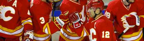
BTLNHL #13: Calgary Flames
Jan
Let me preface the Flames’ entry in the BTLNHL with a little something. I am a Canucks fan. I generally dislike anything to do with the Flames, and I have been trained to think like that almost my entire life. I loved 1994. I hated 1989 and 2004. I tried my absolute best to not let my personal preferences get in the way of ranking this logo. I tried not to rank them too low, or to overcompensate for this by ranking them too high. Did I succeed? I’m sure some of you don’t think so. But it’s hard to detach yourself from something you’ve passionately cheered for your whole life.
But, let me also say that the next grouping of 3 or 4 logos are extremely close in my mind and the Flames could easily have been bumped up a couple spots, but maybe this is where my own biases come into play, and I’ve placed them at 13th. I’ll do my best to validate this decision with incredibly detached and perfectly objective analysis. It will be just, fair and clever. Or maybe just fairly clever.
Okay, now that that’s out of the way. The Flames. Their logo is incredibly obvious (a C, with flames). The Sabres made an obvious logo that ended up being interesting and quirky. The Flames’ is considerably less interesting and quirky. But what it lacks in personality it makes for with simplicity and distinctiveness. The colours, again, while being an obvious choice, is simple and distinctive, as they’re the only team that tries to pull off the red and deep yellow combo and, of course, it fits with the content, you know, fire being red and yellow and all. Unless, of course, you’re this guy. Then (for some reason) it’s blue “natural gas” fire.
There’s a couple things that I don’t like about the logo. First, the seeming randomness of the flames coming off the C. As a designer, I need to find a reason for including every element in a design that I create and, especially in logos, there has to be some sense of order and purpose. Spontaneity and randomness are great in some instances, it’s generally detrimental to logo design. On the negative spontaneity scale, I’d say it’s right below spontaneous combustion. But maybe the logo is trying to depict a C in the middle of a spontaneous combustion? The Flames’ missing the playoffs for the last three years would certainly reflect that.
I’m sorry, that was uncalled for. Okay, pushing the personal feelings down again.
I realize that fire and flames in general don’t follow any sort of structured or sensical pattern at all, and demanding that from a fire-based logo would be non-sensical. But, there should be at least a certain amount of symmetry and purpose to it. This has been achieved in other fire-based logos, like the Tennessee Titans for example (not saying I like the logo as a whole though). Or, the ECHL’s Columbia Inferno (although it looks too much like a Thai Buddhist temple for my liking). Or, the logo of the original NHL Flames, from Atlanta. And if you turn the Flames’ logo sideways, it almost looks like Ghost Rider.
I guess what I’m getting at is that the elegance and simplicity of the logo is downgraded just a bit by the flames. It’s a little bit off-balance (with the flames going below the C on the bottom, but not rising about the C on the top, which drags the logo down a bit) and that white spot in the middle of the flames makes no sense to me, especially when highlighted by the black outline. I have to assume that it was intentional as it’s easy enough to get rid of. And that’s what I find confusing. It’s just drawing attention to something that should have no attention drawn to it. Like children at Milford Academy.
If you have no idea what Milford Academy is, you should watch some Arrested Development. Seriously funny show.
Okay, the good stuff now. And there definitely is, even though I’ve spent most of this post so far dissing the logo (I blame my childhood).
The choice of Helvetica Black Italic is an excellent choice as a starting point for the C. Helvetica is generally known as one of the best fonts ever created, and while I’m not as big a fan of it as others, it can look really nice at large sizes, and in this logo it has a perfect roundness to lead into the flames. It’s not the most “sporty” font for a hockey logo, but the C on its own has some character while not enough to completely dominate the logo. Like this dog, it’s got great balance.
And again, the great thing this logo has going for it is its simplicity and iconic-ness. There’s a reason the logo has barely changed since the Flames moved from Atlanta in 1980. The only change is the addition of a black outline in 1994. Usually, I’m against additional outlines, but the black does two things. One, it makes the C look larger, heavier and more solid than the original, even though they’re identical in size. Two, it solidifies the yellow outline, which isn’t much of an outline against a white background, making it look more fuzzy than solid. They just need to get rid of that white spot I mentioned earlier.
So, the Flames comes in at #13. It seems somewhat low, but we’re heading into ready prestigious territory from here, so it’s definitely nothing to shake a fist at.
And because I still dislike the Flames (and because I’m apparently still 12 years old), I put Carrot Top on it. So there.
The BTLNTL Countdown Posts
BTLNHL Finals: Boston Bruins v Detroit Red Wings
BTLNHL #3: Philadelphia Flyers
BTLNHL #4: St. Louis Blues
BTLNHL #5: Montreal Canadiens
BTLNHL #6: Pittsburgh Penguins
BTLNHL #7: Chicago Blackhawks
BTLNHL #8: Toronto Maple Leafs
BTLNHL #9: Phoenix Coyotes
BTLNHL #10: Vancouver Canucks
BTLNHL #11: Edmonton Oilers
BTLNHL #12: New York Rangers
BTLNHL #13: Calgary Flames
BTLNHL #14: Buffalo Sabres
BTLNHL #15: Winnipeg Jets
BTLNHL #16: Minnesota Wild
BTLNHL #17: New Jersey Devils
BTLNHL #18: Nashville Predators
BTLNHL #19: Carolina Hurricanes
BTLNHL #20: New York Islanders
BTLNHL #21: Ottawa Senators
BTLNHL #22: Tampa Bay Lightning
BTLNHL #23: Columbus Blue Jackets
BTLNHL #24: Washington Capitals
BTLNHL #25: San Jose Sharks
BTLNHL #26: Florida Panthers
BTLNHL #27: Dallas Stars
BTLNHL #28: Los Angeles Kings
BTLNHL #29: Colorado Avalanche
BTLNHL #30: Anaheim Ducks