
Uncategorized
Worst to First Jerseys: Florida Panthers

Jun
As we go through the prolonged 2019-20 season, we’ll be updating all of the Worst to First Jersey posts every Monday, as almost all the teams in the league have unveiled new jerseys since their original posts. We’ll start with the ones most needing updating and work our way through the league. Today, it’s time for the Florida Panthers to get updated.
Also, a huge thanks to SportsLogos.net and NHLUniforms.com for most of the jersey images and references.
When working on the Panthers’ edition of Worst to First Jerseys, it became clear that there’s been ongoing internal strife within the soul of the Panthers since their inauguration in 1993. It’s always been there, like a floating mass of squid ink in the deepest, most sacred inner sanctums of this cat’s interiors, plaguing the franchise with an uncontrollable urge to fight within itself to the point of destroying everything they’ve worked so hard to create: blue jersey or red jersey?
The struggle is real.
Here’s how this works: I’ll count down, from worst to first, all the jerseys the Panthers have ever worn. Homes and aways will be lumped into the same category (so, more of a jersey “era”) and I won’t worry about small changes (like slightly changed positions of piping for example). Third jerseys generally stand on their own. And I’m focusing on the jerseys only, not the entire uniform. For the Panthers, there’s four different jerseys/eras. And we’ll start with the worst one:
4. 2007–16 Home & Away Jerseys
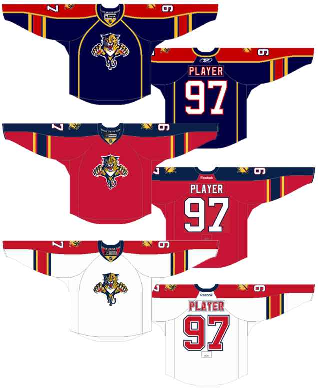
There’s three jerseys grouped into this era because the Panthers enjoyed flipping between red and blue jerseys that are almost identical versions of each other aside from switching around the colours. And there’s an identical white version thrown in too.
These jerseys initially embraced the strange Reebok Edge piping on the front of the jerseys until 2011 (which is also when they had blue and white jerseys), but ditched them from 2011–16, which is also when they switched from the blue to the red jersey.
But the strange piping isn’t what gets them last place on this list. Part of the reason is the colour palette of primary colours that never really worked. (What are primary colours? Take it away, OK Go!)
The primary colours contribute a jersey that’s extremely aggressive on the eyes, not to mention something that evokes primary school more than a fearsome feline predator. What doesn’t help either is that they’re used in almost equal amounts, with the red and yellow fighting for prominence on the blue jerseys, and the blue and yellow on the red jerseys (although less so), and all three on the white jerseys.
But what also gets this jersey last on the list is the attempt to be more sophisticated and refined with a colour palette that just doesn’t allow for it. I appreciate them trying more modern jersey elements (like the front chest piping, the curved shoulder yokes, etc.), but it doesn’t work. If you’re going to use that colour palette, just give’r.
Jersey Recommendation: #9 Weiss. The prime years of his career straddled right over the pre-2011 blue and white chest piping jerseys and the post-2011 red and white no-piping jerseys, and he was the offensive driver for the Panthers during those years. Get it in the piped blues, for posterity’s sake.
3. 1993–2007 Home & Away and Third Jerseys
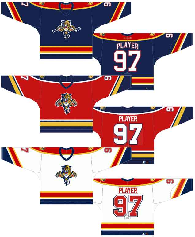
So, what I said about just using the garishly aggressive primary colour palette to its full extent…well, this is the product of that concept.
And again, there’s a red, blue, and white version all mostly identical to each other except for swapping around the colours. It was originally red and white jerseys in 1993, then a blue jersey brought in as an alternate in 1998, then the blue and red switch places and red becomes the third jersey in 2003. Like Lisa to Tommy, this indecision on red or blue is tearing the Panthers brand apart.
Okay…maybe that’s a little overdramatic. Back to the jerseys.
The red/yellow/blue palette is fully embraced here, for better or worse. With equal amount of blue, yellow and red performing an all-out attack for your eyeball’s attention, it’s reminiscent of the Colorado Rockies’ old jerseys that featured the same aggressive, eye-bleeding approach to jersey design. For an newborn expansion team, it’s certainly a surefire way to get stand out and get some attention. Again, for better or worse.
And as ’90s expansion jerseys go, it’s surprising refined.
• More: Top 5: Colourful Hockey Jerseys
Leaving behind the colours, it’s actually a solid mix of modern and classic jersey design, with consistent striping (albeit with waaaay too many stripes in there) along the bottom of the jerseys and the sleeves mixed with the striping on the sleeves being set on an angle. Having the shoulder yokes on all the jerseys actually helps to balance the superfluous amount of sleeves elsewhere, bringing the focus back to the primary logo on the chest.
Hot take time: the original Panthers’ logo was not a good logo at all. The concept was cool, but it was chunkily executed and so overly complicated. Having the panther breaking a hockey stick on their third jerseys made it even worse.
• More: BTLNHL #26: Florida Panthers
Jersey Recommendation: #12 Jokinen. As the franchise leader in points and goals that played for the Panthers mostly during this era, it seems the obvious choice. But, I could easily get behind a #10 Bure or a #55 Jovanovski as well. Get it in the red.
2. 2009–12 Third Jerseys
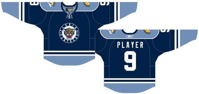
This may be a somewhat controversial ranking for these jerseys, but these are solid jerseys and don’t let anyone tell you otherwise.
Compared to the aggressive primary coloured home-and-away jerseys they were wearing at the time, these take a totally different approach, focusing on the blue to create a two-toned jersey that has a much more classic approach. There’s not enough jerseys that use two tones of the same colour in this league (only St Louis currently does it, unless you want to include Vegas’ black/grey combo), so it’s nice to see a team try it out.
And aside from the alternate logo being used (more on that later), it’s pretty successful. The two tones give a more modern twist on a traditional approach, with the classic double-white stripes on the sleeves and bottoms deftly separating the blues and adding some contrast at the same time.
The additional colours on the front crest and the shoulder patches give them a huge visual impact without overtaking the entire jersey, striking a nice balance and – like any well-planned wedding – adding some punch.
As for the alternate logo/crest, it’s a good concept but like the era’s primary logo, the execution is clunky, without much elegance or style to it. And the inconsistent and über-loose tracking on the text just drives me absolutely nuts.
Jersey Recommendation: #10 Booth. This is a tough choice, as this was a transitional era for the Panthers, with a lot of prominent players moving in and out of south Florida. The picking is slim, and Booth was a dominant player for Florida for a few seasons…so sure, why not.
1. 2016–present Home & Away Jerseys
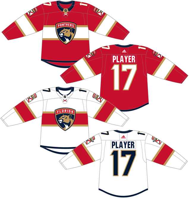
In the summer of 2016 Florida completely re-branded themselves, changing the logo, uniforms, and their philosophy to help the team enter a new phase of their franchise. And the visual side of the re-brand mirrored this with a new and sophisticated approach.
Out with the jumping kitty, in with the noble fearsome panther. Out with the brash colours, in with the deeper, subtler toned palette. Out with the jumbled mess of lines and patterns, in with the minimalist and contemporary approach which still kept its roots in hockey tradition. As visual re-brands go, they did pretty well.
• More: HbD Breakdown: HbD Breakdown: Florida Panthers Logo and Jersey
There’s an intentional military theme to the jersey (as the owner was a military man himself), with the chevron-esque banners on the sleeves, the shielded logo, etc, which creates a nice continuity between everything.
And the use of the Canadiens-esque chest stripe is a great way to borrow someone else’s legacy and try to instill it in your own philosophy. The only problem I see with it is that they didn’t wrap it around to the back of the jersey.
For the colours, they’ve seemed to have finally settled on red as the lead vocalist, with navy blue and a muted bronze/gold as the back-up singers (although I wouldn’t bet against their next third jersey being blue at this point), creating a more refined and balanced (and less punch-you-in-the-face) aesthetic.
It’s simple, modern, sophisticated, has a cohesive theme, and all while being rooted in traditional hockey jersey aesthetics. It pushes the boundaries of hockey in Florida, without breaking them. And it’s the best jersey that the Panthers have ever worn.
Jersey Recommendation: #16 Barkov. There’s a lot of options these days in south Florida, as they have an abundance of good young talent right now. But damn, this Barkov kid is good and possibly the best of the bunch. But, I’d be remiss if I also didn’t recommend a #1 Luongo as well. The guy loves Florida, is über-charismatic, has spent the majority of his career there, and is the best goalie to wear a Panthers jersey. Get it in the whites.