
Uncategorized
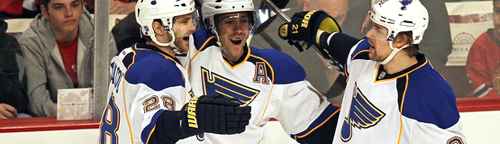
BTLNHL #4: St. Louis Blues
Apr
Of the four remaining logos, three of them have wings featured in them (Detroit, Philadelphia and St. Louis). Two of them have wheels (Boston and Detroit). I didn’t necessarily plan it that way, but I don’t think it’s by accident. You know what wings and wheels have in common? They imply movement, dynamism and speed, all elements that are fundamental to the game of hockey.
In 4th place comes the Blues, a logo that I think is probably the most under-rated in hockey. It’s the Pete Postlethwaite of hockey logos – can always be counted on to give a solid performance but doesn’t get the recognition he deserves. Although, according to IMDB, the most under-rated actor ever is Ed Lauter. I don’t know about that. Pete Postlethwaite is amazing in any movie I see him in. The Town, Inception, The Usual Suspects, he’s always a good choice for a casting director. Although Ed Lauter does get points for being in an actual hockey movie, Youngblood.
But, I digress. The Blues are named after the song “St. Louis Blues” by W. C. Handy from 1914, a blues classic that’s been recorded by people like Louis Armstrong, Ella Fitzgerald and Billie Holiday. It’s a sad song about a woman missing their significant other, so naturally, they decided to name a hockey team after it. For a designer, I don’t imagine coming up with a design concept could have been easy. A music note seems like a natural place to start. And adding the wing works, giving it movement and making it unique.
At the same time, the Blues’ logo is an exercise in the importance of details, as its previous iterations would not comes close to the top of the list like this one. The original Blues logo (from 1967–84) feels off-balance. The angles are too soft, the curves are poorly done, the notch at the top-left corner of the logo is poorly executed, with a blotch of yellow drawing your eye. The 1984-87 logo has this awful domineering font and a typewritten “St. Louis” taking away from a more refined winged note, which is actually quite close to the current one. And they threw in an extra colour just to mess things up. The 1987-98 logo went back closer to the original logo, but even stubbier and rounder. That being said, the overall concept hasn’t changed since the original, and once refined properly, their current logo shows the true potential of the original idea.
There are three relatively small changes between the current logo and the previous one that make a huge difference. One is more obvious, which is dropping the red and simplifying the colour scheme, which works great. The second is the angle that the note’s stem leaves the note’s bulb at the bottom. That small change makes the logo a little more dramatic and gives it more movement. The last change that make this logo great is that the length of the wing is slightly extended, again adding more movement. It’s these small details that, overall, makes the logo more intense, gives it more strength and more movement.
And than there’s the balance of the logo. Have you ever tried balancing on a ball before? It’s not easy, just ask this guy. And that’s what essentially this logo is doing, and what its previous iterations failed at. The balance is achieved by being able to see it both as nothing more than a music note with wings, or as a wing with a base. This sounds kind of weird, but it’s like the faces in the vase effect, albeit without the hidden image trickery. If you focus on the music note, the logo is being pulled to the left. If you focus on the wing, the logo being pulled to the right. It’s just balanced so nicely.
Other things to note (see what I did there?): the raggedness of the wing on the right adds that level of intensity and fight that personifies hockey, which is again something the previous versions of the logo didn’t have as much. And also, it’s executed well because everything lines up so nicely. The left side of the wing’s lines are perfectly aligned with (and at the same angle as) the jagged edge of the second last portion of the wing, and the notch at the top. The angles at the wingtips are also the exact inverse angle, giving the logo more balance overall. The notch at the top is well done too, although perhaps it cuts a little deep, as it almost touches the top yellow line of the wing. Maybe raise that just a tiny bit?
One thing that I’ve generally been against over the course of this countdown is too many outlines, and this one has three: yellow, white and a darker blue. This is one of the few occasions where they all feel necessary and it works. The yellow outline fills the gaps in the lines in the wings. Leaving it at that makes the logo look too flimsy, and as yellow isn’t a strong contrast to a white background, the logo would just kind of fade to nothingness. Getting rid of the white outline, and just having a yellow and blue one is better, but makes the logo too heavy and fighting against the movement in the winged note. Adding the white outline gives it the strength and lightness to compliment the shape. I’m not necessarily crazy about the amount of outlines, but like I said, it works.
So, this logo comes together through its attention to the details – to the angles, the outlines, the balance – that come together better than any other version that existed before. It’s got movement, grace, intensity and strength. It’s totally underrated and deserves to be 4th. To be honest, the gap between 1st and 4th is incredibly small. If I had a couple more White Russians while typing this and feeling a little more bold, it could have even been first.
And yes, that totally random Big Lebowski reference was totally necessary. Totally.
And I actually prefer Black Russians, thanks.
The BTLNTL Countdown Posts
BTLNHL Finals: Boston Bruins v Detroit Red Wings
BTLNHL #3: Philadelphia Flyers
BTLNHL #4: St. Louis Blues
BTLNHL #5: Montreal Canadiens
BTLNHL #6: Pittsburgh Penguins
BTLNHL #7: Chicago Blackhawks
BTLNHL #8: Toronto Maple Leafs
BTLNHL #9: Phoenix Coyotes
BTLNHL #10: Vancouver Canucks
BTLNHL #11: Edmonton Oilers
BTLNHL #12: New York Rangers
BTLNHL #13: Calgary Flames
BTLNHL #14: Buffalo Sabres
BTLNHL #15: Winnipeg Jets
BTLNHL #16: Minnesota Wild
BTLNHL #17: New Jersey Devils
BTLNHL #18: Nashville Predators
BTLNHL #19: Carolina Hurricanes
BTLNHL #20: New York Islanders
BTLNHL #21: Ottawa Senators
BTLNHL #22: Tampa Bay Lightning
BTLNHL #23: Columbus Blue Jackets
BTLNHL #24: Washington Capitals
BTLNHL #25: San Jose Sharks
BTLNHL #26: Florida Panthers
BTLNHL #27: Dallas Stars
BTLNHL #28: Los Angeles Kings
BTLNHL #29: Colorado Avalanche
BTLNHL #30: Anaheim Ducks