
Uncategorized
BTLNHL Vintage: California Golden Seals
Nov

The inaugural edition of the BTLNHL Vintage series looks at a team that most fans over a certain age didn’t know even existed. They have absolutely no legacy to speak of, no history of winning, no success with building a solid fan base, and seemingly no contribution to the NHL despite existing for 9 years, from 1967-1976…except for having some of the worst logos and uniforms to have ever been worn by a hockey player. This post takes a look at the logo they had for their final two seasons, from 1974 to 1976.
I chose this one to start with to help bring awareness to the existence of this team, and after concluding BTLNHL in the spring with some of the best logos to ever grace the game, I felt it might be fun to rip one to shreds. Plus, I like typography, so I picked a typographic logo.
That being said, I have no clue what specific font the Seals used. It’s some weird ’70s-era type (drawing from Bauhaus-era design, which I’ll get to later) that looks like it belongs on a Dirk Diggler movie, and from what I can research, isn’t even an actual font but was specifically created for this logo. If so, the designer who created it was either the nephew of a friend of the cousin of the boyfriend of the aunt of the owner’s daughter who just got out of design school (and would have been extremely cheap), or had no clue what they were doing. Or both.
When creating a type face, one of the first things to keep in mind is that no one letter should stick out dramatically from the rest of the letters. All the letters should be in unison and harmonious, unlike this particular cheerleader. If one letter sticks out more than the rest in any way, your font needs some work.
And this logo has all sorts of continuity problems happening with it. First of all, it’s usual that upper- and lower-case letters look at least kind of like each other, or have similar styles, especially when the lower-case is the exact same shape as the upper-case. But the ‘S’ and ‘s’ in this logo couldn’t look more different. It’s more plausible that Danny DeVito and Arnold Schwarzenegger are from the same family than these two letters.
The capital S is in a style called Bauhaus, which is a German style of design that was taught in the ’20s and ’30s. It preached modernism, functionality and simplicity, and it influenced everything from architecture, to furniture design and, of course, to graphic design and fonts.
While the capital ‘S’ is much more a dramatic example of Bauhaus typography, the argument could be made that the lower-case ‘s’ has Bauhaus roots as well. Perhaps, but that doesn’t mean the two letter belong in together in the same font. They use totally different shapes and given that a lower-case ‘s’ is, 99% of the time with sans serif fonts, a smaller version of the capital ‘S’, it makes no sense to use them together in this way.
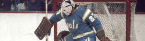
*NOTE: If you look at the image at the top of this page, you can see that the small ‘s’ actually does mimic the capital ‘S’ on their jerseys. Either the logo on the jersey and their “official” logo were different (which I doubt), or I’ve found a small dint in Chris Creamer’s formidable sports logo armor (more likely). Sorry for not noticing it earlier! But, I can tell just from the image that the small ‘s’ still isn’t kerned properly (more on kerning below).*
The rest of the letters fit the same style of the capital ‘S’ well, using the typical Bauhaus aesthetic, but the weights on the letters are all wrong. By weights, I mean the thickness of the letters. For example, if you look at just the ‘e’ and the ‘a’, it’s obvious that the ‘e’ is much thinner than the ‘a’. The black boxes in this image are exactly the same length, and it shows the discrepancy between the weights.
The ‘a’, ‘l’ and ‘s’ are much closer in weight-size, with some minor issues with the ‘s’. Again, the black boxes in this image are the same length, showing the ‘a’ and ‘l’ to be the same weight, with the ‘s’ changing slightly to being thinner in some parts, and thicker in others. But overall, they’re pretty similar.
The ‘S’ though, is in a weight class all its own. Capital letters stand out from the rest of a font only in their height and shape in some cases, not in their girth. It’s pretty terrible.
Also, there’s the issue of kerning, which is the space in-between two letters within a word. This is an example of bad kerning, turning the word ‘savings’ into two words, ‘sa’ and ‘vings’. Be especially careful of tight kerning with words like “flicks” or “final“. In this logo though, the word is getting split in two between the ‘e’ and the ‘a’, partly because of a horribly constructed ‘e’ that, like a lynx, seems to have half a tail. But, it’s also partly because of poor kerning on the letters.
But, when you try to fix the kerning on the letters, you run into another problem, which is the spiky serifs on the yellow outline. I’m assuming that was included to add a little touch of aggressive to the logo that generally wouldn’t exist with Bauhaus-inspired letters. But like the rest of the logo, they’re poorly constructed with some of them being much larger than others. Plus, the capital ‘S’ doesn’t have any spikes at all. I say, if you’re going to go Bauhaus, be true to the style and drop the serifs and kern everything properly. Better.
If you really want to rework the logo though, keeping within the same Bauhaus style and basic concept, how about the logo that shows a little bit of strength and aggressiveness through bolder letters and has a much better constructed font? How about this?
But the colours! Oh, the humanity! Teal and yellow may be okay for a destination wedding, but for a hockey team? Good god no. Again, it’s something straight out of a bad ’70s movie. Thankfully, the team died with the ’70s as well.
So, if this logo were still in use today, where would it fit in on the BTLNHL Countdown? That’s easy. #31. It would easily be the worst logo in the league.