
Uncategorized
HbD Masks: 2018-19 Eastern Conference Preview
The 2018-19 season is fast approaching, and new masks are starting to be unveiled. We’ll be breaking down the newest bucket art from across the league and grading the designs according to style, legibility, composition and branding (if you’ve read the Bucket Bracket Showdowns, you know the drill).
• More: HbD Masks: 2017-18 Eastern Conference Preview
• More: HbD Masks: 2016-17 Eastern Conference Preview
Keep checking back, as we’ll continue to add new masks to the roundup as they roll out before the season gets underway.
Ed. note: The Western Conference bucket preview isn’t ready yet, but it will be sooner so check back for those shortly!
Petr Mrazek, Carolina Hurricanes
Dave Gunnarsson (Daveart)
While the new Hurricanes logo may be a mess on the front of the team’s new third jerseys, it served as artist Dave Gunnarsson‘s inspiration for Petr Mrazek’s new mask. “As his first Canes mask, Petr wanted it to be a classic design which live[s] and breath[es] Canes,” Gunnarsson shared. “We brainstormed together during the summer, and when I saw the new Canes logos, I immediately fell in love with them.”
• More: HbD Interviews: Dave Gunnarsson
Incorporating the hockey stick with tattered hurricane flags on each side and the Carolina “C” in the middle, the end product here is classic Daveart with metallic shimmer, light flares and holograms throughout the design. The logos do fit nicely along each side of the mask, and while the paired-down color palette allows them to stand out in the design, the composition isn’t particularly dynamic or innovative.
A post shared by David Gunnarsson (@daveart) on Sep 1, 2018 at 1:02pm PDT
Overall, this bucket is pretty expected for a logo-centric Daveart design to the point where it almost seems templated (although could you blame him, given the number of masks the guy cranks out a year?). It’s certainly not offensive in any way, but doesn’t blow me away either.
Grade: B
Craig Anderson, Ottawa Senators
Sylvie Marsolais (Sylabrush)
The Senators might be a cluster-you-know-what, but one thing in Ottawa is looking good this season, and that’s Craig Anderson’s gear. Following the netminder’s reveal of his slick black and gold Brian’s pads, artist Sylvie Marsolais gave us a peek at Anderson’s bucket to match.
• More: HbD Interviews: Sylvie Marsolais
A tribute to the late Senators GM Bryan Murray, Marsolais executed the soft portraiture with her usual skillfulness, in high contrast with the bold, rich blacks and sharp lines of the “O” logos surrounding them. The artist’s talent at photo realism airbrushing is really second to none, but her compositional skills also get their chance to shine in this mask. The design is perfectly balanced, creating depth and dimension with the deep blacks and lighter grays and red in the foreground. The letters in “Andy” across the chin really jump forward with the shadow and red halo effects, as do the logos with the light gray borders against the red and black backdrop.
The back plate includes a few extra personal touches, the names of the goaltender’s children along with a golden N and the words “live for the now” for his wife Nicholle, who joined the league’s Hockey Fights Cancer initiative last season and courageously beat the disease.
Overall, this is a beautiful tribute to Murray and Nicholle and a standout mask design. Regardless of what the Sens’ season brings, at least Anderson will be looking good during it.
Grade: A+
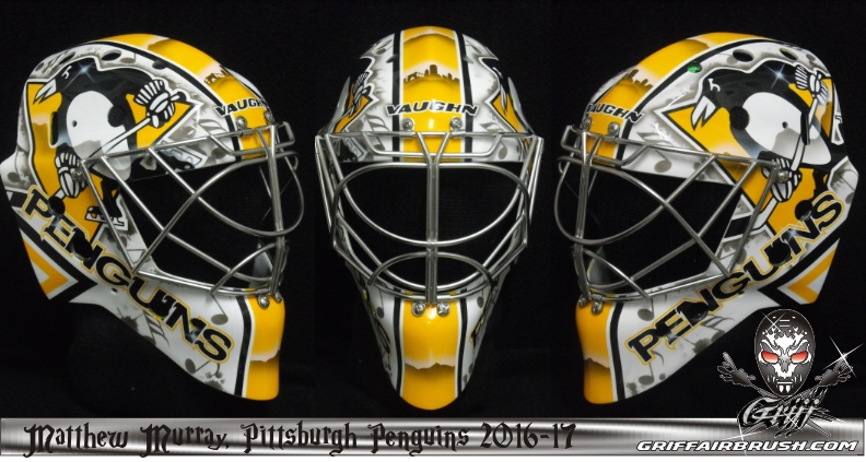
Matt Murray, Pittsburgh Penguins
Stephane Bergeron (Griff Airbrush)
The robo-penguin is back thanks to Matt Murray and his long-time artist Stephane Bergeron. The artist’s interpretation of the minimalist 90’s logo appears on both sides of Murray’s new bucket, sparking speculation that the Pens could be bringing back the look for their new third jersey.
Branding from before Murray’s birth aside, this design is very consistent with what we’ve seen from the goaltender in past seasons. “Murray doesn’t like paint jobs with a lot of details,” the artist shared on his Facebook page, “so he asked for something simple like his previous masks.”
• More: The 2017 Bucket Bracket Showdown (The Finals)
The bold, graphic logos take center stage in this design, framing the gold stripe down the center that contains a silhouette of the Pittsburgh skyline. The negative space is filled with screened logos scattered throughout and a large Penguins word mark in metallic foil down each side.
The consistency and simplicity in this design don’t leave much for us to pick apart, however the basic composition and lack of innovation or pizazz also prevent it from earning higher marks.
Grade: B
Tristan Jarry, Pittsburgh Penguins
Jason Bartziokas
Murray’s backup also has a new mask courtesy of artist Jay Bartziokas. Unlike his teammate who went the more conservative route with his bucket, Jarry went full on cartoony again with his now signature Tom and Jerry motif and bubble lettering around the chin. This seems to be what Jarry gravitates towards, having included the Looney Tunes characters on his bucket since his days with the Edmonton Oil Kings.
There’s not a whole lot you can do as an artist when a client insists on having a Looney Tunes-themed mask year after year, so design-wise, this is a bit cringeworthy, but there’s no denying Bartziokas’ talent in executing this cleanly. There’s some nice texture detail in the Penguin logo on top, but otherwise, the concept of this mask just lacks the sophistication (or irony) to get higher marks.
Grade: C-
Andrei Vasilevskiy, Tampa Bay Lightning
Sylvie Marsolais (Sylabrush)
After winning the NHL’s fan favorite mask vote at the end of the 2017-18 season, Vasilevskiy and artist Sylvie Marsolais are back with another color-changing Bolts bucket. With a very few changes from last year’s design, Marsolais stuck with the winning composition but incorporated the Russian coat of arms tucked behind the palm trees on each side.
A post shared by Sylvie Marsolais (@sylabrush) on Jul 30, 2018 at 6:19am PDT
Aside from the artist’s always flawless execution, the standout element once again is her use of the subzero paint, which reveals the miniature Lightning logos stamped on the sides of the mask and the blue coat of arms on the chin.
Many goaltenders with superstitions prefer to keep their mask designs the same year after year, so it’s hard to fault an artist for delivering on their client’s ask, but while this mask is pretty stellar, that we’ve seen it before is the only thing keeping me from awarding it a higher grade.
Grade: A-

Louis Domingue, Tampa Bay Lightning
Dave Gunnarsson (Daveart)
Sporting a different kind of tribute mask from Craig Anderson, Louis Domingue opted to use his new bucket to honor his team’s past. Painted by Dave Gunnarsson, the design incorporates portraiture of Tampa Bay legends and Domingue’s family with imagery of the city’s history.
The right side of the mask is all about Martin St. Louis with two illustrations of the former Bolts captain and the Hall of Famer’s number 26. The opposite side honors Tampa Bay’s other retired number and former captain, Vincent Lecavalier, in the same fashion.
A post shared by Louis Domingue (@louisdomingue) on Aug 9, 2018 at 4:27pm PDT
Using the thick blue striping to frame the various sections of the mask, Gunnarsson completed the design with a large sketch illustration of Zeus on top and cartoon renderings of the goaltender’s children.
With Gunnarsson’s typically cluttered style, this mask is actually composed quite nicely to let each area of the design really shine. The sketch drawings give a dynamic style to an otherwise simple concept, and the end result is top notch.
Grade: B+