
Uncategorized
HbyD Breakdown: NWHL

May
Formed in 2015, the National Women’s Hockey League (NWHL), has weathered slow growth, limited league awareness and a season-hobbling pandemic in its first half-decade. But after crowning its 5th league champion last month, and scoring an NBCSN airing of their playoff games, it’s time to take a closer look at North America’s premier women’s professional hockey league and their team identities.
WT…NWHL?
Okay, I hesitate to start out on a negative note in this review, but I have to admit that the first five diehard hockey fans that I quizzed about the National Women’s Hockey League had never heard of it. Myself, I had only become aware of it within the last few months, when I saw a quick video promo whose origin has escaped me. But it piqued my interest enough to take a closer look. And I’m glad I did.
It also prompted me to research the league to get a better sense of its birth, its teams and players. The biggest surprise I got during the process was to discover that the league has been around for over half a decade. And that paints a bullseye on the league’s biggest challenge: awareness, plain and simple.
However, in searching for recent coverage of the league, it looks like the future is trending brighter. With NBCSN airing their three 2021 NWHL playoff games in March, I was actually able to watch a couple of the matchups to get a real sense of the style and quality of play. And, of course, a taste of the team identities on display (at least for the three teams who were featured in the games I saw).
A Short History of the League
The inaugural season of the National Women’s Hockey League spanned the fall and winter of 2015–16. The league’s “Founding Four” teams were located in New York, Boston, Buffalo and Connecticut, which were deemed hotspots for young girls playing ice hockey. The team names were: the New York Riveters (changed to the current Metropolitan Riveters in 2017), the Boston Pride, the Buffalo Beauts and the Connecticut Whale.
For the 2018–19 season, a fifth team was added, achieving a larger geographic scope, when the Minnesota Whitecaps joined the league. The first Canadian team joined the league when the Toronto 6 began play for the most recent (2020-21) season.
There’s much more to the story, including two Covid-shortened seasons, salary struggles, a player strike, brief NHL-affiliations and a structural change to mimic an individually-owned team structure similar to the National Hockey League. (The original four teams were league-owned.) But I’ll leave that to your future Googling pleasure.
Starting with the Founding Four teams, here are the team logo identities and some examples of current jerseys. A more extensive review would be required to include a critique of the teams’ various home, away and third jerseys, so for this post, we’ll just focus on the team logos, colors and basic on-ice appeal.
Boston Pride
Pride was the name chosen for the Boston team, with a lion as the natural mascot. The primary logo design is a beautifully-sculpted female lion head (no mane, of course) that features a strong black and gold color palette akin to the NHL Bruins. (Does anybody else love it when different pro sports teams in the same city share the same colors?)
The lion head is used both by itself and within a circle emblem that includes the “Boston” type and two small pawprints. In a slick move, the top of the lion’s head coincides exactly with the top edge of the badge circle. Overall, the design is simply crafted (paying attention Chicago Bears?), aggressive, and just plain lovely. Aside from the tiny footprints, which are a possible throwaway, it’s definitely a great team identity.
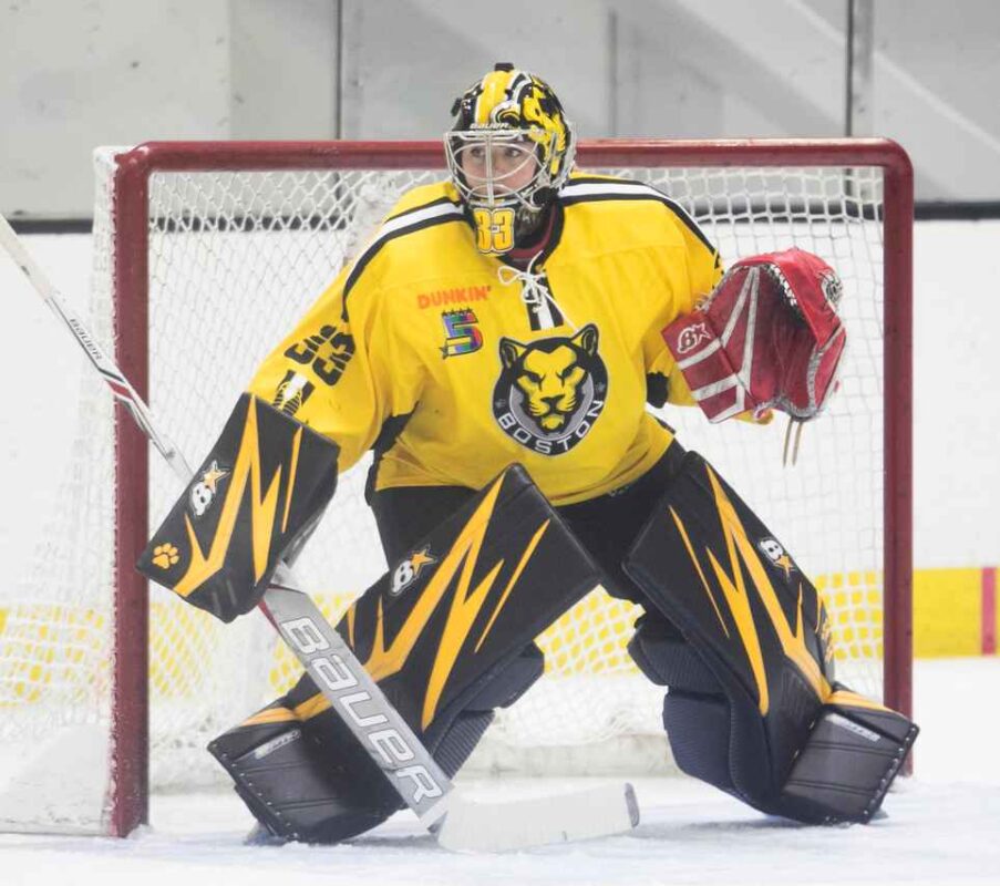

For their on-ice identity, the Pride has had a few different jersey iterations, but their basic palette (black-and-gold bold), is instantly recognizable, and creates a strong vibrant team brand presence.
Grade: A
Buffalo Beauts
It took some digging to try and understand reasoning behind the selection of Beauts as the Buffalo team name. Aside from the somewhat sexist nod to the physical appearance of the players (patronizing?), I could find absolutely no connection between the name and the mascot. So basically, it is what it is.
A better tie-in arrives upon closer inspection of the primary team logo, which features a buffalo in profile. (I know, it’s technically a bison, but bringing up that faulty cornerstone could wreak utter destruction in Orchard Park, so we won’t go there). The bison, er buffalo, is ringed with seven stars and a single crown. (Does anybody else love it when different pro sports teams in the same city share the same mascot?)
Here again, some research was required for a deeper understanding. Since Buffalo is nicknamed the “Queen City,” the crown is a perfect fit (sorry, bad pun). But the seven stars had me scratching my head a little (and maybe they still do). The only tie-in I could find is a bit of a stretch, but Terry Pegula, the team owner, also owns a stake on the NHL Sabres. He has great respect for their well-loved team superstar Rick (Rico) Martin who tragically passed away in 2011, and who happened to wear the number 7. His number was retired in Martin’s honor, so perhaps that is the symbolism of the seven stars? I could be wrong, but it’s my best guess. Feel free to let us know if you have a better explanation!
In any case, the design of the buffalo, and the stars and crown create a nice series of logo elements that are comfortably placed above the word “Beauts.” The font is a sport-style script and works well, aside from an inconsistent spacing between the “B” and “e” letterforms (don’t get me started on the lack of kerning awareness prevalent today).


The Beauts color palette is a series of vibrant blues to contrast the black and white logo. Their primary uniforms are striking and easily identifiable. And the use of black and blue overall makes for a pretty cool on-ice visual identity (sorry, the puns keep sneaking out of me whether I like it or not).
Grade: B+
Connecticut Whale
Aside from the obvious and positive copying of the iconic NHL Hartford team name and color scheme, the team decided to embrace the name Whale, in that enigmatic singular team naming phenomenon. The singular use for names like Lightning, Wild, Avalanche, Kraken, typically works best when the plural of the name is either non-existent or cumbersome. Whale is neither, so it adds a trendy element to the identity that is a bit questionable.
The Whale logo disappoints on a few levels. First, the large “C” is reminiscent of the Chicago Bears/Cubs lettermark, with little design nuance. Second, the small whale, whose gently smiling mouth is created in the shape of an itty-bity hockey stick (visible only in very large applications of the logo) is plopped inside the “C” with no attempt at cohesion. The overall tone of the identity is more placid than fierce, which is a shame considering the potential for a much more memorable and aggressive design.

The Whales’ uniform (excuse me, the Whale uniform), is nicely designed, especially in the away color version. Here the whale is shown in white against the green jersey. Whether this is an attempt to emulate Melville’s White Whale is probably a longshot, but it’s another potential identity element that could have been explored. Overall ice presence (although I didn’t have a chance to watch any of their games) seems strong and saves what could otherwise have been failing marks.
Grade: C
Metropolitan Riveters
The New York team name is a great pick, giving recognition to the famous WWII-era “Rosie the Riveter” mascot. For me, it also conjures up visions of steel-girdered skyscrapers and their death-defying, tightrope-walking construction workers. Grit and toughness personified.
The Riveters logo is a bit less impressive, however. It mimics the classic Rosie flex-pose complete with hair scarf and clenched first, but the style of the design is a bit plain and uninspiring. The Riveters type is constructed to appear as a series of riveted steel panels, but the detailing is way too subtle, and the size and placement of the rivets is questionable. A nice concept poorly executed (which is fairly common in branding for smaller leagues).
The colors are patriotic red and blue with a cream color used for Rosie’s arm and face. Overall, it’s a simple adaptation of the easily recognizable American home front hero, but it doesn’t quite capture or enhance the potential of Rosie as their mascot.

The Riveters on-ice identity is strong (again more so in the away version), with navy blue and red as the predominant color theme, which allows Rosie’s blue lighter shirt to pop nicely. The rivet pattern evident is also a nice and logical element to include.
Grade: B–
Minnesota Whitecaps
The first NWHL expansion franchise chose a unique team name in Whitecaps. I really like the choice, as it brings to mind the choppy frigid waters of Lake Superior in winter, which is definitely an intimidating mascot.
The logo is a dynamic wave shape that curls into a circle badge. The wave design successfully accomplishes representing all three of the team’s letterforms– “W” “C” and even “M” in one smooth flowing swoosh. The colors are a strong blue and black with light grey highlights which give shadow and dimension to the wave elements. The state name is highlighted in the lower part of the circle, but is a bit small and suffers with readability unless the logo is used fairly large.
But here’s the strange part… even though the design is solid and creative, something about it feels like an early design draft. If the concept had been pushed a bit more, I think the end result could have been even more dramatic. Perhaps the negative space inside the circle could have been reduced in its prominence, creating less of a “black hole” and allowing the whitecaps to jump out in a more aggressive fashion.

The Whitecaps uniform presents a great on-ice look for the players. The home whites, especially work well to showcase the logo, and the blue accents make for a strong visual effect.
Grade: B
Toronto 6
The most-recent addition to the league, the Toronto team introduced a unique and particularly strong team name in the Toronto Six. The “Six” was chosen because it is one of the city’s nicknames, representing its original six municipalities, and is a natural reference to the number of the team’s skaters on the ice at one time. The rumor that it was originally inspired by Seinfeld’s George Costanza is currently unconfirmed, but the name does have a certain amount of cache.
The T6 logo is a bold, clean design, much more in line with contemporary sports logo design trends. A large “6” is crossed at its top edge, also creating a “T”. In the center of the 6 is a gold maple leaf which is beautifully crafted. The team’s official unveiling announcement mentioned that the leaf has a notch in it which creates a hockey stick image, but no degree of squinting, head-tilting or zooming in enabled me to see a hockey stick. Anywhere. If it’s there, it’s a pretty big stretch in my book. (Am I missing something?)
The gold, black and red color palette invokes the NHL Ottawa Senators, but is validated by Canada’s traditional red, and the area’s Golden Horseshoe region.
Although the logo is strong and simple, I was sidetracked by a “can’t unsee” experience that has me unable to see anything but a speeding unicycle (something I’m sure was not intended by the designer). And unfortunately, it suffers from a slight case of MOS (multiple outline syndrome) which is another common sports branding affliction. Its “white-black-white-gold series of outline borders could be simplified for a stronger final design. (That’s being picky, I know but KISS still applies in these “more is better” times we flounder through).
The Toronto Six uniforms are striking, and their black jerseys work especially well in highlighting the logo, even in all its outlined glory. Overall, their on-ice visual presence is still pretty strong.
Grade: B+
Final Verdict
As women’s hockey and the NWHL continue to grow and gain more prominence in the typically male-dominated hockey industry, the visual identity of their teams will strive to achieve the same level of excellence as well. And although it has a decent start, there is also room for maturity and growth, as is common for new leagues. I equate their current team identities on a level with the old WHA (World Hockey Association) team logos–lots of great concepts, but also lots of room for improvement.
With Covid still playing havoc with pro sports, I’m hoping the 2021-22 NWHL will be able to return with its best season yet. As the league evolves and its awareness among hockey fans hopefully increases, I look forward to additional expansion franchises—Montreal is most likely next in line—but especially in the western part of the continent. The Colorado 14ers? The Vancouver Orcas? Let’s hope!