
Uncategorized
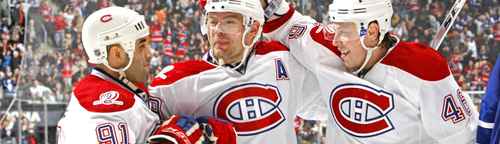
BTLNHL #5: Montreal Canadiens
Apr
If there is one thing I’d like to do is find a DeLorean hidden behind a large billboard for a future subdivision just outside of town, go back to, say, the second decade of the 20th-century and talk to whoever was behind this logo, which was created for the Canadian Athletic Club in 1913. And since then, the logo and jersey have obviously changed, but the original concept hasn’t changed since 1917.
Whoever created that initial logo and jersey in 1913 started what became the most iconic logo and jersey in all of sports. Only the Yankee’s pinstripes even comes close. The jersey was made into a children’s book story, which was made into an animated short film, and an excerpt of the book was put on a special edition of the Canadian five dollar bill. This thing is holy.
But this post is not about the jersey, it’s about the logo. And the basic concept of the logo that was created in 1913 has gone through surprisingly many revisions. There was the most major one in 1917 when the ‘A’ was switched with an ‘H’ in the middle of the logo because of the team being incorporated as ‘Le club de Hockey Canadien’. Yes, the ‘H’ stands for hockey, not Habitants, or Habs, which became the team’s nickname. Don’t let anyone tell you otherwise.
Since 1917, the logo’s gone through six revisions and refinements, but each time the same elements remained, an ‘H’ within an elongated ‘C’ with the colours of blue, red and white. There’s also been the growth at the top-right corner of the ‘C’ which was briefly removed from 1919-1921, but returned in 1922. But by 1925, when the logo was revised again, it really has been relatively untouched, just refined. This kind of longevity for a logo is the stuff that makes designers like me salivate. It’s iconic. It’s timeless. It will absolutely never change, unless the guy behind this Twitter account wants to become a little more active on it.
And nor should it ever change. In fact, with any of the remaining five logos, I wouldn’t necessarily change in any major way, and barely even in any minor way. They’re excellent logos, executed exquisitely. There’s as many ‘ex’-es in that sentence as there is in this new movie.
And this logo has raised the Stanley Cup 24 times, more than any other team in the league by a fair amount. To separate the logo from its historical prominence is difficult.
So, why do the Canadiens come in at 5th? The reason their logo is better than 25 other teams is because the logo incorporates the elements of hockey (strength, intensity and gracefulness) in an incredibly refined way. The strength comes from the thickness of the red C, and especially from the growth on the top-right corner of the C. If you remove the growth, suddenly the logo becomes flimsy and loses its strength. I’m not sure if this was the initial purpose of the growth, or if not, what its purpose actually is, but it works. Unlike Tobias’ hair plugs, this growth makes its host stronger.
The other thing the growth does is give it some character too. The logo is basically nothing more than just a C and an H, and while there’s other elements that also contribute to the logo’s character, that little growth is the biggest contributor.
The intensity of the logo comes from partly the red C as well, but here it’s the thickness of the white and blue outlines, and how they form the H. The use of the negative space (the white outline) to flow around the C and then form the H gives the logo a little bit of lightness, but it also increases the contrast overall, making it more aggressive and vibrant. If you remove the white outline (and rework the H to accommodate), the logo loses all its punch. And having the white and blue lines equal in width increases that intensity, but it also helps balance the logo and keep that lightness ingrained. If you make the blue outline thicker than the white outline, the whole logo becomes really bogged down.
The gracefulness of the logo comes from the shape of the C. The slow curve around the entire C gives the logo a sense of elegance. Think about the other Cs in sports logos: the Canucks, the Cincinnati Reds, the Chicago Cubs, the LA Clippers and the Chicago Bears, for example. Each different in their own way, and I don’t think any of them are as nicely formed as the Habs’ C. Part of that is because the simplicity and grace of the curve is complimented by the strength and intensity of the other elements. It creates a really great balance. Maybe even better balance than this guy.
And the colours are a great choice as it’s connected to Montreal and Quebec, being the same colours as on the French flag. The ‘blue, blanc et rouge’ is now ingrained in the cultural vernacular of Quebec, as the Canadiens were originally the team of the Montreal francophones, while the Montreal Maroons were the team of the Montreal anglophones.
In short, this is an awesome logo. So why are there 4 ahead of it? There’s one more instrumental element of hockey that I’ve constantly talked about that the Habs’ logo doesn’t exhibit: speed, or more specifically, movement. This logo is more on the stoic side and doesn’t have any elements that imply any sort of movement. It’s solid, strong, intense and graceful, but doesn’t have that sense of dynamism, which is something the remaining 4 logos have in spades. Hockey is one of the fastest team sports in the world that’s powered by the human body (which excludes anything involving a car) and the most successful logos are those that incorporate this.
This is not taking away from the Habs’ logo, because it’s great. In fact, its placement makes it the best Canadian-based logo, which for a country where hockey is religion, is no small feat.
The BTLNTL Countdown Posts
BTLNHL Finals: Boston Bruins v Detroit Red Wings
BTLNHL #3: Philadelphia Flyers
BTLNHL #4: St. Louis Blues
BTLNHL #5: Montreal Canadiens
BTLNHL #6: Pittsburgh Penguins
BTLNHL #7: Chicago Blackhawks
BTLNHL #8: Toronto Maple Leafs
BTLNHL #9: Phoenix Coyotes
BTLNHL #10: Vancouver Canucks
BTLNHL #11: Edmonton Oilers
BTLNHL #12: New York Rangers
BTLNHL #13: Calgary Flames
BTLNHL #14: Buffalo Sabres
BTLNHL #15: Winnipeg Jets
BTLNHL #16: Minnesota Wild
BTLNHL #17: New Jersey Devils
BTLNHL #18: Nashville Predators
BTLNHL #19: Carolina Hurricanes
BTLNHL #20: New York Islanders
BTLNHL #21: Ottawa Senators
BTLNHL #22: Tampa Bay Lightning
BTLNHL #23: Columbus Blue Jackets
BTLNHL #24: Washington Capitals
BTLNHL #25: San Jose Sharks
BTLNHL #26: Florida Panthers
BTLNHL #27: Dallas Stars
BTLNHL #28: Los Angeles Kings
BTLNHL #29: Colorado Avalanche
BTLNHL #30: Anaheim Ducks