
Uncategorized
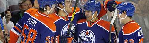
BTLNHL #11: Edmonton Oilers
Feb
In 11th place, we’re heading back to the province of Alberta. But unlike the 13th placed Flames, in which I spilled my heart and allegiances to the Canucks as a preface to the reasoning of their placing, I don’t hate the Oilers. I hated them in the ’80s, but that was back when the Canucks were a punching bag and the Oilers were, well, arguably the greatest team in the NHL for almost the entire decade. I don’t hold that against them anymore, and it helps that they dislike the Flames as well (an enemy of my enemy is my friend). It also helps that they’ve only faced each other twice in the playoffs, and the last time was 20 years ago, in 1992.
But this isn’t about the Canucks, it’s about the Oilers. As I mentioned in the Flames entry, the logos placed between 9th and 13th are all incredibly close and I had a hard time placing them. For each logo, there are things that are great and work incredibly well. But there’s also things that I think could be improved. And the Oilers logo is no exception to that.
First off, I love the simplicity of the logo. The concept itself could use a little bit of work as there’s not much to it, but the logo itself is easy on the eyes and looks classy on a jersey. A circle, an oil drop, and “Oilers”. That’s it. You could make the argument that an oil drop and “Oilers” is redundant, but “Edmonton” would be a pretty tight fit in the allotted space. Also, without that, people might not make the connection that the drop is actually meant to be oil (if they don’t know the name of the team). The Edmonton Molten Magma or Edmonton McDonald’s Orange Drink just doesn’t have the same ring to it.
Also, whoever designed the logo knew their colour wheel. Orange and blue are complimentary colours, meaning that they are considered a perfect accent to each other when one is used as a highlight or feature beside the other. And the balance between the colours in this logo are perfect, as the orange has enough of it featured that it perfectly compliments the blue, adding a splash of intensity but not dominating the whole thing. Other instances of a great usage of complimentary colours in sports are the NBA’s LA Lakers (of which Kobe’s a big fan apparently) the MLB’s NY Mets and the NFL’s Baltimore Ravens (although the logo could use some work, the colours balance nicely). Teams that don’t use it as well: the Wild (too much red, and finding the balance for these ones without making it look like Christmas is difficult), the Islanders and the NBA’s NY Knicks (both the blue and orange are competing with each other).
It’s also a good alternative to using a colour that would be more precise to the actually the colour of oil, either pure unrefined, corn, safflower or Olyve. The orange is close enough that it makes sense to use, and beautiful enough that it works well. The blue is also a little bit darker than their original logo, and for me, I like it better. Adds a little bit more strength to it without become too dark.
The treatment of the oil drop is nice too. It’s got a great shape that mimics the circle around the whole logo and breaking the blue outline to wrap around the oil drop adds a bit more interest, movement and dimension to the logo than what it might look like otherwise.
So, the only thing left is the text. Some of you might think I focus too much on the text of these logos, but I promise I try to tear everything apart as equally as I can. If you feature text prominently in your logo (or if that’s all your logo is), it’s fair game.
And in this case, the text drags down the logo a bit. There’s a fine line between quirky and eccentric and weird. This is quirky and eccentric. This is weird. And the Oilers logo is just barely teetering in-between. First of all, you’ve got the typical Western font. Yeehaw! Except Edmonton is less the cowboy, frontier-esque city than its southern neighbour. True, when the Oilers came into the NHL the Calgary Flames didn’t exist yet, but Calgary has already established itself as a cowboy hockey city, albeit with a horrendous logo from the WHA. The ‘Wanted’ font, on its own, I could handle just fine, as it still makes a certain amount of sense being located in Alberta, but then they give each letter 10″ platform shoes to bring them down to the bottom of the circle. Then, they’re inexplicably gradually curved at the bottom. To mimic the curve of the oil drop? Not sure. And why do it gradually? The “O” has the largest survey on it, while the “S” doesn’t curve at all. It seems to be an attempt at creating movement and depth when the rest of the logo doesn’t have any, so it’s inconsistent. Would it be so bad to not have those curves at all? To me, it gives it more strength to just have straight lines.
But, as mentioned, aside from the relatively minor text issues, this is a great logo with a history and a legacy to it. I think it’s safely say that, aside from maybe some minor adjustments, this logo will remain as is for decades to come. Especially after that Todd McFarlane debacle.
The BTLNTL Countdown Posts
BTLNHL Finals: Boston Bruins v Detroit Red Wings
BTLNHL #3: Philadelphia Flyers
BTLNHL #4: St. Louis Blues
BTLNHL #5: Montreal Canadiens
BTLNHL #6: Pittsburgh Penguins
BTLNHL #7: Chicago Blackhawks
BTLNHL #8: Toronto Maple Leafs
BTLNHL #9: Phoenix Coyotes
BTLNHL #10: Vancouver Canucks
BTLNHL #11: Edmonton Oilers
BTLNHL #12: New York Rangers
BTLNHL #13: Calgary Flames
BTLNHL #14: Buffalo Sabres
BTLNHL #15: Winnipeg Jets
BTLNHL #16: Minnesota Wild
BTLNHL #17: New Jersey Devils
BTLNHL #18: Nashville Predators
BTLNHL #19: Carolina Hurricanes
BTLNHL #20: New York Islanders
BTLNHL #21: Ottawa Senators
BTLNHL #22: Tampa Bay Lightning
BTLNHL #23: Columbus Blue Jackets
BTLNHL #24: Washington Capitals
BTLNHL #25: San Jose Sharks
BTLNHL #26: Florida Panthers
BTLNHL #27: Dallas Stars
BTLNHL #28: Los Angeles Kings
BTLNHL #29: Colorado Avalanche
BTLNHL #30: Anaheim Ducks