Uncategorized
Top 5: Toronto Maple Leafs Logo Concepts
Dec
In this edition of Top 5 Logo Concepts, we scoured the internet for the best Toronto Maple Leafs logo concepts. It’s no easy feat to find designers willing to re-brand one of the most classic and recognizable teams in the NHL! With the recent news of Toronto getting a logo and jersey update for the upcoming 2016-17 season, it got us thinking, what makes a successful Leafs logo concept? Let’s be realistic, there’s going to be a freakin’ maple leaf on it. Right in the middle. It’s not going away. Ever. It’s also going to be blue and white. So within those boundaries, where is Toronto going to take this? Well these designers have a few ideas for us…
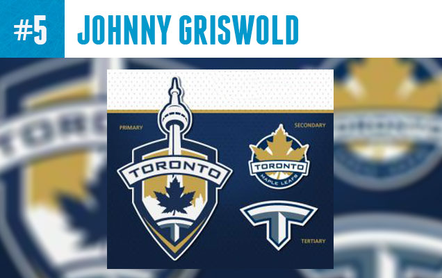
Johnny Griswold :: Concept Source Page
Johnny Griswold, the author of the now defunct hockey design blog “Puckdrawn”, came up with a bold Leafs concept that still has the leaf front and center, but it’s real focus is on the city of Toronto, working the CN tower into the logo and reducing the wordmark to just ‘Toronto’. The logo is framed with a shield and anchored by a letter ‘T’ at the bottom. The real shocker here is the inclusion of a third color into the Leafs sacred blue and white branding, a shiny gold addition that is a far cry from the Leafs current look, but maybe an all-new design is exactly what this organization needs…just don’t tell them about the Seattle Sounderslogo.
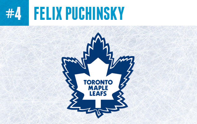
Felix Puchinsky
The modern leaf silhouette cut out from the 1963-67 leaf seems like a lazy solution at first glance, but actually it’s really good. I mean, why not? I couldn’t find much information on this designer, but he has tapped into a solution that maybe the pros haven’t considered: a literal fusion of the old and new leafs that represent the franchise’s history equally. The team hasn’t won any cups with the modern leaf, so why does it deserve more jersey time than the old leaf (sorry Leafs fans)? Is this concept too complicated for the Leafs branding? Maybe, but the NHL certainly has much more complicated logos than this one.
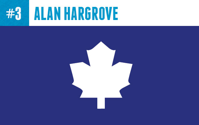
Alan Hargrove :: Dribbble :: Concept Source Page
Here’s a rather obvious direction that really falls in line with modern minimalist design aesthetic: Just take the words off the leaf and BOOM, new logo. Designer Alan Hargrove, actually did an entire NHL series of minimalist logos that can be found here and his Maple Leaf seems to work the best out of all of them. The Maple Leafs organization has hinted at taking this direction as well, as they are currently using a word-less leaf on Twitter (@mapleleafs) and various other social media.
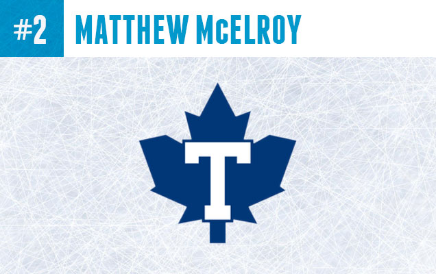
Matthew McElroy :: Dribbble :: Concept Source Page
This concept combines Toronto’s modern leaf with the ‘T’ logo of the Maple Leafs 1917-1919 predecessors, the TorontoArenas. This is a smart concept that simplifies the wordmark on the leaf without completely getting rid of it. The secondary wordmark that designer, Matthew McElroy also included is really interesting and lets the team’s name take center stage while the maple leaf is much smaller and playing more of a flair role. Though, their strict branding may never go for such a concept, I can’t help but think that this would look great on a jersey.
Related Reading: Top 5: Anaheim Ducks Concepts
Related Reading: Top 5: New York Islanders Concepts
Related Reading: Top 5: Tampa Bay Lightning Concepts
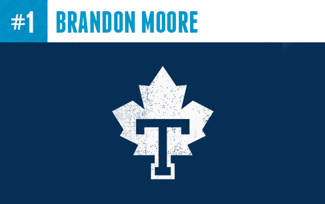
Brandon Moore :: Dribbble :: Concept Source Page
Brandon Moore’s Leafs logo, like the previous concept, is reminiscent of the Toronto Arenas. We all know that hockey fans, maybe more than any other sports fan, love theirnostalgia and this one fits right in with the best of them, while still feeling modern and fresh. Also, the base of the letter ‘T’ fits in perfectly as the stem of the leaf, which is a very nice design detail, and a great solution for how to put the ‘T’ and the leaf together. It has earned this concept the top spot for this Top 5 edition.