
Uncategorized
HbD Breakdown: Vegas Golden Knights (Name and Wordmark)

Dec
Expansion doesn’t happen very often anymore in the NHL. The last one was in 2000 when the Blue Jackets and Wild entered the league. Even franchise re-locations don’t happen much anymore, with the last one being the Jets from 5 years ago. This is the first time in the history of HbD’s existence that we get to discuss a brand new franchise, a new name, a new logo, a new secondary logo, a new everything.
Buckle up kids, this is gonna be a ride. So much of a ride, that we’ll be breaking this into two parts. First, the name itself and the word mark. Second, the primary and alternate logo (coming soon!).
Laying the Foundation
But the importance of an exercise like this for the new Las Vegas franchise can’t be overstated. They are, in essence, laying down the foundation for what they’re hoping will have the same passion and reverence that’s paid to brands like the Canadiens and the Blackhawks. The name, the logo, the visual brand, should outlast everybody currently involved with the team. If there is going to be a bi-centennial for the NHL, the Las Vegas team hopes to be there, with the same name, logo and brand intact – or at the very least, the same general concept.
And if that’s not the goal of the organization, then you’re building on a bad foundation from the very beginning. Whether it’s a lack of understand or caring about this process, or somebody’s ego at play, or a simple desire to cash in on a trend and sell a bunch of jerseys, it’s just hurting the franchise in the long run.
As a designer, I know we all go through this process all the time when building corporate identities. You want something iconic, lasting, and integral to the organization. There’s always roadblocks and hurdles to overcome, but the final product should always be worth it in the end.
TL DR: This shit’s important. You need to get it right at the beginning.
The Name: Vegas Golden Knights
The First Part
Vegas. Not Las Vegas. Vegas.

I understand the reasoning behind this decision (nobody calls is LAS Vegas, blah, blah, blah)…but that’s the goddamn name of the city. Officially, it’s not the LA Kings, it’s the Los Angeles Kings. It’s not the Philly Flyers, it’s the Philadelphia Flyers. And it’s not the Angeles Kings, Jose Sharks, Louis Blues, York Islanders, Jersey Devils or York Rangers neither.
Using slang or a colloquialism for a city name isn’t done by any team in any professional sport in North America. If they called themselves “Las Vegas”, chances are people would just say “Vegas” anyway. People do that all the time. The Senators are more commonly called the Sens. The Canadiens, the Habs. The Predators, the Preds. The Captials, the Caps. Etc, etc, etc.
While that sounds like sound reasoning to just drop the “Las”, it’s not. It turns the official team name into a gimmick, a slang term to fit in with the crowd, to seem cool. It’s basically a marketing ploy and not a way to build a solid foundation for a team’s identity. Striving to be a professional first-class organization means you don’t do stuff like this.
Dropping the Las in Las Vegas – the official name of your own goddamn city – just isn’t professional.
But It’s Too Long!
The other reason given for dropping the “Las” was because it created a four-word team name, which was deemed too long. We’ll deal with the “Golden” later, but I call bullshit regardless.
Las-Ve-gas-Gold-en-Knights. Six syllables. Hey, guess what…Mon-tre-al-Can-a-di-ens. Seven syllables. Phil-a-del-phi-a-Fly-ers. Also seven. Arizona Coyotes, Carolina Hurricanes, Colorado Avalanche…all seven syllables. The argument that four words is too long is ridiculous because it’s still shorter in pronunciation than those teams. And there’s also more teams with six syllables. “Las Vegas Golden Knights” is still well within acceptable range and the word count argument is garbage.
For example, if the NHL gave a franchise to the town of Webster, MA, and they decided to name their team after the nearby lake, they’d be the Webster Chargoggagoggmanchauggagoggchaubunagungamauggs (seriously). Just two words, so totally not too long, right?
Again, I call bullshit on that argument.

The Second Part
There had to have been better options than this (there were). There are some bad team names in the league, but Golden Knights – on its own – isn’t necessarily one of them. But it’s not great either, and I would pin it on the city they’re going to play in. A golden knight in Las Vegas makes me think of a bad statue at the entrance of cheezy medieval-themed casino. Hey, and look, this is outside the Excalibur Casino in Vegas. And this is Excalibur itself. So, maybe something kitschy like that works in Vegas, because Vegas is kitschy af.
Using a colour as an adjective isn’t anything new in pro sports (Red Wings, Blue Jackets, Blackhawks, Red Sox, White Sox, etc), and there’s an historical charm that goes along with it. “Golden” is less often used, but it works in the right circumstances. There’s the Golden Bears of both the Universities of Alberta and California (Berkeley), or the Wilfrid Laurier Golden Hawks. And of course, the NHL used to have the California Golden Seals all those years ago. There’s also the Golden State Warriors, albeit used as the place name and not the moniker.
• More: BTLNHL Vintage: California Golden Seals
And Knights is among the most commonly-used team names, with over 30 US college teams alone using it. Nothing wrong with it. In fact, Las Vegas Knights sounds pretty good (and there’s a double entendre there). But the problem is, there’s an OHL team called the London Knights, which owns the rights to that name in Canada and apparently wouldn’t permit Vegas to use the name. So, no go.
Of the three rumoured “Knights” names – Golden Knights, Silver Knights and Desert Knights – I’d consider Golden to be the least of the three. Desert Knights is the most unique and interesting of them, and Silver Knights is at least less kitschy.
• More: The NHL’s Best Team Names
But, it looks like even Golden Knights is having issues, given that the same name is used by the US Army’s Parachute Team…and are considering their options. But don’t expect a name change to happen. If a professional hockey and baseball team are both allowed to have the name Rangers (and there are many other examples in pro sports), I’m guessing a hockey and parachuting team will be allowed as well.
Final Verdict
As you may have guessed already, I’m not crazy about the name. Dropping the “Las” is just pandering to the masses and an unprofessional mis-step for a new franchise desperately wanting to connect to the city. Golden Knights is an alright name partly pushed on it by uncontrollable circumstances, but there were better options available.
The Wordmark
Lessons in Kerning
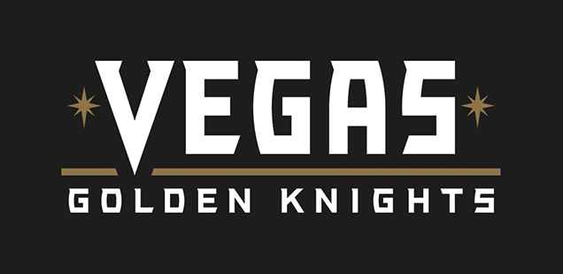
Hooooooboy, and you thought I didn’t like the name. There are some small redeeming parts, but overall, this word mark is simply turrrrible. For a few different reasons.
First off, have would ever heard about kerning? If not, simply put, it’s the spacing in-between letters. Doesn’t seem like a big deal until you do it badly, with potentially horrible consequences. Like this. Or this. Or this. Or it can be used comically, like this. The point is, it’s a subtle but important part of a designers’ job, especially when designing any type of logo. And this Vegas Golden Knights wordmark is kerned turrrribly.
Not the “Vegas” part. That part is fine. It’s the “Golden Knights” that needs work, as the spacing between the letters seem to keep getting looser and looser (that is, the letters keep getting farther and farther apart). And it’s inconsistent with the kerning in “Vegas”.
Good kerning is not about having the letters spaced exactly apart, it’s about making sure there’s an equal amount of negative space between the letters. For example “AV” will need to be a lot closer together than “LA” to have an equal amount of negative space between them.
If you’re interested, I’d highly recommend trying your hand at it Kern Type, a kerning game to test your skills. I just did, and here was my score.
Back to Vegas, here’s a better-kerned version…

See? Much better. Plainly put, the one they unveiled was just poor and sloppy execution.
Lessons in Alignment
Here’s another thing that bugs me about the wordmark (but keep in mind I’m extremely OCD about this type of thing). Why is the gold line extending beyond the G and S of “Golden Knights”? Any design, especially logos, are so much more stronger when things just line up and make sense. And this is a pretty easy fix:

Okay, it’s getting better. The starbursts were also moved out a bit to line up as well.
By the way, the starbursts are probably the best element on the wordmark, as they’re a subtle but immediate connection to the famous Las Vegas signage. That was a smart and elegant inclusion, so kudos on that.
Lessons in Typography
What kind of a strange typeface are they using? It’s either (a) a custom-design for the team or (b) something they found for free on dafont.com. It looks like someone tried to combine Hobo with Acumin and threw in some random serifs for good measure.
There’s curves on the left side of the G and S, but none on the right. The angled tails on the Es, Ss and Ts add more angles into the letters than there needs to be, especially with the serifs at the top of all the letters. And those serifs, especially on the Gs, Ss and Ts, are happening in completely unnatural places for the letters. It’s just…strange.
The curved-in A is strange too, especially when compared to the V, the only letter in the wordmark that has a natural angle to it, and probably the best-designed letter in the font.
To be fair, the V really works to make a visual connection between the primary logo and the wordmark, and to make it standout from the rest of the letters, but it also makes the other letters look horrible.
Also, when you compare the Gs in Golden Knights to the G in Vegas, you can tell that “Vegas” is a condensed version of the font, which is strange because it forces “Vegas” to be so much bigger than “Golden Knights” which is unnecessary.
I could try re-work this typeface to improve it, but at this point, it’s easier to just scrap the whole thing and use a different, better-constructed typeface:

Okay, now we’ve got something. This is using the Industry typeface, and it has some similar qualities to the original, just without the flared serifs. With a little bit of work, those could be added in. Regardless, this is much, much better.
Lessons in Colour
Well, no lessons here really. This is the one place where they kept a simple colour palette: gold (well, more bronze really, but we’ll save that for Part 2) and white. Or gold and black when on a white background. It’s simple, elegant and works.
Final Verdict
The typography, the kerning and the alignment are a sloppy, poorly-executed mess, but the starbursts and colour work well. So, the worst parts of the wordmark are the words. Yikes.
Stay tuned for Part 2, where we break down the primary and alternate logo for the Vegas Golden Knights!