In the last BTLNHL post, I argued the New Jersey Devils were being clever with their logo, but ended up being a little bit cheesy. The Minnesota Wild also are also trying to be clever with their logo, but ended up being overly complicated. So what wins out? Cheesy or complicated? I guess complicated in this case, […]
Category Archives: Uncategorized
With all my preaching of simplicity and refinement in the logo design of NHL teams, I might be accused of being a hypocrite, ranking the New Jersey Devils logo so low, at #17. Essentially, I’m saying over half of the teams have a better logo than this one, and at least half of those are […]
Question. What is the ultimate predator? According to Animal Planet, it’s the Great White Shark. Unfortunately, for naming an NHL team, that moniker is already taken. Next? Lion. Well, that’s not very hockey-esque (unless you’re from Finland), and has nothing to do with Nashville. Next? Grizzly bear. Hmm…well, the Memphis Grizzlies play in the same state, so they probably wouldn’t like that. […]
Given the reaction of some people who follow BTLNHL on Twitter, this appearance of the Carolina Hurricanes is long overdue. There seems to be a general disliking for this logo, and while I agree it’s far from the best, it’s also far from the worst (although, if you’re mathematically inclined, you’ll notice that 19 is closer […]
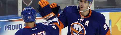
After a brief pause to talk with Terry Smith and to talk about Winter Classic jerseys, BTLNHL continues at #20 with the New York Islanders. I’m not going to lie and say it was easy to place all these teams in order for this countdown and it’s impossible to separate personal prejudices when doing something like this. I […]
A little while ago, I had the pleasure of chatting with Terry Smith, the designer behind the San Jose Sharks logo, both the original and the current redesign. After placing his logo at #25 in the BTLNHL archive, I was pleased he even took my call. In fact, he was very friendly and open to discussion. […]
Yesterday, both the Philadelphia Flyers and the New York Rangers unveiled the jerseys they’ll be wearing on January 2, 2012 for the annual Winter Classic. First my two cents on the Winter Classic itself: LOVE. IT. Outdoor hockey? What’s not to love? That is all. It’s awesome from a design standpoint too, as every year, both teams participating come […]
The first Canadian entry into the BTLNHL enclave is the Ottawa Senators, giving them the unenviable distinction of being the worst NHL logo in Canada. If you are not Canadian, understand that hockey in Canada is like college football in America, or football (soccer) in England, or cricket in India. Huge. A part of the […]
Last night, the NY Islanders played, for the first time, in the new third jerseys. It’s predominantly black with the team’s colours in the piping, the front of the jersey features arching text across the front with the players’ numbers right below. Sound familiar? It’s a bit of a rip-off. And there’s nothing really new or […]
Okay, so a design team walks into a meeting with a corporate client. They were hired to work on their logo and after a few months of sketches, consultations, failed concepts, back-and-forth deliberations with the client, they walked into the meeting charged, confident and armed with what they knew was a great logo that served […]