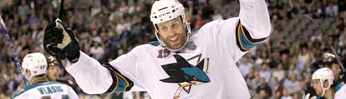
Coming in at #27 is the Dallas Stars, representing another exercise in generally lazy design. So, let’s pick this one apart, shall we? There’s no denying that they, like the LA Kings, tried to walk the fine line between an homage to the historical and a forging of a new identity. The logo was originally conceived […]
Category Archives: Uncategorized
The distinction of having the third worst team logo in the NHL goes to the LA Kings. The Kings would be much higher up the list if they hadn’t changed their official logo from last season to the current one. They switch it up over the summer by pulling the reverse-Starbucks: instead of taking a detail-oriented logo […]
Welcome to Yetiville. The 29th best place in the NHL to be. From the expansion/relocation era of the 1990s and 2000s, there were a rash of teams coming into the league, as well as established teams that redesigned their brands. And there is a definite design aesthetic that emerged from that era, and almost all […]
The first team alphabetically is the worst team designally. I know, not a word, but isn’t the poetry delicious? Anyway, we start off scraping the bottom of the barrel with the Anaheim Ducks. Overall, the logo itself is not too bad. It’s somewhat distinctive, although relatively bland, and it tries really hard to make the […]


