
NHL Playoffs 2022: Round 2 Countdown and Predictions

If there’s anything that we learned from Round 1 of this season it’s that good design and branding always wins… well, most of the time. Our predictions based solely on each team’s overall design aesthetic resulted in a nice 6-2 overall record, with only the Bruins and Maple Leafs failing to match their play on the ice to the quality of their brand. Round 2 features some interesting match ups, let’s dive in…
• More: NHL Playoffs 2022: Round 1 Countdown and Predictions
A refresher for how this works: we’ll compare the overall branding of each series and see how they match up. This includes the logos, alternate logos, jerseys, historical logos and jerseys, general legacy and everything else that builds a team’s brand.
Additionally, the match ups are going to be ranked according to which will be the best to watch from an aesthetic standpoint. Some jerseys work better head-to-head than others, and we’ll outline why. For 2022’s second round pairings, there’s a go-to match up, followed by a mixed bag of the rest. Let’s kick things off with #4 on our list.


Once again we have the Avalanche facing off against the Blues in the playoffs. Although it may be a round 2 match up this season instead of last year’s round 1 tilt, the breakdown is pretty much the same: it’s the worst match up of its respective round. Standing on their own, each franchise is doing some solid things brand-wise…and really always have. However, the three different shades of blue going head-to-head creates too much of a cluttered color palette visually. If the Avs decide to break out their 3rd jersey it’ll be the best jersey match up of the series.
Colorado Avalanche visual brand: The Avs recent removal of black as an accent color has been an underrated, but really great addition by subtraction to their overall look. It gives them a cleaner and brighter visual identity that allows for better consistency across all elements of their home and away unis. Mix in their specialty jerseys and they look almost as good as they’ve played this season…including that dominating round 1 performance.
St. Louis Blues visual brand: The Blues are a case study for how to evolve a brand identity over the years via modernized updates, all while keeping true to core visual landmarks of the franchise. Every era of Blues jerseys have worked well for the time period, and they’ve known exactly when to pull the trigger on brand refreshes and jersey design updates. Bonus points for their two well-executed Winter Classic looks as well.
Prediction: Blues in 6
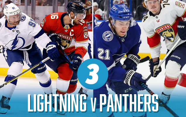
The first “Battle of…” series lands at the #3 spot on our countdown as we take a look at the Battle of Florida. The best thing going for this match up is contrast, and lots of it. You’ve got Tampa Bay’s ultra simplistic look paired against the modern template of Florida with their center striping, unusual shoulder numbers and sleeve patches…two very different approaches to jersey design. Color palettes that feature pretty much primary colors should provide a stark contrast on the ice… a far cry from the Lightning’s first round series vs. the Maple Leafs. Overall this is a tough one to call, there are elements of each brand that work well, but also other elements that are less inspiring.
Tampa Bay Lightning visual brand: Ups and downs are a good way to describe the visual history of the Lightning. They were born out of the 90’s, and it shows via the visible angst in some of their third jerseys over the years. Lately, they’ve settled on a more traditional look that works well in a lot of ways, yet at the same time leaves something more to be desired. As mentioned in the Round 1 countdown, points deducted for lack of originality as their current looks mimics the Maple Leafs a little too much.
Florida Panthers visual brand: The rebranded look of the Panthers has been around for roughly seven years already…time flies! Even in all that time, when I initially think of the Panthers branding, my first thought goes back to their original logo and jerseys. Is that an indictment on the current look or simply nostalgia for the original look? The current logo is good – it’s clean, sharp and well-designed…but it just lacks…something.
Prediction: Lightning in 7 (OT)


Another case study in contrast, but for this 2nd round match up it’s more of a contrast in philosophy when it comes to design and branding. For Carolina, variety is the brand. For New York, the brand is consistency. Overall, the Rangers are very hard to beat when it comes to their overall look – it’s classic in so many ways. On the other hand, the Hurricanes have really leaned into different styles and logos across their three jerseys, with their black 3rd jersey becoming a staple for the Playoffs. In terms of this match up, the bright lights of Madison Square Garden is where the superior brand easily wins this head-to-head battle. Carolina will hit the MSG ice with their version of diagonal chest lettering…only to be outdone by the Blueshirts that made it famous.
Carolina Hurricanes visual brand: The Hurricanes started their tenure in Carolina with a steadily consistent look for the first decade or so. Then, for the past 10 years there’s been a pretty steady stream of minor tweaks and adjustments to their overall brand. Currently, across their three jerseys – each one has its own unique striping pattern, shoulder yokes/patches and primary logo resulting in little to no visual consistency other than the color palette.
New York Rangers visual brand: The Rangers brand identity has been consistent for a little while now…only about a hundred years. They absolutely own the look of diagonal chest lettering and block shadow numbers and letters. Their entire uni set creates the perfect balance of red, white and blue. Throw in their numerous special event jerseys, whether it’s been a Stadium Series, third jersey or a Winter Classic look, and they’ve been able to flex the brand in a way that usually works pretty well. All in all – never change New York.
Prediction: Rangers in 4
Bonus goalie content!
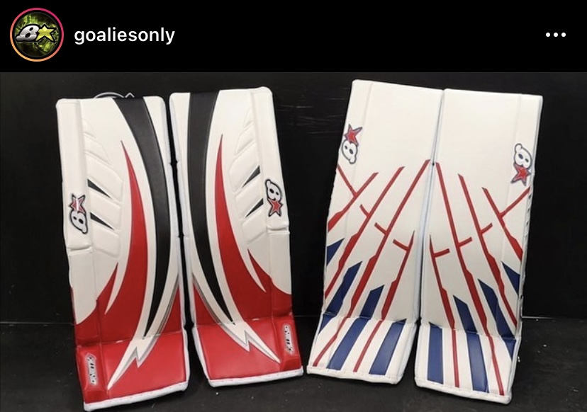
I’d be remiss not to mention the design battle that’ll be taking place between the pipes during this series as both goalies feature excellent custom pad designs from gear maker Brian’s. Utilizing old school cut-and-sew application, Brian’s has the ability to create truly unique pad designs for the netminders that strap on their gear. In this case, Carolina’s Antti Raanta sports a design that creatively utilizes the shapes of the Hurricane logo. While Igor Shesterkin’s “art deco” pads hint at architectural inspiration from the famed Madison Square Garden rafters. Both sets of gear are elite and will undoubtedly enhance the overall visual aesthetics of this series.

Despite Jake Oettinger’s herculean effort in net for the Stars in game 7 vs. the Flames, the hockey gods smiled upon us all with the first playoff edition of the Battle of Alberta since 1991. And speaking of 1991…Edmonton needs to follow Calgary’s lead and rebrand back to their look of that era. Here’s a thought for the bare minimum – at least revert back to a blue home jersey and if you want to keep the orange as the 3rd jersey, that’s fine…as long as the current navy-orange 3rd is retired. Who says no?
Overall this match up will look great on the ice…and the warm color palette should match the heated intensity level of the series. Two traditionally classic jersey designs paired with two great logos is ultimately what landed this match up at #1 on our Round 2 countdown. Let the Battle begin!
Calgary Flames visual brand: Calgary’s decision to finally return to their look from the 80’s to the early 90’s was far overdo. They fell victim to the 90’s trend of forcing black into all things design and branding…and for whatever reason they held onto that trend for about 20 years too long. Even though black made a return for their Reverse Retro “Blasty” jersey, it works as a one-off look. Now, their modernized jersey designs are top-notch all around.
Edmonton Oilers visual brand: Sporting one of the most unique and probably one of the most underrated logos in the NHL, the Oilers seem to keep getting in their own way when it comes to unnecessarily reinventing their color palette…which hinders the overall visual identity of the team. It’s easy to fall back on nostalgia as a crutch when it comes to design, but for Edmonton’s color palette: they got it right the first go-round. Time to go back.
Prediction: Flames in 6
Agree? Disagree? Let us know in the comments below or join the conversation on Twitter, Facebook, or Instagram!


Man y’all stay hating on the Canes.
[…] More: NHL Playoffs 2022: Round 1 Countdown and Predictions• More: NHL Playoffs 2022: Round 2 Countdown and Predictions• More: NHL Playoffs 2022: Round 3 Countdown and […]