
NHL Playoffs 2022: Round 4 Overview and Predictions

Our Round 3 predictions were a split, with the Avalanche edging out the Oilers and the Rangers falling to the Lightning. So, we now sit a decent 9-7 overall record as we head into the greatest playoff round of them all: THE STANLEY CUP FINAL.
• More: NHL Playoffs 2022: Round 1 Countdown and Predictions
• More: NHL Playoffs 2022: Round 2 Countdown and Predictions
• More: NHL Playoffs 2022: Round 3 Countdown and Predictions
2022’s Final match up pits the modern look of the Avs vs. the simplified classic look of the Lightning. Colorado has felt like a team on a mission for the entire season, but the back-to-back champs continue to dominate in the Playoffs. Should be a great match up, now let’s take a look at how they’ll visually stack up against each other.

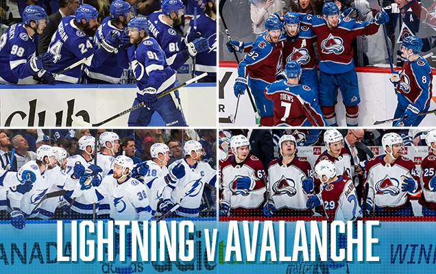
Overall, the Stanley Cup Final will have a nice, clean overall visual aesthetic…even if it leans heavy on the blue side of things. With both teams sporting lots of blue, the Avs burgundy will be a great contrast pop of color that will help showcase the uniqueness of their color palette. As we’ve mentioned, the Avs have developed and maintained a strong and consistent overall visual brand since they hit the ice in Colorado back in 1995. The primary logo and color palette have remained the same over the past 27 years, which is quite an accomplishment considering the state of sports branding these days. The only significant jersey changes have been the secondary logo on the shoulders changing from the yeti foot to the Colorado flag “C” and that 10-year span of the Reebok Edge jersey template where the striping pattern differed from the classic mountain pattern. Luckily for all Colorado fans, the mountain trim reappeared in 2017 and the Avs jersey design is better for it.
• More: WORST TO FIRST JERSEYS: TAMPA BAY LIGHTNING
• More: HBD BREAKDOWN: TAMPA BAY LIGHTNING STADIUM SERIES JERSEYS
Switching gears to Tampa Bay, where consistency hasn’t necessarily been the case when it comes to the Lightning and their 30-year franchise history. In that span they’ve seen a slow-cooked rebrand and four different primary logos adorn their jerseys. The 90’s were represented well in the Lightning’s early days via logo typography, number fonts and plenty of black. 2007 saw a rebrand that simplified numerous elements and essentially served as roughly a 5-year bridge from their inaugural look into the ultra simplistic look of today. As we’ve discussed – the current Lightning brand works well…it’s clean, simple and classic. However, it’s just way too similar to Toronto and lacks that punch of uniqueness that helps define a brand.
Tampa Bay Lightning visual brand recap: Ups and downs are a good way to describe the visual history of the Lightning. They were born out of the 90’s, and it shows via the visible angst in some of their third jerseys over the years. Lately, they’ve settled on a more traditional look that works well in a lot of ways, yet at the same time leaves something more to be desired.
• More: WORST TO FIRST JERSEYS: COLORADO AVALANCHE
• More: HBD BREAKDOWN: 2020 STADIUM SERIES JERSEYS
Colorado Avalanche visual brand recap: The Avs recent removal of black as an accent color has been an underrated, but really great addition by subtraction to their overall look. It gives them a cleaner and brighter visual identity that allows for better consistency across all elements of their home and away unis. Mix in their specialty jerseys and they look almost as good as they’ve played this season.
Prediction: Avalanche in 6
Agree? Disagree? Let us know in the comments below or join the conversation on Twitter, Facebook, or Instagram!


The Avs orignal uniforms IMO are better in terms of color than the current ones. The black and white making the striping really made the mountain motif pop more. That striping is what got me into them as my WC team. It’s so on brand. Something nobody’s ever seemed to notice is that Adidas changed the coloring on the burgundy and blue. It’s brighter and not in the best of ways. I have an Avs jersey I believe is slightly older than I am and the burgundy and blue on it is a deeper shade. Really pops. The black made the jerseys and socks pop a bit too. I don’t really like the all blue pants, gloves, and helmets. It’s too much blue. They shoulda kept the black pants or at least made some blue striping to break it up. It’s just too much blue and makes the home set look like it’s a blue jersey with burgundy accents