
Worst to First Jerseys: Carolina Hurricanes

As we go through the 2019-20 season, we’ll be updating all of the Worst to First Jersey posts every Monday, as almost all the teams in the league have unveiled new jerseys since their original posts. We’ll start with the ones most needing updating and work our way through the league. Today, it’s time for the Carolina Hurricanes to get updated.
Also, a huge thanks to SportsLogos.net and NHLUniforms.com for most of the jersey images and references.
The Hurricane franchise, considering that it’s spanned over 35 years and two cities, has stayed impressively consistent with their jerseys. Of course, the move from Hartford to Carolina spawned a complete re-brand, but on both sides of that 1997 move, there’s only been two different jersey set (not counting the Whalers’ WHA days – which we’re not). Contrast that with a team like Pittsburgh, who had over a dozen different jersey sets in their first 35 years. The ‘Canes/Whalers have all mostly had good jerseys, but of course, someone’s gotta come in last and first.
Here’s how this works: I’ll count down, from worst to first, all the jerseys the Hurricanes have ever worn (including covering the franchise’s Hartford days). Homes and aways will be lumped into the same category (so, more of a jersey “era”) and I won’t worry about small changes (like slightly changed positions of piping for example). Third jerseys will stand on their own. And I’m focusing on the jerseys only, not the entire uniform. For the Hurricanes, there’s seven different jerseys/eras. And we’ll start with the worst one.
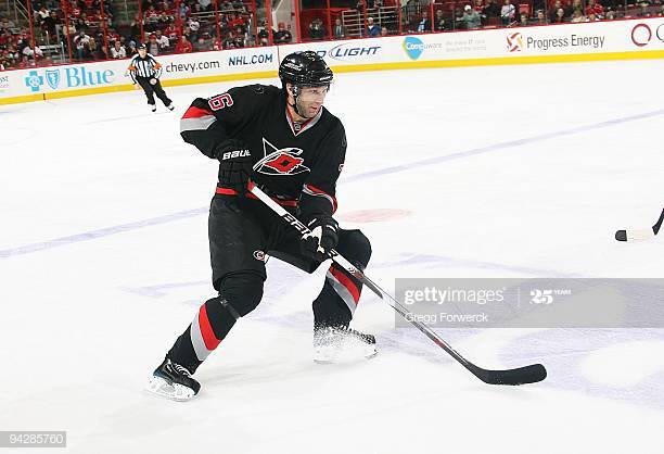
7. 2008–17 Third Jerseys

In their history, the Carolina franchise has only ever had one third jersey, and while it shows a lot more restraint than almost all the other third jerseys worn in the league (I’m looking at you Anaheim, Los Angeles, etc, etc), it’s still not a great jersey. Like an average character in a great ensemble cast, it can’t keep up with the rest of the jerseys that the franchise has worn.
Some of that stems from a person bias I have against black jerseys, that has been well documented on this site. When the other team is wearing white and you’re playing on a white sheet of ice, having black jerseys makes the game visually uninteresting and feels like a missed opportunity. With the minimal amounts of red, on top of adding the monochromatic grey and removing the colour from the logo on the shoulder patches, it makes for a jersey that doesn’t have a ton of impact on the ice. And the whole design is almost bordering on dull, like this sign.
The most prominent remaining feature – the hurricane-symbol pattern along the bottom of the jersey (which we’ll talk about more later) – is a mixed blessing. On the plus side, it’s the most interesting design element on a pretty simple jersey. On the negative side…it’s the most interesting design element on a pretty simple jersey, making it obnoxiously standout from the rest of the jersey. They toned down the contrast by making it grey on black, but yeah, doesn’t help.
But, there are some decent qualities to this jersey – a simple striping pattern to the sleeves and collar, a good alternate logo that is made for a third jersey – that keep it from being a total tire fire. But not enough to keep it out of last place on this list.
Jersey Recommendation: #26 Cole. Eric Cole joined the team during the same season these jerseys were introduced, and lasted in Carolina for another two seasons, which is about the life span this jersey should have had. But at least those were two of his best seasons in the league.
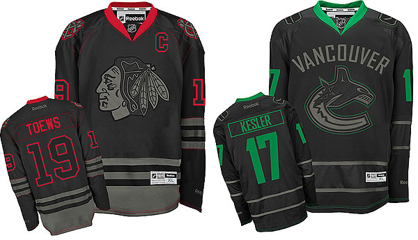
6. 2018–present Third Jersey

Carolina grabbed the alternate logo from their previous third jerseys and literally doubled-down on it being the centrepiece of another black third jersey. Regular readers will know how I feel about black jerseys (not much), but for Carolina, it makes a certain amount of sense so I can understand it. Plus, that’s the least of this jersey’s problems. Back to that new alt logo…
I get it. One flag is just a storm warning, while two flags is an actual hurricane. Logically, it makes total sense. Logistically though, it makes for a spatially awkward logo, being too tall and skinny (the same way that the old Ducks logo was way too short and wide) to look good on a hockey jersey. I’m all for having a double-flag concept, but it just doesn’t work with this particular concept (flag(s) on a hockey stick).
A really great detail of the logo is how they incorporated a map of North Carolina in there. It’s a subtle detail that cleverly uses negative space to give the logo additional meaning and depth.
The other most obvious element of the new thirds is the use of a grey shoulder yoke. I don’t mind it here at all, but the decision to have it only on the shoulder yoke is head-scratching. This photo taken in less-forgiving lighting shows how much it stands out on the jersey. Adding another grey stripe to the sleeves/trim would’ve created a more balanced look. You could even add the subtle hurricane symbol pattern that’s on their regular home/away jerseys to have some consistency throughout the jerseys.
The worse part of the shoulder yoke are the Black Ice-esque treatment of the primary logo and North Carolina flag patches. The only positive to this is that they don’t bring attention to the shoulder yokes in a way that distracts from the jersey as a whole, blending in with the rest of the shoulder yoke. Otherwise, these patches that look like the flag and logo were washed in the ashes of a campfire.
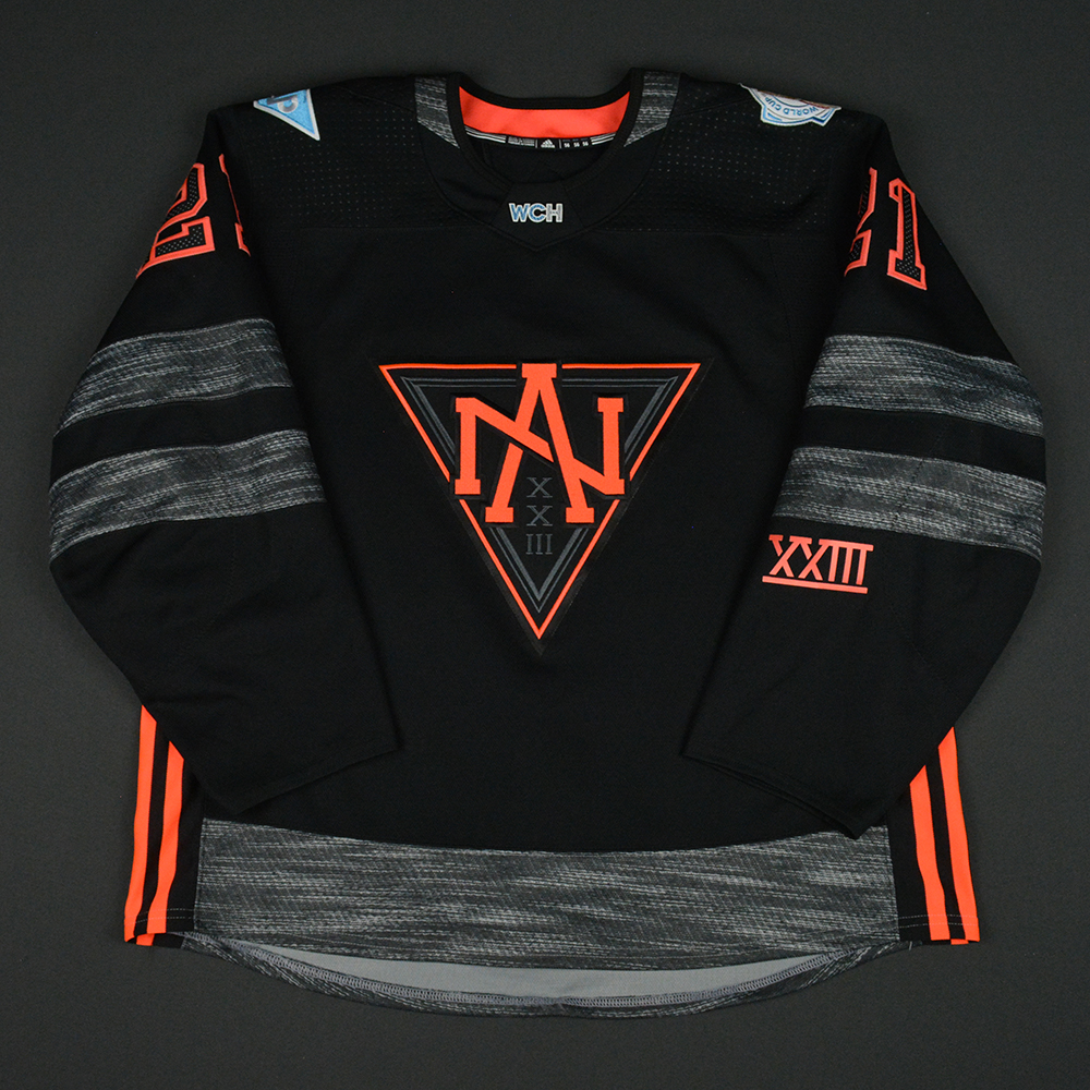
One great element is the heathering of the red stripes. It’s subtle, but it adds a nice texture to the otherwise minimalistic (and infuriatingly inconsistent) approach to the striping on the jersey, so this is definitely something for the plus column. Also, it’s red, so it doesn’t look like duct tape like it did for Team North America. Yeah, those were bad jerseys. Come at me. The Hurricanes used it in a much more successful way.
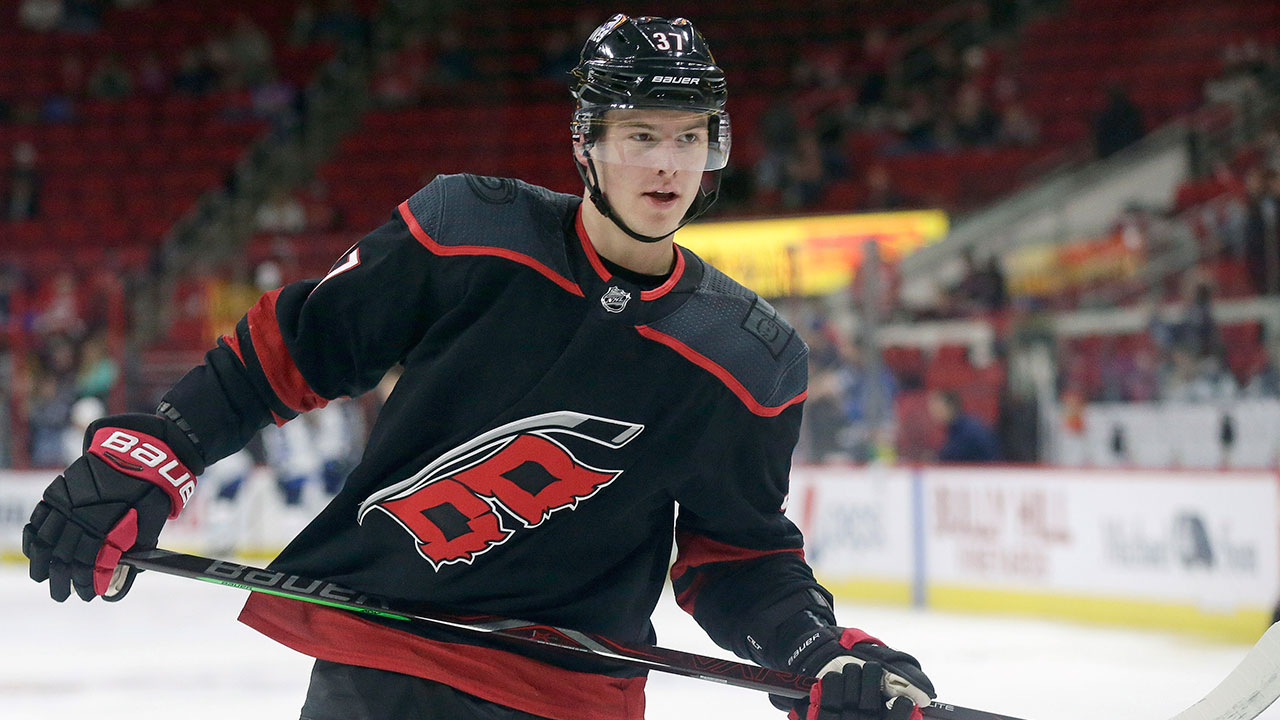
Jersey Recommendation: #37 Svechnikov. A new style of jersey meant to capitalize on recent trends seems a good fit for Andrei Svechnikov: drafted in 2018, and played immediately that season, and his NHL career (which was going extremely well this year) has the exact same lifespan as these jerseys, so far.
5. 1997–2013 Home & Away Jerseys

The original Carolina jersey set takes the next spot. There’s a few interesting features on this jersey that makes it stand out. The first is the there-but-not-there shoulder yokes.
Carolina was one of the first teams to introduce the outlined yoke that’s the same colour as the rest of the jersey, added to these jerseys in 2007 with the introduction of the Reebok Edge jerseys (no outlines were used from 1997–2007). It’s a clever way to introduce the idea of the traditional shoulder yoke, but without having it become more dominant. If they gone with a traditional shoulder yoke, it would have created a jersey way too busy because of…
The second feature is the hurricane-symboled stripe along the bottom. It works better here than on the black third jerseys because there’s less contrast between the red and black, so it doesn’t stick out quite so much. But, it would have been better had it been even more subtle – smaller symbols, or a dark grey on black. While it’s a relevant symbol to use and simple enough that it works in this way, it still commands too much attention. But hey, it’s not like the ’90s were known for subtlety.
And it takes away from what should be the main focus of the jersey: the logo, which makes its appearance for the first time on this list. While it’s been much-maligned as a toilet bowl, it’s definitely not terrible.
More: BTLNHL #19: Carolina Hurricanes
The rest of the jersey is a mixed bag. There’s inconsistent striping, but there’s a simple and solid colour palette. With all this combined, the middle is the best place for this jersey.
Jersey Recommendation: #17 Brind’Amour. Oh captain, my captain. He’s maybe not the most prolific hockey player to don the jersey, but any captain that leads his team to a Stanley Cup can never be a bad choice. Get it in the pre-2007 reds.

4. 2019–present Away Jersey

I think of all the Worst to First Jersey posts we’ve done, this is the only case where a home and away jersey are separated from each other. And that’s the only logical course of action here since these new road jerseys are completely different from the home jerseys in almost every way.
Branding consistency is something that we could discuss, but that’s a conversation for another post (see below). Today, we’re focusing only on the jerseys.
• More: HbD Breakdown: Carolina Hurricanes Road Jerseys
The Hurricanes have defined themselves as a different kind of franchise this past seasons. From their Storm Surges last season, to embracing being a “bunch of jerks”, they’re focusing all their efforts of creating a unique identity. And in that regard, these jerseys fit the bill. They’re more unique amongst the league, and they’re obviously meant to be fan-friendly, off-the-cuff, casual, and visually impactful. Check. Check. Check.
But – and call me a jerk all you want – I’m a bit of a purist, and I’ve never liked team having a nickname on their jerseys. That being said, for a slang-crested jersey, it’s probably the best one from a design perspective. Granted, that’s still a pretty low-bar, but we’ll continue…
One of the things I’ve always loved about hockey jerseys is that the prominently feature the team’s logo – it’s the only one of the four major sports in North American to do so (five, if you include the MLS). It’s what makes hockey jerseys unique. Using text, especially a blocked-off typeface like this one, comes off as looking really collegiate on a hockey jersey. Again, maybe that’s the point: it creates a more casual visual brand. But it loses what makes a hockey design visually appealing and unique: the team logo. The hurricane flag symbol in the “C” though is a really nice touch.
There are some other details that are nice, like the hurricane flag pattern along the base on the jerseys (also featured on their home reds). Having it on the collar is great too.
But the pattern is bigger here than on their home reds, making it less of a subtle feature and more of a distraction, drawing your eye towards it. It feels like it shouldn’t have been included on the sleeve stripes as well to balance things out a bit.
It doesn’t help either that the striping patterns on the jersey are pretty bland, going for a basic thick stripe with a thin outline. For a jersey with no logos on it, it makes everything clean and relatively minimalist, but pretty ho-hum.
Jersey Recommendation: #20 Aho. Before the 2019–20 season went on hiatus, Aho was the ‘Canes leading scorer and arguably most exciting player (Svechnikov’s lacrosse goals aside). Plus, it’s the shortest name on the roster, which pairs well with the slang-shorted jersey crest.
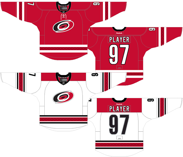
3. 2013–17 Home Jersey, 2013–19 Road Jersey

The next set of ‘Canes threads were no question an improvement on the previous ones.
At the same time, it feels like they simplified a little bit too much from their previous jerseys. These have taken a page from Team Canada’s jersey handbook (which, for the record, I really don’t see as a problem), with the simple and elegant full red home jerseys and slightly more complex road white jerseys. The grey from the previous jerseys is dropped completely, as is the hurricane-symboled striping.
Don’t get me wrong, these are really classic and elegant jerseys and they look great on the ice. But, it feels slightly like a missed opportunity to form some continuity with the franchise’s visual history. I mentioned earlier that the hurricane-symbol pattern just needed to be more subtle, and that could work perfectly here. It’s just something a little bit extra to give the jersey more personality.
The striping on both jerseys are classic. The double white stripes on the home reds are simple and elegant. The triple stripes on the road whites are classic and traditional. No complaints at all there.
The shoulder yoke on the road whites are more contemporary, with them being blocked off with hard corners instead of the usual curved edge. And the typography on these jersey are more modern as well. Overall, it gives both a contemporary and classic look at the same time.
They’re great jerseys, but it just feels like they need something slightly more.
Jersey Recommendation: #12 Staal. Another former captain for Carolina, and while he left the team for eventual greener (literally) pastures, he was the undisputed leader of the ‘Canes after Brind’Amour’s retirement. A #11 Staal would do as well. Get either in the whites.
2. 2017–present Home Jersey

The second half of the current ‘Canes set is essentially the love-child of their just-discussed 2013–17 jerseys and their original jerseys. The huge leap they made toward minimalism with their recent jerseys has been scaled back a bit, but not to the tacky and over-complicated point that they were before. No superfluous grey striping, no shoulder yokes, but yes to the hurricane-themed waist stripe, extra striping, as well as bringing back a ton of black.
The hurricane-stripe works way better here, because it seems the good people at Adidas are readers of this site. Above, I opined about how it would work better if it was more subtle, and that’s exactly what they did. And as expected, it works way better. Less obnoxious, less demanding of attention. It they added it to the sleeve stripe as well it probably would’ve worked.
The collar actually works better than on their previous jersey as there’s more black to balance it out.
These quasi-laces seem to have lace-ends poking out, which is even weirder considering how useless they are.
While the previous jerseys were accused of ripping off the Canadian teams, these new ones are much more distinctive for Carolina and closer to their glory days. I’m usually a fan of more minimalism, but these are justified to move away from that and it’s worked out really great.
Jersey Recommendation: #14 Williams. He’s not the greatest scorer, not the fastest, not the most exciting, but Mr Game Seven brings it every game and he became the emotional core of the team ever since he joined them.
1. 2018–present Heritage Jersey

Sorry ‘Canes fans. The top spot for your franchise’s jerseys belongs to Hartford. And at least Carolina acknowledged that somewhat by bringing these beauties back to the ice the last couple seasons. And since they did that, it’s given entrance into this ranking.
Green is the most tragically under-utilized colour in jersey design, and these jerseys are an excellent example of just how great it can look. Mixed simply with a royal blue, it’s striking and unique to the league, even today. And while there’s a huge amount of green on the uniforms (bordering on an NFL colour rush jersey), the over-large white-blue striping allows for tons of contrast and visual interest.
The striping is classic hockey-jersey striping. While it’s not completely consistent from the sleeves to the bottoms (or from the white to green jerseys), it consistent enough that it doesn’t look out of place but still be visually interesting.
The greatness of the logo, matched with the classic aesthetics and unique colour scheme makes it one of the greatest jerseys in the league, let alone the franchise.
• More: BTLNHL Vintage: Hartford Whalers
Jersey Recommendation: #10 Francis. Who else? Former Whaler, former Hurricane, former Hurricane GM. Aside from a (moderately successful) stint with Pittsburgh, this guy had been the face of the franchise through three generations. He bleeds red and black…and blue…and green. He bleeds rainbows basically. Until he bleeds whatever Seattle becomes anyway.
Agree? Disagree? Let us know in the comments below or join the conversation on Twitter, Facebook, or Instagram!


/https://www.thestar.com/content/dam/thestar/sports/hockey/2018/04/05/playoff-bound-after-40-goal-season-eric-staal-continues-renaissance-with-minnesota-wild/eric_staal_warmup.jpg)
/cdn.vox-cdn.com/uploads/chorus_image/image/65156920/i_FpJS6VC_X3.0.jpg)
/cdn.vox-cdn.com/uploads/chorus_image/image/63188731/1133918623.jpg.0.jpg)
Great read. Honestly though, the 1997-2013 unis are better than the 13-17 unis. The hurricane warning stripe is a unique aspect to our team and when they updated, I felt they had decided they were gonna be bland and lifeless. My theory proved to be true because the team sucked too, but that’s besides the point. The black jerseys (both) honestly shoulda been a bit higher. The original black uni is also impossible to find online anywhere because it is such a treasured piece of every Caniac’s collection. Here’s what I would’ve done
13-17 Home/Away
19-Present Alternate
18-Present Home
20 Away
09-17 Alternate
97-13 Home/Away
79-93/19-Present Home/Away/Heritage
Again, I thoroughly enjoyed the article, but I feel that the purpose of a jersey is to be distinctive and recognized around the league. Thus, the 13-17 Home/Away should’ve been dead last because they weren’t very memorable and neither was the team during that time
[…] • Here’s a ranking of all the Carolina Hurricanes jerseys. (Hockey by Design) […]
They should continue to use the Hartford throwbacks, but for God’s sake, use the whites or the blues (from the later years). Way better than the greens and much easier to decipher the best logo in sports, as it has the city and the team name all condensed into one.
Erik Cole was here in Raleigh twice. He won the Cup in 06 after returning from a broken neck and was part of the famous BBC Line in 02.
[…] • More: BTLNHL #19: Carolina Hurricanes• More: Worst to First Jerseys: Carolina Hurricanes […]
[…] • More: BTLNHL #19: Carolina Hurricanes• More: Worst to First Jerseys: Carolina Hurricanes […]
[…] • More: BTLNHL #19: Carolina Hurricanes• More: Worst to First Jerseys: Carolina Hurricanes […]
ANCHORS