
NHL Playoffs 2021: Round 2 Countdown and Predictions

Well, the superior visual brands were decidedly average in the Round of 16, going 4-for-8, with Carolina, Montreal, Boston, and Colorado correctly predicted. To be fair, some of the brands were pretty close, so we’ll take batting .500 so far. Next round will be better…right?
• More: NHL Playoffs 2021: Round 1 Countdown and Predictions
As a quick recap, here’s how this works. We’ll compare the overall branding of each series and see how they match-up. This includes the logos, alternate logos, jerseys, historical logos and jerseys, general legacy and everything else that builds a team’s brand.
But on top of that, the match-ups are going to be ranked according to which will be the best to watch from an aesthetic standpoint. Some jerseys work better together than others, and you’ll see why. After 9 post-seasons (not including the current one), we’re 69-for-143, or 48.3%. We need a good post-season this year.
Okay, like last time, let’s start with the worst jersey match-up in this, the Cup quarter finals.

Oh, what could’ve been. Carolina seems quasi-allergic to their predominantly-red home jerseys, opting again to go with their inferior and mediocre black third jerseys, removing what would’ve been a beautifully classic red-vs-blue jersey matchup. Instead, we’re treated to that for only the games in Tampa. In Raleigh, it’s decidedly monochromatic with just hints of the red-vs-blue that we all deserve.
Carolina Hurricanes Visual Brand: Carolina has a chance here because of – and all apologies to Connecticut – having those amazing Whalers unis on the ice again. It’s pretty easily the best jersey they’ve ever worn, and having a logo mistaken for a toilet bowl doesn’t help much. But they have been building a more unique brand for themselves over the last few seasons.
• More: BTLNHL #19: Carolina Hurricanes
• More: Worst to First Jerseys: Carolina Hurricanes
Tampa Bay Lightning Visual Brand: Decent logo, pretty good uniforms, and a disastrous jersey legacy featuring some of the worst things that ever graced the ice, not to mention their latest addition to a Bolts third jersey library of horrors. Despite all that, they’ve embraced a superior classically inspired minimalist aesthetic overall and have mostly held to that.
• More: BTLNHL #22: Tampa Bay Lightning
• More: Worst to First Jerseys: Tampa Bay Lightning
Prediction: Hurricanes in 7


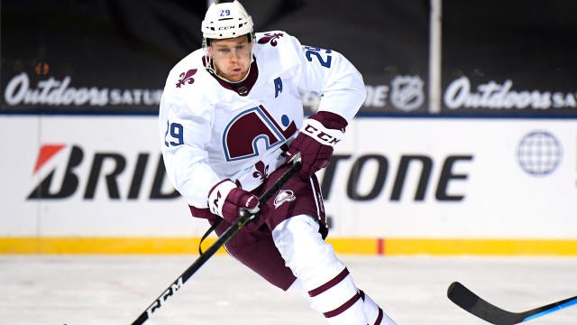
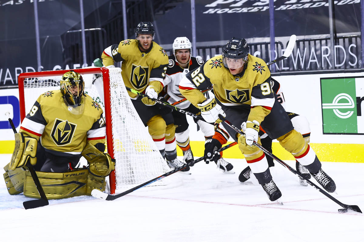
From the Carolina-Tampa match-up, it’s a large step up to the top 3 matchups, each of which could argue for the top spot on this list. The Colorado-Vegas matchup (on top of being probably the series to watch in the second round) is surprisingly great from an aesthetic standpoint. It’s all non-traditional and contemporary colours and jersey designs, and like I’ve said before, Vegas needs a jersey with a lot of colour playing against it to look good, and Colorado brings that. The gold, burgundy, and royal blue play off each other really well. So why third? Because the other matchups are pretty great too, as you’ll see.
Colorado Avalanche Visual Brand: They’ve been remarkably consistent in their visual brand since moving from Quebec City in 1995, using the same (mediocre-at-best) logo and recently going back to a jersey inspired strongly by their inaugural jerseys – the best they’ve worn. And their third jerseys (and Stadium Series jerseys) have been pretty good too, along with an excellent Reverse Retro jersey this season.
• More: BTLNHL #29: Colorado Avalanche
• More: Worst to First Jerseys: Colorado Avalanche
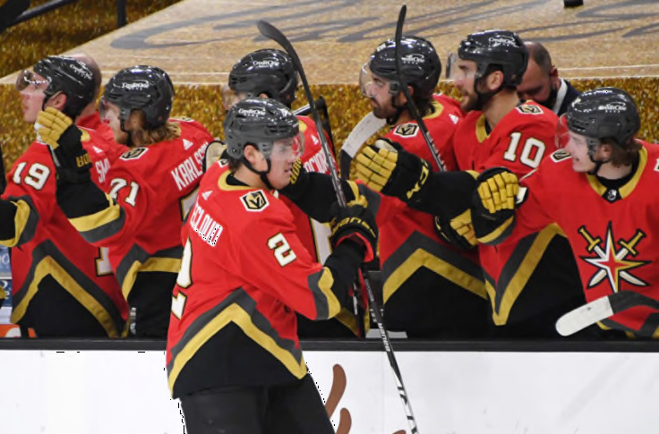
Vegas Golden Knights Visual Brand: The Golden Knights get some decent kudos for their jerseys, but the consensus take on their logo is that it’s buried in the bottom half of the league. Their recent forays into alternate jersey territory, which include those gold-weave third jerseys and the red Reverse Retros, are okay, but those gold helmets are completely unforgivable and objectively terrible.
• More: HbD Breakdown: Vegas Golden Knights Jerseys
• More: HbD Breakdown: Vegas Golden Knights (Logo and Alternate Logo)
Prediction: Avalanche in 6


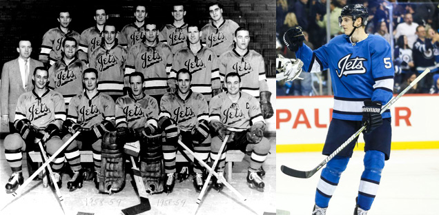
This is another classic red-vs-white matchup featuring two classically-designed jerseys, similar to the Habs/Leafs matchup from the previous round. The difference here is that the Jets use a predominantly navy blue jersey with de-intensifies the colour, looking closer to black than the blue the Leafs where, so it keeps this matchup out of the top spot. It’s still pretty great, especially with the small amount of red in the Jets’ unis connecting to the Habs’ unis, and vice versa with the blue.
Winnipeg Jets Visual Brand: The Jets visual brand is the epitome of middle-of-the-road. An average logo. An average jersey set. And (aside from their glorious recent Heritage Classic jerseys) it’s pretty much always been that way. Oh, and their third jersey is a total rip-off too, which doesn’t help.
• More: BTLNHL #15: Winnipeg Jets
• More: HbD Breakdown: Jets and Sharks Third Jerseys
• More: Worst to First Jerseys: Winnipeg Jets
Montreal Canadiens Visual Brand: But uh yeah, it’s the Canadiens. The most iconic hockey sweater in existence that has endured for almost 100 years now. The “bleu, blanc et rouge” is on par with the Yankee pinstripes and has been celebrated in book and film. The logo is almost equally iconic. Montreal is a visual brand beast. They don’t really miss with their alternate jerseys either, and they never let the ’90s influence their brand at all, which gives them a game right there.
• More: BTLNHL #5: Montreal Canadiens
• More: Worst to First Jerseys: Montreal Canadiens
Prediction: Canadiens in 5


Similar to the Islanders’ first round opponents, the Bruins feature a black-and-gold jersey set that really combines well the Isles’ classic blue-and-orange look. And as black jerseys go, Boston pretty much has the best one in the league, with lots of gold and white to set up some aggressive contrast. Add in that they’re both classically-designer jerseys, and you’ve got an aesthetically-great matchup.
Boston Bruins Visual Brand: This is an incredibly strong visual brand, epitomizing the “big, bad” moniker attached to it, using a consistent logo concept since 1948. They’re among the best in every single category from a visual brand perspective: great logo (2nd best imo), great jerseys, great legacy. And those Reverse Retro jerseys! They’re a brand beast.
• More: BTLNHL Finals: Boston Bruins v Detroit Red Wings
• More: Worst to First Jerseys: Boston Bruins
New York Islanders Visual Brand: Their current classic look is great…for the Islanders. The consensus is that they still don’t have a great logo, their jerseys are not too bad, and their recent third jerseys don’t stand up against some of the others in the league (and they have a history of some much, much worse ones). Oh, and Captain Gorton is still too recent to be completely forgotten.
• More: BTLNHL #20: New York Islanders
• More: Worst to First Jerseys: New York Islanders
Prediction: Boston in 5
Agree? Disagree? Let us know in the comments below or join the conversation on Twitter, Facebook, or Instagram!


/cdn.vox-cdn.com/uploads/chorus_image/image/68866825/1303529909.0.jpg)
/cdn.vox-cdn.com/uploads/chorus_image/image/52663085/623535160.0.jpg)
[…] More: NHL Playoffs 2021: Round 1 Countdown and Predictions• More: NHL Playoffs 2021: Round 2 Countdown and Predictions• More: NHL Playoffs 2021: Round 3 Countdown and […]