
Worst to First Jerseys: New York Islanders
As we go through the 2019-20 season, we’ll be updating all of the Worst to First Jersey posts every Monday, as almost all the teams in the league have unveiled new jerseys since their original posts. We’ll start with the ones most needing updating and work our way through the league. Today, it’s time for the New York Islanders to get updated.
Also, a huge thanks to SportsLogos.net and NHLUniforms.com for most of the jersey images and references.
“It was the best of times. It was the worst of times.” That basically sums up the Islanders’ existence so far, from the incredible success of the ’70s and ’80s Cup dynasty years (the Islanders are still the last professional sports team in North America to four-peat a championship) to the long slide down to the humiliation of the Mike Milbury and Charles Wang years. And despite this issues that happened with…um…*whispers* Tavares, some strong play over the last few seasons, along with stable management, give hope for the future. And their jerseys have actually followed this same general trend.
Here’s how this works: I’ll count down, from worst to first, all the jerseys the Islanders have ever worn. Homes and aways will be lumped into the same category (so, more of a jersey “era”) and I won’t worry about small changes (like slightly changed positions of piping for example). Third jerseys will stand on their own. And I’m focusing on the jerseys only, not the entire uniform. For the Isles, there’s eight different jerseys/eras. And we’ll start with the worst one.
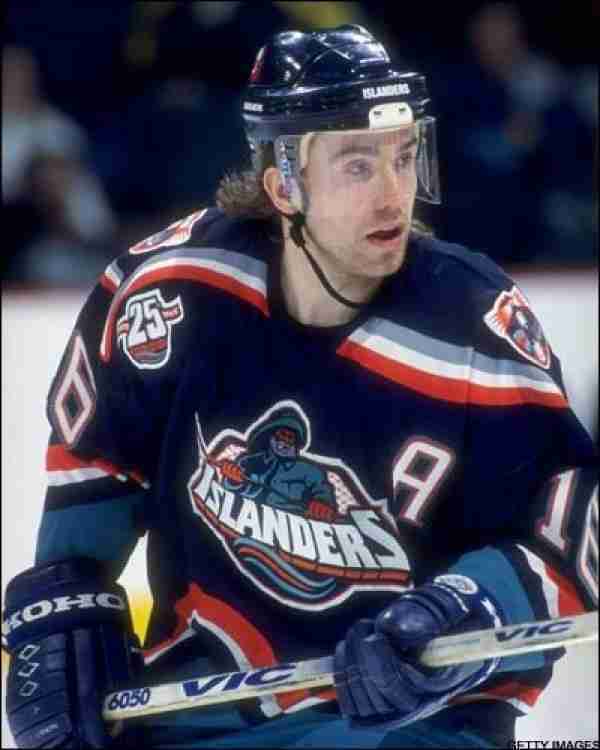
8. 1995–98 Home & Aways
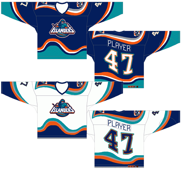
C’mon, was there any doubt? From the Highliner/Gorton captain to the wavy lines to the seasick numbers, these jerseys are a complete mess. The general rule of thumb on a bad jersey is that they last about 5 seasons before being changed (sometimes less for third jerseys). These lasted 3 seasons, with the Fish Stick logo lasting only two seasons, being replaced by the more traditional logo. That should tell you something right there.
Some call the ’90s the “dead puck era” in the NHL. I call it the “dead design era”. Almost everything that was created in the ’90s in terms of jersey design was some of the worst the NHL has ever seen. There’s the Kings’ Burger King, the Ducks’ Wild Wing, anything by the Thrashers, etc, etc. The Islanders graciously provided the most obvious piece of evidence to corroborate this “dead design” theory.
Curved striping is certainly not a stranger to hockey jersey design, but the Islanders took it to the extreme, with waves as dramatic as The Perfect Storm and as shoddily executed as Rasputin (Russian history, yo.): mis-shaped, irregular, seemingly random. It’s actually somewhat regular on the sleeves, but everywhere else, it’s incredibly inconsistent and follows no apparent system at all. That’s fine if you’re actually the ocean, but if you’re a hockey jersey, it’s pretty stupid.
What that also does, of course, is affect the nameplates and numbers on the back and sleeves, creating oddly-shaped and roughly put together numbers and letters. It’s not visually interesting at all, looking more like a certain news team on a bad night. Simply, it’s a mess, and looks worse than what the Blues did with their jerseys in the ’90s (and again this season).
The shoulder yokes follow the same non-sensical pattern. And on top of everything, they decided to make it more inconsistent than the rest of the striping on the jersey by not colouring the yoke in teal and adding in a grey stripe. Makes absolutely no sense.
And then there’s the colours: navy blue, teal, grey, white and orange. Teal was a trendy colour in the ’90s, popularized by the Sharks in the NHL, but adding navy blue, orange and grey into the mix as well just creates a visual mess for a single team. I can appreciate the blue and orange, as they’re complimentary colours and work well together (which we’ll get to later), but this is just too much and they all end up competing with each other.
I won’t talk about the logo at all. That thing deserves a post all on its own, but it’s a serious indictment of a jersey when that logo is easily the most professional-looking and well-designed element on the entire jersey. The one positive about these jerseys is that it goes absolutely perfectly with this era being the Mad Mike Milbury years: erratic, non-sensical, badly planned and executed even worse.
All the being said, I’d love to own one of these, because they’re just that terrible. And it can serve as a constant reminder that however bad any new jersey that might be designed in the future, at least we’re not in the ’90s anymore.
Also, there’s a book that came out about it. A great gift for hockey-loving designers who enjoy reading about chaos.
• More: Top 10 Holiday Gifts for Hockey Fans (2019)
Jersey Recommendation: #16 Palffy. This is not a slight against the Ziggy One – he was a star player in the league at the time – but he was the dominant star on the team during these years and played on Long Island almost exclusively during this era. Get it in the blues with Fish Sticks guy.

7. 2002–07 Third Jerseys
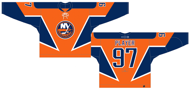
Remember what I said in the previous jersey’s section about the blue and orange being complimentary colours, and them working well together? Well, here comes a further explanation of how that works, and this jersey perfectly explains how it shouldn’t be applied.
The idea with complimentary colours (blue/orange, red/green, purple/yellow) is that they compliment each other perfectly when used together, as long as one is allowed to be the dominant colour and the other just compliments it. Think Penn & Teller: Teller’s quiet, Penn’s the screaming limelight hog. The best sports example is probably the LA Lakers. Their purple/yellow jerseys look fantastic. The Oilers, with orange and blue, have done a good job of that too. And the Wild’s road jerseys are another good example.
But these Isles jerseys are examples of where it can go wrong. If you give the two complimentary colour equal status, things clash and get messy. These jerseys just cause your eye to jump around and fight for your attention. It’s a headache.
And even without the colour issues, there’s the non-sensical angled striping taking over the jersey. At least when the Dallas Stars did something similar, it made sense, because it was the shape of a star. I can deal with that. Here, it seems to be there for nothing but effect. And it just doesn’t work.
Remember the shelf-life for a bad jersey? Generally 5 seasons. This one lasted just 4 because of the lockout.
Jersey Recommendation: #79 Yashin. Is he still on the payroll? Another botched experiment compliments of Mad Mike. He also played on the team from 2001–07, almost exactly the entire life of these jerseys. Just don’t expect to get out of the Coliseum alive.
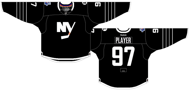
6. 2011–14 Third Jerseys
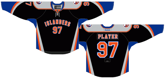
It says something when we’re already three jerseys into the countdown and we only getting to this third jersey now. It’s predominantly black with the team’s colours in the piping, the front of the jersey features arching text across the front with the players’ numbers right below. Sound familiar? It’s a bit of a rip-off (again from Dallas!). But it’s worse(!) with those strange angled stripes on the sleeves and sides.
And there’s nothing really new or innovative about this jersey at all. A dominant black jersey has, in general (and thankfully), being moved away from in NHL jerseys these days after almost. Every. Team. Experimented with it. When you have a terrific complimentary colour palette to work with for your team’s brand, why would they bother bringing black into the mix?
It’s also a clear break with traditional jersey design in the NHL and leaning more towards that of the rest of the major sports’ jerseys. That’s not necessarily a horrible thing, but at least this one was relegated to the third jersey only to be worn once in a while. Hockey jerseys, with their prominent logos on the front, are a thing of beauty and unique among the major professional sports in North America.
Also, specifically to the Islanders, it seems strange for a team that has struggled for upwards of a decade on the ice, has trouble filling its building on most nights, and after having such a storied legacy as one of the most successful dynasties ever from the States, would eschew a pretty decent logo and relegate it to a shoulder patch.
But the detailing is something atrocious. The shoulder yokes mixed with the curved-V sleeve and side striping makes it overly busy and complex. Remember the last time a team featured prominent ‘V’ shapes all over their jersey as accents? Mmm hmm.
This jersey’s shelf-life? 3 seasons.
Jersey Recommendation: #26 Moulson. With the team almost exclusively while these jerseys were worn, and one of players who worked well with Tavares to provide some offence for the Isles.

5. 2007–10 Home & Away Jerseys
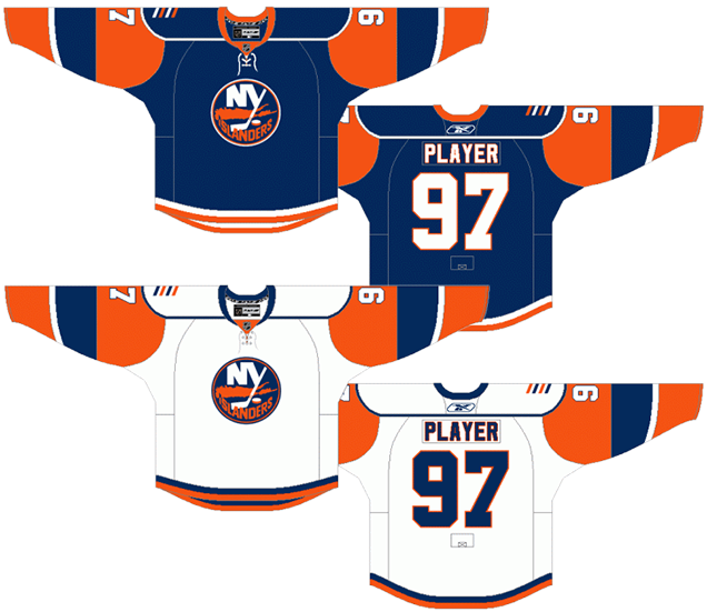
With the league-wide adoption of the new Reebok Edge jerseys before the 2007 season, the Islanders took the opportunity to re-design their jerseys. After ditching their fisherman logo/jersey fiasco in 1998 for something closer to what they wore in their past (more on that jersey later), they introduced these Edge jerseys. It’s definitely better than anything previously on this list, but it’s still not great.
Simply, it’s really over-designed, meaning that it tries to incorporate way too many elements that don’t end up working well together. There’s tons of strange inconsistencies in the striping and details of the jersey and it feels a little like the “kitchen sink” mentality of designing. Throw enough mud, and something’s gotta stick.
None of the elements individually are bad at all, but together it just turns into a shit mix. The only thing holding it all together is a pleasantly simple and consistent colour scheme.
For example, there’s the stripes along the bottom of the jersey, which don’t match the stripes on the sleeves at all, which also don’t match the stripes on the shoulder yokes, which also doesn’t match the single collar stripe. Then they threw laces on there, along with numbers on the front. It all becomes very busy and detracts from what should be the star of the jersey: the Islanders’ logo.
Of note, this is one of the few recent jerseys to use sleeves that are a different colour from that torso part of the jersey, which is a realatively minor thing, but it creates an odd dynamic with the rounded cut of the shoulder yokes. Very few teams have done this sort of thing, the most notable one being Detroit’s white jerseys with the red sleeves, and Pittsburgh’s current jerseys). It’s not necessarily a bad look at all, but the outline of the yokes just accentuate the oddness of it.
The best part of the jersey? The four stripes on the shoulder, symbolizing the four Stanley Cups won by the franchise.
Shelf life? 3 seasons.
Jersey Recommendation: #13 Guerin. These three seasons are pretty bleak ones for the Islanders, but it led to the 2009 1st overall pick (and Tavares), and Guerin was there for two of those seasons. Wait, Geurin played for the Islanders? Fam, he captained the Islanders.
4. 2015–17 Third Jerseys
Wait, what are these jerseys doing this high? That is a damn good question. And it says something about the state of the Islanders jersey library in general.
These are not good jerseys. But there’s nothing really offensive here from a design perspective, mostly because there’s just nothing really there, like, at all. It’s the jersey equivalent of a deadpan stare.
This whole uniform reeks of a publicity stunt of trying to be relevant to a new locale whose apparent sports visual identity relies on a basketball team with no historical connection to the place, but rather dictated by current trends. And of course, it’s a publicity stunt to sell more jerseys.
The four stripes for the Islanders’ four Cup victories is a nice touch, as is the minimalist alternate logo, but the use of black-and-white (which works for basketball) is incredibly bland for hockey. Throw on a bright blue-orange shoulder patch, and it becomes the focal point of the jersey, which is not ideal. The whole jersey feels like it was trying to cash in on a trend.
Trends don’t last, and neither do bad jerseys/uniforms. I originally said that if these last more than a season or two, I’ll be shocked. Or just deeply disappointed. They lasted 2 seasons.
• More: HbD Breakdown: NY Islanders’ Brooklyn Uniforms

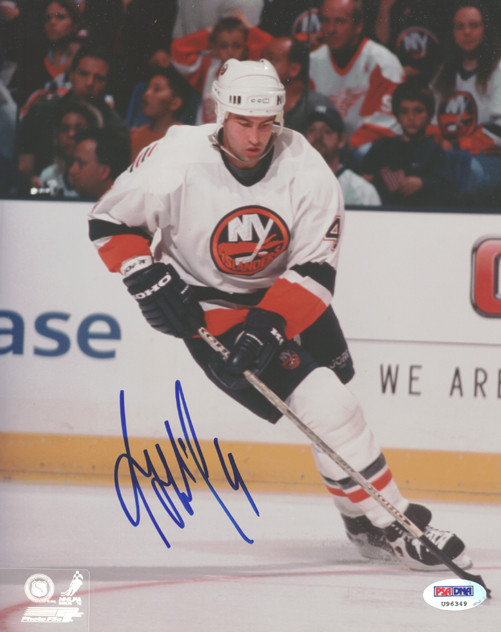
3. 1998–2007 Home & Away Jerseys

After the debacle of the Islanders’ seasick fisherman jerseys, they retreated back to what worked, a replica of their original jerseys, but with a much darker shade of blue. Otherwise, these are pretty much identical to their original (and current) jerseys, and there’s a lot to like about them.
First of all, it actually looks like a hockey jersey. No ocean-wave lines. No “Islanders” on the front. No messed up star pattern. No mishmash of totally disparate elements. There’s nothing necessarily traditional or innovative about it, but it just works.
The complimentary blue and orange colours here are nicely balanced, especially on the blue jerseys, which is like a well-experienced and efficient wedding caterer – brings just enough punch to the table. On the whites, the blue are orange are about equal, but since they’re both relegated to the trims, it’s not a problem.
Speaking of the trims, the striping is consistent and simple for both jerseys. The whites add a thin strip of white between the orange and blue, which helps separate the orange and blue and adds a little bit of visual levity. It’s a really nice balance.
The whole jersey is a strong, simple and traditional design. Given the history of the Islanders’ jerseys that we’ve already discussed, it’s a welcome addition. And again, love the 4 stripes on the shoulders for the 4 Cup wins.
Shelf life on this jersey? 8 seasons. The longest-lasting jersey discussed so far. That should tell you something right there.
Jersey Recommendation: #3 Chara? #1 Luongo? #30 Snow? Sorry Isles fans, one last poke at the dark years. How about #4 Hamrlik? The Isles never won a playoff series during these years, and all their best players got traded away, so the pickings are a little slim. So, how about their best defenseman during the era? I guess? Get it in the road whites.
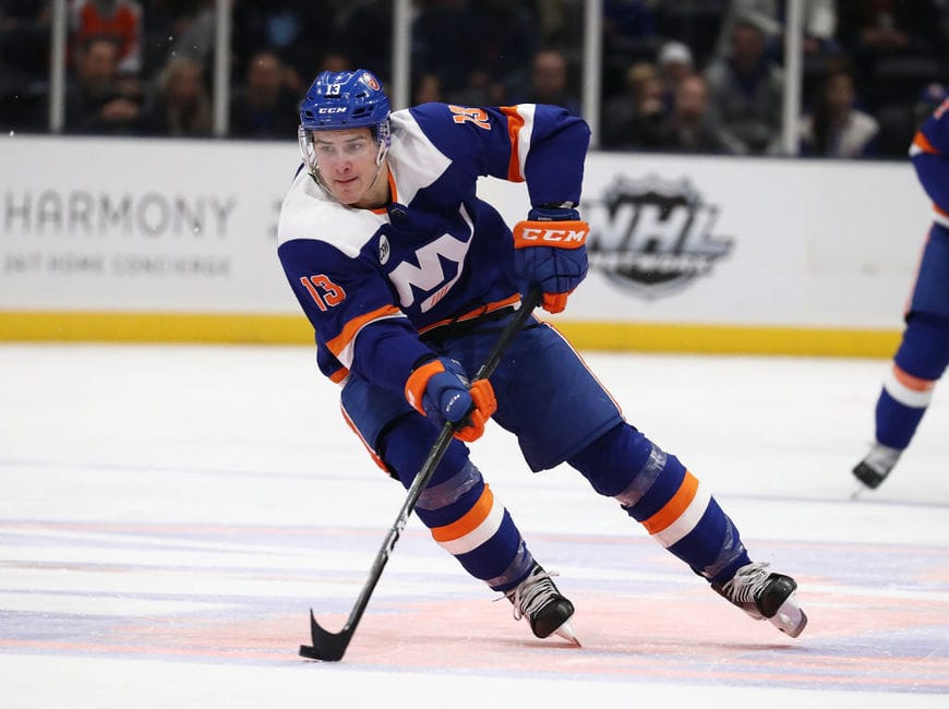
2. 2014 Stadium Series Jerseys, 2014–15 & 2018–present Third Jerseys
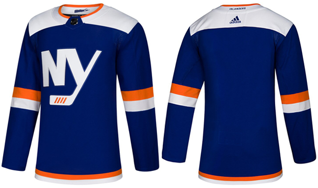
Most of the jerseys worn during last year’s Stadium Series were a disappointment, either looking like orange pyjamas or well, not really much different at all. What the Islanders came up with was a refreshingly different and somewhat innovative jersey, introducing a new alternate logo and a simplicity that’s hard to find in their other alternate jerseys.
Obviously, we’re lumping these new third jerseys in with those Stadium Series jerseys because there’s a ton of similarities: the two narrow stripes on the sleeves, the chunky white shoulder yokes, the minimalist NY logo.
The things I didn’t like about the Stadium Series is exactly what’s been changed on these new third jerseys: an additional orange stripe added to the bottom, the fake chrome removed from the logo, and no white nameplate on the back.
Seriously, like exactly. This is what I said previously: “I like the stripes on the sleeves, if they went all the way around. But then there’s the striping on the bottom of the jersey, being just a single white line. Not crazy about it, as it’s a little too simple, and I wonder how an orange line included in there might work. And…[the nameplate is] more of a distraction than a positive look.” Adidas read this article obviously.
There’s a lot to like about these jerseys, but it’s not all completely positive. The biggest negative is the chunky white shoulder yokes. The shape of them isn’t the problem, it’s the bright white yokes on a navy blue jersey creates an incredibly start contrast, constantly drawing the eye to the jersey’s shoulders. It’s balanced somewhat by the brightness of the NY logo, and the new thirds are even more balanced by the logo’s chrome elements and light grey outline being removed altogether.
Other than the yokes though, I like how the orange is dialed down in the jerseys. As mentioned earlier, using complementary colours like orange and blue only works if one if clearly given prominence over the other, which allows the other colour to truly compliment it instead of competing. With the orange left to striping in the collar and sleeves on the jersey (and pants/socks in the full uniform), it allows for the colours to work together smoothly.
But overall, it’s a good looking uniform and does what third jerseys are meant to do: play around a little bit, see what works in jersey and uniform design to continuously push the conversation forward in an innovative way. Oh, and for the teams/league to make more money, of course.
Shelf life? To be determined. But the changes they made from the Stadium Series elements to these new third jersey equivalents allows it to get bumped up the list by a spot from last time.
Jersey Recommendation: #13 Barzal. The face of the franchise going forward (barring any Tavares-like shinanigans) deserves to grace the back of the best third jersey the Isles have produced.
1. 1972–95 Home & Away Jerseys, 2008–10 Third Jerseys, 2010–present Home & Away Jerseys
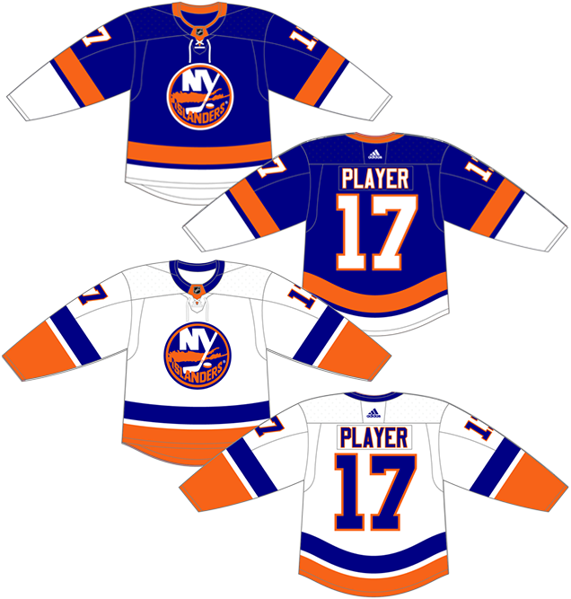
C’mon, was there any doubt? The only thing separating the third-place jersey and this one is the blue, because otherwise, they’re pretty much identical. Same striping on both of these jerseys as the white ones just previously discussed. Nice balance of orange and blue.
And that blue! The darker blue is fine, but when blue starts getting into midnight/navy blue territory, it just looks black during gameplay, which is almost never a good idea. Hockey is a game played on a sheet of white ice, a blank canvas, so adding as much colour as possible is always preferable. And these jerseys keep the blue looking blue. It’s the classic Islanders look that all the other jerseys listed here have never surpassed. It’s iconic, it’s strong and simple, and it’s raised a few of these.
The first place jersey selection was as obvious and expected as the last pick was. These jerseys symbolize the Islanders’ successes, so it’s fitting that they’re wearing them again, now that their future is looking bright again.
Shelf life on these jerseys? 30+ and counting.
Jersey Recommendation: So many choices! Personally, I’d go classic with a #22 Bossy. Or, there’s #5 Potvin or #19 Trottier or #31 Smith, all excellent players. Just make sure to get in those beautiful blues.
Agree? Disagree? Let us know in the comments below or join the conversation on Twitter, Facebook, or Instagram!


/cdn.vox-cdn.com/uploads/chorus_image/image/63162594/gettyimages_1127459688.0.jpg)
[…] • More: Worst to First Jerseys: New York Islanders […]
[…] • More: BTLNHL #20: New York Islanders• More: Worst to First Jerseys: New York Islanders […]
[…] • More: BTLNHL #20: New York Islanders• More: Worst to First Jerseys: New York Islanders […]
[…] • More: BTLNHL #20: New York Islanders• More: Worst to First Jerseys: New York Islanders […]