
Worst to First Jerseys: Detroit Red Wings
As we go through the prolonged 2019-20 season, we’ll be updating all of the Worst to First Jersey posts every Monday, as almost all the teams in the league have unveiled new jerseys since their original posts. We’ll start with the ones most needing updating and work our way through the league. Today, it’s time for the Detroit Red Wings to get updated.
Also, a huge thanks to SportsLogos.net and NHLUniforms.com for most of the jersey images and references.
Detroit is the last team to be given the Worst to First Jersey treatment. It wasn’t intentional, it’s not because we hate Detroit. Quite the opposite. I think it’s because the conclusion of this list is going to be so obvious and anti-climatic, it was always put off. But there’s still a bunch of other jerseys to look at before we get to the jersey is first place.
Here’s how this works: we’ll count down, from worst to first, all the jerseys the Wings have ever worn. Homes and aways will be lumped into the same category (so, more of a jersey “era”) and small changes (like slightly changed positions of piping for example) will be excluded, for everyone’s sanity. Third and special event jerseys, like the Winter Classics, will stand on their own (unless they’re very similar to one of their other jerseys). For the Red Wings, there’s 8 different eras/jerseys, and we’ll start with the worst one.
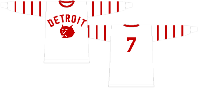
8. 1930–32 Falcons Jersey
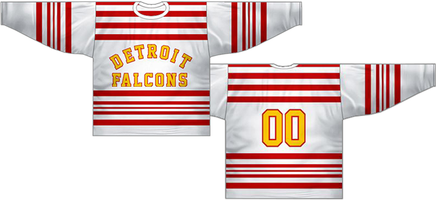
Before they were the Red Wings, they were the Detroit Falcons. And these two seasons are the only time they’ve ever worn anything other than red and white. Well, almost…we’ll talk about that further down the list. But, this is only time on a regular (non-special event) jersey.
And like the general aesthetics of the era, there’s tons of stripes all over the place. It’s actually almost identical striping to the Blackhawks jerseys of the same years, but red-on-white instead of white-on-black. And while I loved those ’Hawks jerseys (because they’re remarkably consistent and unique in today’s game), these finish last on the list mainly because of the crest/text.
• More: Worst to First Jerseys: Chicago Blackhawks
Hockey is unique in the four major North American sports is having the team logo prominently on the chest, not just a word mark (à la baseball), numbers (à la football), or both (à la basketball). It does happen from time to time in hockey (more so during the Falcons’ era), but it’s definitely not commonplace.
And while according to Sportslogos.net, the arched collegiate text was the official logo for Detroit when they were named the Falcons (post-Cougars, pre-Red Wings), it still detracts from what’s special about a hockey jersey: an illustrated logo on the chest.
And this typographic logo doesn’t mesh well with the stripes: stoic, authoritative lettering mixed with energetic striping is a mis-match. Throw in the odd choice of yellow lettering, and you’ve got the lowest jersey on this list. Detroit doesn’t wear yellow. Come on!
Jersey Recommendation: #5. Ebenezer (“Ebbie”) Robertson “Poker Face” Goodfellow may have the best name/nickname combo in all of hockey history, but he was also the best player for the Falcons for the two years they had the moniker. He eventually became a captain for the Red Wings as well.
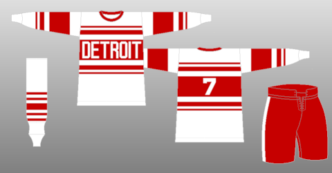
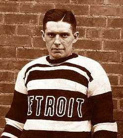
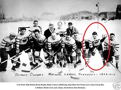
7. 1927–28, 1929–30 Cougars Jersey, 1991–92 Commemorative Jersey
These Detroit Cougars era jerseys directly preceding their two seasons as the Falcons are similar is that they also feature a bunch of stripes and text on the chest. The image above is from the 1991–92 season when the NHL brought back historical jerseys for the Original Six™ teams in honour of the NHL’s 75th anniversary. They’re extremely close to the originals.
They’re not too dissimilar from the Falcons jerseys, but with a few less stripes and no yellow anywhere. Instead of the team name, it’s just got “Detroit” on a thicker red band, so already it’s more cohesive of a jersey than their Falcons counterpart.
But, there’s still the same complaints here as the previous jersey: text instead of a team logo (especially since the Cougars actually had a logo to use) making the whole jersey a bit bland. It’s interesting from a historical perspective, but nowhere near the top of this ranking.
Jersey Recommendation: #4. William George “The Western Wizard” Hay (they seriously had the best nicknames back then) was one of the best stickhandlers during his era in the league, and was inducted into the Hockey Hall of Fame in 1958. His best years came as a Detroit Cougar, so he’s a fitting number to get for this jersey.

6. 2016 Stadium Series Jersey
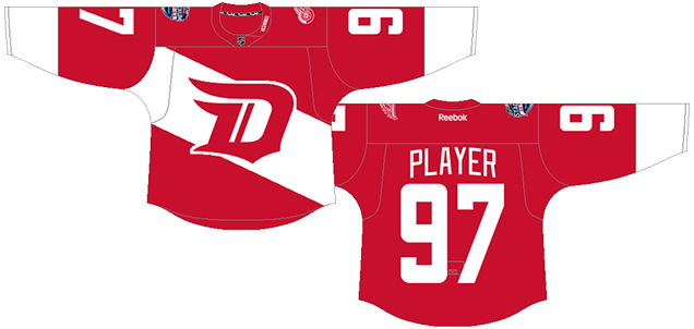
The jersey is essentially a reversed version of their original 1926-27 Cougars jersey, but with the stripe put on a slant (or, just call it a sash). The old Cougars logo is also slightly stylized to look more modern, and italicized to have a similar movement to the slanted stripe.
I don’t mind the sash, as it’s thick enough to not be confused as a murse strap, or something like that. But the lack of it wrapping around to the back is what causes problems for me, as it becomes a design element that doesn’t make sense. The movement created by the sash just halts at the sides and the momentum just dies. The numbers on the back could easily be outlined to accommodate for it.
• More: 2020 Stadium Series Jersey Countdown
• More: HbD Breakdown: Red Wings Stadium Series Jerseys
Speaking of number, the ludicrously large, but that’s more on the league’s strange mandate for that in Stadium Series jerseys. The Wings couldn’t do much about that.
The stylized “D” is strange too, trying to be old and new, stoic and athletic, classic and modern, all at the same time. And that’s a fitting description for the entire jersey. It looks over-designed, but at the same time, it’s clean and minimalist. It looks like an on-brand Red Wings jersey, but also feels out-of-sync. So, it’s neither an outstanding jersey, nor an awful jersey.
Jersey Recommendation: #21 Tatar. With a goal and an assist, Tomas Tatar was named the second star of the game in Detroit’s 5–3 win over Colorado. As this is the only time the Wings have worn these jerseys, it seems like a fitting number for it.
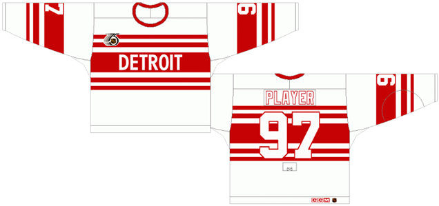
5. 1926–27 Cougars Jersey, 2009 Winter Classic Jersey
And here’s the originals that the previous jersey was based on. Instead, it’s white with red stripes (no sashes here), and the “D” isn’t trying to be modern at all. Because it’s original. Although, in 1926, using old Gothic letters probably was considered modern in a retro kind of way. Anyway, that’s getting too meta.
As jerseys go, it’s strong, consistent, and minimalist, using a simple single thick stripe on the sleeves and chest. Put the logo on there and, well…and that’s it. As Detroit jerseys go, that’s pretty much the modus operandi. Like Jon Snow looking forlorn, it’s kind of their thing.
• More: 2020 Winter Classic Jersey Countdown
So why isn’t it higher up the list? The logo is very meh compared to their current one, and although the chest stripe no longer belongs solely of the Montreal Canadiens, it’s hard to picture an Original Six™ team other than Montreal with it. It’s a strong, simple jersey, but it’s not iconically Detroit.
Fun fact: Detroit played their entire first season, wearing these jerseys, across the border in Windsor, Ontario since their building (the Olympia) wasn’t ready yet.
Jersey Recommendation: If you’re going for 1926 styling, go for #3. Art Duncan was the original captain and player-manager of the Detroit franchise and lasted with the team for as long as these jerseys – a single season – before somebody named Jack Adams came to manage the Cougars. If you’re going for the Winter Classic styling, how about #26 Hudler, who had 2 goals and an assist in their 6–4 win over Chicago.

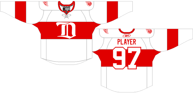
4. 2014 Winter Classic Jersey
There’s a lot to like about these jerseys, the heritage feel, the character added to its elements, the uniqueness of it within the Red Wings’ jersey library, but therein lies the rub (to mis-quote Shakespeare): it seems to try too hard to be authentically old.
The arched “Detroit” on the chest returns, this time in a modernized version of an old-looking typeface. It uses a mixture of striping patterns from other old Detroit jerseys (see #s 5, 7, and 8 on this list) that ends up looking nothing like a Detroit jersey. The numbers, like the “Detroit” are made to look old and quirky, even though they’re modernized versions of it (and a clear nod to their 1982–83 jerseys). The use of the old logo is cool though, it definitely has that.
It’s mushed together a bunch of different elements from different era to create a kind of Franken-jersey, but then modernized some elements by making them look old.
• More: HbD News: 2014 Winter Classic Jerseys Announced
• More: 2020 Winter Classic Jersey Countdown
On it’s own, in a contextual vacuum, it’s a great jersey. There’s definitely a strong vintage feel with a lot of character, charisma, and uniqueness in it. The striping is strong, classic, and consistent.
But within the context of the Red Wings franchise and their entire history of jerseys, it’s legitimately far off-brand. One-offs like this can be fun, and they definitely had some fun with this jersey, but it’s completely out of character for Detroit. And for that reason, you have been Chopped™…I mean, dropped to fourth on this list.
Jersey Recommendation: #35 Howard. In a tight shootout game with Toronto, Howard shone stopping 24 of 26 shots, earning the second star of the game.
3. 1928–29 Cougars Jersey
Ridiculous cougar-face logo aside, these jerseys represent a great balance between minimalism and character, which pushes them up this list.
There’s still the arches “Detroit” on the jerseys – which the franchise seemed to have loved in their first near-decade of existence – but the addition of a cougar logo (albeit a badly-drawn one, which probably has to do with jersey production limitations of the time) gives it some much needed character.
Mix that with the more unique approach of four single stripes on each sleeve, and you’ve got a great balance between quirky and elegant. Simple and complex. Minimalism and character.
Each element needs to be there, because if you remove any single element the whole thing starts to fall apart. But if you add anything, the balance would be off. It’s a tough balance to achieve, so while nobody would think of this jersey as being iconically Detroit, it’s still really good from a design perspective.
Jersey Recommendation: #6. Lawrence (Larry) Henry “Little Dempsey” Aurie (seriously, these nicknames were the best) was a long-time Cougar/Falcon/Red Wings and instrumental in helping the team achieve their first two Cup wins in 1936 and ’37.
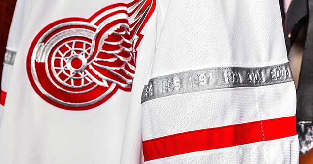
2. 2017 Centennial Classic Jersey
The 100th Anniversary of the NHL featured an outdoor game between Detroit and the Toronto Maple Leafs. Detroit took to the ice wearing what can best be described as updated versions of their just-discussed 1928–29 Cougars jerseys.
The four stripes on the sleeves are there. It’s all white with the logo crest on the chest. The only real alteration is the addition of the two consistently-thin red stripes on the bottom of the jersey, but the balance discussed in the Cougars jersey remains despite the addition because of the removal of “Detroit” on the chest.
It also is the only other instance of a colour other than red or white being featured on a Detroit jersey, with silver added in to the logo crest, sleeve stripes, and number outlines. It works better than the yellow did for the Falcons.
• More: HbD Breakdown: Red Wings and Maple Leafs Centennial Classic Jerseys
• More: 2020 Winter Classic Jersey Countdown
It’s another example of that balance: simple and complex. Quirky and elegant. Minimalism with some character. And then throw in a balance between classic and modern. It’s a great achievement and it’s the details that really makes it work.
The additional of silver really complements the jersey’s elements rather than dominating it. It was a good call the have the lone silver stripe right at chest level to visual connect it to the silver in the logo. But the better call was what’s included in the stripes: the years of all Detroit’s Cup victories, making it a must-own for Detroit fans and, let’s be honest, it will probably stay relevant for quite a while.
Jersey Recommendation: #39 Mantha. With two goals, an assist, and a third-star (with one goal being the game-tying one with 2 seconds left), he was a standout for the Wings in this game, in their narrow 5–4 OT loss to the Leafs.
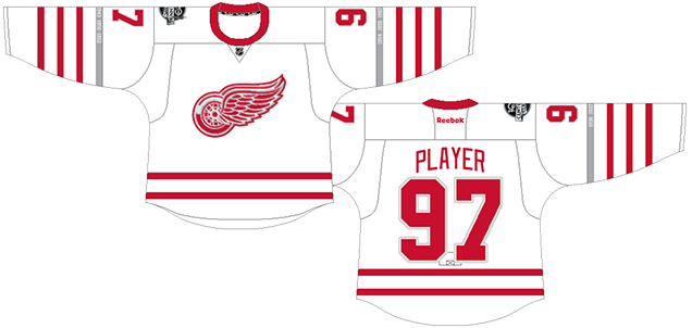
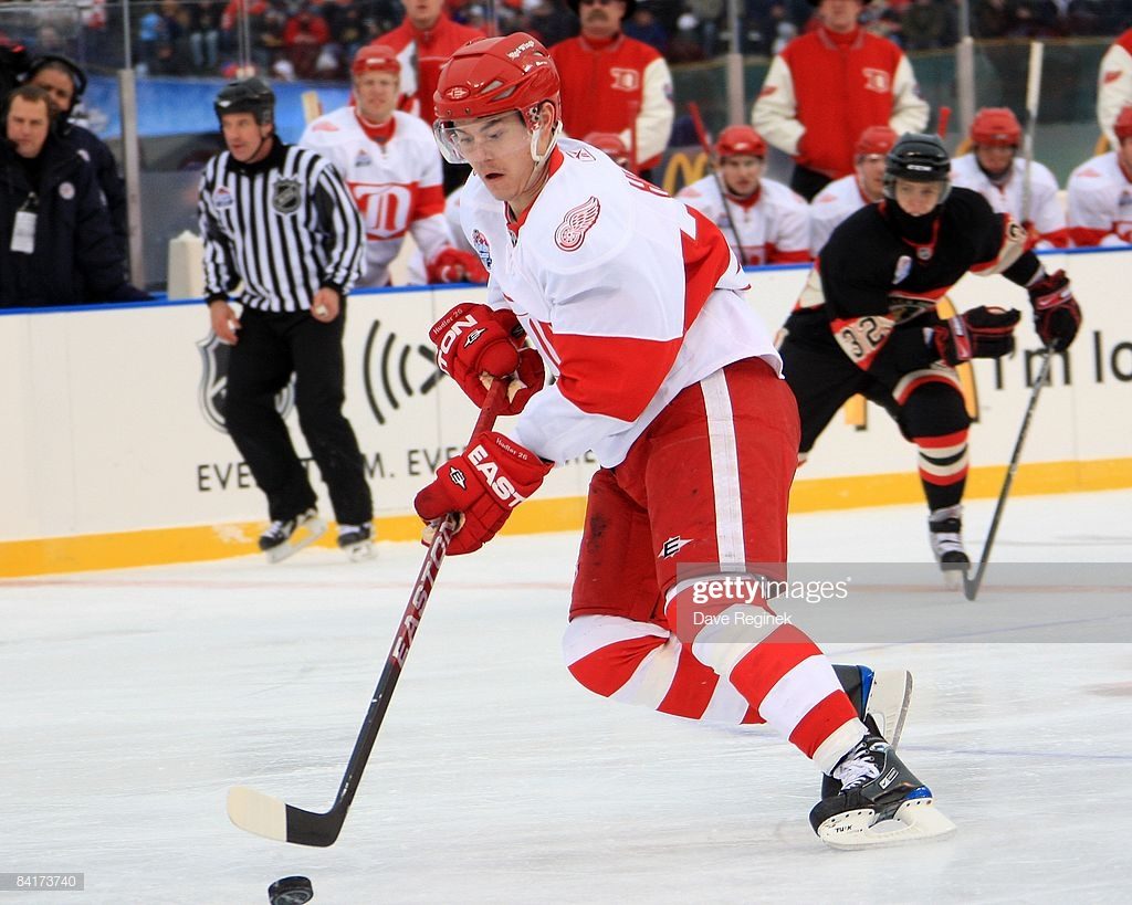
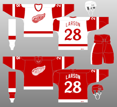
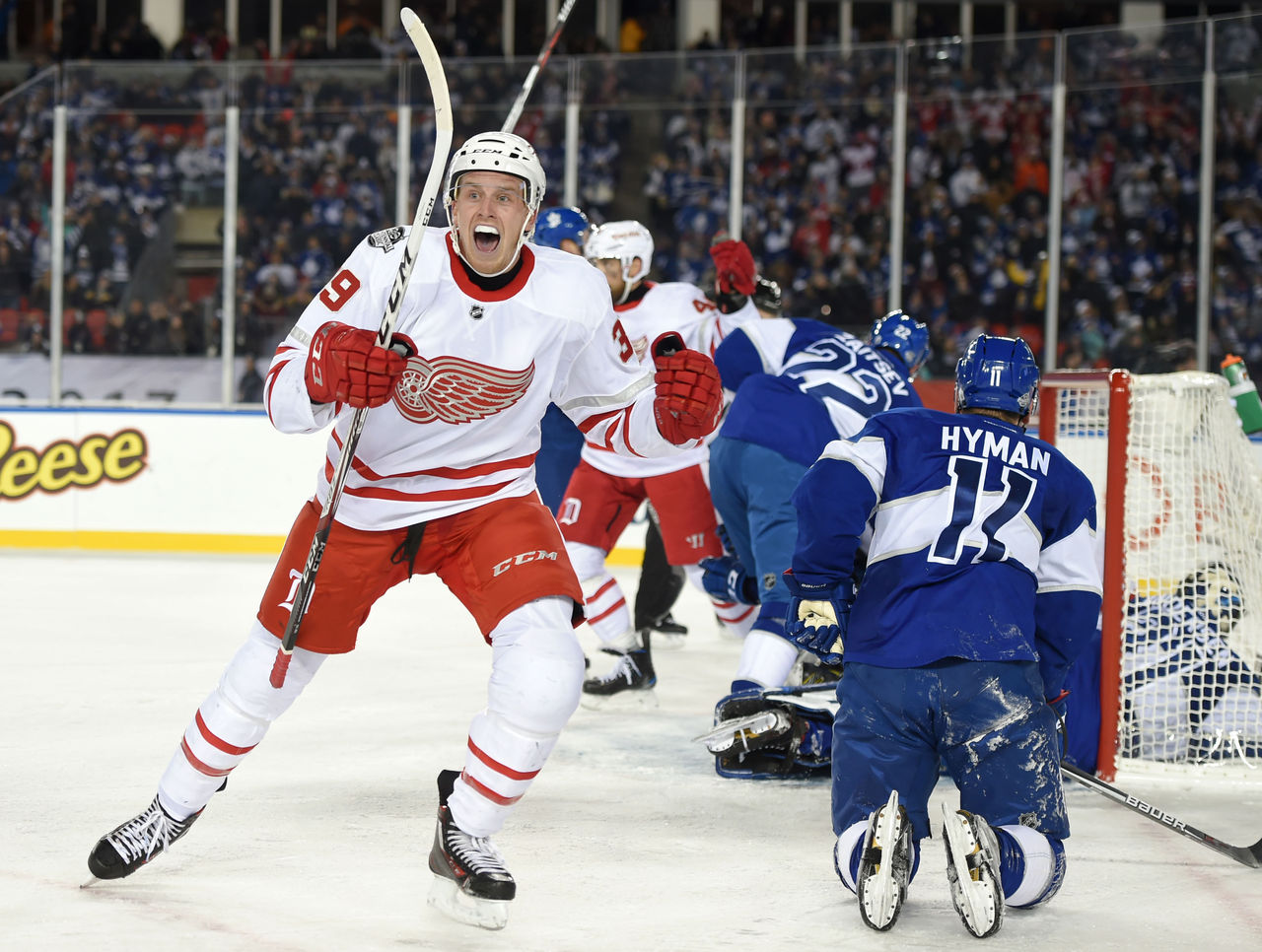
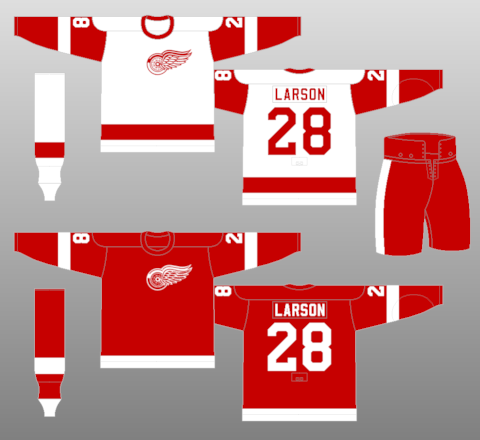
1. 1932–present Home & Away Jerseys
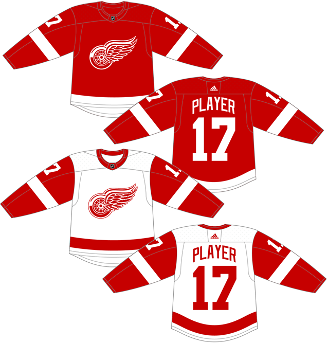
C’mon, was there really another option?
This is the second oldest jersey still being used in the NHL. Only Montreal’s iconic red sweaters are older. It’s gone through minor revisions over the years – most notably the logo previously being worn off-centre from 1932–82 and the sleeves on the white jersey being white from 1934–61 – but that’s it. Otherwise, it’s been the exact same jersey from 1932 to today. The logo has gone through minor changes, but the arches lettering on the nameplate added in 1982 just perfected it, adding one additional bit of character. Even Reebok in 2007 and Adidas in 2017 couldn’t get them to change a thing, and I’m assuming (hoping) they didn’t bother to try.
Detroit can get away with the relatively simplicity in their jersey (two colours with a single thick stripe on the sleeves and bottoms) because of their logo, which is by my account, the best logo in the league.
• More: BTLNHL Finals: Boston Bruins v Detroit Red Wings
There’s a strength and elegant complexity in the logo that, when allowed to be the dominant feature on the jersey (as it should be), it doesn’t need much more to make it all work together. The jersey’s designers realized this way back in the 1930s, and they still realize it now. 80 years later, it’s too ingrained in the psyche on the Red Wings organization to even think about changing it now.
And some of the best players to have ever laced up skates have worn it. It’s iconic, minimal, classic, elegant, modern, timeless, etc, etc, all rolled up into one jersey. It’s the best the Detroit franchise has ever worn, easily.
• More: Top 5: Gordie Howe Jerseys
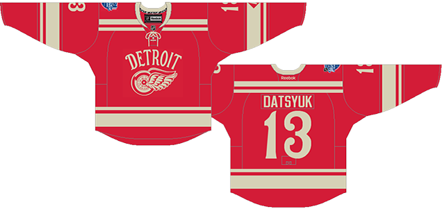
Jersey Recommendation: Take Your Pick. Uh yeah, you could do Zetterberg, Datsyuk, Lidstrom, Yzerman, Lindsay, Federov, Sawchuk, Shanahan, Abel, Delvecchio, the list goes on and on. But you can never go wrong with a #9. Gordie Howe was the best of his era, and the best player to wear a Detroit jersey. Get it in the red.
Agree? Disagree? Let us know in the comments below or join the conversation on Twitter, Facebook, or Instagram!


:format(jpeg)/cdn.vox-cdn.com/assets/1040254/nfluniforms.jpg)
[…] Ranking the Detroit Red Wings' jerseys. Yes, there were more than two of them. […]
[…] Ranking the Detroit Red Wings‘ jerseys. Yes, there were more than two of them. […]
[…] Ranking the Detroit Red Wings‘ jerseys. Yes, there were more than two of them. […]
[…] Ranking the Detroit Red Wings‘ jerseys. Yes, there were more than two of them. […]
[…] Ranking the Detroit Red Wings‘ jerseys. Yes, there were more than two of them. […]
The Red Wings Sweater has changed since 1932, to start the White wasn’t added until 34 for games against the red sweaters of the Habs, in 37 the numbers went from a white outline to solid white, 48 the Crest is changed, 61 the White sweaters get red sleeves, there’s more involving the stripe on the bottom and the number designs etc I’m not going through it all. I jus don’t know how you can throw 1932- present up there that’s lazy. A hockey Sweater is a work of art where the minor details make all the difference
From the intro: “Homes and aways will be lumped into the same category (so, more of a jersey “era”) and small changes (like slightly changed positions of piping for example) will be excluded, for everyone’s sanity.”
Everything you described I consider to be “small changes”. The basic concept of the jersey’s design hasn’t changed since 1932. And most of the things you commented on I wrote about. Did you read it?
[…] Ranking the Detroit Red Wings‘ jerseys. Yes, there were more than two of them. […]
[…] Ranking the Detroit Red Wings‘ jerseys. Yes, there were more than two of them. […]
[…] Ranking the Detroit Red Wings‘ jerseys. Sure, there have been greater than two of them. […]
[…] Ranking the Detroit Red Wings‘ jerseys. Yes, there were more than two of them. […]
[…] Ranking the Detroit Red Wings‘ jerseys. Yes, there were more than two of them. […]
[…] Ranking the Detroit Red Wings‘ jerseys. Yes, there were more than two of them. […]
[…] Ranking the Detroit Red Wings‘ jerseys. Yes, there were more than two of them. […]
[…] Ranking the Detroit Red Wings‘ jerseys. Yes, there were more than two of them. […]
[…] Ranking the Detroit Red Wings‘ jerseys. Yes, there were more than two of them. […]
[…] Ranking the Detroit Red Wings‘ jerseys. Yes, there were more than two of them. […]
[…] Ranking the Detroit Red Wings‘ jerseys. Yes, there were more than two of them. […]
[…] Ranking the Detroit Red Wings‘ jerseys. Yes, there were more than two of them. […]
[…] Ranking the Detroit Red Wings‘ jerseys. Yes, there were more than two of them. […]
I am thrilled with the data that I have just obtained.