
Worst to First Jerseys: Pittsburgh Penguins
As we go through the 2019-20 season, we’ll be updating all of the Worst to First Jersey posts every Monday, as almost all the teams in the league have unveiled new jerseys since their original posts. We’ll start with the ones most needing updating and work our way through the league. Today, it’s time for the Pittsburgh Penguins to get updated.
Also, a huge thanks to SportsLogos.net and NHLUniforms.com for most of the jersey images and references.
One of the teams that came out of the first expansion after the so-called Original Six, Pittsburgh has been fairly consistent with its logo (at least in the main concept), but have been pretty wild and varied with their jerseys, switching color schemes, tones and patterns. A Pens fan could go broke trying to buy every jersey they’ve worn. Luckily, that’s what we’re here for, to let you know which ones you should (or shouldn’t) spend your money on.
Here’s how this works: I’ll count down, from worst to first, all the jerseys the Pens have ever worn. Homes and aways will be lumped into the same category (so, more of a jersey “era”) and I won’t worry about small changes (like slightly changed positions of piping for example). Third jerseys will stand on their own. And I’m focusing on the jerseys only, not the entire uniform. For the Penguins, there’s 15(!) different jerseys/eras. And we’ll start with the worst one.
15. 1995–97 Third Jersey, 1997–2002 Away Jersey
Okay, there’s a lot of jerseys to get through, so to prevent this from turning into a Stephen King novella, we’ll keep the analysis short and – for these worst jerseys – not-so-sweet, like Danny DeVito.
I know there’s a lot of love for this Penguins logo from the ’90s and early-’00s, but it’s really awful – at least for a hockey logo. It would make a great logo for Linux, or some other tech business like that, rather than a hockey team: too corporate, too bland, no fierceness or intensity that makes hockey such a great sport. In the end, it’s not inspiring as a sport logo.
And any jersey that plays off of its design isn’t going to be great either. But these took it to a whole new level…multiple amounts of gradients (one color blending into another), asymmetrical sleeve patterns, diamond-shaped shoulder yokes. There’s more going wrong with this jersey than right. It’s easily the worst thing the Penguins have ever worn, born out of the first attempts at third jerseys in the NHL, when jersey producers first developed the ability to print gradients. Just because you can do something, doesn’t mean you should.
Jersey Recommendation: #93 Nedved. Nedved played with the Penguins for only 2 seasons, from 1995–97, which is one season longer than these jerseys should have lasted. He was very offensively-minded, scoring 99 points in one season. These jerseys are also very offensive, so it fits.
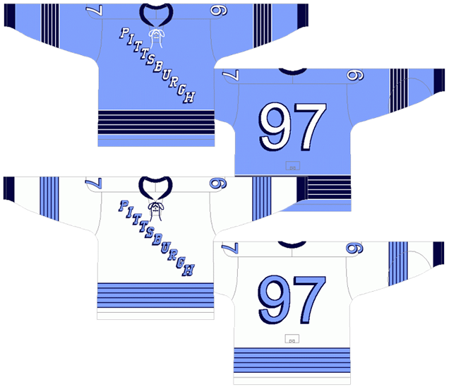
14. 1977–80 Home & Away Jerseys
The use of blue in the early days of the Penguins’ franchise is a bit confusing, as after 1971, they didn’t have any blue in their official logo anymore (after ditching the blue circle around the skating penguin). The baby blue was perhaps understandable – penguins live on ice, hockey’s played on ice, ice is generally a very light blue. Makes sense. But navy blue?
This is only one of two Penguins jerseys to prominently feature navy blue on the colored jerseys, lasting only three seasons before the Penguins ditched any shade of blue altogether, making the jersey (justly) the final nail in the blue coffin. Regular Hockey By Design readers will know our feelings about blue jerseys that are either navy or midnight blue – jerseys that are so dark blue, they’re almost indistinguishable from black when you see them on the ice. And on that sheet of pristine white ice – a virtual blank canvas – there’s almost always one team that wear white. If the other team wears just black (or dark blue), it makes for a very boring game visually. Monochromatic even. The flashes of baby blue on this jersey (and, of course, the splash of yellow in the middle) save it a bit.
Like the previously discussed jersey, all of the striping is inconsistent, with the bottom stripes following a different pattern than the sleeve stripes, which is different from the collar stripes. It just makes the jersey look cluttered and awkward.
This is also the first Penguins jersey to introduce the full sleeve colourings, where the colours of the shoulder yokes and main part of the jersey are fully connected and the sleeves are different. The only other team I’ve been able to find that does this (and still does this) is the Red Wings on their white jerseys. Otherwise, it’s unique within the league and the Penguins rocked it for a long time (and do once again). It’s not necessarily a bad thing, but with all the other visual noise happening on the jersey, future jerseys will utilize it better (#spoiler).
But otherwise, the jersey is a bit of an odd mixture with the Penguins moving from one era to another, making for an awkward and generally bad viewing experience. Not unlike Jim Carrey in Mr. Popper’s Penguins.
Jersey Recommendation: #17 Kehoe. Some of Kehoe’s best seasons as a Penguin came wearing this jersey, and he’s 5th in Penguins scoring behind the usual suspects: Lemieux, Jagr, Malkin and Crosby. Get it in the bizarrely navy blues.
13. 2019 Stadium Series Jersey
Neither of the 2019 entries into the Stadium Series jersey library were very good. The ultra-modern/minimalist approach to the Stadium Series in general goes overboard here, paring down the Penguins logo to a single colour with a few gold stripes on a black jersey…and that’s it.
I applaud Adidas for trying to do some new things here and pushing the boundaries of a hockey jersey, but these jerseys push it too far, taking it into bland pyjama/practice jersey territory. It’s minimalism for minimalism’s sake, without creating any needed contrast or depth to the jersey at all.
• More: 2020 Winter Classic Jersey Countdown
There’s just simple not much to these jerseys. The angled stripes on the sleeves are a good allusion to the angles in their logo’s triangle, but that’s about the most interesting element on the jersey, and it’s too thick of a stripe (and inconsistent with the stripe along the bottom).
Other than that, what’s there to talk about?
And the helmets, though innovative, look like a blotchy mess with all the edges on a hockey helmet.
Jersey Recommendation: #4 Schultz. The game’s second star with an assist gets the nod here. He’s also more of an offensive defenceman prone to defensive errors, and this jersey is offensive and error-prone, so sure, why not.

12. 1973–77 Home & Away Jerseys
This entry needs to be slightly prefaced by the fact that, in the four seasons between 1973 and 1977, the Penguins actually wore three different jerseys. And that’s just absolute craziness. It’s one thing to have slightly inconsistent branding, but it’s another thing altogether to have absolutely no idea what you’re doing when designing jerseys. Fans eventually get frustrated by continually having outdated jerseys and feeling forced to shell out more money to buy a new one. You don’t build a brand this way, you destroy it. The jersey pictured here is from 1973–74. You can see the 1974–75 jersey here, and the 1975–77 jersey here.
So why are they all lumped together? Because they share the same general base design with changes predominantly to just the striping. And also that the stupidity of changing your jersey every season can be clearly stated.
The base of the jerseys are white with sky-blue/navy-blue stripes and sky-blue with white/navy-blue stripes. These are the only four years that they used a rich sky-blue colour, which is an odd choice of blue to use, as it’s not an icy baby-blue and didn’t really have any visual connection to anything else the Penguins wore. Apparently, they just decided they liked that blue. And it’s not a bad blue to use, but just a puzzling choice for the team.
The 1973–74 jerseys (pictured above) are the best of the bunch, with consistent striping and laces. Laces are always awesome with a great nod to the history of hockey. It’s a classic-looking hockey jersey. It’s also one of the first hockey jerseys to play around with typography for the nameplate, but unfortunately choosing a typeface that belongs more like a old western movie than for a penguin. Awkward!
The 1974–75 jersey was innovative in another way, becoming the first hockey jersey to introduce angled striping on the sleeves, mimicking the triangle on their logo to a certain degree. It was a bit ahead of the time, as angled striping became all the rage in the ’90s, but it made sense with their logo, and it worked with the removal of the shoulder yokes. Oddly though, the triangles points up (towards the shoulders) than down. The angles became less dramatic a couple years later for the 1977 –80 jerseys already discussed. The striping changed to black and white on the blue jerseys – a bad choice with way too much contrast when put with the blue, but at least it was consistent. The whites went an inconsistent sky-blue sleeve base for the striping and a navy-blue base on the bottom of the jersey. But the jerseys had consistent patterns between the two at least.
The 1975–77 jerseys went back to the 1973–74 jerseys for the whites (but without the bad typeface). The blues stayed the same except for taking on the worst element of the 1974–75 white jerseys – changing the bottom stripe from white to navy-blue and using a totally different striping pattern than the black-and-white angled sleeve stripes, creating a visual mess of a jersey. The whole 1973–80 era was an odd and horribly inconsistent (and seemingly random) time for Penguins jerseys, but the fault may lie with another team…
Jersey Recommendation: #26. Syl Apps (Jr) had his best years as a Penguin, and his best years as a Penguin came during this era. Get it in the 1975–77 jerseys (which has no names on the back). 1975–76 was the most productive year of his career, with 99 points.
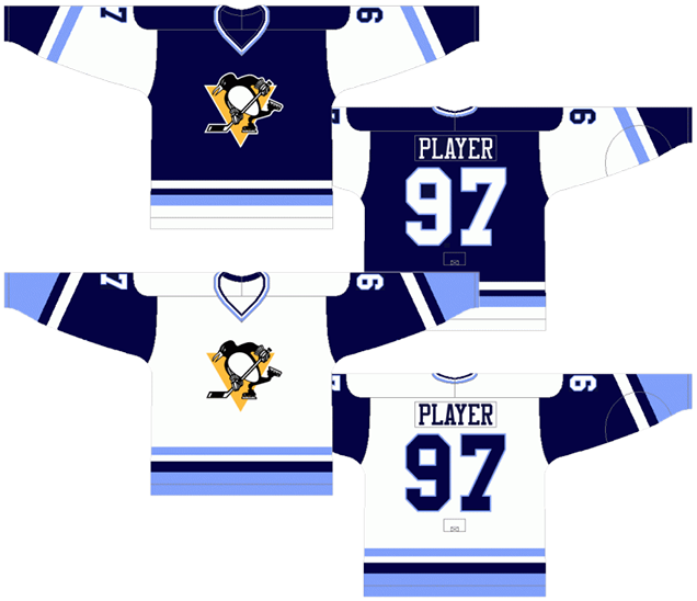
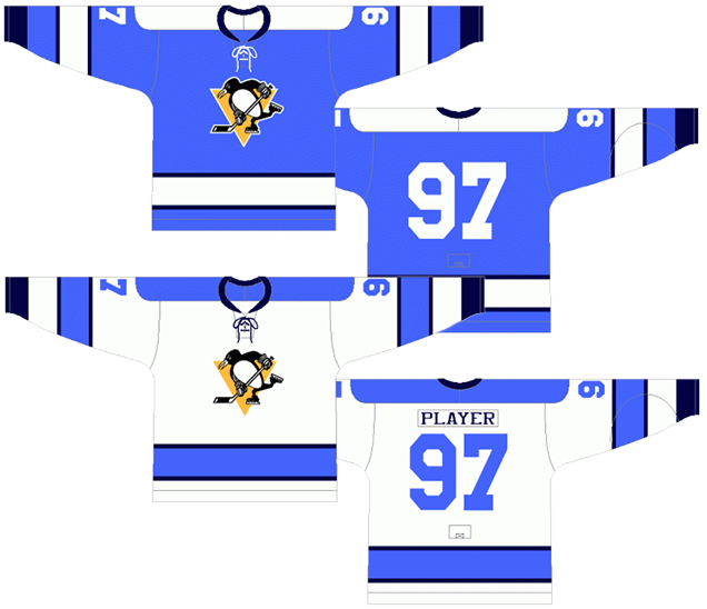
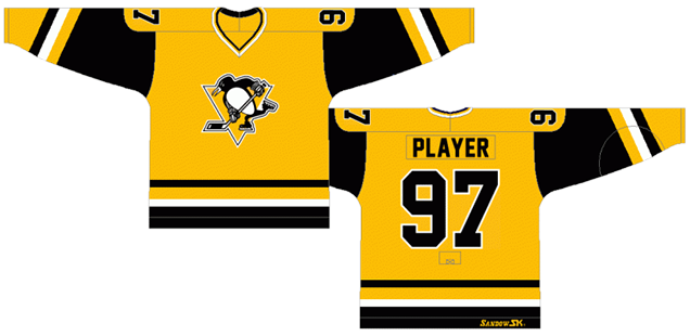
11. 1992–97 Home & Away Jerseys, 1997–2002 Home Jersey
More Robo-Penguin coming your way, with these jerseys being the official introduction of it, completely dropping the skating penguin for the only time in their history. It was also a major change after having just won the Stanley Cup in 1992, which is generally odd since hockey teams and players are generally a superstitious bunch and don’t like messing with things like that. Turns out they were right, and didn’t win the Cup again for another 17 years.
• More: Behind the Pittsburgh Penguins’ 1992 Rebranding
The whites are identical to the ones ranked last this post, so we’ll skip talking about them with their inconsistent striping, diamond-shaped shoulder yokes and corporate penguin entirely.
The black jersey took a page out of their history by bringing back the angled “Pittsburgh” that was on their original jersey (still to come). Originally for myself, I thought it was a complete rip-off of the Rangers, but I was wrong. The original 1967 jerseys were a complete rip-off of the Rangers. This jersey just brought that back.
It’s not a bad element to include on a jersey, as the diagonal writing is somewhat unique to hockey of all the major sports and, as mentioned, there’s historical precedent to it. But it gets a little bit crammed in there visually. “Pittsburgh” is 10 letter long while “Rangers” is only 7, and there’s not a lot of room on a hockey jersey for those three extra letters. If I wanted to spend my time reading something associated with penguins, I’d read a Penguin.
The Robo-Penguin is relegated to shoulder patches, which both clutter the top left corner of the jersey, but also doesn’t instil much confidence in this brand new logo that’s been developed. Having the diamond-shaped shoulder yokes would almost be better in this instance, to allow for more room for the “Pittsburgh”. At least the rest of the striping is consistently inconsistent with the white jerseys. It has to be said though, the black and gold is better than the navy-blue, sky-blue jerseys that have taken up most of the post so far.
Jersey Recommendation: #68 Jagr. No jersey epitomizes Jagr’s time with the Penguins than this one, becoming one of the most dominant forces in the league during this era. Get it in the white, with a mullet wig if you can. Another option? #10 Francis. Francis’ Penguin years were arguably his best years, winning the Selke and Lady Byng in 1994–95, as well as racking up 92 assists in 1995–96, and of course winning the Cup in 1991 and 1992. And was also the captain of the Penguins in 1994–95 when Lemieux took a one-year hiatus. Get it in white, without the wig.
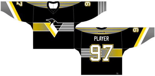
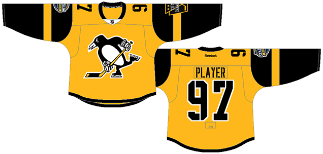
10. 2018–present Third Jersey
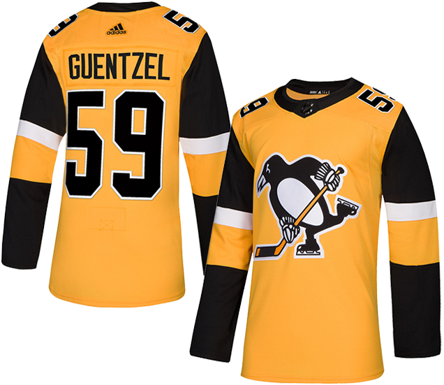
The Penguins’ current third jersey is obviously based off of their 2017 Stadium Series jerseys (more on them in a minute), which we can assume sold pretty well based on their decision to bring it into a regular rotation.
But the changes they made from its parent jersey hit all the wrong marks, adding simplicity where it needed none, and the adding complexity where the simplicity worked.
First, the former. Within the context of a full uniform, the removal of the black stripe along the bottom of the jersey makes sense since the black pants negated their necessity and just made the jersey appear shorter than it actually was. As a stand-alone jersey, however, the lack of a black stripe hurts the overall balance of the jersey, pushing it into practice jersey aesthetics.
Second, the latter. On the sleeves, changing the gold stripe to white and then adding an über-thick gold stripe makes the sleeve look totally disjointed and clunky. The full-black sleeves on a gold jersey was a strange look to begin with, but the striping pattern on these just accentuates that strangeness.
Overall, as gold jerseys go it’s…nice, I guess? I like the idea of the penguin outside of the triangle as an alternate logo. And not using stencilled letters/numbers that was on their Stadium Series version makes sense given they’re not playing in the Steelers stadium with these.
But again, the different coloured sleeves is odd. While it’s not unusual for Penguins jerseys to have those, the other examples are more successful (spoiler alert) because they made the striping complex enough to distract from this disjointed feature.
Jersey Recommendation: #81 Kessel. Nice jersey. Tries hard. Loves the game. He was only with the Penguins for the first season of these jerseys, but like him (and the constant trade rumours), who knows how long these will last.

9. 2011–13 Third Jersey, 2011 Winter Classic Jersey
The Penguins’ second Winter Classic participation brought a historical jersey that was more of a mishmash of different historical elements than reminiscent of anything specific that they wore in the past, a jersey I affectionally call “The Cummerbund“. But the major inspiration of this jersey was the just discussed 1967–68 inaugural jersey, righting some of the wrongs from that jersey, but also creating some new wrongs out of the rights.
• More: 2020 Winter Classic Jersey Countdown
The historical nature of the game let them get away with some things that wouldn’t fly as a regular jersey (because penguins don’t fly, duh). First, they brought the crazy multi-stripd pattern on the sleeves and bottoms of the jersey back from the dead, which is great. The stripes were made just slightly thicker too and take up more of the jersey, which is not great, as that’s totally unnecessary for the design and starts to crowd the other elements, especially the numbers.
The biggest plus of this jersey is having the inaugural Penguins jersey placed on a jersey for the first time. We’re a big fan of the skating penguin and this retro version is all kinds of wonderful, with lots of charisma and character. Should it take the place of the current logo? Absolutely not, but as a historical jersey and third jersey, it works wonderfully.
• More: BTLNHL #6: Pittsburgh Penguins
The original rounded numbers are brought back as well, which is still relatively unused in the league at all, giving the jersey a little more mystique. And laces. Love the laces.
But why the navy-blue? We’ve already gone over the case against such dark-blue jerseys, but its a major strike against these jerseys which, otherwise, did a lot of things right. The sky-blue used from 1973–77 might have been interesting to see on there, but then again, what could they possibly wear if (when?) they play their next Winter Classic game?
Jersey Recommendation: #29 Fleury. From what the research tells me, Fleury is so far the only goaltender to have a point in a Winter Classic, getting an assist on Malkin’s goal in the 2011 game. So sure, why not commemorate that with this jersey?
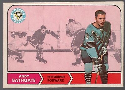
8. 1967–68 Home & Away Jerseys
Speaking of having “Pittsburgh” on the jersey, here’s the original one that the previous black jersey drew from. This jersey is also a symbol of the erratic and nonsensical approach that the Penguins have taken to their jersey design, with these jerseys lasting only one season before giving way to a brand new design.
But the icy baby-blue! Personally, I love it. It makes sense for a team called the Penguins and it was completely unique for the league in 1967, which was expanding to more than 6 teams for the first time since 1942. It would have looked strange and exciting and new, as it looked when Pittsburgh rolled the colour out again for the inaugural Winter Classic in 2008, as it still looks today. And the typeface used for the numbers on the back were completely different than anything any other team was using, foregoing the traditional thick, blocky, angled-cornered numbers for something thin, shadowed and very round. It was a bold choice.
But a jersey is more than just a colour and numbers. The actual design of the jersey is completely historical, using a crazy amount of stripes on the sleeves and bottoms of the jersey that call back to the 1930s when a crazy amount of stripes on hockey jerseys were all the rage. The “Pittsburgh” rips off the historicity of the Rangers jerseys, which had been doing the slanted lettering thing since 1926. And there’s laces on the jersey, which only half the teams in 1967 used. The jersey was an interesting blend of history and innovation. Like a penguin who communicates through song and dance.
But it suffers the same way that the other “Pittsburgh” jerseys suffered. It just becomes too cluttered and awkward-looking on the chest with that many letters, especially when mixed with so many stripes. And for a new team trying to build an identity with a city, it’s a bit crazy to not show their logo at all. The original Penguins logo was never used on a jersey at all during the inaugural years of the franchise, as that was changed the next season as well.
It’s an exciting jersey that has a lot of things going for it (and one that I’d love to own myself), but the missteps drop it down the list.
Jersey Recommendation: #9. Andy Bathgate was a popular (and elite) player for the Rangers and was one of the first professional players to don a Penguins jersey. He also led the team in scoring in their inaugural season. Get it in the sweet baby-blues.
7. 2017 Stadium Series Jersey
This jersey marked the return of a gold jersey for the Penguins. For an event like the Stadium Series, a gold jersey makes a lot of sense. It’s a chance to wear something different, interesting, and on-brand without committing to it past one wearing. I’m assuming it went over well (in sales), as they brought out the afore mentioned third jersey variation of it the following season.
But again, for a special one-off event like the Stadium Series, the Penguins ticked all the boxes: unique, interesting, on-brand, great details, Stadium-Series-esque. These manage to strike a balance between extreme minimalism and obnoxious oversized elements to have something that kind of works. But yeah, the gold definitely helps.
• More: HbD Breakdown: Penguins and Flyers Stadium Series Jerseys
What keeps these jerseys from looking odd is that they maintained a level of traditional hockey jersey design, and especially within the Penguins new visual brand of jerseys. Just like their new (old) jersey set, the sleeves are a different colour from the rest of the jersey, which allows the gold to be repeated in a single simple sleeve stripe (alliteration ftw). Unlike their current third jersey counterparts, the minimalism of the stripe doesn’t break up the sleeve as much, which allows it to work better.
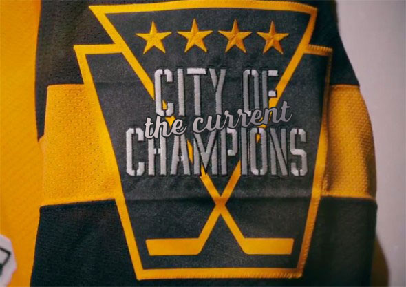
It was also the first time the Penguins will be wearing a penguin without its triangle on their jerseys…and it works. To make up for it, the Pens used their golden triangle (which represents the city of Pittsburgh, btw) is a couple different places. First, as the marker for the captaincy indicators, which is a great touch. Second, as a white triangle at the collar, holding the NHL logo, which is not a great touch, as the white draws undue attention to the collar.
There’s one more triangle featured on the jersey, on the City of Champions patch worn on the left sleeve of the jerseys. The triangle, holding four stars representing the Pens’ four Cup championships turn into two hockey sticks held within a keystone shape (representing Pennsylvania of course), all with “City of Champions” laid overtop.
As patches go, it’s really great, cleverly incorporating many different symbolic elements (the city, the state, the Cup championships, the sport) all within one simple shape. But…City of Champions? That’s a bit much. Sure, they were the reigning Cup champions at that point, but don’t worry Pens, I fixed it for you.
As Stadium Series jerseys go, it’s one of the better ones (an admittedly low bar). And it was a fun brand extension for the Penguins to try out. But the extreme minimalism keeps it further down this list.
Jersey Recommendation: #59 Guentzel. He was the first star of the game, with 2 assists in a 4–2 win over their cross-state rivals. And he’s one of the best players on the current Penguins roster these days as well.

6. 2014 Stadium Series Jersey
When the NHL initially rolled out all the different novelty games, the Penguins were almost always invited in order to showcase the game’s biggest star, Sidney Crosby. The Stadium Series is no different. No matter what you think of some of the more negative features of the 2014 Stadium Series jerseys (chromed-up logos! slanted numbers! wallet-stuffing cash grabs!), the Penguins version of the jerseys are the best that any team came out with that year.
• More: 2020 Stadium Series Jersey Countdown
• More: HbD News: Stadium Series, All Chromed-Up
What was said about them back when they were released still stands: these jerseys are a great balance between classic jersey design and moving the conversation into innovative directions. Keeping with the overall design of the other Stadium Series jerseys, the Pens’ entry has the shoulder yokes that are chopped off at angles (which is interesting and innovative) and the slanted numbers on the sleeves (which is incredibly stupid) and the angled sleeve stripes that don’t wrap around the entire arm (which is somewhere in between). Also, the logos on the Stadium Series jerseys are super-sized. For the Pens, it works more in their favour since their logo comes to a point at the bottom. This shape allows there to be a good amount of white space around the logo at the bottom, so it doesn’t come across as being too large. The opposite of this is the Kings, which fills up a huge amount of the jersey because it’s more of a square shape.
• More: HbD News: Penguins’ Stadium Series Jerseys Announced
But it’s the detailing in these jerseys that really work. Adding the gold stripe to the shoulder yoke works well. All the stripes on the jersey, from the yoke, to the sleeves to the stripes along the bottom, are the same thickness and are consistently patterned, making the whole jersey look more cohesive. The pattern of stripes along the collar is consistent with the yoke, but is a bit thinner by necessity, so it works great.
I’m also a fan of angled stripes that all the Stadium Series are using along the bottom of the jerseys. It’s something a little more innovating and dynamic, but still strong and consistent with traditional aesthetics. I’m not saying it would work for everyone, but the Stadium Series jerseys are trying out a few new things (some more successful than others) and when it works, like these Pens jerseys, it works well. Obviously, the NHL has very definite restrictions that had to be used for these jerseys (striping, shoulder yoke, etc) and the Penguins are the first ones to really use them successfully.
On the flip side, I can see why some people would complain that they don’t do enough, and it looks very similar to their current road whites. Fair enough. It would have been interesting to see a Vegas gold jersey instead of white (which would have worked against the Blackhawks in the game since they wore black). But like I said, the NHL is setting restrictions on these jerseys, and these ones are miles ahead of what Anaheim or Los Angeles came up with that year.
Jersey Recommendation: #18 Neal. He was the only Penguin to get a point during the entire game, with an unassisted goal, so it’s the only logical choice.
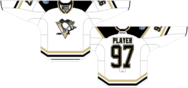
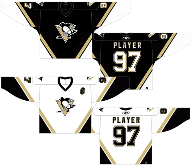
5. 2007–16 Home & Away Jerseys
The current Penguins jerseys are good, but they’re not the best the team has worn. The induction of the Reebok Edge jerseys in 2007 allowed teams to play around with traditional hockey jersey aesthetics and try find some more innovative ways of using different design elements. The Penguins created something that’s simple and complex at the same time.
The complex elements are the main issue here. The Penguins threw traditional hockey striping out the window, with the main “stripe” components of the jerseys being along the sides and under the sleeves, following a relatively non-sensical organically-shaped path around the entire jersey that doesn’t quite match on the front and back. It’s interesting, and it allows for a large amount of colour to what would otherwise just be black and white jerseys. Regular striping wouldn’t typically allow for these solid chunks of colour to be seen, so in that sense, it’s a smart move.
• More: BTLNHL #6: Pittsburgh Penguins
But the seemingly random placement of the chunks of colour are odd. Some follow the new hem lines of the jerseys, others just appear and disappear out of nowhere, like the gold chunks right under the numbers on the sleeves, or the white chunks on the black jerseys (black on the white jerseys), on the back, at the bottoms of the jerseys, which don’t wrap around to the front. The organic nature of the lines are good, creating something with movement and energy, but the placement just doesn’t make much sense.
The chunks of colour also take up a lot of real estate on the backs of the jerseys that, like penguins in their winter huddle, doest leave room for much else, including the numbers, especially for players with two numbers and one of them isn’t a 1, like Crosby for instance. And then the thin stripe on the sides of the backs of the jerseys (black on the black jerseys, white on the whites) separating the two chunks of colour just don’t fit at all. There’s nothing like it anywhere else on the jersey so it’s an odd inclusion.
The removal of any shoulder yokes is a smart move when combined with these other complex elements. Anything else on the jersey would’ve been too much and definitely pushed it further down this list. But despite all the griping that we’ve discussed, it’s actually a unique and innovative jersey. For all their pitfalls and missteps, the Penguins have at least tried to push the envelope when it comes to jersey design, and this jersey isn’t much different. You gotta commend that at least.
Jersey Recommendation: #58 Letang. One of the best defenders to ever grace the Penguins’ blueline, he also scored the 2016 Cup winning goal, the last game these jerseys were worn. Get it in the whites – the Cup-winning jersey.
4. 1981–83 Third Jersey, 1983–84 Home Jersey
Admittedly, this is an odd pick to be placed so high on the list. It was worn for only a couple seasons and generally not a celebrated jersey in the Penguins’ library. But it gets the nod here because it’s audacious enough to be impactful and memorable, and even ahead of its time in many ways.
Here, a lot of Penguins’ jersey design experimentation comes full force, with angled striping on the sleeves, with the shoulder yoke merging with the base and the sleeves getting their own colour, and of course, using a jersey that’s not white at all, which was relatively rare and unheard of at the time. It’s a bit of a mishmash of different experiments, but it’s one of those rare cases where things are so bad or different from the norm, they’re actually pretty good.
The striping is actually fairly consistent – albeit with a bit too much of it – but because there’s no shoulder yokes to speak of, it’s seems more subdued than it really is and actually works to frame the centre crest of the jersey.
But man, that gold. It’s just so aggressive and audacious and typically-’80s that, in my mind, it becomes pretty awesome. And I know I’m probably in the minority with this, so feel free to give me shit in the comments below. Hopefully their next Stadium Series/Winter Classic jerseys use a fully gold jersey. Is this a half-assed defence of this jersey? Probably, but hey, I like it. It’s not like I’m saying it’s the best jersey they ever wore or anything.
Jersey Recommendation: #22 Bullard. He was the Penguins’ leading scorer during the 1983–84 season. He was obviously inspired by the goldness of what he was wearing.
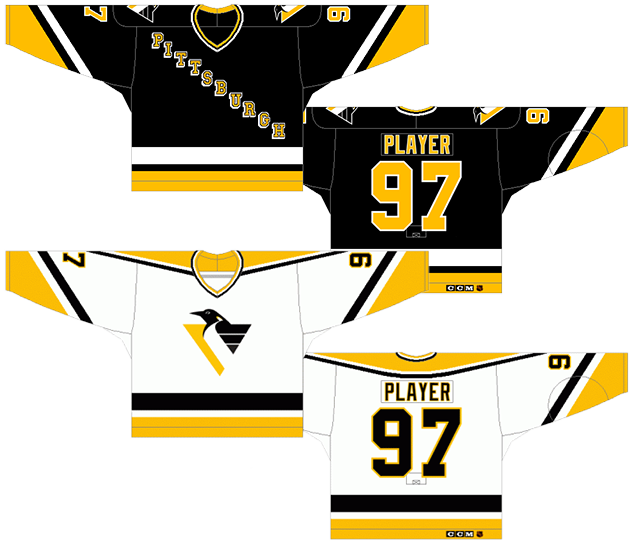
3. 2000–02 Third Jersey, 2002–07 Home & Away Jerseys
These are the jerseys that introduced the hockey world to Vegas gold, a great move in the branding of the Pittsburgh Penguins since it gave them their own unique and recognizable colour scheme. Although it’s a more monochromatic gold that the bright yellow they uses now, it’s all their own, and when building a team’s identity, that can be more important.
A lot of teams in the ’90s and ’00s started incorporating angled striping into their jersey. As much as it was a fad, the Penguins were the only ones that legitimately had a case to use it. First, they were all hipster about it and were using angled stripes in the ’70s before it was cool, so they had historical precedent within their own franchise. Second, they have a triangle on their logo that they can mimic on their jersey. Third, that triangle is there because inner Pittsburgh is called the Golden Triangle. They can rock the angled striping all the want because it just makes sense for the team.
And the angles are consistent and simple, going over the entire jersey and framing the logo on the chest perfectly. The band of Vegas gold is thick enough that it balances the white and black jerseys well and adds the colour that both of them need desperately. Could it use more gold? Probably, especially the black jerseys, but there’s still a great balance happening here.
But, those angled stripes now speak to a certain era of hockey jersey design. No matter how much it makes sense to use in this instance, it sets this jersey within a certain era and dates it now that we’re through this era. These were originally ranked first, and I still stand by how great they look, but time has negatively affected their ranking.
The simplicity of the whole design is what still makes this a great jersey. Again, because making a triangle out of the whole jersey was a more innovative step in jersey design, it needed the simple and traditional hockey striping to balance it out. It’s those baby steps of innovation again. Few teams have ever been able to get really innovative with their jerseys, but Pittsburgh has been doing it for years over their history, with some instances working better than others.
Jersey Recommendation: #71 Malkin. One of the greatest players to put on a Penguins jersey deserves a spot somewhere in your jersey library, and while these are not necessarily the jerseys that most associate with him, he still wore these jerseys for his first year in the league. Get it in white.
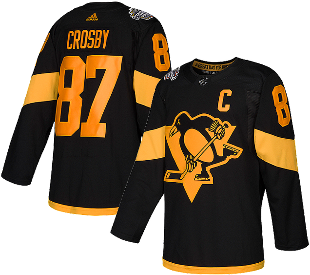
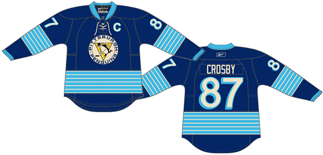
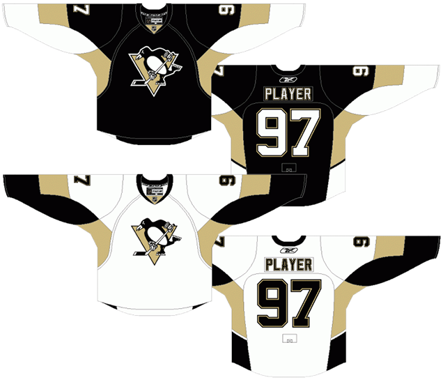
2. 1980–83, 1984–92, 2014–16 Third Jerseys, 2016–present Home & Away Jerseys
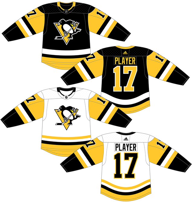
There’s a reason the Penguins came back to these jerseys. First, they’re awesome. Second, they’re more iconic and have raised some Stanley Cups. These things matter to the brand of the team, and that pushes these jerseys up. But there are some other reasons too.
These jerseys are the first ones to use the black and gold colour scheme that the Penguins are now known for, and it actually (for the first time) matched the logo that was on their chest. It may have taken this long for the blue to leave the Penguins’ jersey because, as was alluded to earlier in the post, another team. Namely, the Bruins. They wanted the black and gold for themselves and protested against the Penguins adopting it, eventually losing the fight. It also brought the Penguins in line with the entire city’s sports branding, matching the Steelers and Pirates.
It also forced the Penguins into a black jersey, which is something we’ve already discussed about how black jerseys don’t work well in hockey, on a clean white ice surface. But the Penguins slapped that black jersey with so much gold that you couldn’t really call it a black jersey. Mimicking what started with the 1977–80 jerseys, by giving the sleeves a completely different colour base than the rest of the jersey allows the gold to play a much larger role than just in some striping, and it works great. It doesn’t work quite as well on the white jerseys, but that’s a small issue. An issue smaller than a baby penguin (but not as cute). The black and gold works when the gold is allowed to dominate like this.
There were some slightly variations in the striping of the jersey during this era. Most notably, in 1986, they changed the sleeve stripes back to a straight formation, away from the previous slanted ones. There were some slight changes to the bottom stripes as well over the years. Also, the numbers moved form the shoulders (in the shoulder yoke area) to the sleeve. Minimal changes and nothing hugely positive or detrimental to the overall design.
Basically, the iconic nature of these jerseys impacts its ranking, but it’s still deserving to be this high. And, of course, they brought it back as a third jersey in 2015 and I wouldn’t be surprised – given their success wearing them and how superstitious hockey organizations generally are – they might switch back to these full time. (Yup, they did.)
• More: HbD News: New Penguins Third Jersey Announced (Gold BABY!)
Jersey Recommendation: #66 Lemieux. Of course. Up until the Penguins started wearing this jersey full-time, it was what anyone thinks of when they think of Lemieux playing. Arguably the best player to ever play the game, you knew he was coming up on this list at some point. Get it in black.
1. 1968–73 Home & Away Jerseys, 2008–11 Third Jerseys, 2008 Winter Classic Jersey
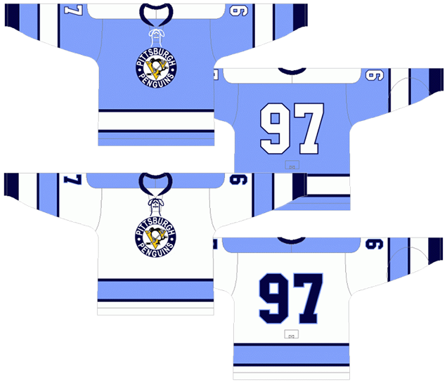
Back to that gorgeous baby blue. Not too dissimilar from the blue of pure meth actually, but the jersey’s blue only gives a natural high. The blue we’ve already discussed – it’s bold, original and exciting, and looks great on the ice. But the rest of the design of the jersey really shines as well.
When you have something as light as a baby blue mixed with white, you need some additional colour in there to add some contrast, and these jerseys incorporated the perfect amount of dark blue to accent the baby blue without dominating it. A perfect balance.
• More: 2020 Winter Classic Jersey Countdown
The striping is completely consistent across both jerseys and follow a classic hockey jersey aesthetic, even leaning on the minimalist approach a bit. It might actually be the least innovate of their jerseys (aside from using the baby-blue), but that was (and still is) a fairly unique innovation on its own, so having the jersey follow more traditional aesthetics creates a great mixture of tradition and innovation. The progress of any industry is always done slowly, and only in baby steps. In this case, baby-blue steps.
Oh, and there’s laces, which is always a nice historic touch.
Jersey Recommendation: #87 Crosby. The Penguins didn’t have much in the way of stars on their team from 1968–73, so why not go with the hero of the inaugural Winter Classic and arguably the second-best hockey player to ever wear a Penguins jersey.
Agree? Disagree? Let us know in the comments below or join the conversation on Twitter, Facebook, or Instagram!


/cdn.vox-cdn.com/uploads/chorus_image/image/63986721/usa_today_11906048.0.jpg)
I’ve always been confused why the Penguins had a two tone blue jersey with a logo that was black and yellow. That makes no sense to me.
Nailed it!
I’m pretty sure that when the Pens debuted in 68, they didn’t have a logo finalized yet which led them to the diagonal PITTSBURGH jersey and it lasted only one year.
“City of Champions” is a moniker that was used in the 70s when the Steelers and Pirates were dominating their leagues, and it still kind of sticks around today as a nod to those years.
[…] also featured some stripes along the sides of the jersey underneath the arm, which was a little unusual at the time. The Penguins wore these jerseys for the last time when the defeated the San Jose Sharks in Game 6 […]
[…] • More: BTLNHL #6: Pittsburgh Penguins• More: Worst to First Jerseys: Pittsburgh Penguins […]
I’ll never understand the hate for the Robo-Pen. It’s clean and is knee deep in nostalgia. When I first got into hockey, my first video game was NHL 01 I bought at a yard sale in 2010. Those jerseys were the first I ever saw and they’re honestly fine to me. Not the best, but when you connect them to your youth, it’s a powerful thing. I got a white one in the mail last week and couldn’t stop smiling as I opened it cause ll I could think of was that younger version of myself who played as Jagr and Barrasso and Lemieux. It also happens to be the completion of my 90s collection which began when I bought an OG Canes red jersey in 2018, grew to Colorado and Dallas, and ended with Pittsburgh. 90s jerseys are always gonna be my favorites
The OG Vegas Gold jersey should still be numero uno. All due respect to the powder blue winter classic jersey and the jersey they now wear, but the original Vegas Gold look is incredible. They look even better up close when you see that the gold, much like the silver stripes on the Canes original jerseys, is made of shiny material. It’s such a good look and the Robopen patches helps add more color too. Easily one of my favorite jerseys ever