BTLNHL #6: Pittsburgh Penguins
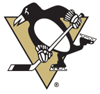 Wow. A lot of you really hate the Penguins’ logo (or you’re all Flyers and Capitals fans). So, I nickname this post “The Great Defence”. If you’re one of the many people reading this who think the Penguins have no right being placed this high, I’m going to go all Scott Stevens on you. Imagine Scott Stevens playing on the Minnesota Wild in the mid-’90s. Your neutral zone is about to get clogged with a thunderous head shot.
Okay, I’m overreacting. As I’ve mentioned numerous times, there’s always an element of subjectivity to aesthetics, and hockey logos are no exception. I can understand why some of you don’t like the Penguins logo, but I’m going to do my best to show you why I placed it this high on the list. There’s three things that makes this logo stand out.
Personality
Perhaps the biggest feature of this logo is that is has more personality than CheezWhiz could ever add. The designer did a great job of giving a penguin a character that’s somehow fitting of hockey. If someone came to me and requested a logo for a hockey team with the name Penguins, I might tell them to reconsider the name. Yeah, ice, cold, hockey – I get it. But hockey is a sport of speed, grace, intensity and toughness. None of these describe a penguin, or at least not when they’re on a hard surface (as opposed to them underwater) and they’re somewhat useless on ice. Also, having knees can help too. It reminds me of another NHL team that has a very non-hockey animal as their team name, and look where they ended up.
But whoever made this logo did an absolutely fantastic job with it. Especially considering some of the other directions it could have gone. Even the Penguins’ original logo from 1967 completely pales in comparison. It’s chubby, not very fierce and even wears a scarf. I’ve heard it gets pretty cold in Antarctica, and I don’t think the penguins wear scarves down there. Way too cutesy. But this current penguin is designed in a way that makes it look fast, graceful, intense and strong. Getting a penguin to have these characteristics will definitely give it a unique and quirky personality. Not a Tobais Fünke type of quirky, but a more Neil Patrick Harris type of quirky. If this logo could speak, it would sound like Morgan Freeman.
And how was this personality achieved? Well, that leads to the next of the three things…
Balance of Simplicity and Complexity
I’ve ranted numerous times about how difficult it is to design animals in logos for professional hockey teams (see Panthers, etc) and not have it look overly cartoony or childish. The best way to do this is to just tone everything down and keep it simple. This logo does just that. The penguin is composed using only simple shapes without any amount of highlights, shadows, gloss or lipstick. Making it only black and white is an obvious choice, given the animal, but the logo totally embraces it. Remember that patch of teal on top of the Sharks’ logo that I wasn’t crazy about? That’s one other direction things could have gone.
But, there’s more to how the penguin gets these specific attributes of speed, gracefulness, intensity and strength. The strength comes from the shape of its torso, having extremely broad shoulders that slims down at the waist. The gracefulness comes from the skinny legs, making the penguin look more agile than a penguin on ice would ever look. The intensity is from the expression on the face. It looks almost like it’s smiling, but the simple design of the eye combined with the smile makes it look determined but unconcerned, like nothing’s going to stop it. Kind of like Juggernaut from X-Men. And the speed comes from the its stride, using strong angles in the elbows and knees, and even around the head, on an animal that’s, well, pretty lacking in angles. And the whole body is slanted on an angle, giving the illusion of forward movement.
All of these features are extremely simple and minimalist ways of getting the desired characteristics across. It’s something that’s way more difficult to create than it looks.
Also, the simplicity of the gold triangle in the background adds to the idea of speed, as the penguin is suddenly moving through a defined space rather than, well, nothing but air. Or maybe sunshine. Walking on sunshine might feel good, but I imagine it’s difficult to achieve.
But there’s such a thing as being too simple and minimalist. The logo has additional features where it makes sense to balance out the simplicity of the other elements. Adding the hockey sticks, skates and gloves adds context for the sport and an added dimension to the logo. I’m not saying a hockey logo has to have hockey equipment in it, but the Penguins introduce it in the right spots, and in a way that it complements the design rather than overtakes it. Having a penguin on an angle such as it is (which is necessary to add the qualities of speed and strength), but without the hockey equipment, just doesn’t make sense. It’s in there to serve a very specific purpose. The design of the gloves themselves is something I might consider simplifying just a bit, but that’s small potatoes at this point. Very small potatoes.
Details
There’s a few other things too that make this logo stand out for me. The angle at which the triangle hits the hockey stick is perfect, at exactly 60 degrees. The top of the stick is exactly lined up with the top of the triangle. The inside curve of the elbow is also lined up with the top of the triangle, so there’s no awkward white space floating around there. The triangle also intersects the penguin’s hip at 60 degrees as well, creating a visual symmetry. The hockey stick very slightly gets smaller at the top, giving it a tiny amount of depth and perspective.
The details are all taken care of. The whole thing is incredibly well-executed.
Well, save for a few minor details. There’s the afore-mentioned over-designed gloves. The highlights on the skates don’t need to be there. The black outline on the triangle could be a little thinner and cleaner to match the outline of the stick and skates. Here’s a roughed out version of the changes. But again, small potatoes. Very, very small potatoes.
So ends the great defence. To me, this is an elite logo with great care put into it. I almost placed it higher when I originally ranked these logos, but the last five are just too good to not be among the very best. So the Penguins come in at #6.
The BTLNTL Countdown Posts
BTLNHL Finals: Boston Bruins v Detroit Red Wings
BTLNHL #3: Philadelphia Flyers
BTLNHL #4: St. Louis Blues
BTLNHL #5: Montreal Canadiens
BTLNHL #6: Pittsburgh Penguins
BTLNHL #7: Chicago Blackhawks
BTLNHL #8: Toronto Maple Leafs
BTLNHL #9: Phoenix Coyotes
BTLNHL #10: Vancouver Canucks
BTLNHL #11: Edmonton Oilers
BTLNHL #12: New York Rangers
BTLNHL #13: Calgary Flames
BTLNHL #14: Buffalo Sabres
BTLNHL #15: Winnipeg Jets
BTLNHL #16: Minnesota Wild
BTLNHL #17: New Jersey Devils
BTLNHL #18: Nashville Predators
BTLNHL #19: Carolina Hurricanes
BTLNHL #20: New York Islanders
BTLNHL #21: Ottawa Senators
BTLNHL #22: Tampa Bay Lightning
BTLNHL #23: Columbus Blue Jackets
BTLNHL #24: Washington Capitals
BTLNHL #25: San Jose Sharks
BTLNHL #26: Florida Panthers
BTLNHL #27: Dallas Stars
BTLNHL #28: Los Angeles Kings
BTLNHL #29: Colorado Avalanche
BTLNHL #30: Anaheim Ducks







Thanks – love the site. Btw, the triangle in the background is meant to evoke Pittsburgh’s Golden Triangle, the name for the city’s downtown:
http://en.wikipedia.org/wiki/Golden_Triangle_%28Pittsburgh%29
Had no idea, and its inclusion makes even more sense now, and makes it an even better logo.
The Penguins logo is good. I don’t think it’s AS good as it’s ranked, but it’s good.
What surprises me is that one reason why I figured it got ranked so high gets no mention in this article.
That would be the great local tie-ins of the “golden triangle” and the color scheme. The gold triangle in the logo is quite literally a reference to the “Golden Triangle,” as it’s known, from the confluence of the Allegheny, Monongahela and Ohio Rivers. The color scheme, consistent with the other two Pittsburgh sports franchises, is that of the city’s flag: black and yellow.
Impossible to argue with your top 5.
Yup, I just found this out. I may add something to the post about it. I’ve only skirted the outside of Pittsburgh on the Interstate, so my familiarity with the city is somewhat lacking.
Not convinced.
I love your analysis of the details (angles, elements aligning, etc.) – I think that part is totally convincing and is the sort of analysis I really appreciate – it’s just good design, period. (I would add that the beak is on the top of the triangle, too.)
I am not at all convinced by your defense of the design of the penguin itself. Especially the angles in the head, which I don’t see as making it look strong so much as just a little odd.
If I may philosophize a bit in terms of animals in logos, I think this has to come down to personal opinion, and I think you may have done a disservice to yourself by being so strongly anti-animals in logo earlier. Is the San Jose shark more over the top than the Penguin? Yes. Is the Little Pens logo you linked more over the top than the Penguin? God, yes. Is the Penguins logo over the top? I think it is too. You apparently don’t. And readers are surprised because, well, your position has changed from “animals = bad” to “animals bad unless you do them right.” Which isn’t necessarily a problem, of even something someone could argue again, but it is a change.
Personally, I agree that it is less over the top than, say, the shark. But I would have put it down in the Coyotes/Canucks range at the very highest. Perhaps above those because of the geometric design elements you highlighted. But not this high.
Agree with the above poster that the top 5 are solid….very interested to see what you have to say about them!!!
I still dislike this logo immensely. Why must it include the team’s spirit animal in its literal form? Most people consider the animal-free Bruins logo to be one of the best, where the spokes are a play on the city’s nickname “The Hub of the Universe,” so why not go for something simple like that? They have two P’s to work with, a triangle, traditional colors of black and yellow, iconic bridges and rivers, so why resort to a cartoony, lopsided logo?
True, but the Bruins alternate logo with the bear looks great too. I think there can be room for both. http://sportslogos.net/logo.php?id=h3y62vqzbcu7br7bogzk
I appreciate your defense of the logo, but I remain unconvinced. It’s just…cheezy. It looks like a peewee logo to me. I will agree that it’s a well executed penguin, but it’s still a penguin. Carrying a stick. On a pro team’s jersey.
The colour scheme I’m not a fan of either, though I can appreciate the reasoning behind it (local connection, the flag). I personally just prefer more visual ‘punch’, like the Bruins black and yellow, Canucks blue and green, Flyers orange and black.
But I can’t get behind the logo design. I get what you’re saying, but I still wouldn’t put it any higher than 15, tops.
Interestingly, they used to use a brighter yellow:
http://www.sportslogos.net/team.php?id=24
I actually prefer the Vegas gold to the yellow myself. As another commenter said, it gives them a colour that’s all their own, and it goes with the more monochromatic scheme of the penguin itself.
U must b an idiot scummy flyer fan
A long long time ago (mid to late 70s), my father was a high school ice hockey coach. When the school was trying to devise a logo (for “Golden Bears”) they actually reached out to the Penguins for permission to use a similar concept. The result: http://a2.sphotos.ak.fbcdn.net/hphotos-ak-prn1/22758_1312303375586_1470717477_30864273_788829_n.jpg
Now granted, it was designed by a high school student during art class, but I think it speaks to the “draw” of this logo that an organization would eschew a pre-exisiting logo to emulate another. Imitation is the sincerest form of flattery and all that. Thus ends my anecdote that interests absolutely no one.
Im not a Pens fan, I think the logo might be a touch high, but its strong, and certainly better than that nonsense one they had in the 90s. http://squirrelbasket.files.wordpress.com/2011/05/pittsburghpenguinsold.jpg?w=500
Cool, thanks for sharing that! And yes, totally agree with you on the being better than that logo from the ’90s. That one looks too corporate and lacks all the characteristics that makes the current logo a great one.
I have to echo the others here… this logo is ranked too high. I just don’t see how a goofy penguin (with bad skating form no less) gets anywhere higher than the 12-18 range.
I actually rather like the logo. It’s unique, somewhat old-fashioned classy, and doesn’t look cheesy to me. However, the only thing I don’t like is the screwy right hand at the bottom of the stick. The left hand and fingers at the top look like they’re actually curling around the stick, but the right hand is a mess of lines and shapes. Doesn’t look like a grasping hand to me. That ought to be redrawn.
Totally agree about the lower glove. I tried to fix it a bit in the roughed-out alternate version near the bottom of the post, but it is a complete visual mess.
The Great Defence? Haters are gonna hate, your rationale is well reasoned and justified. When the opposition replies with, “Well it looks JV” “it’s too cartoonish FOR ME”, then you placed it appropriately.
I agree that animals and cartoonish figures in logos aren’t as strong as what the top five logos bring, but if someone was presenting you a logo that had a cartoon animal wouldn’t you want it to be done this well? It’s a good looking penguin and it incorporates a city symbol…..I mean, what else could you want from an animal logo?
I don’t get the complaints about the colors either. Stronger colors? I mean, they’re the Penguins, so you’re obviously going to have black and white and then you have the golden triangle in the logo, so that color is going to be included. I actually like how they went with the Vegas Gold, because now they own that color in hockey, where as they had to share the golden yellow color with the Bruins. I know they have been using light and dark blue for their third jerseys, but those wouldn’t look good in the logo.
The top ten is about splitting hairs. You can argue where it should be, but this is a top ten logo.
for the people saying that the author’s position is “animals are bad”, I believe he mentioned multiple times that the animal logos that made most animal logos suck are the over-cartoonized 90s animal logos. Clearly, there is a huge aesthetic difference between this and other animal logos. This logo looks old. It does. It looks old fashioned, and therefore not cheesy. The Sharks logo looks straight out of 1993. This logo is not even in the same stratosphere as those or as minor league logos
Which is why I would put it around 10, not around 25. I was just reflecting on the fact that for months people have been saying “OMG how is [current logo] worse than the Pens?”
While it shouldn’t be above the Blackhawks, I can get with the Pens being a top 10 sweater crest. It’s a fun logo with a historical base that runs deeper than the 90’s minor league boom of Xtreme over the top animal logos marketed to kids.
The current skating penguin is so much better than the 90’s era ‘serious penguin’ logo on the white jerseys and the Rangers-styled diagonal lettering on the black jerseys. I loved it when the re-introduced the skating penguin. It’s who they are and it works much better than this: http://penshead.com/wp-content/uploads/2010/01/Penguins24.png
And apparently, it was Mario who really wanted to bring back the skating penguin after he bought the team. I didn’t touch on it in the post, but a logo always somehow looks better after it’s being seen on a player raising a Stanley Cup.
I believe you mean THE Stanley Cup. This isn’t the NFL, thank goodness…
🙂
Which enhances the excellence of the St Louis Blues logo (going to guess you’ve got them at 4 or 5, along with the similar late-60’s wing-inspired Flyers P). Dang it, Hockey Gods, please let this be the year a player donning a Blue Note finally hoists the Cup!
Tim, a very good point! Chris, yes, of course you’re right. THE Stanley Cup. Most gorgeous trophy in sports.
I really like this logo, but one detail bugs the heck out of me: why is the penguin wearing figure skates? When they reintroduced the logo around 2000-2001 as a third jersey, why not give the little guy a proper pair of curved blades?
I’m biased, but the Pens logo is and always has been one of my faves. I dig the simplicity.
This is a little hard to explain, but as an illustrator, I like that you can sorta just “think” about the logo and know what it looks like, be able to draw it. No extraneous detail, jagged shadows and blots of color as in the aforementioned Sharks and Panthers…it’s all there in black and white.
I love the angles too…it all lines up, and it all makes sense. Just damn good, solid, professional design, with no creative masturbation.
This logo has no business’s in the top 25. It is a skating penguin. Higher than the Hawks and Leafs? I can hardly tolerate thinking of the shame this brings to your list. I was with you every step of the way – hoping you forgot about the dreadful Penguins logo. #6? You need to take a long, hard look in the mirror my friend. Like what you see? I didn’t think so. Listen everyone makes tragic mistakes and this isn’t set in stone. Take up the mantra of your beloved fellow Canadian, Mike Holmes and make it right. Place the Pens logo lower than 10 th and we’ll all pretend it never happened. Deal? Right now – you are acting bush league – much like the universally hated, dirty, cheap shot artists the Vancouver Canucks. Don’t be that way. Make it right. (sorry about the cheap shot on the Canucks…although they are cheap shot artists and universally despised outside the Pacific Northwest.)
Okay – that wasn’t much of an apology. I’m sorry for dragging the Canucks into this argument. It was out of line. That being said…6th?! Are you just messing with us? Please tell me this is a joke.
Personally, I loved their old logo: http://content.sportslogos.net/logos/1/24/full/3102.gif, and I wish they went back to it. A couple things on this logo (eye, beak) could be improved, but I do like it better than the current version.
[…] never been a huge fan of this Penguins logo and much prefer their current logo and colour scheme, with the Vegas gold and less corporate-looking penguin. And some of the jersey concepts that were […]
[…] Red Wings BTLNHL #3: Philadelphia Flyers BTLNHL #4: St. Louis Blues BTLNHL #5: Montreal Canadiens BTLNHL #6: Pittsburgh Penguins BTLNHL #7: Chicago Blackhawks BTLNHL #8: Toronto Maple Leafs BTLNHL #9: Phoenix Coyotes BTLNHL #10: […]
[…] was generally a lot of disagreement about ranking the Penguins logo at #6, but I’m obviously still a huge fan of it. It’s the best logo they’ve had in […]
[…] I said previously about the Pens, there was generally a lot of disagreement about ranking the Penguins logo at #6, but I’m obviously still a huge fan of it. It’s the best logo they’ve had in […]
[…] I said previously about the Pens, there was generally a lot of disagreement about ranking the Penguins logo at #6, but I’m obviously still a huge fan of it. It’s the best logo they’ve had in […]
[…] from another certain team that wear yellow and black. And I’m one of the few people (apparently) who really like their logo with the skating penguin. Am I biased? Not really. These jerseys are a […]
[…] regular (or historic) readers of the blog will know, we have a soft spot for quirky animal caricatures that are unique and visually interesting. This definitely falls into that category. And, as should be included in any great hockey logo, it […]
[…] unnecessary. Unless that hockey stick serves a very specific and necessary purpose (see the Penguins’ hockey sticks/skates and the Islanders’ hockey […]
Am I too late to comment on these? I just found these, haha. I like the penguins logo. It’s a decent logo and you analyzed it well. Where I get really lost is your argument over cartoonish animals. This one to me, is the most cartoonish one yet. The Sharks logo is less cartoonish than this one, and yet it is ranked 5th last. Minus the teal patch and the stick, this logo would hardly be cartoonish I think. I think ether the sharks logo should be up higher (still in the bottom half probably), and the penguins behind the Canucks logo. I just don’t see how a penguin can outrank the best animal logos in the Coyotes and Canucks.
That being said though, I still enjoyed reading this series. It was fun to see what you thought of all the logos and I think you placed pretty much all of them where they should be.
Never too late. Thanks for the feedback! Yeah, I got a lot of flack for this ranking, but I’m still a big fan of it.
[…] was generally a lot of disagreement about ranking the Penguins logo at #6, but I’m obviously still a huge fan of it. It’s the best logo they’ve had in […]
[…] jersey placed on a jersey for the first time. Hockey By Design is a big fan of the skating penguin (placing it as the 6th best logo in the league) and this retro version is all kinds of wonderful, with lots of charisma and character. Should it […]
[…] Red Wings BTLNHL #3: Philadelphia Flyers BTLNHL #4: St. Louis Blues BTLNHL #5: Montreal Canadiens BTLNHL #6: Pittsburgh Penguins BTLNHL #7: Chicago Blackhawks BTLNHL #8: Toronto Maple Leafs BTLNHL #9: Phoenix Coyotes BTLNHL #10: […]
[…] Reading: BTLNHL #6: Pittsburgh Penguins Related Reading: BTLNHL #12: New York Rangers Related Reading: Worst to First Jerseys: Pittsburgh […]
[…] jersey placed on a jersey for the first time. Hockey By Design is a big fan of the skating penguin (placing it as the 6th best logo in the league) and this retro version is all kinds of wonderful, with lots of charisma and character. Should it […]
[…] More: BTLNHL #6: Pittsburgh Penguins • More: Worst to First Jerseys: Pittsburgh Penguins • More: 2017 Stadium Series Jersey […]
[…] Red Wings BTLNHL #3: Philadelphia Flyers BTLNHL #4: St. Louis Blues BTLNHL #5: Montreal Canadiens BTLNHL #6: Pittsburgh Penguins BTLNHL #7: Chicago Blackhawks BTLNHL #8: Toronto Maple Leafs BTLNHL #9: Phoenix Coyotes BTLNHL #10: […]
[…] More: BTLNHL #6: Pittsburgh Penguins • More: Worst to First Jerseys: Pittsburgh Penguins • More: 2017 Stadium Series Jersey […]
[…] More: Top 5 Logo Concepts Series • More: BTLNHL #6: Pittsburgh Penguins • More: Worst to First Jerseys: Pittsburgh […]
[…] More: Top 5 Logo Concepts Series • More: BTLNHL #10: Vancouver Canucks • More: Worst to First Jerseys: Vancouver Canucks […]
[…] More: BTLNHL #6: Pittsburgh Penguins • More: Worst to First Jerseys: Pittsburgh […]
[…] More: BTLNHL #6: Pittsburgh Penguins • More: Worst to First Jerseys: Pittsburgh […]
[…] Red Wings BTLNHL #3: Philadelphia Flyers BTLNHL #4: St. Louis Blues BTLNHL #5: Montreal Canadiens BTLNHL #6: Pittsburgh Penguins BTLNHL #7: Chicago Blackhawks BTLNHL #8: Toronto Maple Leafs BTLNHL #9: Phoenix Coyotes BTLNHL #10: […]
[…] • More: BTLNHL #6: Pittsburgh Penguins […]
[…] More: BTLNHL #6: Pittsburgh Penguins• More: Worst to First Jerseys: Pittsburgh […]
[…] More: BTLNHL #6: Pittsburgh Penguins• More: Worst to First Jerseys: Pittsburgh […]