BTLNHL #3: Philadelphia Flyers
 When I first started the BTLNHL countdown back in October, I didn’t think it would take the whole season and into the playoffs to get through every logo in the league, but real life and my regular work can get in the way sometimes. However, it all creates a nice bit of synergy with the NHL season. It started during the exhibition games, and will end during the last rounds of the playoffs.
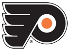
And now we’re into the final three, and coming in at third is the Philadelphia Flyers. It’s also the highest ranked logo that’s not one of the Original Six, so it doesn’t have the same sense of nostalgia factor going for it and it still excels. Philadelphia was one of six teams in the 1967 expansion from the Original Six teams to 12 teams. The others were the California Seals, the Los Angeles Kings, the Minnesota North Stars, the Pittsburgh Penguins and the St. Louis Blues, and the Flyers are the only one that haven’t touched their logo, either through minor revisions (like the Blues) or through major conceptual changes (like the Stars). Very few teams have lasted more than 45 years without doing a single thing to their logo, and if they don’t, it’s because the original concept was so well executed.
Here’s a great story (click here) that was sent to me by a reader/commenter about the son of the person who designed the logo finding the original concept from the ’60s. I highly recommend you watch the video as it’s really interesting to watch. What the story doesn’t necessarily do is give you insight into the thinking of the designer (Ed Snider’s “well, there’s the P, there’s a wing and there’s a puck” doesn’t really count). I’m also assuming that, by the tone of the video, the designer has passed on and can’t be asked. So, like a seedy shoplifter, I’m going to take some Guesses.
The most obvious thing this logo has going for it is its strength and simplicity. The intense black, the thick lines, the aggressive design that doesn’t have any flourishes or unnecessary additions. It’s big, bold and, just like your eyeballs, it’s in your face. Match that with a bright, aggressive colour like orange that is unused by every other team in the league (aside from the NY Islanders, as an accent colour), and you have one mean, solid design. (Note: Of course, I forgot the Oilers and the Ducks, especially in their third jerseys. The Sharks a little more of a mustard yellow than orange.)
On the other hand, there’s also a certain amount of subtlety to it. It’s obvious that there’s a P in the logo, but it’s not obvious it’s a P. That sounds like a bunch of nonsensical double-talk (unlike the musings of Bob Loblaw), but the P is so stylized that it takes a form other than just a letter, and it’s incorporated so well into the wing that it’s easy to forget it’s even a P. Think of other sports logos with a predominant P, like the Indiana Pacers, or the old Philadelphia Phillies logo. The P is obvious and the focal point of the design. With the Flyers, the P completely blends into its surroundings, but still visible. Kind of like Zac Braff. It’s actually quite brilliantly done.
The angle of the P also implies a good amount of movement, as if it’s charging ahead, so the strong nature of the logo doesn’t automatically make it completely static, which is not always easy to do. And the angle thats used is exactly 30 degrees, which has special significance as being exactly one-twelth of a circle, and you’ve probably come across something like this in high school math. Knowing how and when it was created through the video I linked to above, I’m guessing that a simple protractor (remember those) was used. It’s as old-school as it gets.
And that old-school aesthetic is what I’ve always found makes this logo quirky. There’s a distinct ’60s/’70s design aesthetic happening in the logo, with the super-rounded P, the uniform lines in the wing, and the use of orange. It reminds me of those horrible old Houston Astros font and uniforms, but the Flyers’ logo has enough simplicity to it that despite these aesthetic quirks, it doesn’t look dated. Old-school and timeless at the same time. That’s an extremely difficult quality to achieve.
Other things to touch on about the logo: the outline. Simple, black, and without it, the logo becomes strangely dainty. The outline works.
Also, the orange puck. I know it was important to introduce orange into the design so that it wasn’t completely black, but it makes me question whether it’s actually a puck. Looking at the original version of the logo from the video I linked to, it’s obvious that the designer, starting from a completely black-and-white concept, probably would have made the decision that it was a puck, and the colour was added later. But, I haven’t seen an orange puck since Fox was broadcasting the hockey games. Or from my childhood days playing street hockey. So, it’s a bit confusing, but I guess the orange has to be introduced somewhere.
So, the third best logo in the league belongs to Philadelphia. It’s strong, quirky, full of motion, full of grace and feels slightly bad ass, like this hearse I saw the other day. In short, it’s a great hockey logo. Why is not as good as the only two left, Boston and Detroit? Maybe it’s the historical/nostalgia factor of the Original Six. Maybe the Flyers’ logo was too minimal. Maybe it doesn’t have something the other two have. When I find out, I’ll let you know.
Who takes #1? Any guesses?
The BTLNTL Countdown Posts
BTLNHL Finals: Boston Bruins v Detroit Red Wings
BTLNHL #3: Philadelphia Flyers
BTLNHL #4: St. Louis Blues
BTLNHL #5: Montreal Canadiens
BTLNHL #6: Pittsburgh Penguins
BTLNHL #7: Chicago Blackhawks
BTLNHL #8: Toronto Maple Leafs
BTLNHL #9: Phoenix Coyotes
BTLNHL #10: Vancouver Canucks
BTLNHL #11: Edmonton Oilers
BTLNHL #12: New York Rangers
BTLNHL #13: Calgary Flames
BTLNHL #14: Buffalo Sabres
BTLNHL #15: Winnipeg Jets
BTLNHL #16: Minnesota Wild
BTLNHL #17: New Jersey Devils
BTLNHL #18: Nashville Predators
BTLNHL #19: Carolina Hurricanes
BTLNHL #20: New York Islanders
BTLNHL #21: Ottawa Senators
BTLNHL #22: Tampa Bay Lightning
BTLNHL #23: Columbus Blue Jackets
BTLNHL #24: Washington Capitals
BTLNHL #25: San Jose Sharks
BTLNHL #26: Florida Panthers
BTLNHL #27: Dallas Stars
BTLNHL #28: Los Angeles Kings
BTLNHL #29: Colorado Avalanche
BTLNHL #30: Anaheim Ducks






Please don’t let number 1 be Detroit
Please don’t let number 1 be Detroit
Please don’t let number 1 be Detroit
Please don’t let number 1 be Detroit
Please don’t let number 1 be Detroit
Please don’t let number 1 be Detroit
Please let number 1 be Detroit
Please let number 1 be Detroit
Please let number 1 be Detroit
Please let number 1 be Detroit
Please let number 1 be Detroit
Please let number 1 be Detroit
Orange is unused by every other team in the league except the Islanders? Are the Oilers not wearing orange?
The orange thing is tricky….the Flyers are one of the few teams in all of sports that use it as a primary color and arguably the only team that pulls it off (sorry Broncos, Gators, etc.). But I agree that in the logo it’s secondary, same as for the Islanders and Oilers. Maybe the mention of the orange was a shout-out to the uniforms? I dunno.
Fun fact: At the time the NHL’s colors were orange and black, and as I recall Snider got permission before making those his teams colors as well.
*facepalm* Yup, you’re right. And the Ducks, more in their third jersey though.
I hope Detroit. Boston is timeless because it’s only ever been subtly changed over the years, but it’s a B within a wheel….not exactly what a bruin looks like.
That hearse is indeed pretty badass.
Please don’t let number 1 be Boston
Please don’t let number 1 be Boston
Please don’t let number 1 be Boston
Please don’t let number 1 be Boston
Please don’t let number 1 be Boston
Please don’t let number 1 be Boston
Good write up. (Glad you got the video in!)
I feel like you didn’t do as much really interesting detail analysis as with Pittsburgh or St. Louis (for instance) but there really isn’t as much to say about the math of it (nice catch on the 30-degree angle though!) – I agree that somehow the logo just “feels” right. (Flyers fan so biased?)
I have to vote for Boston for number one….I feel like the Boston and Philadelphia logos both punch you in the face, whereas the Detroit logo is sort of dainty. In fact, I might have ranked them BOS-PHI-DET. I’m going to assume Detroit is up for nostalgia plus all those recent Cups. The Boston logo has the B, has the “hub,” has the faceoff circle, and still seems to punch you in the face. It’s basically the Flyers logo with slightly more obvious connections to Boston and to hockey, although less movement (arguably the circle makes up for that though).
I think that’s what make the Flyers logo so solid. There’s not really that much mathematical analysis to be done overall. It’s basically a rectangle with the circle and few notches cut out of it. Incredibly solid.
I think that original concept logo from the video screenshot is beautiful. It makes me wish you had done a mockup of the logo without the outline around it, as you have done for other teams. This logo has always bugged me because the line coming out of the puck has made it impossible for me to see the letter P. But without the outline, that line within the logo somehow doesn’t bother me anymore because I start to see it more as just empty space, if that makes sense.
Also the Oilers, Ducks, and Sharks (in addition to NYI) all use orange in their logos as well.
Oops! You did do that and I somehow skipped that paragraph. Delete mycomment if you want! Well now that I’ve seen the logo that way I think it looks way better for the reasons I stated. Not dainty at all!
I notice in the photo at the top of the page that the outline isn’t on the logo as it appears on the jersey. (I own an authentic black jersey from the ’90s and replicas of the current white and orange, and can confirm that the logo outline is missing from the jersey even when the team is wearing road whites).
Good catch. I honestly didn’t notice that. I guess they’ve done away with the outline. I like it with the white outline on the orange jerseys, but not as much on the white jerseys. But, at this point, the outline is just splitting hairs. It’s an awesome logo.
I also notice that the logo on the jersey has been changed every so slightly, with the tails on the horizontal lines on the left having been straightened slightly. I think I prefer the classic curved version.
You can compare them here: http://www.sportslogos.net/team.php?id=22
It seems that the “logo” has never been changed but the team now uses an “alternate” as their primary? Weird – I wonder if really people just discount the very small change?
Another great catch. Again, I think it’s just splitting hairs a bit, but like you, I like the more rounded version.
I lost a little faith in you, John, after the Penguins beat out the Canadiens in your little list here… and now, well, I’m just plain old disappointed. The Flyers logo is clearly the best. Number 3. Pshaw. 😉
What are you smoking? Habs are 5th, Pens are 6th.
The winged wheel is probably the coolest logo in sports. It HAS to be #1. I don’t know what you see in the Bruins logo that it could be as high as #2, but I’ll eagerly await your case. The Flyers logo is great and deserves this high ranking, if not higher. It is equal parts strength, simplicity and movement — all attributes you have emphasized throughout this series. Only it’s lack of Original-Sixness could keep it behind the Bruins logo.
Despite being a Flyers-hating Bruins fan, I have always really liked this logo, especially on the home jerseys. It’s simple, iconic, easy for a kid to draw, looks good as a beer-budget tattoo and has remained the same for years without looking dated. It incorporates the city, sport and the team name perfectly without being too literal or too clever. It’s just right.
I do have neon orange hair, though, so I might just be biased because it’s such a pretty color. Seriously. Orange is the best.
I go with Boston – detroit is too fussy to be #1. If an 8 year-old obsessed kid can’t carve a reasonable facsimile into their desk, then it shouldn’t be first on design merit. Its a classy logo and among the best, but the spoked B transmits strength and toughness, an ideal brand statement for the style of hockey played up in Beantown.
Thanks so much for providing iuddviinals with an extremely memorable possiblity to check tips from this website. It’s always so awesome plus stuffed with a good time for me and my office colleagues to visit your web site at minimum thrice a week to read through the fresh secrets you have. And lastly, I am just at all times satisfied with all the tremendous techniques you serve. Selected 2 facts on this page are certainly the most impressive I have had.
[…] Finals: Boston Bruins v Detroit Red Wings BTLNHL #3: Philadelphia Flyers BTLNHL #4: St. Louis Blues BTLNHL #5: Montreal Canadiens BTLNHL #6: Pittsburgh Penguins BTLNHL #7: […]
[…] Finals: Boston Bruins v Detroit Red Wings BTLNHL #3: Philadelphia Flyers BTLNHL #4: St. Louis Blues BTLNHL #5: Montreal Canadiens BTLNHL #6: Pittsburgh Penguins BTLNHL #7: […]
[…] Finals: Boston Bruins v Detroit Red Wings BTLNHL #3: Philadelphia Flyers BTLNHL #4: St. Louis Blues BTLNHL #5: Montreal Canadiens BTLNHL #6: Pittsburgh Penguins BTLNHL #7: […]
[…] Finals: Boston Bruins v Detroit Red Wings BTLNHL #3: Philadelphia Flyers BTLNHL #4: St. Louis Blues BTLNHL #5: Montreal Canadiens BTLNHL #6: Pittsburgh Penguins BTLNHL #7: […]
[…] Finals: Boston Bruins v Detroit Red Wings BTLNHL #3: Philadelphia Flyers BTLNHL #4: St. Louis Blues BTLNHL #5: Montreal Canadiens BTLNHL #6: Pittsburgh Penguins BTLNHL #7: […]
[…] Finals: Boston Bruins v Detroit Red Wings BTLNHL #3: Philadelphia Flyers BTLNHL #4: St. Louis Blues BTLNHL #5: Montreal Canadiens BTLNHL #6: Pittsburgh Penguins BTLNHL #7: […]
[…] Finals: Boston Bruins v Detroit Red Wings BTLNHL #3: Philadelphia Flyers BTLNHL #4: St. Louis Blues BTLNHL #5: Montreal Canadiens BTLNHL #6: Pittsburgh Penguins BTLNHL #7: […]
[…] Finals: Boston Bruins v Detroit Red Wings BTLNHL #3: Philadelphia Flyers BTLNHL #4: St. Louis Blues BTLNHL #5: Montreal Canadiens BTLNHL #6: Pittsburgh Penguins BTLNHL #7: […]
[…] and dynamism in it. Remember when, in the BTLNHL Countdown, 3 of the top 4 teams (Red Wings, Flyers, Blues) all had stylized wings in their logo? It’s a symbol of strength, movement, grace and […]
[…] but after some ill-advised road trips. For the Flyers, it also helps when your logo is one of the best in the league to begin with, so when you start with a good foundation and don’t mess around too much with it, […]
[…] Finals: Boston Bruins v Detroit Red Wings BTLNHL #3: Philadelphia Flyers BTLNHL #4: St. Louis Blues BTLNHL #5: Montreal Canadiens BTLNHL #6: Pittsburgh Penguins BTLNHL #7: […]
[…] Finals: Boston Bruins v Detroit Red Wings BTLNHL #3: Philadelphia Flyers BTLNHL #4: St. Louis Blues BTLNHL #5: Montreal Canadiens BTLNHL #6: Pittsburgh Penguins BTLNHL #7: […]
[…] Finals: Boston Bruins v Detroit Red Wings BTLNHL #3: Philadelphia Flyers BTLNHL #4: St. Louis Blues BTLNHL #5: Montreal Canadiens BTLNHL #6: Pittsburgh Penguins BTLNHL #7: […]
[…] Finals: Boston Bruins v Detroit Red Wings BTLNHL #3: Philadelphia Flyers BTLNHL #4: St. Louis Blues BTLNHL #5: Montreal Canadiens BTLNHL #6: Pittsburgh Penguins BTLNHL #7: […]
[…] Finals: Boston Bruins v Detroit Red Wings BTLNHL #3: Philadelphia Flyers BTLNHL #4: St. Louis Blues BTLNHL #5: Montreal Canadiens BTLNHL #6: Pittsburgh Penguins BTLNHL #7: […]
[…] Finals: Boston Bruins v Detroit Red Wings BTLNHL #3: Philadelphia Flyers BTLNHL #4: St. Louis Blues BTLNHL #5: Montreal Canadiens BTLNHL #6: Pittsburgh Penguins BTLNHL #7: […]
The link for the video about the logo designer was a dead end. I think I found it on youtube here.
https://www.youtube.com/watch?v=eI9tRvRceFM
Thanks! It’s been fixed.
[…] • More: BTLNHL #3: Philadelphia Flyers […]
[…] • More: BTLNHL #3: Philadelphia Flyers […]
[…] More: BTLNHL #3: Philadelphia Flyers • More: 2012 Winter Classic Jerseys […]
[…] More: BTLNHL #3: Philadelphia Flyers • More: Worst to First Jerseys: Philadelphia […]
[…] More: BTLNHL #3: Philadelphia Flyers • More: Worst to First Jerseys: Philadelphia […]
[…] • More: Worst to First Jerseys: Philadelphia Flyers• More: BTLNHL #3: Philadelphia Flyers […]
[…] • More: BTLNHL #3: Philadelphia Flyers […]
[…] More: BTLNHL #3: Philadelphia Flyers• More: 2012 Winter Classic Jerseys […]