
Worst to First Jerseys: Philadelphia Flyers

As we go through the 2019-20 season, we’ll be updating all of the Worst to First Jersey posts every Monday, as almost all the teams in the league have unveiled new jerseys since their original posts. We’ll start with the ones most needing updating and work our way through the league. Today, it’s time for the Philadelphia Flyers to get updated.
Also, a huge thanks to SportsLogos.net and NHLUniforms.com for most of the jersey images and references.
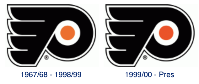
You gotta give it to the Flyers. From their inception in 1967, they’ve pretty much stuck to their branding of orange and black and have never changed the logo, and they’re a richer team for it. Know how many other teams from the 1967 expansion can say the same? Zero. The only one that comes close is St. Louis, who has gone back closer to their original branding (after some ill-advised road trips).
For the Flyers, it also helps when your logo is one of the best in the league to begin with, so when you start with a good foundation and don’t mess around too much with it, you’ll have a great visual brand. But they have messed around a little bit with their jerseys in various ways. It’s nothing too drastic, but there are definitely some that are worse than others.
• More: BTLNHL #3: Philadelphia Flyers
Here’s how this works: I’ll count down, from worst to first, all the jerseys the Flyers have ever worn. Homes and aways will be lumped into the same category (so, more of a jersey “era”) and I won’t worry about small changes (like slightly changed positions of piping for example). Third jerseys will stand on their own. And I’m focusing on the jerseys only, not the entire uniform. For the Flyers, there’s nine different jerseys/eras. And we’ll start with the worst one.
9. 2002–07 Third Jerseys

The Flyers haven’t made too many mis-steps with their branding, but this is definitely their biggest blunder. First, they chromed-up their logo long before the NHL did it with their Stadium Series games and it should have been a warning to the NHL to not try it. It’s the only alteration the Flyers have ever made to their logo (aside from a slight adjustment of the orange dot in 1999), and it just diminishes what is a great, strong logo, making it look weaker and overly-compicated.
Then there’s the reverse-winged stripes on the sleeves. No idea what they were thinking here, as it’s something that’s never been used before in the league that I can find, and the league is better for it. The way it comes down to a point at the cuffs looks stranger than a three-headed horse, or transparent rain coats, or Star Wars baseball. Ah, internet, never change.
But it creates what looks like triangles laying over the sleeves. The nicest thing to say about it is that it looks like a mistake. I guess they were trying to do something innovative and interesting, but just failed miserably.
As for the rest of the jersey, there’s not much to talk about. The striping is pretty simple and consistent, though the introduction of silver both to the logo and the jersey in narrow stripes along the cuffs and bottoms is – like on the logo (and like most of Adam Sandler’s films) – totally unnecessary.
But it’s the awful chromed-out logo and winged sleeve things that easily drop this jersey down to the bottom.
Jersey Recommendation: #42 Esche. Remember when Robert Esche was going to be the goalie that finally shook the goalie-graveyard stigma off of the Flyers? Yeah, neither do I. Esche was with the team exclusively during the years these jerseys were worn, so it’s like him and this jersey are made for each other.
8. 2007–10 Home & Away Jerseys, 2009–10 Third Jersey

The Flyers have always had a thing with shoulder yokes extending all the way to the cuffs of the jersey. These jerseys (and the ones just discussed) are the only two exceptions, with these being the only non-alternate/third jersey exceptions. And if these two last place jerseys are the only things they can come up with instead, then we’re the better for it.
Just like the last place jerseys, triangle shapes are covering the sleeves in no particular order, for no particular reason, while the rest of the jersey is no minimal, it leaves next to nothing else to discuss.
This was the Flyers’ re-design for the new Reebok Edge jerseys started being used, which a lot of teams did (with mixed results). But it seems the Flyers just basically tried to rework their awful 2002–07 third jersey, making the point on the sleeves go up towards the shoulders, rather than away from it. Then they added a couple more slabs of color so the sleeves’ numbers wouldn’t get mixed up in there. I haven’t seen slabs of colour that oddly applied since Pee Wee’s Playhouse. Really, it makes the players look like they’re wearing a bib. Or a weird tank-top with really pasty-white arms showing.
Jersey Recommendation: #12 Gagne. Going with Gagne here because he was one of the leaders of the team during this era that didn’t have greater success somewhere else afterwards (looking at you Richards and Carter). And he left the team the same time as these jerseys did. Get it in the whites.

7. 2019 Stadium Series Jerseys

The ultra-modern/minimalist approach to the Stadium Series in general goes overboard here, paring down the Flyers logo to a single colour, and while that doesn’t change too much, making that circle black just kills it. The lack of white to create some contrast on the jersey overall just makes this flat and uninspiring.
• More: 2019 Stadium Series Jersey Countdown
I applaud Adidas for trying to do some new things here and pushing the boundaries of a hockey jersey, but these jerseys push it too far, taking it into bland pyjama/practice jersey territory. At the very least, there’s a good amount of colour/orange on here compared to their 2019 Stadium Series jersey counterparts.
The jersey is just too mono-chromatic and bland, so it gets a hard pass from me.
Jersey Recommendation: Claude Giroux scored the OT-winner in the Stadium Series game, but he’s got a different jersey on this list, so let’s give it to #14 Couturier, who had a goal and assist in the game, as well as being named the third star.
6. 2017 Stadium Series Jersey, 2018–present Third Jersey

I can definitely sympathize with the Flyers. A consistent brand, one of the best logo/jerseys in the league, and this was their 3rd outdoor game and 1st Stadium Series game. How do you continually try to improve on what is already near-perfection? You really can’t. These jerseys are proof of that.
• More: HbD Breakdown: Penguins and Flyers Stadium Series Jerseys
Black jerseys just make everything mono-chromatic and visually boring. It’s the first black Flyers jersey since 2010, at which point they switched back to their original 1967 jersey design full-time. At least those old black jerseys had way more white to balance the black…and they still were always the lesser of their jersey set.
For these Stadium Series jerseys, the only white is in the outlines of the numbers and the logo. Otherwise, there’s some thick orange stripes on the sleeves, but not enough to create enough contrast to balance the overwhelming black jerseys/uniform. It’s an example of going too minimal, too simple, which makes them look like border-line practice jerseys.
• More: 2019 Stadium Series Jersey Countdown
Throw in some giant numbers and nameplate – which are large for no reason since they never feel the need to have giant numbers with the Winter/Centennial/Heritage Classics, even though they often take place in stadiums as well (which found it’s way onto the third jersey set as well for whatever reason) – and you’ve got some oddly proportioned pyjama jerseys. Generally, being big just for the sake of being big doesn’t make it better. Although there are exceptions.
Jersey Recommendation: #53 Gostisbehere. The Ghost-Bear had a goal and 4 PIMs in the 2017 Stadium Series, so we’ll give him a nod here. Also, ghosts are hard to see, and put this jersey on a black background…it will almost disappear as well!

5. 2016-17 Third (50th Anniversary) Jersey

Anniversary jerseys usually have a sense of history to them, to celebrate the legacy of the team and their brand. But, Philadelphia’s in the somewhat unique circumstance where they’ve gone back to wearing their original jerseys in recent years.
And really, those original jerseys are among the best in the league. So, admirably, they stuck with what worked for these new jerseys: simple, elegant, strong, a jersey that feels both contemporary and classic at the same time…and then threw in a bunch of gold/beige.
• More: HbD Breakdown: Flyers’ 50th Anniversary Jerseys
Why the Flyers (one of the best and most consistent visual brands in the league) took a page from the Ducks (one of the worst and least consistent visual brands in the league) is beyond me. Orange and beige do not look good together. Full stop. And again, “gold” on a non-metallic surface is beige, no matter how many lens flares your promo video uses, or how many Photoshop effects you use to make it shimmer.
50 years is a cool thing to commemorate, and I don’t blame the Flyers wanting to do something, but sorry, these jerseys just don’t look good with the gold features. If you wanna do gold, just do gold. Go for it. They’re already wearing their original 1967 jerseys, so just get rid of all the orange and replace it with gold. When you’re celebrating 50 years, you don’t half-ass it, you dive right in.
But the actual design of the jersey is great, and very Flyers-esque (not –esche). Simple, strong lines with minimal features – and that’s not meant to be disparaging. The orange is bright and aggressive enough that, when used with the right balance of black and white, you don’t need to have additional design elements to make a statement (take note Ducks).
The thick orange sleeve and bottom stripes are great, and the black cuffs/bottom stripe are a perfect balance. They’ve forgone their usual cuff-to-cuff should yoke for a simple rounded-off one. And it looks great. Simple, bold, classic. They’re the only team that’s consistently done orange-jerseys right (take note Ducks).
But, that beige. *shudder*
Jersey Recommendation: #28 Giroux. He was (and still is) the captain and leader of the current Flyers during their 50th anniversary season, so it feels pretty natural to give him the nod here. I strongly considered #50 Morin for obvious reasons, but he played one game that season, and it wasn’t one of the games they wore these jerseys.
4. 1997–2001 Third Jerseys, 2001–07 Home & Away Jerseys

I was going to bring this up when discussing the previous jerseys, but I thought I’d save it for this one. The Flyers logo is awesome (being ranked at #3 on our list of NHL logos), but putting it on a black jersey is a waste of a beautiful logo.
When you’re working with a hockey logo as nearly-perfect as the Flyers’ is, it makes absolutely no sense to hide it in any way, especially on a hockey jersey which is the only major North American sport that prominently displays team logos as the centrepiece of the uniform. But putting a black logo on a black jersey diminishes the strength of the logo in a criminal way. You can outline it in white all you want, but it still loses the impact it should have.
In the late-’90s and into the ’00s, there was a big trend for NHL teams to adopt black jerseys. Teams like Washington, Buffalo, Ottawa, even Chicago, starting bringing them in for a reason that confounds me. Because goth was a thing in the ’90s? No idea.
And it sucks to use in hockey. A game played on a sheet of white ice, with one team almost always wearing white, and then the other team wears black. There’s no colour, no visual impact, and a severe lack of aesthetic quality in a sport that should be swimming in it.
The white jersey is the better of this pair, easily. Compared to the previous jerseys talked about, the shoulder yokes and striping are consistent and structured in some way. The classic Flyer’s cuff-to-cuff shoulder yoke makes its appearance here too, something they’ve had on their jersey on the vast majority of seasons they’ve played. The curves on the sleeves/cuffs nicely mimic the circular curve on their jersey. Simply put, these yokes and stripes just make sense.
Jersey Recommendation: #10 LeClair. One of the members of the Legion of Doom in the mid-’90s, he stayed with the team for 10 seasons, until 2004, becoming one of their most productive scorers in Flyers’ history. And then he signed with the Pens…but let’s forget that part. Get it in the whites.

3. 2012 Winter Classic Jerseys, 2014–16 Third Jersey

For the second Winter Classic game they played in, the Flyers introduced a jersey that was different from everything else they’d worn in their history. When you’ve got such a limited amount of jerseys to historically draw from, and you’ve already used your original jersey in the first Winter Classic, you’ve got to go outside the box a little bit. Unless you’re a cat, then stay inside the damn box, cat!
• More: Winter Classic Jerseys Unveiled
• More: 2019 Winter Classic Jersey Countdown
What they came up with is serviceable. The off-white colouring and collar laces will automatically look historic for the game, and it’s the only jersey they’ve ever worn that could be said to have ‘classic’ jersey design: straight stripes along the bottom and sleeves with simple shoulder yokes.
But for those same reasons, it doesn’t feel very Flyers-esque. The orange and white is muted/faded, making the vibrancy and impact that highlights all of their other jerseys are lost. It’s a branding side-trip that works as a classic hockey jersey, but doesn’t fit with the rest of the Flyers’ jersey library.
Again, that being said, it’s a fine jersey. Classic, strong, somewhat consistent striping and the boxed-namplate is a nice touch. And bonus points for the keystone-shaped captaincy markings, which was a smart addition.
But if you’re going to go outside the box for your jersey, why not go really outside the box? Maybe a play on the old Philadelphia Quakers from the ’30s. Maybe that wouldn’t have worked for having them as a regular third jersey, as they started doing this season, but what’s the point when you’ve already got fantastic jerseys to play in?
Jersey Recommendation: #93 Voracek. Voracek had a couple monster seasons for the Flyers when this was in their rotation, and the year of the 2012 Classic was his first year with the Flyers.
2. 1982–2001 Home & Away Jerseys

These jerseys are extremely similar to the 2001–07 Jerseys (ranked at #4), but with one immediately obvious difference. Instead of a black jersey, they have an orange one. That alone is enough to bump it up a couple spots.
These jerseys also represents a bit of a glory era for the Flyers, in the late-’80s when the Kerr-Tocchet-led Flyers went twice to the Stanley Cup Finals, only to lose to the powerhouse Oilers both times. And in the mid-’90s, being a dominant force in the NHL with the Legion of Doom and the trip to the Finals again in 1997 against the Red Wings.
And it’s again, a clasically-styled Flyers jerseys: cuff-to-cuff shoulder yokes, orange being used dominantly, and the logo (here an orange or white background) is allowed to be the most prominent element on the jersey and show off one of the best logos in the league.
It’s a great jersey, so why is it not first? Well, aside from the Cooperalls, it just a bit too busy, with the extra stripes around the cuffs and the black stripe separating the orange and white areas of both jerseys. What happens when you remove those extra elements? Well, keep reading…
Jersey Recommendation: When you’ve got a history of successful and dominant players like the Flyers with so few jerseys to represent all of them, it’s hard to pick one. But, I’d go with #27 Hextall myself: the most feared goalie in hockey at the time, in more way than one. But, it’s also hard to dispute a #88 Lindros, or #22 Tocchet, or #12 Kerr. All dominant players that epitomized Flyers hockey. Get it in the oranges.
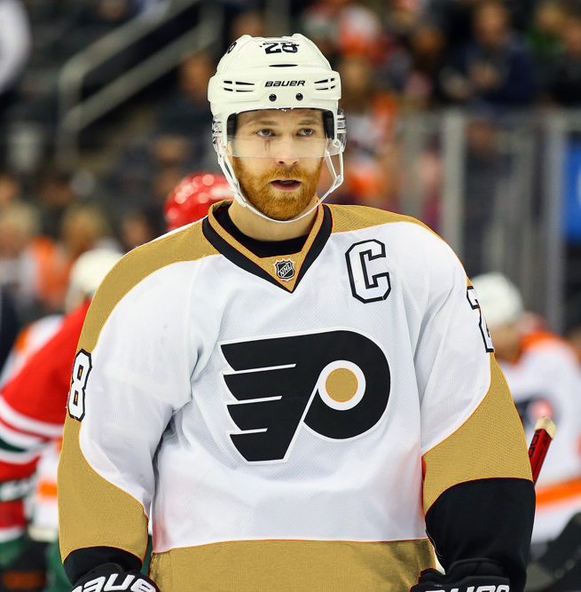
1. 1967–82 Home & Away Jerseys, 2008-10 Third Jerseys, 2010 Winter Classic Jersey, 2010–present Home & Away Jerseys

These jerseys have been modified slightly over the seasons they’ve been worn, but they’re essentially the first jersey they wore and became so wildly popular when they were resurrected both as a third jersey in 2008 (the orange jersey) and the 2010 Winter Classic (the white jersey), it’s once again their primary jerseys.
And they’re extremely similar to the jerseys at #2, much a little bit more simplified. The outlines around the shoulder yokes and cuffs are removed, the orange is a little less red-orange and more a vibrant and intense orange, and the stripe along the bottom is thicker and moved up a bit. It actually makes the #2 jersey look clunky and heavy by comparison.
The black elements are left to a minimum as well, existing only on the cuffs, outlining the numbers/names, and the logo, which allows the logo to become easily the most prominent thing on the jersey. And it looks absolutely fantastic on the ice, perfectly complimenting the graceful minimalism of the Flyers’ logo. It’s strong, impactful, unique, a little brash and fits right in with traditional Flyers hockey.
Jersey Recommendation: Again, so many options, spanning the eras that included numerous Cup Finals appearances and a couple wins. Me, I’d go for #1 Parent, but would be tempted by a #16 Clarke, #7 Barber or even a #19 Hartnell. Hartnell’s not the obvious choice, but with that long orange hair/beard, he fit the Flyers jerseys perfectly.
Agree? Disagree? Let us know in the comments below or join the conversation on Twitter, Facebook, or Instagram!


/cdn.vox-cdn.com/uploads/chorus_image/image/64016274/usa_today_12403334.0.jpg)
/cdn.vox-cdn.com/uploads/chorus_image/image/46869282/usa-today-8512555.0.jpg)
As a life long Flyers fan, I completely agree they have one of best logos in hockey and appreciate as an team not straying roo far off the uniform track. One obvious exception which recieved only passing mention was the Cooperall uniform. Readers would find the origins and controversy surrounding this groundbreaking design facinating. The Coopetall was so despised (ahead of its time?)that the NHL actually banned the design and the Flyers had to return to a “traditional” uniform.
Yup, those Cooperalls were something awful, that’s for sure. And dangerous too.