
Worst to First Jerseys: Chicago Blackhawks
As we go through the prolonged 2019-20 season, we’ll be updating all of the Worst to First Jersey posts every Monday, as almost all the teams in the league have unveiled new jerseys since their original posts. We’ll start with the ones most needing updating and work our way through the league. Today, it’s time for the Montreal Canadiens to get updated.
Also, a huge thanks to SportsLogos.net and NHLUniforms.com for most of the jersey images and references.
The Blackhawks currently wear what is generally considered the pinnacle of hockey jerseys, especially their current red home jerseys, and they’ve remained relatively unchanged for decades. But, with a glut of outdoor games over the years, as well as some different designs from the first decades in existence, there’s still a variety of jerseys to rank.
Here’s how this works: we’ll count down, from worst to first, all the jerseys the ‘Hawks have ever worn. Homes and aways will be lumped into the same category (so, more of a jersey “era”) and small changes (like slightly changed positions of piping for example) will be excluded, for everyone’s sanity. Third and special event jerseys, like the Winter Classics, will stand on their own (unless they’re very similar to one of their other jerseys). For the Blackhawks, there’s 6 different eras/jerseys, and we’ll start with the worst one.
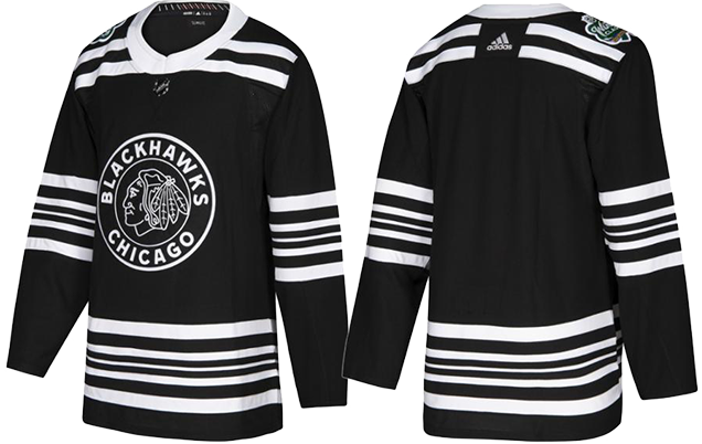
6. 2016 Stadium Series Jersey
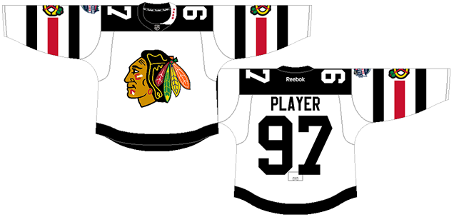
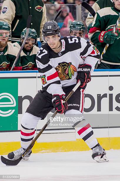
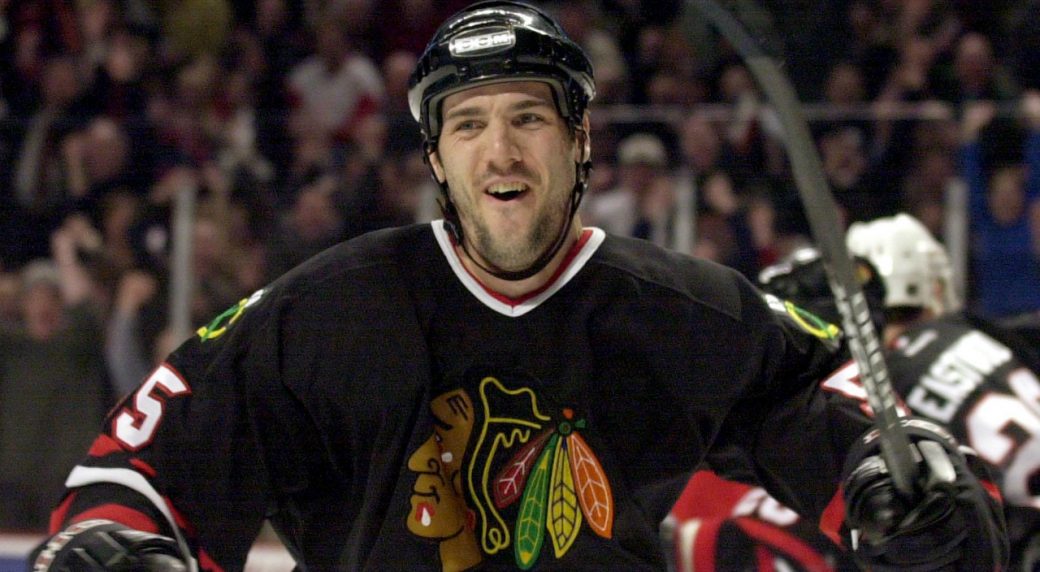
I am fully comfortable admitting that despite the greatness of their red jerseys, Chicago’s current road whites should not be held in the same regard. All the colour is stripped out, with it basically being a black-and-white jersey with minimal amounts of red and looking relatively flat in comparison.
And their 2016 Stadium Series accentuate all the worst parts of their road jerseys, enlarging the black striping to the point where the red looks like an afterthought. Add in the Stadium Series-mandated über-large numbers and über-thick striping, along with the oddly asymmetrical collar design, putting these at the bottom of this list was an easy decision.
• More: HbD Breakdown: Blackhawks and Wild Stadium Series Jerseys
• More: The 2019 Stadium Series Jersey Countdown
It’s too clunky, it’s too monochromatic, it’s too busy and too minimalist at the same time, it’s the worst thing the Blackhawks have worn.
Jersey Recommendation: #57 van Riemsdyk. Chicago lost this game 6-1 to the Minnesota Wild, so aside from Roszival taking out Zucker with a headshot, nobody on the ’Hawks did anything of note. Ole TVR got an assist on the only goal, so I guess that’s something?

5. 1996–2009 Third Jersey, 2014 Stadium Series Jersey
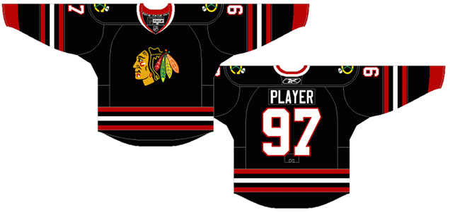
The Blackhawks joined the Third Jersey Program in only its second season, and given the other jerseys that joined the early group of entries, they showed remarkable restraint. And you can’t pin that to being an Original Six team either.
But they didn’t create anything that new either, choosing to simply switch their white jerseys to black and call it a day. In some ways, it’s a better jersey than their road whites, as the red is much more prominent: red cuffs and a red-white-red striping pattern, as opposed to the black-red-black on their white jerseys. As black jerseys go, it’s actually pretty good.
• More: Top 5: Black NHL Jerseys
But it also reeks of the ’90s “anything black is cool” aesthetic that created a deluge of black jerseys during the era…an era we’re apparently still dealing with. And black usually makes for bad jersey matchups, showcasing a white vs black jersey that’s aesthetically boring, especially when played on a white ice surface.
And then there’s the logo issue. Because they chose not to outline their crest, the black jersey bleeds into the black hair, creating an odd and distracting lack of definition to the logo. It looks like a race track floating beside a guy’s head.
Their 2014 Stadium Series jerseys followed an extremely similar design, so they’ve been lumped together here. The only differences is that the striping has been angled and cut-off on the sleeves. And then there’s the chromed-out logo, which is stupid but at least sets off the non-outlined logo crest better. All of these things were league-mandated, following the template for the inaugural Stadium Series games, so it’s hard to fault the ’Hawks here directly.
• More: HbD News: Rangers and Blackhawks Stadium Series Jerseys
• More: HbD News: Stadium Series, All Chromed-Up
Jersey Recommendation: #55 Dazé. Remember Eric Dazé? This whole era of Blackhawks history isn’t…well…very good, making the playoffs only twice, and the second time was in the last year, when the Toews era just getting going. But Dazé was a solid contributor, and his career – entirely with the ’Hawks – almost spans this era exactly. Seems like a good fit.
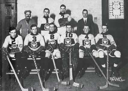
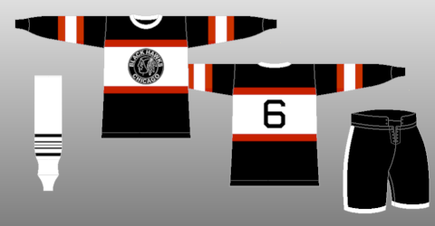
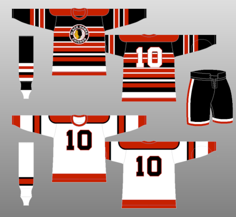
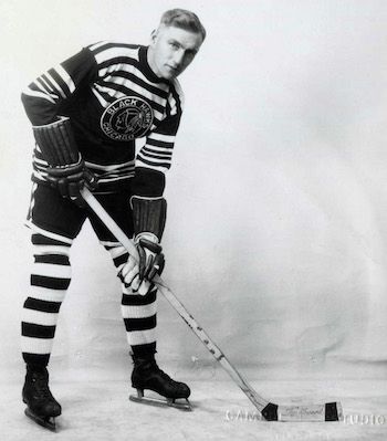
4. 1934–37 Jersey, 2009 Winter Classic Jersey, 2009–11 Third Jersey
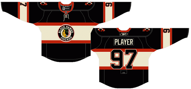
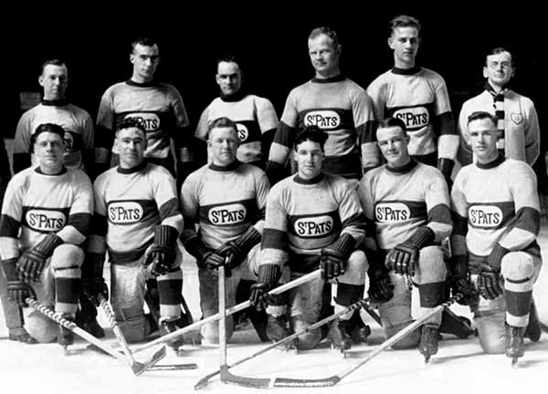
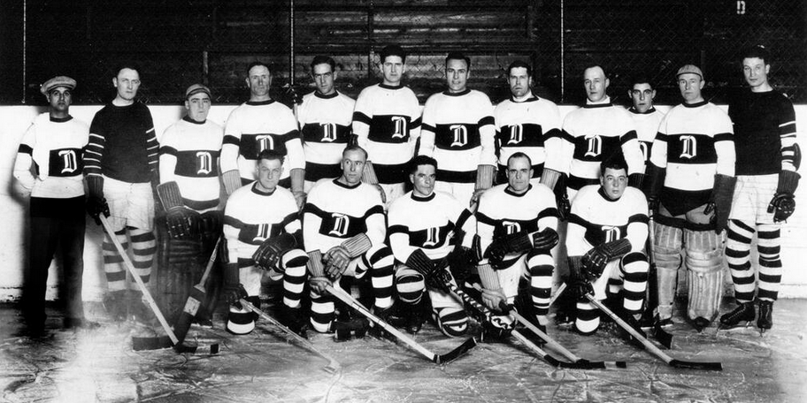
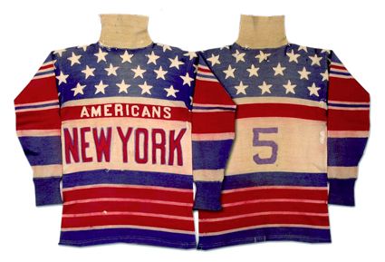
I’d be easily persuaded to have these rated below the previous entry, but what bumps it up is the more unique, historical aesthetics of them. The chest stripe is more in vogue right now (compliments of the Panthers and Wild), but their origins trace back over 100 years. It’s mostly known today as a Montreal Canadiens thing, but they didn’t have a monopoly on them either. That particular design element didn’t have the same exclusivity when the Black Hawks started wearing them in 1934 – the Montreal Wanderers, Quebec Bulldogs, Toronto St Pats, and Detroit Cougars, to name a few, had already used it.
But even as all those chest stripe jerseys go, this is a good entry. Although it’s a black jersey (see rant in previous jersey’s discussion), there’s a good amount of red and tan to balance it out. The original 1934 version actually used white instead of tan, but that lasted only about half a season before they switched.
Otherwise, it’s a classic, historical design. The striping is simple but consistent. The colours work well together. The crest is the most prominent part of the jersey. Solid.
• More: 2019 Winter Classic Jersey Countdown
The modern version (2009–2011) made some small modifications from the original – like not using the accurate logo crest, which is understandable since it featured a very problematic red-skinned profile – and added simplified tomahawk shoulder patches. Good alterations, overall.
Jersey Recommendation: #6. Paul Thompson was the Black Hawks leading scorer for all three seasons that these jerseys were worn, so it’s an easy recommendation for this particular jersey.

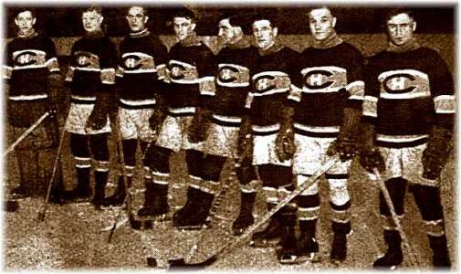
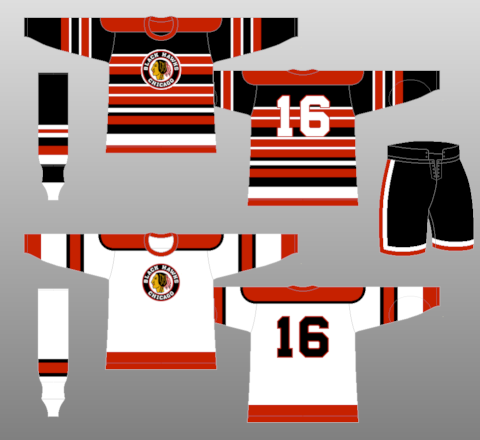
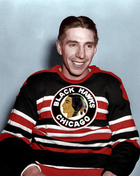
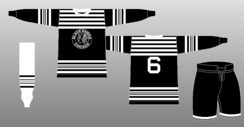
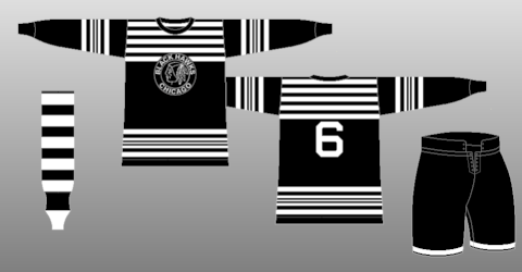
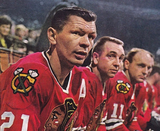
3. 1937–55 Home & Away Jerseys
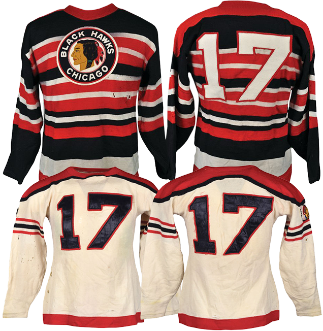
When people think of old Chicago Blackhawks (or Black Hawks, as they were officially named back then), the über-striped black jersey is usually what comes to mind. And although they went through numerous small alterations over the almost-two decades they wore them, the general concept stayed the same: black jersey, lots of sporadic red and white stripes.
Personally, I love these aesthetically. They multitude of stripes was – like the chest stripe on the previous jersey – not unheard of for the era. And the combination of red, white, and black is about the most powerful and impactful colour combination there is. The fact that these jerseys have them is relatively equal measure ensures they become the visual equivalent of a punch to the face…in a good way.
Sure, it’s gaudy and aggressive, but it’s interesting and it something doesn’t overtake the crest. The roundel logo along with introducing a unique colour (dark tan?) for the logo’s skin tone ensures that it still stands out…a hard balance to achieve.
The era’s white jersey is significantly less complicated, and looks a bit bland in comparison (including going football-style with the numbers on the front), dragging this pairing down the rankings a bit. But it’s also the first time a Chicago jersey has the now-iconic triple stripe pattern, here featured on the sleeves, so that’s something.
This jersey, too, went to minor alterations, with the version pictured above being worn from 1940 (when they were first introduced) to 1947. For 1947–55, they went back to the previous jersey’s striping, and from 1948-55, they replaced the chest numbers with the logo.
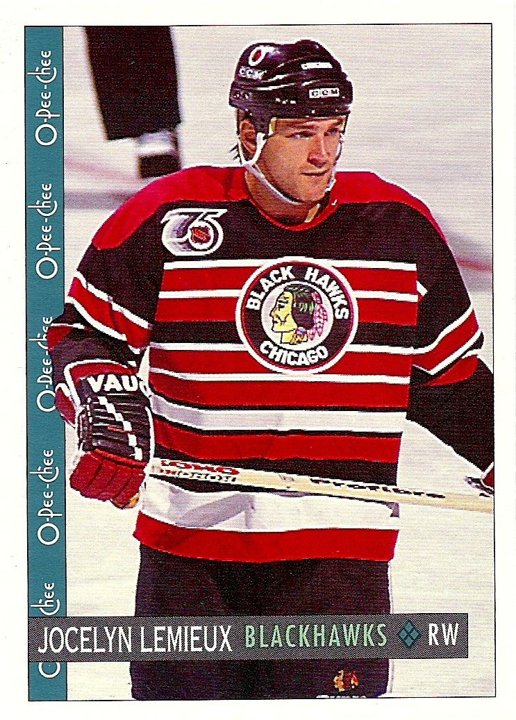
And for the NHL’s 75th Anniversary in 1991-92, they brought the striped jerseys back. It was pretty awesome.
Jersey Recommendation: #5. Max Bentley – named one of then NHL’s 100 Best Players – was one of the leaders for this era of the Blackhawks, along with his brother Doug. Although he split his career with the Maple Leafs, his best years were in Chicago. Get it in the black striped jerseys.
2. 1926–34 Jersey, 2019 Winter Classic Jersey
Maybe this is a controversial ranking, but there’s just so much to love about these. Yeah, it’s black and monochromatic which I usually address as a negative, but these just embrace it completely and it’s so packed with contrast and intensity, it overcomes any issues.
• More: HbD Breakdown: 2019 Winter Classic Jerseys
• More: 2019 Winter Classic Jersey Countdown
The 2019 Winter Classic jerseys featured in the image above are modern replicas of their 1928–34 jerseys, with the only differences being the use of the modern logo crest and less stripes on the shoulders. The 1927–28 jerseys had black collars, and their inaugural 1926–27 jerseys were identical, but inverted to white with black stripes. We’re just lumping them all together for this ranking.
For such seemingly erratic and superfluous striping, they’re actually surprisingly consistent across the sleeves and bottoms of the jerseys. Even the shoulders use the same thickness from the two thick stripes on the sleeves/bottoms. There’s a sense of order in all that chaos.
And again, it’s just so aggressive. And different for a modern game. And different for the original era, as these were the first fully-monochromatic jerseys, and the first predominantly black jersey to ever be worn in the NHL.
Jersey Recommendation: #2. Dick Irvin (not that Dick Irvin, I mean his father) – a Hockey Hall-of-Famer was the inaugural captain of the Black Hawks and one of their leading scorers. He retired in 1929 due to injury and immediately jumped to coaching the Hawks until 1931, and then again for the 1955–56 season (after spending the in-between years coaching Toronto and Montreal).
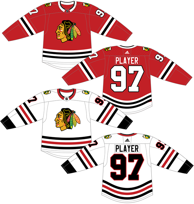
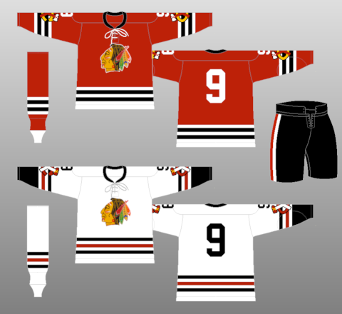
1. 1955–present Home & Aways Jerseys, 2015 & 2017 Winter Classic Jerseys
Yeah, you already knew what would take first place, right?
Widely considered the jersey set in the league, the Blackhawks current set has remained relative unchanged since 1955, with only minor changes (mainly to the shoulder patches and sleeve number placements), along with updated logos. And really, why mess with it?
Especially the home reds. They’re pretty much as close to perfection as you can get. The red-white-black combination is powerful, and it’s offset by the multitude of colours in the logo crest (and shoulder patches) which, surprisingly, doesn’t detract from the overall aesthetic but enhances it by balancing out the aggressiveness of the colour scheme with some character and relative softness. Which is another really hard balance to achieve.
The striping is consistent and the white bottoms of the jerseys with the black stripes is iconically Chicago (sorry Dallas). The use of black and white striping to balance the onslaught of red is perfect. It gives good contrast, but again, the logo’s unique design ensures it’s still the centrepiece of the design.
As mentioned earlier, I’m not as big on the white road jerseys and the balance between white, red, and black is too black-heavy. But the iconic tri-stripe is fantastic. And again, that logo balances out the aggressiveness of the palette.
We lumped in the 2015 and 2017 Winter Classic jerseys because the differences between them all are extremely minor, with some slight changes to the logos and shoulder patches.
If not the best current jersey set in the league, it’s definitely up in the Top 5. Maybe even of all time. Beautifully balanced, classic and iconic striping, it’s a look that almost certainly will be worn as long as the Blackhawks are in Chicago.
Jersey Recommendation: Take Your Pick. With over 60 seasons to draw from, there’s tons of players: Toews, Roenick, Hossa, Chelios, Esposito, Hall, Pilote, Belfour, etc. For me, I’d go with a #21 Mikita. A classic jersey for one of the best players in hockey. Get it in the red jersey, of course.
Agree? Disagree? Let us know in the comments below or join the conversation on Twitter, Facebook, or Instagram!


/cdn.vox-cdn.com/uploads/chorus_image/image/46932254/GettyImages-220740.0.jpg)
/cdn.vox-cdn.com/uploads/chorus_image/image/63026778/usa_today_12124873.0.jpg)
/cdn.vox-cdn.com/uploads/chorus_image/image/59876889/Screen_Shot_2018_05_28_at_6.09.25_PM.0.png)
.JPG)
[…] • More: Worst to First Jerseys: Chicago Blackhawks […]
[…] • More: Worst to First Jerseys: Chicago Blackhawks […]
[…] More: BTLNHL #7: Chicago Blackhawks• More: Worst to First Jerseys: Chicago Blackhawks• More: 2020 Winter Classic Jersey […]