HbD Breakdown: Blackhawks and Wild Stadium Series Jerseys
 The day after the Detroit Red Wings made their Stadium Series jersey unveiling a few months back, the Chicago Blackhawks and Minnesota Wild followed suit and unveiled what they’ll be wearing against each other on this Sunday, February 21, 2016 at TCF Bank Stadium in Minneapolis.
More: HbD Breakdown: Red Wings Stadium Series Jerseys
More: HbD Breakdown: Avalanche Stadium Series Jerseys
And like what Detroit’s jersey suggested, the teams are being given a little bit of freedom to create something more unique for their own and not have to follow a specific template, as is what’s happened in previous years. But, they all still are incredibly minimalist with a modern design, and uber-large numbers. Read more after the jump.
Chicago Blackhawks
Bleak Peeks?
The Blackhawks made their announcement first, so we’ll start with them. They made a series of sneak peeks on Twitter the day before their official unveiling, basically confirming that yes, their logo will be on it. Thanks @NHLBlackhawks, these Twitter sneak peeks are always so enlightening!
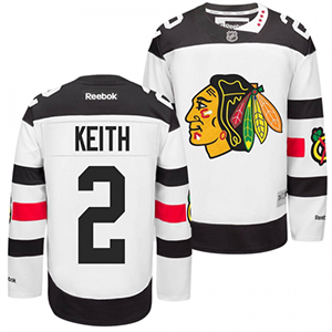
As mentioned above, and as usual with the Stadium Series jerseys, this year’s Chicago jersey veers towards the minimalist with bold impactful elements. And it’s predominantly white and black with very little red. Which makes it look somewhat uninspiring: monochromatic, simple stripes, and a logo. But some of these simple elements redeem it a bit.
Up Their Sleeves
The area of the jersey with the most going on in undoubtedly the sleeves, with thick, consistent stripes of black and red with the alternate logo in the middle of the red stripe on both sides. Personally, I really like it. Most often the striping on these jerseys are one or two thick chunks of colour, and that’s it. Here, there’s at least a little bit more, and it mimics the striping on their current road jerseys, albeit much like a soup so thick you’ll want to eat it with a fork, it’s chunkier.
What it does, however, is force the ridiculously large numbers from the sleeves to the shoulders (à la Oilers third jerseys). It’s a more unique placement, and if you’re using numbers this large for the presumed purpose of being able to see them from a greater distance in a larger stadium venue, it actually makes more sense. Most people will be looking down on the players and shoulder numbers (as opposed to sleeve numbers) is a better angle to see the numbers. And a players’ shoulders will generally move less than their arms, making it easier to see. So, from a logistical (and design) standpoint, it’s a win.
The addition of the alternate logo? Cool, no issues there. It’s one of the best alternate logos in the league. It’s a little bit of needed flair on a minimalist jersey (although where’s the other 36 pieces of flair?).
But now things start to go downhill a bit. There’s one more stripe to talk about. The thick black stripe along the bottom of the jersey is certainly odd. The current trend has been moving towards a single thin stripe along the bottom of the jerseys (à la Kings, Islanders, Coyotes, etc), but this is so chunky, you could probably eat it with a sledgehammer. And because white-and-black is the strongest contrast you can get, it forces the eye to jump to and from the bottom of the jersey. It’s pretty unnerving.
And it’s most likely pointless. I haven’t seen any full-uniform images yet, but if they’re wearing black pants with these, you won’t even see the bulky black stripe, which begs the question…why have it then? What that will do is make the jersey look abnormally short, ending at the bottom of the white instead of the black.
A Lack of Colour
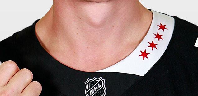
The extremely monochromatic scheme is pretty disappointing. The NHL seems oddly adamant about avoiding colour-vs-colour match-ups, even in one-off jersey games like these. Red Chicago jerseys versus Green Wild jerseys? Would look great! But these jerseys barely even tried to bring more red into the design. Other than the logos, there’s a single red sleeve stripe and some minuscule stars on the collar (more on those later).
How about a red shoulder yoke instead of black? Or switch up the black and red stripes on the sleeves? It wouldn’t take away from the crest on the front, and add some more visual interest. I think big bursts of colour was in these days again?
The last thing is the collar, the one truly unique element in the jersey design. What I definitely like about it is introducing the 6-pointed stars from the Chicago flag into the design. The Avs added “5280” (feet in a mile), Detroit added “Red Wings” (creative!), but this is the best collar-addition design I’ve seen. It directly connects with known symbolism of the city and is beautifully iconic. A really nice touch.
And that’s where my love of the collar ends. The asymmetry of it, with black on the left and white on the right, is distracting and completely out-of-sync with the rest of the jersey’s utlra-simple and minimalist design. And it doesn’t wrap around, just ending for no apparent reason on the hemline at the top of the jersey. Maybe, maybe, it would work better on a traditional v-necked jersey so it could come to a point in the front, but these crew-necked ones, no way. Love the stars, hate the stripe.
Final Verdict
Minimal, simple, and bordering on uninspiring. There’s a few elements to lift this jersey up a little bit, but overall, the ‘Hawks seem to be losing interest in creating unique and iconic outdoor game jerseys. Their last Stadium Series jerseys were unquestionably better.
Minnesota Wild
The Wild are quietly amassing themselves a very impressive collection of diverse jerseys lately. Their road jerseys are one of the best in the league. Their homes and alternates have a very different design but are still very well-designed, being the only team to accomplish using a script-font on their crest positively. And this jersey does nothing to diminish their jersey set. It’s quite easily an impressive addition to the Stadium Series jersey library and fits completely with their current branding.
It’s got the signature simplicity and bold stripes that the league demands from the Stadium Series jerseys, but it all works harmoniously together. In design, more is not more, less is not more, ‘just enough’ is more. And these feel like they’re perfectly ‘just enough’ given the design concerns and constraints.
Stadium Smarts
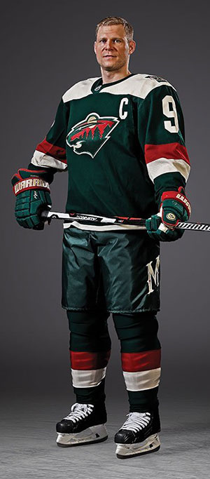
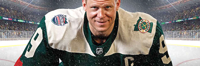
If the Stadium Series jerseys in 2016 must have (a) enormous patches of colour/stripes, (b) enormous numbers and (c) not much else, these fit the bill. The red and cream stripes on the arm are thick, on-brand and consistent. They’re also far enough down the sleeve that there’s a comfortable amount of room for the uber-large numbers, which has the nice effect of – while they’re still obviously large – they sit nicely on the jerseys and don’t look incredibly awkward.
The cream shoulder yokes are simple, logical (follow the hemlines and nicely squared-off) and are certainly prominent, but don’t take over the entire jersey. The balance between the dominant forest green with red and cream is pretty much perfect. Not enough red to make it look like a Christmas-themed uniform, and the cream provides a nice contrast to the green.
Then, as is the new modern style (again, see Kings, Islanders, Coyotes, etc), there’s a simple thin cream stripe along the bottom to visually separate the jersey from the pants.
Slap the logo in the middle, and bam, you’re done. Stadium Series jersey extraordinaire!
The only other element left are the shoulder patches, which are nice details for those who buy the jerseys. Right shoulder, the Stadium Series logo for Minnesota. Cool. The left shoulder, a patch in the shape of Minnesota with their “State of Hockey” motto. This is a only 2016 Stadium Series jersey to not have anything on the collar, but this is pretty sweet alternative. Nicely designed. Simple but distinctive. I got no complaints.
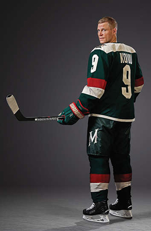
Minnesota was also the only team to unveil not just their jersey, but the entire uniform, which is really fantastic. You can see all the elements of the uniform and how they’ll work together…and how the jersey looks with a player wearing their full gear. And again, with Minnesota, they hit the mark perfectly.
The stripes on the socks are completely consistent with the sleeve stripes and, again, create a great balance between the green, red and cream on the entire uniform.
And the real winner for me is the “M” on the pants. Using the same script font from their alternate jerseys, the “M” adds a unique and distinctive addition to the jersey which (unlike the Blackhawks’ asymmetric collar) fits really well with the rest of the uniform. It’s visible, but not in a spot that largely detracts. Again, there’s a really nice balance.
Final Verdict
Yeah, these are pretty great. Maybe it’s the high production value of the photos that make them look so good, but they even look good here. It’s simple, modern and perfectly balanced with all the distinctive elements of a Stadium Series jersey and elements unique to the Wild. It’s even better than those rumoured Wild/North Star combination jerseys from the summer. Touchdown Minnesota. Get it? Stadium Series? Touchdown?
Bonus!
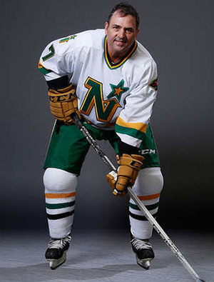 And to make the day even better for Wild/North Star fans, the alumni game will feature former North Star players wearing their North Star uniforms from the ’80s, which are unbelievably awesome. That’s worth the price of admission on its own. Neal Broten, you’ve never looked so good.
Agree? Disagree? Let us know in the comments or join the conversation on Twitter and Facebook!





[…] Related Reading: HbD Breakdown: Blackhawks and Wild Stadium Series Jerseys […]
[…] More: HbD Breakdown: Blackhawks and Wild Stadium Series Jerseys • More: The 2018 Stadium Series Jersey […]
[…] • More: HbD Breakdown: Blackhawks and Wild Stadium Series Jerseys […]
[…] More: HbD Breakdown: Blackhawks and Wild Stadium Series Jerseys• More: The 2019 Stadium Series Jersey […]
[…] • More: HbD Breakdown: Blackhawks and Wild Stadium Series Jerseys […]