HbyD Breakdown: Nashville Predators’ Stadium Series Jerseys
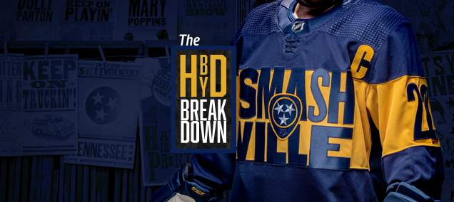
On February 26th, the NHL’s Stadium Series event will return at at Nissan Stadium in Nashville for the Preds to take on the Lightning outdoors. Recently both teams unveiled their jerseys for the event, so you knew we had to break down all the details. Kris will be sharing his thoughts on Tampa’s uniforms, but first, let’s take a look at what Nashville will be wearing.
Feeling… blue?
For the first time since 2011, the Preds will be skating in navy uniforms, a departure from the gold and white they’ve worn over the last decade. The initial reception to the new sweaters has been mixed (to say the least), garnering… um… passionate comments like “this is absolutely the worst sweater I have ever seen,” “y’all should try again,” and “WHO IS DESIGNING THESE. THEY CANT KEEP GETTING AWAY WITH THIS.” I mean, nearly 100 people have signed a Change.org petition to get rid of these all together.
at least I can refresh an old meme pic.twitter.com/k5AyijSlcQ
— NSH Housecats in the Hat (@HousecatsNSH) December 2, 2021
While these jerseys certainly have their flaws (which we’ll get into in a minute), after years and years of head scratching, I think I’ve finally accepted that the Stadium Series events are the NHL’s opportunity to push the envelope and create jerseys that would never fly as primaries. From the huge numbers and dark mode looks, to storm trooper pajamas and whatever bib-look Colorado tried for in 2020, I’ve come to terms with these games being a sandbox for experimentation, where sometimes you’re going to swing and miss. That said, let’s get into the details.
Pressed and Smashed
Tapping into the history of music city, Adidas pulled inspiration from Nashville’s legendary Hatch Show Print letterpress shop, who’ve been in the business of creating posters from their vintage type and hand-carved blocks since 1879.
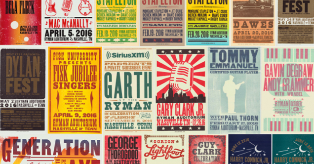
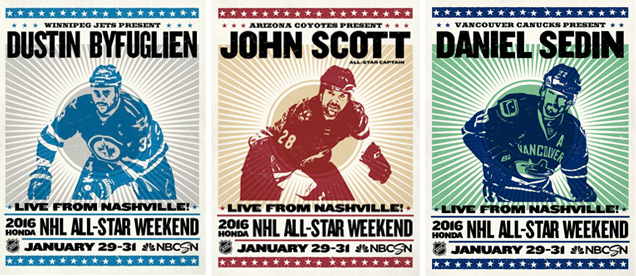
Not dissimilar to the poster series Fanbrandz created for the 2016 All-Star Weekend in Nashville, Adidas and the NHL pulled the iconic hand-pressed typography style from Hatch to create the front typographic crest for the jersey. As a letterpress and typography nerd myself, I can’t help but feel some affinity for this concept, but there are a few things that irk me in execution that I need to address.
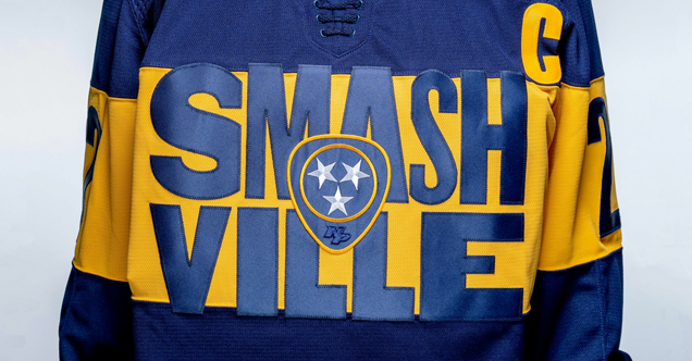
I feel like a broken record, having called out this same gaffe on Nashville’s Winter Classic jerseys, but I cannot STAND the edges of the letters extending beyond the horizontal stripe. Now you might be thinking, letterpress doesn’t always fit neatly inside the lines, which brings me to gaffe number two –– the right curve of the S being chopped off to leave negative space before the M. On top of not fitting with the letterpress-style, it takes what’s otherwise a cool, eclectic style and makes it feel clunky and forced.
Lastly, the placement of the captain’s C here is just absurd. Because of the “Smash” bleeding over the yellow stripe into the chest of the jersey, the C is pushed so far off into the armpit that it looks as if it’s about to be sucked into a vortex.
I appreciate what the designers were going for with this inspiration –– it’s bold, and certainly a big swing –– but unfortunately it misses the mark for me in some of the details.
Party in the front, business in the back
While the letterpress inspiration on the front crest is undeniable, the designers took a more subtle approach with the typography on the back. From the Preds’ release:
The player’s name and number font features digits and characters of different widths and weights as seen when mismatched letterpress blocks are used in letterpress music posters
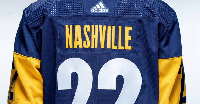
I like that the varied weight style carries over onto the back, as going bold like they did with the front would be chaotic beyond belief, but I wish the name plates had a tad more variation from one letter to the next to drive that style home, especially given the exaggerated elements elsewhere on the jersey.
It’ll be interesting to see how different players’ names look in this style, but from seeing “Nashville” in the jersey reveal, the A certainly stands out as bolder, but the variance between the I and Ls for example is less noticeable at first glance.
Like with all Stadium Series jerseys prior, the numbers are absolutely massive, but I actually like the contrast here between the white numbers and gold nameplate, and the reversed out navy-on-gold sleeve numbers that collectively help create some balance in an otherwise very cluttered design.
The finer details
To me, the best parts about this jersey are in the small details. While Stadium Series uniforms are known for being larger than life and outside the box, those elements can sometimes become a distraction from the little touches that were done right.
Sitting on top of the “Smashville” typography is the Preds’ alternate logo, a cleverly designed guitar pick with the three Nashville stars in the center. The details in how this is embroidered also gives a richness and texture to the jersey that the overall design is generally lacking.
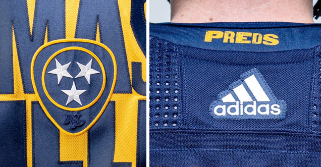
I also quite like the small treatment of “Preds” on the back collar, further tying in the letterpress treatment in a subtle way. It may not be totally necessary, but it helps bring some cohesion to the design from all angles.
• More: 2020 Stadium Series Jersey Countdown
In the end, this is far from my least favorite Stadium Series sweater. Evaluating it through the lens of experimental jersey design, I think it has a lot of potential conceptually, but missed the mark in a few areas execution-wise. It’ll be interesting to see how it looks on the ice, so we’ll be checking back in February to find out!
Agree? Disagree? Let us know in the comments below or join the conversation on Twitter, Facebook, or Instagram!


[…] kicked off our Stadium Series breakdowns with her thoughts on Nashville’s letterpressed Smashville look. As she mentioned, and I totally agree with, the […]