
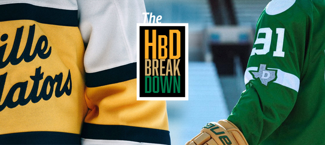
HbD Breakdown: 2020 Winter Classic Jerseys
While most Winter Classics in the event’s decade-plus history have been homages to the respective teams’ storied heritage, this year’s announcement left many wondering how these two teams, each less than thirty years old, would adopt a vintage aesthetic with the same level of authenticity as franchises with nearly a century of history behind them.
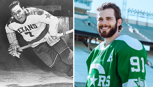
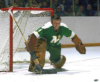
Spawned from the relocation and rebrand of the Minnesota North Stars, a club founded as a part of the 1967 expansion, the Stars first debuted in Dallas for the 1993-94 season. The Stars enjoyed great success in the late 90’s, winning the team’s first and only Stanley Cup in 1999, but hockey existed in Dallas long before the Stars (or North Stars) ever played their first game. The Dallas Texans, after spending one season as a part of the American Hockey Association, played in the United States Hockey League from 1945 to 1949, amassing an unremarkable 93-116-39 record in four seasons.
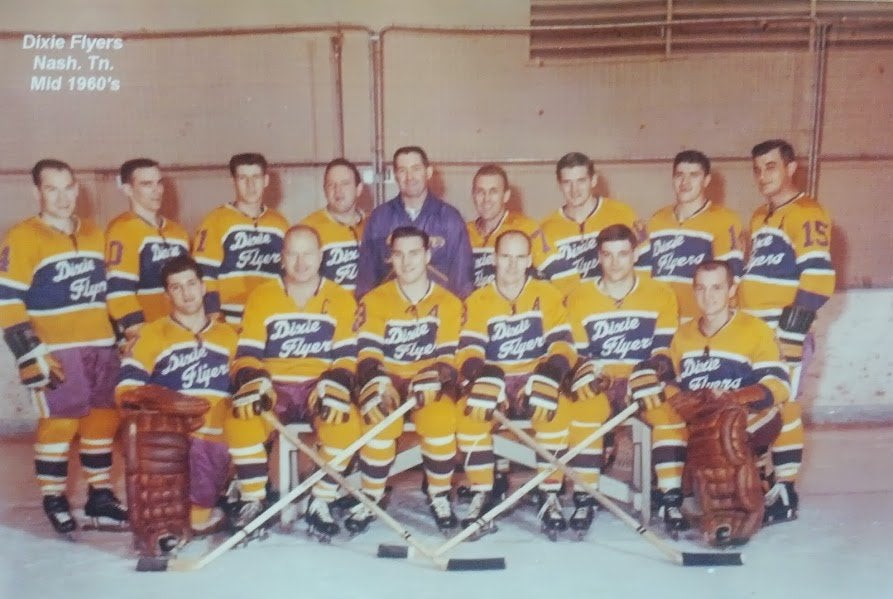
Nashville’s hockey history isn’t dissimilar, with the city not having an NHL club of their own until 1998, yet having since reached a Stanley Cup Final and proven themselves to be a legitimate hockey town. That said, long before the Preds entered the league, Music City has had hockey elsewhere. The Nashville Dixie Flyers played in the Eastern Hockey League from 1962 until 1971, and even won league championships in 1966 and 1967.
Tapping into these historic non-NHL clubs, Adidas was able to craft some pretty authentic looking retro uniforms for two of the league’s newer franchises, so let’s break them down in more detail.
TL;DR – For the lazy or those with short attention spans, Dallas’ are rad with some legibility issues. Nashville’s are clean but just ok.
Dallas Stars
Straight From the Archives
Almost immediately after the Stars’ Winter Classic logo was unveiled back in September, the connection was made between the design and that of the Dallas Texans. The full uniform unveiling on November 6th coincidentally (or maybe not, who knows) came on the 78th anniversary of the Texans’ first ever game against the St. Paul Saints. While the Stars haven’t explicitly referenced the USHL club in any of their releases about the brand, it’s hard not to see the inspiration from, as the team described, “historical hockey uniforms from Texas.”
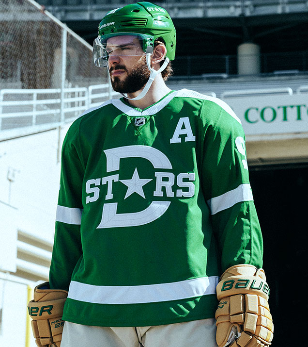
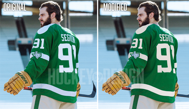
Using felt fabric and silver thread, the textures in the logo feel really rich and authentic, stitched to create a faux-beveled look. The only place the stitching gets a bit wonky is in the thinnest notches around the serifs in the “S”s, but that’s really splitting hairs.
Aesthetically, this logo is a nice modernization of what the Texans used. That being said, there are some pretty significant legibility issues that can’t go unmentioned here: let’s start with the choice to turn the “A” into a star. While the team posed this as a reference to the Texas state flag, it visually takes the “A” out of the word “Stars” and instead leads us to read the large Dallas “D” in it’s place, so S-T-D-… yikes.
The Dallas STDrs– oh wait… https://t.co/vc2hEdn0oY
— Hockey By Design (@HockeyByDesign) November 6, 2019
Clearly we all know what it’s supposed to say, but to miss that from a legibility standpoint, it seems like a pretty big gaffe.

A Historic Hybrid
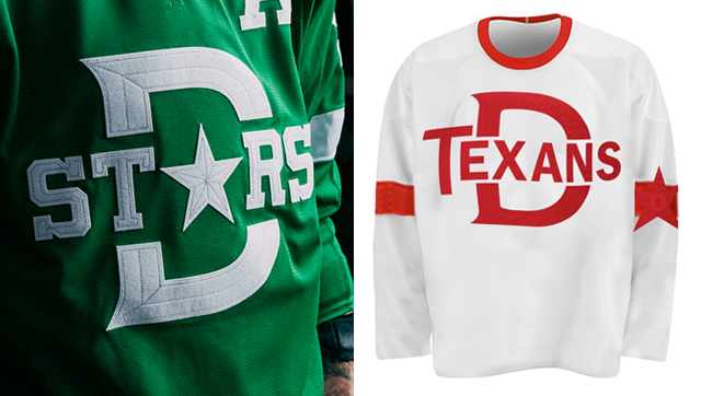
While the logo on the front of the sweater serves as an homage to one Texans jersey, the shoulder yokes and arm patches pay tribute to another. While not dissimilar to the white yokes of the Minnesota North Stars, as pointed out by Chris Creamer, the typography and most of the design elements from the Texans’ word mark jersey were also adopted in the Adidas modernization. “We’ve really steered away from promoting and showcasing the Minnesota North Stars brand,” Stars president Brad Alberts told NHL.com, as this year’s Winter Classic is meant to highlight the history of hockey in the south.
As a reader has pointed out, much more likely the Dallas Stars #WinterClassic set is a mash-up of these two Texans designs rather than original North Stars. Note the shoulder yoke, sleeve patch, waist stripe in the first pic, all carried over to the Starshttps://t.co/V2PfUCjJ9O pic.twitter.com/7ZHjjavwC1
— Chris Creamer (@sportslogosnet) November 6, 2019
It’s an interesting approach, as this style of shoulder yoke is most often associated with the 70’s, where as the rest of the design elements were inspired by the Texans of 40’s, which creates a somewhat odd juxtaposition. Shoulder yokes aside, the bold stripe around the waist and “D” patch on the arm can both be seen adopted in the Winter Classic sweaters. “We worked to sort of Frankenstein the best ideas of all of these designs into one,” Stars senior vice president of marketing Dan Stuchal shared with NHL.com, “and that’s where we came up with this.”
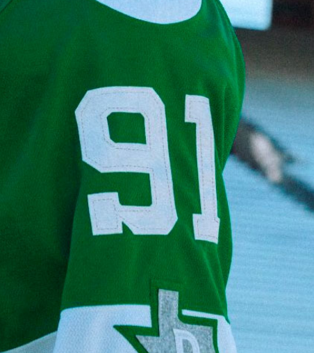
The lettering style is also quite similar to that of the original Texans jerseys, a varsity-style serif font that can be seen both in the “Stars” logo on the front, but on the back and sleeve numbers as well. While we haven’t seen a full alphabet in this font yet, some of the numbers do appear a bit clunky, like the “S” in Stars, as I mentioned before, or the serif on the “9” of Seguin’s 91.
The Complete Getup
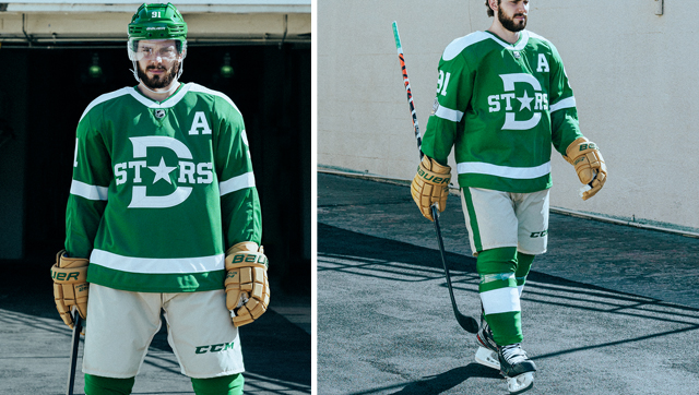
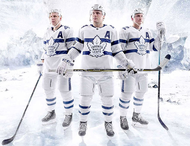
No matter how great the design of any jersey, the rest of the uniform can really make or break the look on the ice. Just ask the Leafs after the 2018 Stadium Series. That said, I can’t stress enough how much I love that Dallas is going with the light pants and tan gloves to accompany these jerseys. We’ve seen a number of goaltenders wear tan pads for Winter Classic games (which according to The Athletic, Ben Bishop seems to be planning on), so channeling the vintage leather with tan gloves, even in a modern construction looks really sharp and plays to the overall faux-retro vibe.
Adding to that, the beige pants are a great addition to set off the Victory Green sweaters and socks. Light pants can easily go awry (again, see Toronto’s 2018 Stadium Series uniforms), but with the bold pops of green on top and bottom, and the green striping along the sides, the complete look really works.
My only gripe here, and I know they were going for a mismatched look, is that the beige color wasn’t leveraged in place of white in the jersey. Using off-white felt can work really well for a Winter Classic sweater, as the Bruins did in 2016, but here the bright white ends up making the shorts look less vintage and more just dull.
Final Verdict
Overall, these are really stellar. With questions around what era the team should draw their inspiration from, I’m really pleased with the direction Adidas and the Stars’ management ended up taking. Are there some flaws? Sure, but for the first time seeing a) southern and b) newer franchises in the Winter Classic, these are a great homage to hockey history in a southern state.
Nashville Predators
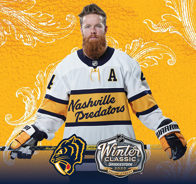
Dixie Script
Also playing in their first Winter Classic, the Predators took a similar historic approach in coming up with a concept for the game at the Cotton Bowl. However, while the team of Adidas designers and Stars management were working on concepts for the Dallas sweaters, some 664 miles away in Nashville, the Preds were doing the exact same thing with no knowledge of what their counterparts were coming up with. “We had no idea what Nashville was doing,” Dan Stuchal told the Dallas News. “They kept each of us completely separated when we were designing.”
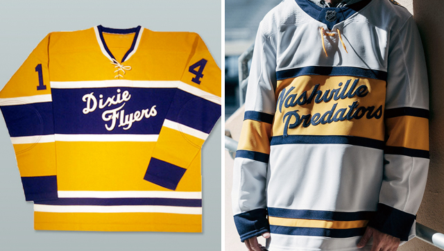
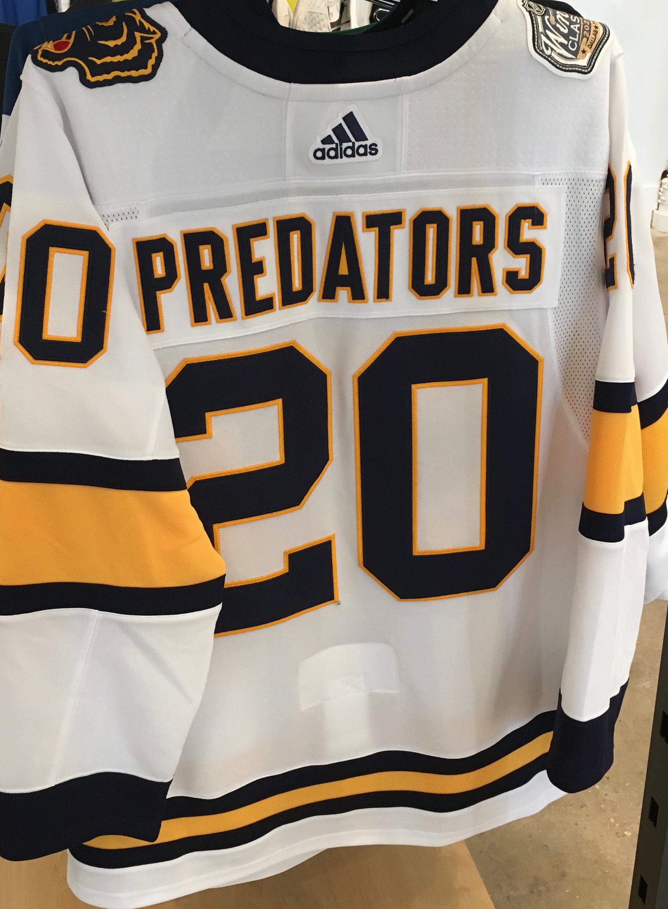
Like Dallas, Nashville dug into the archives of their city’s hockey history and found themselves a template courtesy of the Dixie Flyers, a team that, like the Preds, sported gold sweaters but with a large purple stripe across the chest enclosing a script word mark. Now if you ask me, this seemed like a golden (pun intended) opportunity for a color vs. color game, as also pointed out by Icethetics:
It is standard in the NHL for the road team to wear white, but based on some of the concept art we’ve seen in recent months, yellow and green seem to contrast well enough to tell the teams apart.
Yet the Preds went with white, which while expected, makes these jerseys slightly duller than the originals. I digress.
The lettering style here is a great modern adaptation of the original Dixie Flyers script––majorly cleaned up and streamlined––however the challenge lies in the number of characters in “Nashville Predators” versus “Dixie Flyers.” Where as the original fits neatly in the center of the stripe where a crest or shield would sit, fitting 18 characters in the same space doesn’t look quite as tidy.
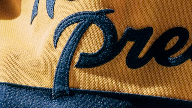
Given how long the name is, I think Adidas actually did a fine job making it work as well as it can in the space, but my biggest complaint is this itty bitty overlap between the bottom of the P and the navy stripe. In the original Dixie Flyers jersey, the text doesn’t interact with the frame at all, and this small overlap looks more like a mistake than a deliberate design choice. If perhaps the “l”s in “Nashville” had the same interaction, it would appear more intentional, but this detail in the execution cheapens the design a bit.

A Fauxback Cat
While hockey may not be new to Music City in the past 30 years, the Predators brand certainly is, so coming up with an authentic-looking retro interpretation of the team’s visual identity presented a challenge for the Adidas designers. “We worked backward in time to transform the current Predators logo into a completely new form that sits perfectly with the heritage look,” Matt Beeman, senior designer at Adidas told The Athletic.
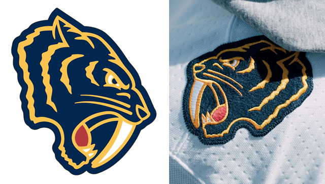
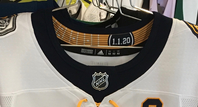
The team took the Predator head and created a fauxback version that drew inspiration from 1950s letterman-style patches. The simplified style and posturing of the cat is very high school-esque (in the best possible way), and the execution with embroidered felt further supports the letterman aesthetic.
The collegiate style continues onto the back of the jersey where the designers opted for bold, varsity-style typography on the name plates. As Predators president and CEO Sean Henry shared with The Athletic, “it really makes you think you’re wearing a varsity jacket in the 50s.”
The Rest Still to Come
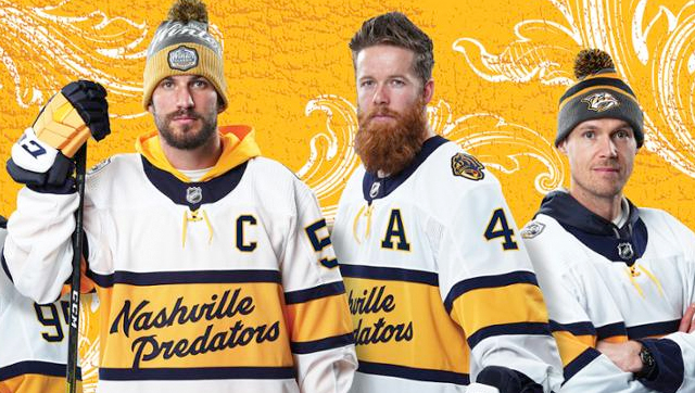
Dallas did us a huge solid in unveiling the jersey along with the pants, socks, helmets and gloves that the team will be wearing, as seeing the uniform in its entirety allows us to best assess the design of the jersey in context. Nashville went a different, and somewhat unusual route of showing the jerseys with street clothes––paired with jeans and toques, and over hooded sweatshirts.
While likely better for marketing jersey sales to fans, it leaves us much to be desired in being able to evaluate the overall look of the uniform. What we have seen so far are the gloves, a tri-tone navy, yellow and white design that mimics the color blocking in the jerseys.
I would assume the Preds would go with navy pants and white and gold socks, but we’ll likely have to wait until January 1st to find out for sure.
Final Verdict
Is this a bad design? Definitely not, but it’s a little bit underwhelming given what the Preds and Adidas were working with. It’s a golden (again, pun intended) opportunity for a color vs. color match up that never was, and while the details like the shoulder patch and guitar frets inside the collar are really nice, it’s an overall fine, but not stellar, sweater.
Agree? Disagree? Let us know in the comments or join the conversation on Twitter, Facebook and Instagram!


[…] Taking a critical look at what the Dallas Stars and Nashville Predators are wearing at the Winter Classic. […]
[…] Taking a critical look at what the Dallas Stars and Nashville Predators are wearing at the Winter Classic. […]
[…] Taking a critical look at what the Dallas Stars and Nashville Predators are wearing at the Winter Classic. […]
[…] Taking a critical look at what the Dallas Stars and Nashville Predators are wearing at the Winter Classic. […]
[…] Taking a important have a look at what the Dallas Stars and Nashville Predators are wearing at the Winter Classic. […]
Thumbs up on the very thorough coverage, John. I’ll add a little context for Nashville.
The Dixie Flyers’ jersey you have pictured there is a reproduction. When recreating historic artwork, we always use authentic photos or game worn jerseys as reference material because reproductions are inevitably slightly off in almost every case (Ebbets Field Flannels are probably the only repros I trust the accuracy of).
As you can see in the photo linked below, the actual script had a more elegant slant and rhythm to it, which I wanted to capture in the Winter Classic lettering. The script was also a little larger than what you see on the repro, and on some jerseys, the dot of the i and the tail of the y actually did creep onto the edge of the stripe. It was necessary to position the script as it is so that it looks optically centered within the stripe (the stem of the P hanging down leaves too much negative space underneath when the tops of the ls and the bottom of the P are centered within the stripe).
https://i.iheart.com/v3/re/new_assets/5dbe30fcaf1a6c4a1ce6bd98
As always, thanks for the additional info Andrew, it’s much appreciated! Although it was Ally that wrote this piece, so I can’t take credit for it.
[…] • More: HbD Masks: 2019 Winter Classic Masks• More: HbD Breakdown: 2020 Winter Classic Jerseys […]
[…] • More: HbD Breakdown: 2020 Winter Classic Jerseys […]
[…] More: HbD Breakdown: 2020 Winter Classic Jerseys• More: 2019 Heritage Classic Jersey […]
[…] • More: HbD Breakdown: 2020 Winter Classic Jerseys […]
The new alternate jerseys for the Anaheim Ducks and Colorado Avalanche were accidentally leaked by the NHL. One of the most popular aspects of the outdoor Winter Classic games are the team’s jerseys, throwbacks to a franchise’s heyday or notable eras in the team history. Here’s a look at the sweaters that have become a part of the game again.
[…] feel like a broken record, having called out this same gaffe on Nashville’s Winter Classic jerseys, but I cannot STAND the edges of the letters extending beyond the horizontal stripe. Now you might […]