
Worst to First Jerseys: Dallas Stars

As we go through the prolonged 2019-20 season, we’ll be updating all of the Worst to First Jersey posts every Monday, as almost all the teams in the league have unveiled new jerseys since their original posts. We’ll start with the ones most needing updating and work our way through the league. Today, it’s time for the New York Rangers to get updated.
Also, a huge thanks to SportsLogos.net and NHLUniforms.com for most of the jersey images and references.
Dallas has not had the greatest reputation for jerseys/branding design in the league, from some infamous jerseys to some lacking much personality or forethought at all. But which is the best in their history, and which is the worst?
Here’s how this works: I’ll count down, from worst to first, all the jerseys the Stars have ever worn. Homes and aways will be lumped into the same category (so, more of a jersey “era”) and I won’t worry about small changes (like slightly changed positions of striping for example). Third jerseys will stand on their own. And I’m focusing on the jerseys only, not the entire uniform. For the Stars, there’s seven different jerseys/eras. And we’ll start with the worst one.
7. 2003–06 Third Jersey
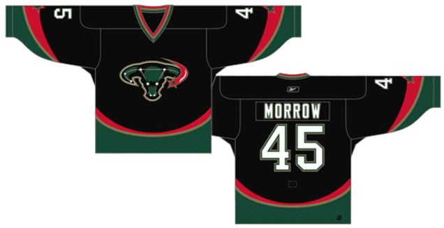
If you need a serious explanation as to why these jerseys achieved last place on this list…then let me oblige! But if you’re honestly surprised by its placement, there may just be no hope for you.
Ah, the Mooterus, named as such because of the crest’s resemblance to a cow’s head laid over a constellation of a uterus. Obviously, that was not the original design’s intent, but the organization’s inability to see this and kibosh its release before it got released and mocked by the rest of the hockey world shows (a) a severe lack of forethought, and (b) a lack of understanding of what makes for good design. But the rest of the jersey gives all that away as well.
Dallas are not the only ones guilty of using curved stripes on a jersey in the first years of the new millennium (they were one of many) and in fact, they’re used here better than most. The stripes form a consistent and coherent line across the entire jersey, reminiscent of the Penguins and Flames jerseys from the same era.
But the addition of red to an already busy colour scheme of black, gold, green and white is an awful decision, especially since it’s never existed anywhere else within the brand of the franchise. Adding in a North Stars-esque yellow with the gold would be a better decision. Or, just not add another colour at all. For example.
The dominance of the black is a bad decision as well, as the green the Stars wore then wasn’t especially light, and the red and yellow don’t add enough contrast to the jersey overall. It’s unbalanced and top-heavy. The addition of the star on the arms is a well-crafted detail to the jersey, but it’s the lone silver lining on a very dark and muddy cloud. Mix that with a logo crest that will forever be laughed at, and you’ve got a recipe for a forgettable and last place jersey.
Jersey Recommendation: #32 Sweeney. Yup, that’s current Bruins GM Don Sweeney playing for the Dallas Stars, wearing the Mooterus. He was in Dallas for the final season in his career, his only one as not part of the Bruins. If you wear it, people would find it incredibly funny, trust me. And then show up for a game in Boston wearing it when the Bruins play the Stars and get ready for all the hilarity bound to ensue.
6. 2007–11 Home Jersey, 2008–10 Third Jersey, 2010–13 Home & Away Jerseys
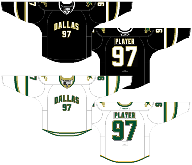
Okay, the timing on these are pretty confusing. The black jerseys were used as the primary home jersey continuously from 2007–13. The white versions were used as a third jersey for a couple seasons before switching to become the primary road jersey. I grouped these two together since, as you can see, they’re slightly more similar to each other than the 2007–10 road jerseys (which will come later).
These jerseys were the first since the 1946-47 Rangers to introduce a hockey jersey with the city or team name arching over the player’s number. Looks good on a basketball jersey (or at least, it doesn’t look out-of-place), but on a hockey jersey, it removes exactly what makes the hockey jersey stand out from the rest of the major sports leagues in North America: a prominently-displayed team crest. I respect Dallas’ effort to try something different, but it falls flat by undermining a visual symbol of hockey ethos which values the team over the individual.
But that’s not the only reason. It also sucks all personality or charisma out of the jersey out of a generally life-less jersey. The overall aesthetic is generally modern and minimalist, but it’s pushed too far into the dull and un-interesting region.
There’s some thin green/white and gold stripes on the sleeves with the primary logo being relegated to shoulder patches. And that’s about it. The most interesting thing about the jersey is that one set of the green/white and gold stripes is curved. Yippee.
Oh wait, oh wait, there’s more. The white jersey added some even thinner green and gold stripes along the bottom. Wow!
Sarcasm aside, these are jerseys that border on the design of practice jerseys: devoid on any personality. Seriously, how did a franchise get from a jersey like this to these?
Jersey Recommendation: #21 Eriksson. Think about it, how often have you seen a full-on teeth-bearing smile from Loui Eriksson? Not very often. This isn’t to say that Loui is devoid of personality like these jerseys, but it’s just not outwardly shown. Plus, his career span in Dallas mirrors the lifespan of these jerseys almost perfectly. Get it in the blacks, just to add a bit of variety in your jersey collection considering what’s about to come next…
5. 2007–10 Away Jersey
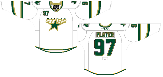
Exactly the same as the above jerseys, but at least they had the Dallas logo on the chest, giving it slightly more personality. But it’s still a pretty bad logo, one of the worst in the league during its time.
• More: BTLNHL #27: Dallas Stars
The addition of the numbers on the top-right corner of the jersey doesn’t help its cause, completing the almost impossible task of having a jersey so minimalist look cluttered. It’s still better than the previously-discussed jerseys, but only slightly.
Jersey Recommendation: #91 Richards. This is no slight against Brad, but like Eriksson above, his career span in Dallas almost exactly mirrors the lifespan of these jerseys, and he had some pretty fantastic seasons in Dallas, so it seems like a natural choice.

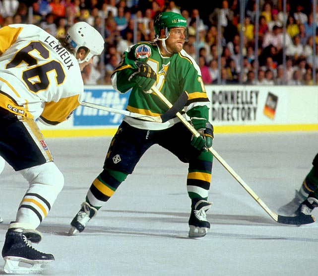
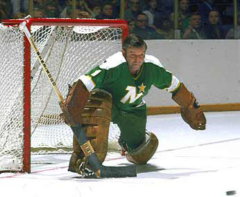
4. 1993–99 Home & Away Jerseys
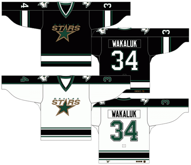
Some people forget that when the Minnesota North Stars first moved to Dallas to become the Dallas South Stars, the jerseys didn’t change at all. Two seasons previously, Minnesota had already removed any “north” references (including replacing a great logo with an awful one) and went from the iconic green and gold jerseys to something much more monochromatic. Dallas just slapped some Texas-shaped patches on the shoulders and called it a day.
Note: The first season’s jerseys are slightly different, with a lighter green, no “Dallas” on the logo, and thinner stripes.
Regulars of this site will know how I feel about black jerseys in general (without a good amount of colour, they’re boring, lifeless and a wasted opportunity to make a game played on blank white sheet of ice more aesthetically pleasing), and these fit into that category. The brashness of the Stars franchise’s previous jerseys are lost completely, replaced with a style that has very little energy.
A bad logo doesn’t help things here, but neither do the straight cuff-to-cuff shoulder yokes which represent a holdover from ’80s aesthetics and make the jerseys look dated immediately. Any team that still does it today (Columbus, Philly, for example) use curves to give it some life and movement. The black jerseys have a faux-shoulder yoke – opting for sleeve stripes that just stop mid-sleeve where a yoke would be instead of a regular should yoke – which makes it even more uninteresting than the white jerseys. They’re almost practice-jersey-esque.
The one thing that makes these jerseys shine (literally and figuratively) is that the gold in the logo is the most prominent element, both on the black jerseys and the white jerseys. And that’s what helps it climb this list. It allows what should be the most prominent element on a hockey jersey (the team logo) to be just that.
It’s also one of the few instances where the gold on a jersey naturally looks metallic, almost like there was some special stitching used on the logo crest, which wouldn’t be used anywhere else. It’s a smart move on the designer’s part, because the only place you’ll find gold/beige on the jersey is on the logo patches.
Jersey Recommendation: #2 Hatcher. A physically-imposing defenceman very well-suited to how hockey was played in the ’90s, he was considered one of the best in the league in his prime, and was the captain of the Stars for some of the time they wore these jerseys. Get it in the more interesting whites.
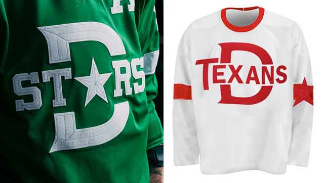
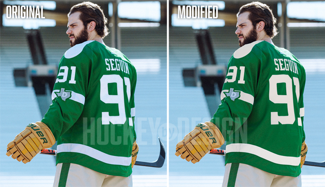
3. 2020 Winter Classic Jersey
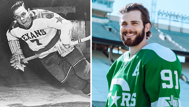
The Stars reached into Texan hockey history with these jerseys, with an obvious visual connection between the logo design and that of the Dallas Texans. While the Stars haven’t explicitly referenced the USHL club in any of their releases about the brand, it’s hard not to see the inspiration from, as the team described, “historical hockey uniforms from Texas.” Aesthetically, this logo is a nice modernization of what the Texans used. But there’s some pretty significant legibility issues that can’t go unmentioned here: let’s start with the choice to turn the “A” into a star. While the team posed this as a reference to the Texas state flag, it visually takes the “A” out of the word “Stars” and instead leads us to read the large Dallas “D” in it’s place, so S-T-D-… yikes.
• More: HbD Breakdown: 2020 Winter Classic Jerseys
Using felt fabric and silver thread, the textures in the logo feel really rich and authentic, stitched to create a faux-beveled look. The only place the stitching gets a bit wonky is in the thinnest notches around the serifs in the “S”s, but that’s really splitting hairs.
While the logo on the front of the sweater serves as an homage to one Texans jersey, the shoulder yokes and arm patches pay tribute to another. While not dissimilar to the white yokes of the Minnesota North Stars, the typography and most of the design elements from the Texans’ word mark jersey were also adopted in the Adidas modernization.
It’s an interesting approach, as this style of shoulder yoke is most often associated with the 70’s, where as the rest of the design elements were inspired by the Texans of 40’s, which creates a somewhat odd juxtaposition. The bold stripe around the waist and “D” patch on the arm can both be seen adopted in the Winter Classic sweaters.
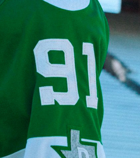
The lettering style is also quite similar to that of the original Texans jerseys, a varsity-style serif font that can be seen both in the “Stars” logo on the front, but on the back and sleeve numbers as well. While we haven’t seen a full alphabet in this font yet, some of the numbers do appear a bit clunky, like the “S” in Stars, as I mentioned before, or the serif on the “9” of Seguin’s 91.
While we’re only talking about the jersey, my only gripe with rest of the uniform – and I know they were going for a mismatched look – is that the beige color wasn’t leveraged in place of white in the jersey. Using off-white felt can work really well for a Winter Classic sweater, as the Bruins did in 2016, but here the bright white ends up making the shorts look less vintage and more just dull.
But overall, these are really stellar. With questions around what era the team should draw their inspiration from, I’m really pleased with the direction Adidas and the Stars’ management ended up taking. Are there some flaws? Sure, but for the first time seeing a) southern and b) newer franchises in the Winter Classic, these are a great homage to hockey history in a southern state.
Jersey Recommendation: #3 Klingberg. The mainstay on the Stars’ defence corps, Klingberg had a great Winter Classic, getting 2 assists and the second star in Dallas’ 4–2 win over Nashville.
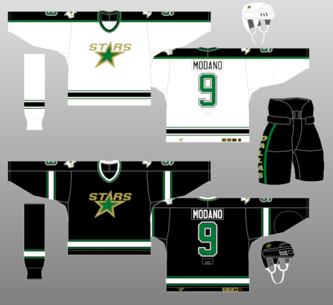
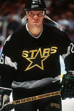
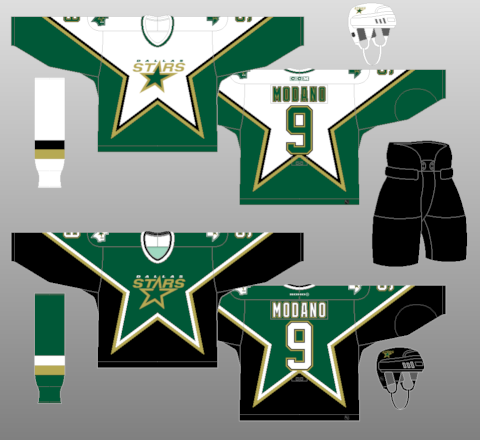
2. 1997–99 Third Jersey, 1999–2006 Home & Away Jerseys
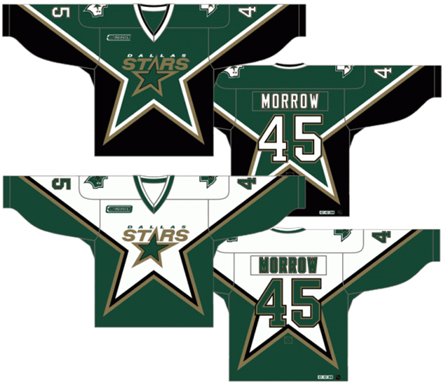
This jersey represents one of the few times that an NHL team tried something unique with jersey striping…and it actually worked. The ’90s were an era of extreme experimentation in hockey aesthetics, and it was mostly to the detriment of sports design in general. These jerseys though, they knew how to balance the oddity with simplicity to create a jersey that helps define the most successful and dominant eras in Dallas hockey.
The first thing to notice is that it works mostly well with the Stars logo crest. The logo’s star is kind of italicized, but still exactly parallels the lines of the jersey’s star from the top-left to the top-right. The image of the jersey above is a little bit different than the actual jerseys in terms of the logo’s placement (this rendering from nhluniforms.com is smaller, but more accurate). The actual jerseys had a smaller crest with the second “S” in Stars right at the right-hand angle on the jersey’s star.
Anyway, all that to say that the logo works well with the design. It fits. It looks comfortable in there.
However, the opposite is true for the numbers on the back, overlapping with the jersey’s star design, even slightly with single numbers. But if you gotta choose between the logo looking good or the player numbers looking good, they chose…wisely.
Or at least they did on the black/green jerseys, where the white numbers contrast well with the jersey underneath it. On the green/white jerseys, the number become a muddy mess without inadequate contrast which can be mostly blamed on the gold and black outlines. Throw a white outline on there (not quite the same font, but you get the drift) and you’re golden. They chose…poorly.
Otherwise, the designers were smart to leave everything else alone. No other stripes, no shoulder yokes, no cuffs, no nothing. When you’re dealing with something this complex and unique, don’t let anything else get in the way of it. Make the right choice.
Jersey Recommendation: #9 Modano. The greatest player to ever put on the Stars jersey? The argument could definitely be made. And he was a key factor in the Stars achieving their greatest triumph (well, that and Hull’s foot). Get it in the same jersey that rose the Cup: black/green.
1. 2013-present Home & Aways
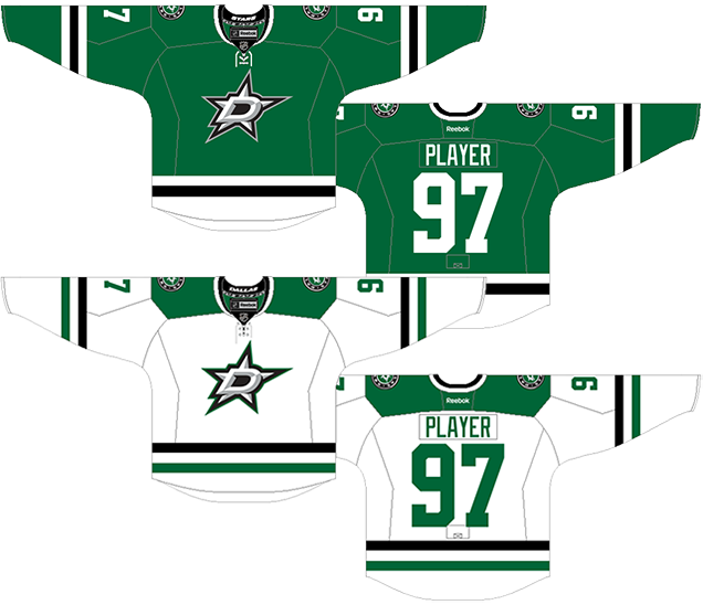
2013 marks possibly the first time in the Dallas Stars’ existence that they put more time, thought, and probably dollars in the visual design of their brand, and it shows. They borrowed where it was necessary, they innovated where it necessary, and in the end, they have a unique jersey and brand that they can be proud of.
• More: HbD News: New Stars and Hurricanes Jerseys Announced
They call it Victory Green. It’s more like a kelly green, but if you’re the only team in the league to use that particular shade of green, I guess you can call it whatever you want, so sure, let’s go with that.
Where all their previous jerseys relied heavily on black, these jerseys only have minimal amounts of them: the logo (and patches), and a single stripe along the bottom and sleeves. Speaking of the stripes, that’s one of the elements they’ve borrowed from one of the most beloved jerseys in the league: Chicago.
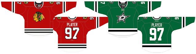
On the Blackhawks’ iconic red jerseys, the entire bottom part of the jersey is white with two black stripes. Dallas did the same, but just removed one of the black stripes and made it thicker. The stripes on the sleeves are pretty much identical.
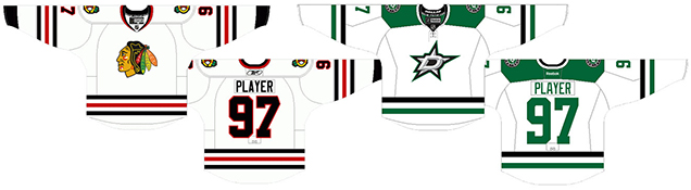
For the white jerseys, it’s less obvious, but they’ve still just reduced the number of stripes on the sleeves and bottoms from three to two, and then added in some shoulder yokes.
I’m not saying there’s anything wrong with borrowing Chicago’s look. If you’re going to mimic someone, might as well mimic from one of the best. And (unpopular opinion time) they improved on the white jerseys, throwing in more colour than the ‘Hawks have on theirs. In this case, the green shoulder yoke really works well, and it has a modern twist by being more chunky and following the hemlines of the jersey itself.
Overall, it’s nice to see Dallas finally ditch the black and embrace the green, a colour that’s woefully lacking in the league. And they’ve taken this opportunity to claim it as their own. The design itself is modern enough and classic enough to be considered among some of the best jerseys sets in the league. About that logo though…
• More: HbD News: New Dallas Stars Logo
Jersey Recommendation: #14 Benn. The current and long-term captain (especially given the length of his current contract) of the Stars is still one of the more dynamic players in the league.
Agree? Disagree? Let us know in the comments below or join the conversation on Twitter, Facebook, or Instagram!


/cdn.vox-cdn.com/uploads/chorus_asset/file/19584520/1197758393.jpg.jpg)
/arc-anglerfish-arc2-prod-dmn.s3.amazonaws.com/public/ID7I4G6F2TPPKEPHZPO2VB24R4.jpg)
Bravo! Green! It’s beautiful. Great choice for #1.
Lightening up a team’s color palette has become passé, if not downright blasphemous in this century, and I have no idea why. The Sabres are too dark, the Blue Jackets are too dark, and the Winnipeg Jets put dark blue with dark red and dark silver. Blech.
In other green news, over in the NFL, The New York Jets recently went where Eagles dared, and now both teams look like wet astroturf. Dull and lifeless. https://www.inquirer.com/eagles/eagles-giants-football-rain-weather-nfc-east-nfl-20191229.html
[…] • A look at the best and worst (Hello, Mooterus!) of the Dallas Stars’ jersey history. [Hockey by Design] […]
[…] • A take a look at the most effective and worst (Howdy, Mooterus!) of the Dallas Stars’ jersey historical past. [Hockey by Design] […]
You got this right, bottom to top.
[…] • More: HbD News: New Dallas Stars Logo Leaked• More: Worst to First Jerseys: Dallas Stars […]
Ugh, no! The current uniforms are dull and uninspired. Bring back the dark green and gold. Lots of contrast and an imposing presence. The current jerseys look like a 1970s pee-wee team!
I don’t mind the rankings. It’s pretty spot on.
However, what’s with all the hate for the 90s/00s logo? No, it’s not the classic NorthStars logo (a great one in its own right), but it is great. Using the actual star to complete the name is iconic.
Also, why weren’t the NorthStars logos on here? They’re the same franchise and should be part of this list.
For the North Stars, yeah, it’s the same franchise, but it’s the same reason there’s no Quebec jersey in Colorado’s, etc, etc. Basically, an editorial decision to keep it to the franchise’s current city.
The “Star” jersey, as I like to call it, is one of those jerseys that is fondly remembered by literally anybody who was alive during the time it was used. For me, I was born the same year it came out, but didn’t see what they looked like til I was 11 and I got NHL 05 for my Windows 2000 PC for Christmas. I immediately fell in love with the look. It’s iconic. It’s the most perfect branding for a jersey I’ve ever seen aside from my Canes and the Avs’ jersey (the original, not the current because of the butchering they’ve done to it). I finally got one just today and when you hold it up and look at it, you can really see how great a jersey it is. The logo is also one of the best I’ve ever seen. The whole thing is perfect, which leads me to wonder why Dallas refuses to bring it back. They came out with the RR edition of it, and it’s just awful. I hate what they did to the “Star” jersey. I just don’t understand why they want to pass up wearing the most on-brand jersey to ever grace the ice of an NHL stadium.