
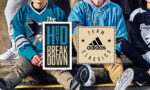
HbD News: New Dallas Stars Logo Leaked!
 The most convenient thing about the Dallas Stars’ logo being leaked is that it allows me to write about just the Stars right now instead of having to discuss both the Stars and the Hurricanes on June 4, when things get officially leaked. Or released. Same thing.
So, the Stars have the first shot at setting the bar for between-season branding tweaks for the entire league. And that bar has been set pretty low. Silly Dallas, this is hockey, not limbo! I don’t think the Stars are this limber anyway. How official is this logo, and how much can we rely on the leak? Considering it came from the official Stars iPhone app, I think it’s a safe assumption.
Logo
 First off, is it better than their current logo? Yes. Is it enough to climb out of their lacklustre placing of 27th in the BTLNHL Countdown? That would mean it’s better than the Florida Panther’s logo, ranked at 26th. I’m not totally convinced yet.
But first, what has improved from their previous logo? For one, it’s simpler. The awkward “Dallas Stars” text has been removed and replaced with a simple large D, which considering Dallas in nicknamed “the Big D”, it makes sense conceptually. Seriously, that text was horribly constructed and looked like italic Arial/Helvetica, which makes me wonder if it was actually designed with MS WordArt. The text is gone, and that’s a good thing.
They also simplified the colour scheme by removing the gold/yellow from the logo, which I don’t mind. At first it looks a little bare without the gold in there, but it allows the Stars to really play up the silver/light grey look that they’re developing, which goes well with the green and could look really nice to used correctly. Just as long as they still keep the green heavily in there because otherwise they’re moving toward a monochromatic LA Kings-style aesthetic. Which is boring and awful. We’ll see where they go with it.
But, as much as this logo is clearly executed better than their previous one, the concept is barely different. And even though they simplified some of the elements, they borrowed almost the exact same star design from the Blue Jackets with beveling and embossing to match. I’m not automatically against bevelling like this, especially when it’s a little more subtle like it is here, but it’s not necessarily something I readily condone either since it’s usually indicative of lazy designing.
In this case, however, I think it’s more of a case of taking a concept and forcing it to work instead of re-visiting the initial concept. Overlaying the D and the star is an interesting concept to simplify the logo but keep it similar to the previous logo, but it just doesn’t work. The deep vacuous black hole in the middle of the logo is terrifying and if you stare at it long enough, you will find the secrets of the universe and everyone on the other side will look like the people from the Black Hole Sun video. Frightening!
The D and the star also start merging together because there’s not enough distinction between them. If you look quickly, you could mistake it for a P or an R. The designer tried to break it up with the black wedges going into the star along the outline of the D, so they clearly saw it was an issue. It just wasn’t rectified enough.
And does anyone else think it looks more like a boot spur?
According to team owner Gaglardi: “What I wanted for this franchise was a logo and a look and a crest that when you look at it has timeless, original-six, vintage, classic qualities to it, and that’s been the theme of what we’ve been pursuing,” Mmmm…yeah, not really there yet.
It’s a good attempt at simplifying the concept of the original logo, but it’s becoming clear that it’s not a concept that can work. My guess is that the Dallas ownership didn’t want to create a drastic departure with the logo concept, even though it was necessary. It’s too bad because it’s a missed opportunity.
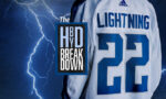
Jerseys
 Speaking of missed opportunities, nothing disappoints me more than the fact they didn’t seem to make any sort of improvements or changes to the jerseys. They are pretty close to being the worst regular jerseys worn in the league right now, with absolutely no character and no colour. I’ve said numerous times that when you’re working with a clean white sheet of ice, the best thing to add is splashes of colour to it. The Kings don’t get that, and the Stars don’t seem to either.
I realize it’s a black-and-white photo that we’re working from to get a sense of the jerseys, but they certainly look black, and nothing seems to have changed at all from the previous season’s jerseys.
This is a horribly missed opportunity, and I hope I’m wrong that they’re not really changing them for this new logo, and these are just old images that are going to be updated once the jerseys are released. I hope.
Alternate Logo
 Hooray, another circular alternate logo! Just what we wanted!
I’m not always against using them as an alternate logo, as they can sometimes be very interesting, especially when you go with a totally different concept for it. But this is nothing more than the exact same logo with no additional elements aside from the “Dallas Stars” text and the removal of some of the outlines on the main logo.
It’s pretty uninteresting and doesn’t add a single thing to the brand, except to get it confused with coffee.
So in the end, the logo is a bit of a disappointment, but it’s definitely a step up from where it was. I think I’d move it up to #23, just ahead of the Blue Jackets, but still below Tampa Bay. For the jerseys, I’ll hold my vicious profanity-laced tongue until we know for sure if it’s changing or not. And the alternate logos…meh.
What do you think? Agree? Disagree? Make a comment below.


The logo by itself is boring, plain and simple. It’s a step up yes, but boring still. If this is indicative of how overused and hard it is to come up with a new concept of a star in a logo is hard to say. However, the one thing I do love about it is that new green color. It’s a bold, strong, North Dakota-style green. Icethetics had a concept submission for jerseys, and if the jerseys are anything like the concept, the logo is actually fitting for them with it’s bold green color and crisp, sharp lines. I think this is a case of a jersey making or breaking a logo, because by itself, it doesn’t do much of anything except make you yawn. http://www.icethetics.info/storage/concepts/2013/0525-davidkerr-dal.png?__SQUARESPACE_CACHEVERSION=1369426068735
You make a good point about how the logo will interact with the jersey, which is why I make the point in the post that I sincerely hope the leaked image is not indicative of how the new (or in this case, not new at all) jerseys will look.
If new jerseys do happen, and they’re pre-dominantly using the green as your link to the Icethetics showed, I’ll be more than happy with that aspect of the brand, as their current jerseys are awful and don’t take the unique aesthetics that hockey and hockey jerseys bring to the table at all.
Is it not obvious that the jerseys aren’t shown in the ‘leak’? Those are photos with the soon to be discontinued jerseys.
As for the logo and colors? Terrible. A missed opportunity to say the least. The team could have gone back to the Kelly green or forest green instead of this Philadelphia Eagles and Starbucks mish-mash.
I really don’t understand the dislike for the Star’s logo either. I can agree it’s a bit dated, which means it needs some touching up. Removing the lettering is a good start. But overall, that logo does have twenty years of up and downs to it.
Look at the Texas Stars. They just did the usual minor league, half assed new logo and it’s still better than this leak..
You’re probably right about the jersey. At least I hope you’re right. But, it seems strange though that they would leak something with the new logo and not the new jerseys, which are coming out June 4th as well, I believe.
[…] let’s start with the ‘Canes. As I mentioned in the post about Dallas Stars’ leaked logo, the bar for off-season redesigns in the NHL had been set, and it had been set very low. Like […]
This is now the worst logo in the league. I don’t know how you consider it an improvement at all. Even the old lazy helvetica italic text and a star is better than this. To call it awkward would be an insult to gangly, pimple-faced teens everywhere. This logo is so terrible, it makes me angry.
As usual, your analysis of it is pretty spot on, and you did roundly ridicule it. I just don’t understand how you moved it up in the rankings.
It’s better than the old Stars logo because it’s a vast improvement in execution and increased simplicity. The last logo looked like it was made in MS Word. But yeah, it’s still not very good.
[…] practice jersey look to them. The more I think about the new Dallas jerseys, the more I like them (but still not the logo, bleah!), and I think the Sharks could have borrowed from them a bit here, having a white bottom on the […]
[…] showcasing a brand new (and unique for the league) shade of green that looks beautiful on the ice. But about that logo…. The Ducks, however, are pulling things apart visually, with boring black and white jerseys with […]
[…] Jaro Halak won’t be the only netminder to be sporting 2 new masks this season. Designed by Marcus Power of Head Strong Grafx, Lehtonen once again turned to his former teammate and fellow countryman Joni Hallikainen, an injury-sidelined goaltender-turned-artist to paint his duo of Stars buckets. Faced with the same challenges as Dave Gunnarsson, who designed and crafted Anders Lindback’s new Stars mask, Power and Hallikainen found a solution to creating a dynamic, beautiful design out of a somewhat sub-par logo. […]
[…] Reading: HbD News: New Dallas Stars Logo Leaked! Related Reading: HbD News: New Stars and Hurricanes Jerseys […]
[…] More: HbD News: New Dallas Stars Logo Leaked• More: Worst to First Jerseys: Dallas […]
[…] • More: HbD News: New Dallas Stars Logo […]
[…] More: HbD News: New Dallas Stars Logo Leaked• More: Worst to First Jerseys: Dallas […]