
HbD Breakdown: Avalanche Stadium Series Jerseys
Ed Note: HbD News has just changed names to something a little more honest and insightful: HbD Breakdown. What does that mean? We may not be the ones breaking news about new jerseys designs (even though we’ll always be discussing them with others on Twitter as they get announced), but we’re the only ones really breaking them down and giving you insight into why they suck, or why they’re awesome, or anywhere in-between. So, the same thing we do now. But, it’s just not called HbD News, it’s called HbD Breakdown.
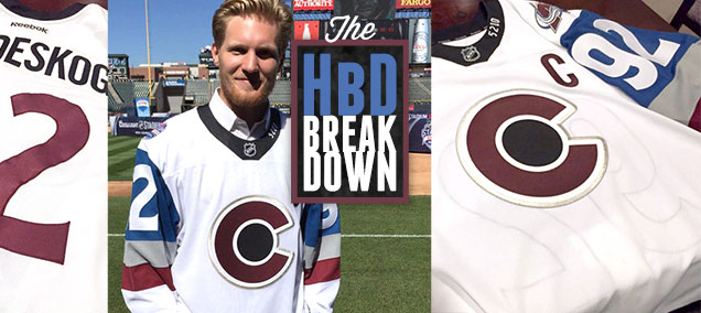
Just a couple days ago, in a promo event at Coors Field in Denver, the Avalanche unveiled the jerseys they’ll be wearing at their Stadium Series event on February 27, 2016 against the Detroit Red Wings. As always, we’ll break these down, after the jump.
These jerseys come close on the heels of the NHL Shop-leaked (but still unconfirmed, but pretty safe to bet on considering it was the NHL that leaked them) new alternate jerseys that the Avs will be wearing this coming season. Not surprisingly, there’s lots of similarities between the two, including the prominent use of a new alternate logo mimicking the Colorado state flag‘s C with a circle in the middle (and reminiscent of the 1970s Colorado Rockies franchise). In the third jersey, the C is placed in a mountain. In the Stadium Series jerseys, there is no mountain, and that design is also used as a shoulder patch on their Avs regular home and away jerseys this season.
So, there’s a lot of jersey incestuousness happening. Not that that’s a bad thing. Consistent and relevant branding is a good thing. Plus, I’m sure George Michael and Maeby would approve.
Stadium Series Jerseys
 This seems to be the first year that the league is loosening its control over what the teams participating in the Stadium Series would be wearing. Or, at least, they’re loosening their restrictions on following the exact same jersey template for all the games. Although these Avs jerseys are the first to be officially unveiled, the Red Wings’ leaks look to have a sash going across the jersey.
I, for one, welcome our less restrictive design overlords. But, I’m sure the league is not giving up all control and still giving guidelines. And that would include, more than anything, simplicity to the jersey design. Last year’s lone Sharks/Kings Stadium Series match-up featured minimal lines/patterns and large design elements. The purpose, as the NHL puts it, is because of the grandeur of the stage the games are played in. It’s harder to see the players in the nosebleeds of a football/baseball stadium holding 50,000+ fans, so it was meant to help everyone watching identify the teams/players playing more clearly.
More: HbD News: Sharks and Kings Stadium Series Uniforms Announced
More: The Stadium Series Jersey Countdown
It’s sound logical, except for one issue…can anybody actually see all the details of a jersey during a regular NHL game anyway? Logo, kind of. Stripes, a bit. Jersey colour, definitely. Sleeve numbers, definitely not. While I like the idea of the jersey designs accommodating for the context of a bigger venue, that reason doesn’t necessarily hold water. Unlike buckets. Except this one.
Changing Its Stripes
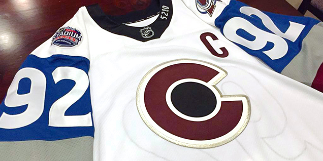
Despite that, the minimalism in this jersey works really well. This first look at this year’s Stadium Series jerseys have eliminated some of the unnecessary elements from last year’s event, like the horizontal stripe through the middle of the jersey, for example. And the thick simple stripes on the sleeves are a really nice look and let the Avs flaunt their branded colours on an otherwise all-white jersey.
What hurts the jersey is the elimination of all striping except on the sleeve, edging it ever-so-slightly towards a practice jersey look. My suggestion? Remove the grey stripe on the sleeve and place a single stripe that’s the exact same thickness near the bottom of the jersey, but in the Avalanche blue. Here’s a mock-up of that.
They’ve also cleaned up the collar from last year, making it simpler, which is great in this context. But why black (or is it navy blue)? I know it matches the circle in the logo, but I have something to say later about that too. Instead, make that collar the Avalanche blue as well.
Spare Me the Details
The biggest missteps of the jersey are in the details – some jersey-specific some brand-specific.
About that logo. As stated earlier, it’s mimicking the Colorado state flag. In the flag’s design, the circle is yellow and represents the sun. But in this Avalanche-altered version the sun is a black hole, which doesn’t make much sense unless you’re a ‘90s grunge band. This oddity is brand-specific, as it’s duplicated in both their leaked third jersey (as navy blue) and the patch on their regular jerseys. I understand not wanting to add yellow to the brand, but maybe something a little lighter than black?
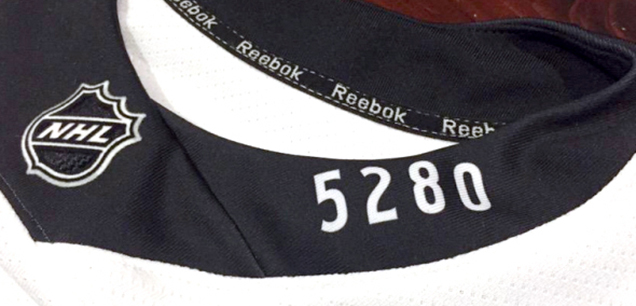
Then there’s the “5280” on the collar, which happens to be the amount of feet in a mile. Being Canadian, where the much more intuitive metric system is used to calculate these sorts of things, it didn’t make sense to me initially. But I wonder, American readers, is this general knowledge for you? Either way, when I did figure it out, I didn’t feel enlightened or amused by their clever whimsy. I rolled my eyes. “Mile High City”, got it. A bit cheesy and unnecessary. Does Denver really pride itself that much on its elevation?
But, I did find out that the 20th row in the upper deck at Coors Field would be exactly 5280 feet above sea level. So the jerseys are just lying everywhere else.
 And the final detail, which you may have picked up on already throughout this post, are the gigantic numbers on the sleeves, which are bordering on comical. From year to year, they seem to keep getting bigger, like some slow-motion Hulk. Eventually, the league will finally just say “Aw, fuck it.” and replicate some football jerseys, which is what they really want to do anyway.
The thing that gets me about the numbers is that their main purpose is for the referees. Nobody, even in the lower deck, is going to be able to see those numbers clearly during game play, no matter how big they are. Nobody sees them when they’re on regular jerseys in the regular intimate hockey arenas, so why are they focusing on them for the Stadium Series? It just hurts the overall design of the jersey.
Final Analysis
Overall, these are some pretty nice looking jerseys. Glad to see the home team wearing white (as it should be) and its clean simplicity will work well in the context of the venue, and probably some of the better Stadium Series jerseys we’ve seen yet. But those details take it slightly down a notch.
(All images from avalanche.nhl.com and Twitter.com)
Cool Stuff
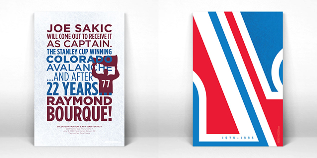 You can get your own piece of Avalanche history from the Hockey By Design Store! Get the Avs’ entry in the Play-By-Play series and Vintage series, pictured above.


[…] • Breaking down the design of the Colorado Avalanche‘s Stadium Series jerseys. [Hockey By Design] […]
The circle in the C represents gold, not the sun. And the reason it is black on the jersey is because it is a puck.
The circle is not gold. The CO flag represents the four elements: yellow, sun, fire; white, snow, water; blue, sky, air; red, clay/rocks, earth.
No. Those aren’t even elements.
Your final mock-up version of the Jersey is sweet, any change they can still make the adjustment! http://hockeybydesign.com/wp-content/uploads/2015/09/CPcbCHvUYAA3S8C.jpg-large2.jpg
More buckets that don’t hold water http://www.bucketofblood.info/work-2/#/lumen/
Naw, once it’s out, it’s out. They won’t be making any changes to it anymore.
I can’t help but feel they are forcing the Colorado Rockies “C” into the Avalanche branding. I think it’s a great graphic element, but it seems forced, they are pasting it everywhere they can.
These jerseys are a huge step up from last year’s pajama design. The giant numbers on the sleeves won’t make much of a difference for the viewers at the game. And isn’t that the purpose of the PA announcer? To let us know who just scored/ took a penalty/ etc. The highest contrast will be the numbers on the back on the white jersey, so this problem is essentially a problem that is one the NHL made up.
The 5280 is overkill. Everyone gets it’s the “Mile High City” and placing it on the collar isn’t the most creative way to display it. The stripes make the sleeves heavy and there is no balance on the rest of the jersey. Perhaps some stripes at the bottom of the jersey?
The stadium series jerseys have not been the NHL’s greatest experiment. It seems that Detroit’s letter mark won’t make for a great design either, especially if there is a red stripe diagonally across the jersey. Hopefully the players look better int he jerseys than they do by themselves. And the games are great.
Yup, totally agree.
You asked “Does Denver really pride itself that much on its elevation?”
I spent 16 years growing up there, so I feel like I can answer: yes, yes it does. The Mile High City moniker is one that is referenced quite a lot, so it doesn’t surprise me in the least that it shows up here, too.
As for the jerseys themselves, they aren’t bad but they aren’t my favorites either. Simplicity in design is great, but these feel a bit too simplistic to my tastes. I appreciate that they’re working hard to iconify the brand but I don’t feel like it’s there yet.
[…] More: HbD Breakdown: Red Wings Stadium Series Jerseys More: HbD Breakdown: Avalanche Stadium Series Jerseys […]
[…] Full Analysis: HbD Breakdown: Avalanche Stadium Series Jerseys […]
[…] main elements that made Mrazek’s such a success. First, the consideration of the jerseys. The Avs Stadium Series sweaters had a really nice, sophisticated color palette of maroon and a a medium blue with clean lines and […]
[…] • More: HbD Breakdown: Avalanche Stadium Series Jerseys […]
[…] • More: HbD Breakdown: Avalanche Stadium Series Jerseys […]
[…] • More: HbD Breakdown: Avalanche Stadium Series Jerseys […]
[…] • More: HbD Breakdown: Avalanche Stadium Series Jerseys […]
[…] More: HbD Breakdown: Avalanche Stadium Series Jerseys• More: The 2020 Stadium Series Jersey […]