
Stadium Series Jersey Countdown (2016)
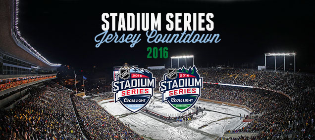 With the third annual Stadium Series officially starting their 2016 on February 21, when the Minnesota Wild take on the Chicago Blackhawks at TCF Bank Stadium, it’s high time we do what we love to do here at Hockey By Design: count things down. With four new additions to 2014–15 library of 9 jerseys, where do the Wild, ‘Hawks, Wings and Avs fit in with the rest of them? I’ll say this – this year’s batch is easily the best of any Series year as a whole. But is any individual jersey enough to take top spot?
Stuff that are related to the jersey templates themselves (like 2014’s stupidly slanted sleeve numbers, or the stupidly large sleeve numbers, for example) won’t be touched on, as they all have them.
Okay, let’s pretend we’re German and start with the wurst.
13. Anaheim Ducks (2014)
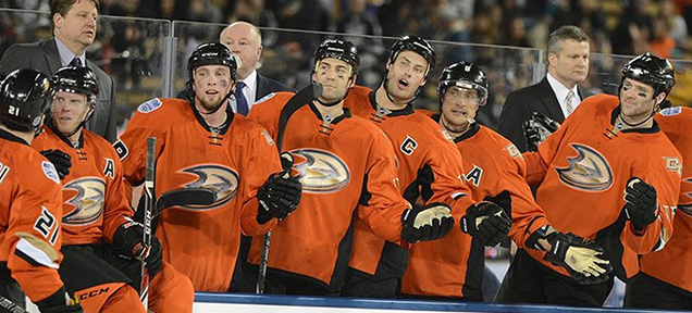
You saw this one coming, right? Regular readers who have read our Top/Worst 5 of 2013 post from last year would know how we feel about the Ducks’ orange pyjamas uniform. There’s too few other elements to counteract the extremeness of the orange that completely dominates the entire uniform. This jersey needed the full sleeve stripes, as well as striping along the bottom of the jerseys, and maybe ever the shoulder yokes. The full orange is just too much. With black gloves and shorts, it’s getting a little Halloween-esque as well. And in case nobody has yet mentioned it, orange and beige don’t really work together. Kudos to Jonas Hiller though, for fully embracing the monstrosity of it all, by adding an orange helmet and pads to compliment these jerseys, if you can use the word ‘compliment’. If I may offer an alternate idea for the Ducks that would have been awesome? How about the jerseys from the movie they’re originally named after?
Full Analysis: HbD News: Stadium Series Jerseys Announced for LA and Anaheim
12. Los Angeles Kings (2015)
 “Everybody’s talkin’ ’bout my white pants. I got my white pants, I got my white pants on.” White, tight, close enough. Even the coach is voicing his displeasure. Sure, this is a “jersey” countdown, but the solid colour from nipples to knees is a strange choice, and it makes it even worse when it’s white. Black, okay (see further down the list), but white? Caman! Like the Ducks’ jerseys at the bottom of the list, it’s too minimal, and needs something else to break up that white. The white helmet doesn’t help either. And using this particular jersey template for the Kings doesn’t work as well since they literally have no colours in their team branding, with the grey just looking like a dirty white. On the plus side, having two crowns on the black collar ring is a nice touch, to commemorate the Kings’ two Cup wins. And especially impactful considering the team they played wearing these jerseys. #itwas3tozero
Full Analysis: HbD News: Sharks and Kings Stadium Series Uniforms Announced
11. New Jersey Devils (2014)
 All things considered, these are fine jerseys. Then why so low? Because there’s not much to discuss. The Devils (aka Lou Lamoriello) were extremely adverse to any sort of alternative- or celebratory-anything outside of their brand. They’ve changed their designs once, in 1992, going from green-and-red to black-and-red and slightly simplifying the design of their jerseys. That’s it. So, for the Stadium Series, they’re just brought back their green-and-red jerseys, identical to what they wore pre-1992 and called it a day. As I said earlier, it’s not a bad jersey necessarily (although those extra white stripes on the sleeves are weird) but there’s so little creativity or celebration of anything involved, it’s hard to get excited about it at all. A complete missed opportunity. And that pushes it down this list. On the plus side, they didn’t go with a fake-chromed logo like the rest of the 2014 Stadium Series teams. And they ignored the jersey template given by the NHL. Lou Lamoriello didn’t care what Gary Bettman demanded apparently. #thuglife
10. San Jose Sharks (2015)
 Using the same NHL-mandated template as the LA Kings’ jerseys this year, the Sharks at least have some colour to work with in their branding. And the template works better in this format, in the very least because their nipples-to-knees colour is black, and teal looks good on top. But why does San Jose cling to the orange as part of their visual identity? It’s barely used in their current jerseys and here? Well, it’s only used as the colour on the collar, making it look more like a choker necklace. Given their recent playoff performances (over the last decade or so), it’s a really strange inclusion. I’m sure the Sharks organization loves even the NHL rubbing their faces in it with the jersey template. #trolling
Full Analysis: HbD News: Sharks and Kings Stadium Series Uniforms Announced
9. Chicago Blackhawks (2016)
 The lowest-ranked 2016 jersey belongs to the Blackhawks. It’s not a bad jersey per-se, but it’s just genuinely uninteresting. A white jersey with a few chunky black lines and a couple logos. It seems like there just wasn’t much effort put behind it compared to the other teams in the 2016 series. That could possibly be because this will be Chicago’s fourth outdoor game (compared to Colorado and Minnesota’s first, and Detroit’s third), so there’s only so far they’re willing to delve into their history to create interesting and/or on-brand one-off jerseys. And that cut-off date appears to be 1955 for them, so they’re starting to run out of options. Or there’s the option of asymmetric collars. Blah, no thanks. I like the Chicago stars on it, but the black-and-white collar just looks ridiculous.
Full Analysis: HbD Breakdown: Blackhawks and Wild Stadium Series Jerseys
8. New York Rangers (2014)
 The Rangers reached back to their Gretzky days for inspiration for these jerseys, closely replicating the stripe pattern on the sleeves, collar and base of the jersey. The colours/outlines of the numbers are also the same. But they added in the shoulder yokes from the 2014 Stadium Series jersey template and, of course, switched out quadruple-outlined super-spiky Lady Liberty logo for their classic diagonal text. It’s not a horrible jersey, but the “New York” being forced to be chromed because of the league just makes it look out-of-place. The sleeve stripes are a little too complex given the relative minimalism of the rest of the jersey too and look odd because of that. And there’s the issue of the blue being way too dark compared to their usual colours, which looks flat during the game. There’s good and bad, so the middle-of-the-pack is a good place to put this jersey. And it’s better to just ignore it. But again, kudos to Lundqvist for doing something creative, like having pinstriped pads and gear to pay homage to the Yankees.
Full Analysis: HbD News: Rangers and Blackhawks Stadium Series Jerseys Announced
7. Los Angeles Kings (2014)
 I’ve changed my mind a bit about this jersey. Originally, it was way down the list. Last year, it’s jumped up all the way to sit right outside the podium. This year, middle of the pack. There’s still issues, like how the light grey looks more like dirty white. And there were other possibilities, like bringing back the purple and/or yellow and using them on these updated Stadium Series jersey templates. But sometimes, when you see a jersey in action during the game, it works better than it does seeing it static. There’s enough black and white thrown in with the grey to give it a lot of contrast and movement, and actually worked against a sheet of white ice. The “LA” shoulder patch still looks good and I’m glad they used some shoulder yokes. So, it gets a bump up the list.
Full Analysis: HbD News: Stadium Series Jerseys Announced for LA and Anaheim
6. Chicago Blackhawks (2014)
 Yeah, these jerseys are pretty minimalist and cool-looking, but black?! C’mon, what is this, the late-’90s? Aren’t we over this black jersey phenomenon yet? The biggest problem with the black jerseys is that they made the chromed-up logo look incredibly cheap, because of the deep richness of the black. Against the black hair on the logo, it looks more like dark grey. In that sense, these are the worst jerseys in the whole Series in terms of working with the logo. Take the logo out of the equation and they’re pretty nice. Simple but strong red and white stripes along the sleeves and bottoms to barely keep them from looking like black pyjamas (take note, Anaheim). It still might have been nice to have seen red shoulder yokes on these.
Full Analysis: HbD News: Rangers and Blackhawks Stadium Series Jerseys Announced
5. Detroit Red Wings (2016)
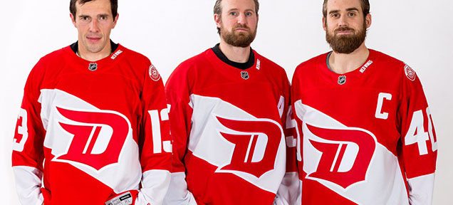 The jersey is essentially a reversed version of their original 1926-27 Cougars jersey, but with the stripe put on a slant and taken off of the back, and made to look more modern. Which seems to be its main detriment. It’s a jersey that is trying to be old and new at the same time. It looks over-designed, but at the same time, it’s clean and minimalist. It looks like an on-brand Red Wings jersey, but also feels out-of-sync. So, it’s neither an outstanding jersey, nor an awful jersey. I don’t really mind it, but I’m definitely not in love with it.
Full Analysis: HbD Breakdown: Red Wings’ Stadium Series Jerseys
4. Colorado Avalanche (2016)
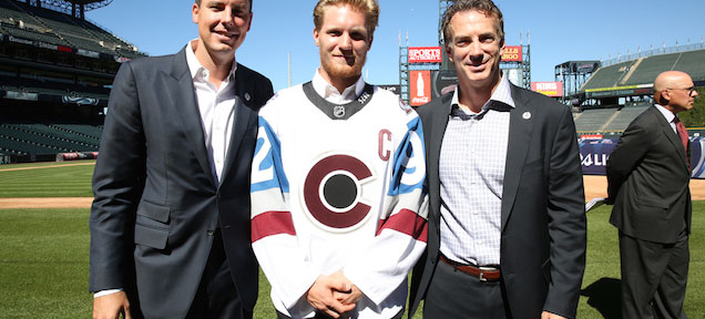 The first Colorado Avalanche outdoor jersey definitely hits some good marks. Overall, these are some pretty nice looking jerseys. Glad to see the home team wearing white (as it should be) and its clean simplicity will work well in the context of the venue, and it’s one of the better Stadium Series jerseys we’ve seen yet. But there’s minor details take it slightly down a notch, like the black-hole sun, the black collar, needing a stripe along the bottom. Minor details maybe, but it keeps it a little bit down on this list.
Full Analysis: HbD Breakdown: Avalanche Stadium Series Jerseys
3. New York Islanders (2014)
 The only team to really introduce a new, or alternate, logo to the Stadium Series was the Islanders, removing everything from their current logo except for the “NY”. It makes for a more iconic, but strange and modern, logo (kind of like this highrise). Again, it just needs to get rid of the chrome though. The rest of the jersey is solid, with just enough orange to compliment the blue, and keeping the super-thick stripe pattern that the Isles have on their current jerseys, a look they’re using well. The white shoulder yokes are unexpected and stand out a little bit too much, but overall, this is a solid jersey design for something like the Stadium Series, given the template their working with in terms of what the NHL gave them and their brand’s colours. And they even become their third jersey…for one season. Which is waaaaaay better than their previous thirds, not to mention their current ones as well.
Full Analysis: HbD News: NY Islanders’ Stadium Series Uniforms Announced
2. Pittsburgh Penguins (2014)
 This was the jersey that best used the mandated 2014 Stadium Series jersey template/design restrictions that were obviously given to the teams by the league. Everything on it just works. The striping along the bottom works well. They knew that these stripes would work just fine if it didn’t wrap around the whole sleeve. Even adding the strip of Vegas gold to the shoulder yokes is a nice touch that compliments the rest of the jersey well. The whole thing looks classic and forward-thinking at the same time, which is what that league appears to have been going for with the Stadium Series as a whole. Easily, this one was the best of that bunch.
Full Analysis: HbD News: Penguins’ Stadium Series Jerseys Announced
1. Minnesota Wild (2016)
 Minnesota is quietly developing one of the best modern sets of jerseys in the entire league and this latest addition – combining the simple and minimalist modernism of the Stadium Series jerseys with distinctively Minnesota Wild branding elements – is excellent. All the elements works together perfectly: colours, stripes, minimalist, modernism, simplicity, details, etc. It sets a new high bar for Stadium Series jerseys. Touchdown Minnesota. Get it? Stadium Series? Touchdown?
Full Analysis: HbD Breakdown: Blackhawks and Wild Stadium Series Jerseys
Agree? Disagree? Let us know in the comments or join the conversation on Twitter and Facebook!


[…] Stadium Series Jersey Countdown (2016) […]
[…] • More: HbD News: Sharks and Kings Stadium Series Uniforms Announced • More: Stadium Series Jersey Countdown (2016) […]
[…] • More: Stadium Series Jersey Countdown (2016) […]
[…] • More: Stadium Series Jersey Countdown (2016) […]
[…] • More: Stadium Series Jersey Countdown (2016) […]
[…] More: BTLNHL #7: Chicago Blackhawks • More: Stadium Series Jersey Countdown (2016) • More: The Best Winter Classic Jerseys […]
[…] More: Stadium Series Jersey Countdown (2016) • More: HbD News: Stadium Series, All […]
[…] • More: 2020 Stadium Series Jersey Countdown […]